


Nine point infographic elements of a business plan




Try Before you Buy Download Free Sample Product
 Impress Your
 Audience
 100%
100% Editable
 Save Hours
 of Time


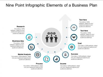
A business plan is a reference tool to keep your management on track with sales targets and operational milestones. Describe your business plan using our nine point infographic elements of a business plan PowerPoint slideshow. A business plan is an important tool to help guide your present and future decisions. It is a roadmap to success which provides greater clarity on all the aspects of your business, from marketing and finance to operations and product/service details. Our business plan presentation template is designed using a nine steps visual process which provides insight on steps to be taken, resources required for achieving your business goals and a timeline of anticipated results. This marketing roadmap PPT graphic can be used to help focus strategy, manage milestones, manage metrics, assign and track responsibilities and performance, and manage money using projections for sales, costs, expenses, and cash. Make your presence felt among your team members, stakeholders and customers by creating effective business plans. Download and highlight your message now. Consider actions to control inflation with our Nine Point Infographic Elements Of A Business Plan. Deliberate on how to halt further growth.
People who downloaded this PowerPoint presentation also viewed the following :
Nine point infographic elements of a business plan with all 5 slides:
Our Nine Point Infographic Elements Of A Business Plan are adept at handling demands.You will exercise effective control.
FAQs for Nine point infographic elements of
Okay so you'll need six main things: executive summary, market analysis, competitive landscape, revenue model, financial projections, and team overview. Basically it's like a visual elevator pitch - investors should get your whole concept in 30 seconds max. Put your revenue model front and center since that's honestly what everyone looks at first anyway. Market size needs to pop visually too. Charts and icons work way better than walls of text. Oh and if you're not great at design (most of us aren't), just grab a template and swap in your colors and numbers.
Honestly, visuals are a game-changer for business plans. Charts for revenue projections, infographics for market stuff, diagrams showing how everything connects - way better than making people slog through endless paragraphs. I actually hate reading those massive text-heavy documents myself. Icons help too, makes it super easy to scan for what you need. The trick is being smart about it though. Don't just slap random graphics everywhere - pick ones that actually explain your complex data in seconds. Trust me, investors will thank you for not giving them another novel to read.
Colors seriously matter for business infographics - they mess with people's emotions more than you'd think. Blue makes everything look trustworthy (great for money stuff), green screams growth and success. Red gets attention but feels risky, so don't go crazy with it. I'd stick to maybe 2-3 colors max that actually match your brand. Orange and yellow work well for highlighting important numbers. Honestly though, I've seen so many people use these awful neon colors that just look unprofessional. Your investors should feel confident, not like they need sunglasses to read your charts.
Line charts are your best bet for revenue and cash flow - they show trends really clearly. Bar charts work well when you're comparing quarters or years, plus most people can read them fast. Waterfall charts are clutch if you need to break down how different things affect your bottom line. Skip pie charts though, they're kinda misleading with financial projections. I learned that the hard way in my first pitch deck. Just pick whatever tells your story best without overcomplicating it.
Look, nobody wants to stare at spreadsheets when you're pitching. Infographics basically save you from that awkward moment when everyone's eyes glaze over at your data dump. Charts and icons make your revenue projections and market research way easier to digest - like, people can actually see your growth potential instead of hunting through boring tables. I learned this the hard way after watching investors scroll their phones during my number-heavy presentation last year. Pick your most important metrics first, then find simple visuals that tell the story. Don't overthink it.
Lead with your value prop - that's what grabs attention right away. Then go: problem, solution, market size, how you'll make money, financials. Use consistent colors and icons so it looks polished. Nobody wants to squint at messy financial charts, so make those super clean. White space is your friend - cramped slides look amateur. Bullet points beat paragraphs every time. I'd actually put your call-to-action on a separate slide at the end rather than cramming it in. Oh, and definitely test this on someone who doesn't know your business - they'll catch things you miss.
Honestly, visuals are a game-changer for business plans. Nobody wants to read through pages of dense text - it's like torture. Icons and illustrations act as shortcuts that help people actually understand what you're trying to say. A lightbulb instantly screams "innovation" way better than a paragraph explaining it. Growth arrows? Everyone gets that immediately. The trick is picking visuals that actually mean something instead of random pretty pictures. You want them guiding readers through your story and creating a flow that makes sense. Otherwise you're just making your plan look busy for no reason.
Canva's probably your best bet to start - crazy easy to use and they've got a bunch of business templates already. Adobe Illustrator is obviously the pro choice but honestly, who has time to learn that whole thing? Piktochart and Venngage sit somewhere in between if you want more control than Canva without the Adobe headache. Unless you're pitching to some major VCs or whatever, Canva Pro should totally cover what you need. I'd just try that first before dropping money on the expensive stuff. Way easier than I thought it'd be when I first used it.
Dude, whitespace is a game changer for business plan infographics. Without it, you're basically creating a hot mess that nobody wants to look at. Give your key stuff room to breathe - viewers need space to actually process what you're showing them. I made this mistake once and crammed everything together... total disaster. Short sentences work. But you also want some flow between your ideas so people can follow along naturally. Shoot for about 20-30% of your layout being empty space. Trust me, it'll make your most important data pop instead of getting buried in visual chaos.
Honestly, think of it like telling a story about your customer's journey. Start with their problem, then boom - your solution swoops in to save the day. A visual timeline works really well for this flow. Try using simple character icons (stick figures are totally fine) to represent your audience. Here's the thing though - don't just throw numbers around. Instead of "30% market growth," show what that actually means for real people's lives. Structure the whole thing like a short movie with a clear beginning, middle, and end. Makes the data way more relatable and keeps people hooked.
Know your audience first - that's everything. Investors? Put the money stuff front and center - ROI, market size, financial projections. They live and breathe numbers. Partners or employees care more about mission and company culture though. Here's what I do: ask yourself what actually stresses your audience out at 2am, then make those answers huge and bold on your infographic. Customers just want to know how you'll fix their problems, honestly. Same info every time, but you're just rearranging what jumps out first.
Ugh, don't cram everything onto one page - nobody wants to read a novel disguised as an infographic. Pick like 2-3 fonts max and make sure your colors actually work together. I learned this the hard way lol. Your info needs to flow logically too, so don't jump from revenue projections to your company history randomly. Those generic stock photos? Skip them entirely. Charts should be readable without squinting. Oh, and definitely run it by someone first - if they're confused after 10 seconds, you need to simplify. Brand consistency matters way more than you think.
Honestly, infographics are a game-changer for business plans. Stakeholders can actually absorb your key metrics and timelines without drowning in paragraphs of text. Investors look at tons of pitches daily, so charts showing revenue growth or market size help you stick out. You can highlight competitive advantages, map out team structure, or turn messy processes into clean flowcharts. Pick maybe 3-4 core pieces that really tell your story visually - don't go overboard. I'd start with whatever your strongest data point is and work from there. Makes everything feel less overwhelming, you know?
Stick to the metrics that actually matter for your business story. Revenue growth, customer acquisition cost, profit margins - those are your must-haves. If you've got a subscription model, definitely include monthly recurring revenue too. Customer retention and conversion rates are solid picks for the operational side. Honestly? Less is more here. Pick maybe 5-7 metrics tops because nobody wants to stare at a cluttered mess of numbers. I've seen so many infographics that try to cram everything in and they just end up looking overwhelming. Focus on whatever shows you're actually hitting your goals and make sure they'll look good as charts or simple icons.
Every 6-12 months usually works, but honestly? Just update it whenever something big happens. New funding, strategy pivot, market changes - that kind of stuff. I cringe when I see founders still showing "2023 projections" in their decks. Like, come on. Your audience definitely notices that stuff and it looks pretty amateur. Keep your design template since that probably works fine, but swap out the data points and metrics that have changed. Oh and set a quarterly reminder to check it - otherwise you'll forget and be scrambling later. Trust me on that one.
No Reviews