

Powerful ten point infographic to create your business plan




Try Before you Buy Download Free Sample Product
 Impress Your
 Audience
 100%
100% Editable
 Save Hours
 of Time


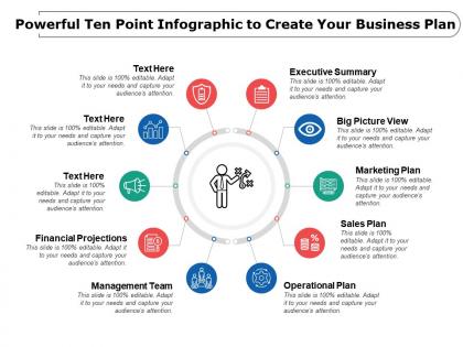
Choose our powerful ten-point infographics create your business plan presentation diagram to help you manage your new business. A strong business plan helps business owners to communicate their vision and can be crucial for attracting investors. Starting a new business requires a complete planning as you need to ensure that you have enough funds to manage manpower and other resources in the most organized way. Our ten step PowerPoint template allows you to pitch your business in a professional manner with some key aspect such as executive summary, big picture view, marketing plan, sales plan, operational plan, management team, financial projections and other crucial aspects that are required to engage the investment firms. This PPT slide has been crafted with innovatively designed icons that are quite useful in communicating the message to the audience. If you are planning to set up a new business, then download this creatively designed presentation layout. You can see how it assists you to achieve your ultimate objective which is success. In general our Powerful Ten Point Infographic To Create Your Business Plan are brilliant. They are also fairly exquisite.
People who downloaded this PowerPoint presentation also viewed the following :
Powerful ten point infographic to create your business plan with all 5 slides:
Gain intercontinental access with our Powerful Ten Point Infographic To Create Your Business Plan. Impress folks around the globe.
FAQs for Powerful ten point infographic to create
So you'll need the basics: business concept, target market, your edge over competitors, how you make money, and financial projections. Team info and marketing strategy too. If you're raising money, definitely include funding needs. Icons and charts are your friend here - they make financial stuff way less boring to look at. Keep it super scannable though. Like 1-2 sentences per section, tons of white space so it doesn't feel overwhelming. Oh and make sure each part has a clear "why should I care" moment for whoever's reading it.
Dude, visuals are a game changer for business plans. Charts make your financial stuff actually readable instead of just endless spreadsheets. Use timelines for your milestones, throw in some icons to break up the wall of text - whatever keeps people's eyes moving. I swear investors see so many boring decks that anything remotely visual stands out. Plus infographics let you show your key metrics without making people dig through paragraphs. Replace like 3 or 4 of your heaviest text sections with something visual. Trust me, it works way better than you'd think.
Honestly, the worst thing you can do is cram a ton of text into one graphic - like, nobody's gonna read all that. Also avoid going crazy with random fonts and colors because it'll look super messy. Make sure your charts are actually accurate too, otherwise people will think you don't know what you're talking about. White space is clutch for making things readable. Oh, and definitely test it on someone who doesn't know your business stuff - if they can't get the main points in like 30 seconds, it's probably too complicated and you'll need to cut some things out.
Dude, charts and graphs are your best friend here - way better than cramming paragraphs of numbers everywhere. Bar charts kill it for revenue stuff, pie charts for market breakdowns. Line graphs show growth nicely too. Honestly? I've seen so many decks where you need a magnifying glass to read anything. Pick your strongest stats that actually back up your pitch. Stick with the same colors and fonts so it doesn't look like a mess. Oh, and make sure your sources aren't sketchy. If you can't read it on your phone easily, it's probably too cluttered.
Stick with blues and grays - they make you look trustworthy, which is exactly what investors want to see. Navy, white, and gold work great together too. If you're doing something eco-friendly, sage green with neutral tones actually looks pretty sharp. But seriously, avoid the rainbow mess that screams amateur. Three colors max is the sweet spot. Oh, and here's something most people don't think about - print it in grayscale first to check if everything's still readable. You'd be surprised how many "perfect" color combos turn into gray mush when printed.
Basically, icons are like shortcuts for your brain. An arrow shows flow instantly, while a pie chart communicates market share way better than listing out percentages. People can see revenue projections or customer segments at a glance instead of reading through paragraphs of boring text. It's honestly faster than wading through business jargon - though honestly, some executives still love their walls of text for some reason. The trick is using icons your audience will actually recognize. Keep your visual style consistent throughout, and you'll have something that actually works.
Honestly, stick to 3-5 sections max. Should take someone like 2-3 minutes to scroll through the whole thing. I've watched people zone out on those massive 10-panel infographics - looks impressive but nobody finishes them, you know? Focus on the big stuff: what problem you're solving, your solution, market size, how you'll make money, and the numbers. That's it. Don't try to cram everything in there. Pro tip - show it to a couple friends first. If they're already losing interest halfway through, you've got too much going on. Better to nail 4 solid sections than bore people with 8.
Okay so basically turn your business plan into a story that follows your customer's journey. Start with the problem they're dealing with, then show how you fix it - like a before/after thing. I'd use visual metaphors or character illustrations to make it more engaging. Don't just dump data everywhere, that's boring as hell. Connect each section so people flow through it naturally instead of just skipping around. Think chapters - why does your business matter? Where's it going? The whole point is making them feel invested in your story rather than scanning random facts. Does that make sense?
Honestly, just start with Canva - their business templates are pretty solid and you don't need to be a designer. PowerPoint actually works way better than people give it credit for, especially if you're already comfortable with it. Adobe Illustrator's great but probably overkill unless you're doing this professionally. Oh, and Piktochart's really good for charts if that's mainly what you need. Venngage too. Figma's worth checking out if your team's already using it for other stuff. I'd mess around with Canva's free version first, see what you can pull together. You can always jump to something fancier later if you need more features.
Honestly, just switch up what you emphasize for each group. Investors are all about the money - show them ROI and financial projections, skip the feel-good stuff. Your employees want to see where they fit in, so focus on team roles and company culture instead. For customers, it's about solving their problems and what sets you apart. I'd make it modular - like building blocks you can rearrange depending on who's looking at it. Way easier than creating totally separate infographics every time. The core message stays the same, you're just highlighting different pieces.
Honestly, typography can make or break your whole infographic. Go with clean fonts like Helvetica or Montserrat - they're readable at any size. Skip the fancy decorative ones that look "creative" but nobody can actually read (learned that the hard way). You'll want different weights for headers vs body text to create hierarchy. Two or three font styles max, otherwise it looks messy. Use size and color to guide people through your info. Oh, and definitely check how it looks at the actual viewing size first!
Keep your case studies super short - like tiny boxes with just client name, problem, what you did, and the numbers. People barely read infographics anyway, so don't overdo it. Pick maybe 2-3 examples that actually relate to your target market. Something like "boosted revenue 40%" or "saved $50K" hits way harder than long stories. Oh, and icons help break things up visually. Each case study shouldn't take up more than a small panel. The metrics need to back up whatever you're pitching. I've seen too many cluttered infographics that try to cram everything in - it's just overwhelming.
So interactive stuff is everywhere now - clickable sections, animated charts that walk people through your story. Mobile-first is basically required since everyone's scrolling on their phones anyway. Minimalist designs with chunky typography are killing it (thank god those messy 2019 infographics are dead). Oh, and green/sustainability themes are performing really well if that fits your brand. Honestly, I'd just pick one interactive feature for your next business plan infographic and test it out. White space is your friend too - don't be afraid to let things breathe a little.
Check your likes, shares, comments - basic engagement stuff. Website traffic is huge too, see if people are actually clicking through to your full plan. Honestly, I'm obsessed with click-through rates because those show real interest, not just casual scrolling. Lead generation matters if you added any CTAs. Don't ignore the comments either - sometimes the best insights come from what people actually say. Oh, and conversion data is everything. Are they taking next steps or just looking? Set up tracking links and give it 2-4 weeks minimum to see what's really working.
Look at Airbnb's original pitch deck - those clean visuals nailing their market opportunity were perfect. Buffer did something smart too, turning their revenue dashboard into investor updates. Canva's business model canvas is kinda genius since they're literally showing off their own product. Here's the thing though - they all focus on ONE story. Don't try cramming everything in there. Market size, revenue growth, competitive edge... pick whatever's most compelling about your business and build around that. I've seen way too many infographics that are just visual chaos because people think more = better. It doesn't.
No Reviews