

Org chart with multiple departments and icons





Try Before you Buy Download Free Sample Product
 Impress Your
 Audience
 100%
100% Editable
 Save Hours
 of Time


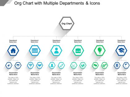
Highlight the organizational structure of all departments in the business using our org chart multiple departments presentation design. Every leading multinational company has a defined department structure to ensure the smooth functioning of the work. Be it you are working in finance, customer service, human resource, information technology or any other unit, you can create the information related to the company using this PowerPoint slide. This PPT template shows the different hierarchy levels that you can use to show information from top management team to executives. You can let the people know about the key members of each department so that they can reach them easily in case if they need assistance. Select this amazing Presentation graphic to show how a business unit works. You can also use this PPT diagram to show the details about the global business leaders and representatives of the company in each country. This PowerPoint design will assist you in every possible way. Download and deliver the message related to work structure of multiple departments. Initiate the dialogue with our Org Chart With Multiple Departments And Icons. Give folks cause to bring about accord.
People who downloaded this PowerPoint presentation also viewed the following :
Org chart with multiple departments and icons with all 5 slides:
Discard archaic beliefs with our Org Chart With Multiple Departments And Icons. They build faith in a free and fresh approach.

FAQs for Org chart with multiple
Start with the obvious stuff - who reports to who, job titles, contact info. The hierarchy needs to be super clear so nobody's wandering around confused about chain of command. Group people by departments too. Most org charts I've seen go stale like yesterday's bagels, but whatever. Show the formal reporting plus any big cross-team connections that actually matter. Keep it visually simple. Maybe get someone to update it every quarter? Otherwise it just becomes that thing on the wall everyone ignores because half the people shown don't even work there anymore.
So basically it shows everyone who reports to who and how teams connect. Saves you from that awkward "should I email this person directly or go through their boss?" moment. Plus people can see how their job actually fits into the bigger company picture. When problems come up, there's a clear path for escalating things. Honestly, half the companies I've worked at had org charts that were like 6 months out of date though. Make sure yours is current and easy to find, or it's pretty much useless.
So there's basically three types: the pyramid one (hierarchical), flat where there's barely any managers, and matrix which is chaos but somehow works. Traditional companies love the pyramid thing - clear boss chains and all that. Startups usually go flat because decisions happen faster when you're not passing notes up five levels. Matrix is weird because you report to like multiple people, but it's actually perfect for project stuff where teams mix and match. Most places are just some random combo anyway, honestly. Quick tip though - figure out who really calls the shots at your place first. That'll show you what structure you actually have vs what the org chart says.
Honestly, just check if your HR system already does org charts before buying anything new. Most tools like Lucidchart or Visio are pretty solid, but the real magic happens when they sync with your employee database. Someone gets promoted? Chart updates itself. No more moving little boxes around like we're still using PowerPoint from 2003. You can add photos and contact details that actually work when people click them. I spent way too much time manually updating ours before I figured this out. The auto-sync feature alone will save you hours.
Think of your org chart as a roadmap for strategy stuff. It shows you who actually makes decisions and how work moves around your company. Honestly, most people invite way too many people to strategy meetings when like 3-4 key folks could handle it. You'll spot weird gaps and bottlenecks before they mess up your plans. When you're rolling out new projects, the chart tells you if your structure can even handle what you want to do. Maybe you need to shuffle people around first. Map out who's accountable for what early on - saves headaches later.
So basically it shows who does what and who everyone reports to - super helpful for avoiding those "wait, is this my job or yours?" moments. You can see your direct reports, your boss, how you connect to other departments, all that stuff. When you need to escalate something or work with another team, you know exactly who to bug instead of sending random emails hoping someone responds. Though honestly, half the time these things are out of date anyway. Just make sure yours actually reflects reality or it's pretty useless.
Honestly? Don't go crazy with details - nobody needs to see every intern and contractor cluttering up the chart. But also don't make it so basic that it's pointless. Update the damn thing regularly too. I've seen companies with org charts from like 2019 still hanging around, which is just sad. Show how teams actually work together, not just who reports to who on paper. Oh and please don't bury it in some random folder as a PDF. Keep it somewhere people can find it when they're trying to figure out who handles what.
Honestly, just throw some location tags next to everyone's names - "Remote," "Hybrid," or whatever office they're at. Color coding is clutch for this stuff, way easier to scan. Time zones are huge now too since scheduling's such a pain otherwise. Oh, and maybe add how people like to communicate? Some folks are Slack obsessed, others still do email for everything. The whole point is making it actually useful for connecting people, not just another boring hierarchy chart. Just don't forget to update it regularly or it'll be useless in like two months.
Oh man, you're gonna be updating that thing constantly as you grow. At first everyone just reports to you and the other founders, but then you'll start adding team leads and directors. Eventually you need HR and ops people too. Your first marketing person? They'll probably end up running the whole marketing department later - it's wild how fast people's roles expand. The structure gets messier with cross-functional teams and people reporting to multiple managers. I'd review it every quarter and update whenever you make big hires or restructure. Otherwise you'll forget who actually does what.
Honestly, org charts are a lifesaver for new hires. Instead of bombarding them with random names and job titles, you can actually show them how everything connects. Walk them through who reports to who, which departments work together - that visual element makes it stick way better. During training, use it to map out who they should escalate issues to and how different teams collaborate. Oh, and definitely make a pared-down version focusing on the people they'll actually work with in their first few months. Nobody needs to memorize the entire company structure on day one.
Dude, make your org chart super scannable - same fonts, colors, shapes throughout. I've literally seen ones that look like someone threw up a box of crayons everywhere lol. Clear hierarchy is key, and bump up those font sizes way bigger than you think. Nobody wants to squint at tiny text. White space is your friend so it doesn't look all cramped together. Break huge companies into separate department charts instead of one giant mess. Oh and if it's digital, definitely make the boxes clickable with contact info - saves everyone time hunting people down later.
Honestly? Every 3-6 months is the sweet spot, or right after big changes like new hires or people leaving. I'd put HR in charge since they're already dealing with headcount stuff anyway. But here's the thing - don't just assume someone will do it. Actually assign it to one specific person or it'll never happen (been there). If your company has an HRIS system that can automate updates, definitely use that - saves so much hassle. Set a calendar reminder and treat it like any other routine thing that keeps the business running smoothly.
Org charts are basically your succession planning blueprint - they show who's where and help spot gaps before they bite you. You'll see reporting lines, figure out which roles desperately need backups, and identify departments that are way too dependent on one person (seriously, some teams are walking disasters waiting to happen). Plus they're great for mapping career paths and finding employees with real leadership potential. My advice? Start with your most critical spots first, then build out your talent pipeline from there. Takes some time but honestly saves you from major headaches later.
Org charts are goldmines for metrics honestly! Look at span of control first - how many direct reports each manager has. If someone's got 15+ people under them, yikes. Also check organizational depth (how many layers top to bottom) and department sizes. You'll see patterns around centralization vs decentralization too. Communication pathways become super obvious once you map everything out visually. These help you catch bottlenecks and bloated hierarchies before they become real problems. Oh, and reporting ratios - sometimes the weirdest structures hide in plain sight until you actually count things up.
Yeah, you can totally make org charts work better by showing how stuff actually gets done instead of just who reports to who. Product teams might map out cross-functional squads. Sales could show territories or client relationships. Marketing - maybe group by campaigns? Engineering loves their squad structures (they're obsessed with that stuff). The traditional corporate pyramid is pretty useless anyway since it doesn't show real workflow. Just figure out what connections actually matter for your team's daily work and map those instead.
No Reviews