


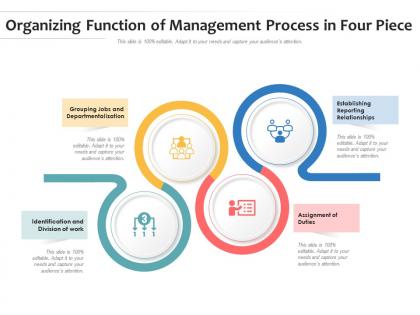
Organizing function of management process in four piece




Try Before you Buy Download Free Sample Product
 Impress Your
 Audience
 100%
100% Editable
 Save Hours
 of Time


Our Organizing Function Of Management Process In Four Piece are topically designed to provide an attractive backdrop to any subject. Use them to look like a presentation pro.
People who downloaded this PowerPoint presentation also viewed the following :
Organizing function of management process in four piece with all 2 slides:
Use our Organizing Function Of Management Process In Four Piece to effectively help you save your valuable time. They are readymade to fit into any presentation structure.
FAQs for Organizing function of management process
Lead with your main point - what should they remember when they leave? Pick 3-4 key ideas max because honestly, people zone out after that. I know it sounds basic, but do the whole "preview, present, recap" thing. It actually works. Make smooth transitions so nobody gets lost following along. Front-load your best material since attention dies pretty fast. Each section needs a clear takeaway. Oh, and don't just end with "thanks for listening" - give them something specific to do next. That's what separates okay presentations from ones that actually get results.
Honestly, good visual hierarchy is a game changer - it guides people's eyes right to the important stuff. Make your headers bigger and bolder than regular text. Use consistent spacing and indentation for bullet points. I swear, once you start noticing this stuff, poorly formatted documents become painful to read! Pick maybe 2-3 text sizes max and stick with them throughout. Color helps too, but don't go crazy. The whole point is being consistent so people catch on to your system fast. Trust me, your readers will thank you.
Dude, color-coding seriously works. Your audience gets it instantly when related stuff matches - like blue for problems, green for solutions. I used to think it was just making things pretty, but turns out it actually makes slides easier to follow. Pick maybe 3-4 colors tops and stick with them throughout. Don't be that person with rainbow slides that hurt people's eyes lol. The trick is staying consistent - if red means "urgent" on slide 2, it better mean urgent on slide 15 too. Makes a bigger difference than you'd think.
Okay so templates are seriously a lifesaver when you're trying to get organized. Instead of reinventing the wheel every single time, you just follow a structure that already works. I use them for everything - morning routines, project stuff, even packing for trips. My brain is basically useless before 9am, so having a morning template saves me from forgetting important things like... actually eating breakfast lol. Pick something you do over and over again and just write down your best process. That's your template right there. Then you can just fill in the details each time instead of starting from zero.
Okay so here's what actually works - chunk your data into bite-sized pieces people can follow. I do this "story sandwich" thing where you give context first, then your findings, then wrap up with what it all means. Use lots of bullet points and white space because honestly, dense blocks of text make everyone's brain shut off. I've bombed enough presentations to know this lol. Throw in rhetorical questions when you see people zoning out. Always include one "holy crap" moment in your data - something that makes people sit up. End each section by spelling out exactly what it means for them personally.
Okay so first thing - just dump all your main points somewhere and figure out what order makes sense. Think of it like you're telling someone a story, not writing a boring report. What do they need to know first before the harder stuff clicks? I always try to anticipate what questions they'll have and answer those before they even ask. It's kinda like being psychic but easier lol. The best test? Explain your flow to someone else first. If they look confused or interrupt with "wait what," that's your cue to shuffle things around. Trust me on this one.
Drag and drop in PowerPoint's slide sorter view - that's honestly where I spend most of my time organizing. Google Slides does the same thing pretty well. You could also try Prezi if you want something fancier, or even map everything out in Notion first (though that might be overkill). Some people still use sticky notes which... actually isn't a terrible idea? The key is seeing all your slides at once so you can catch awkward transitions. I'd start with your main points outlined, then just move slides around until the flow feels right.
Oh man, formatting consistency is such a game-changer! Like, I used to throw random fonts everywhere and wonder why my presentations looked messy. When everything matches - your fonts, colors, spacing - people actually pay attention to what you're saying instead of getting distracted by visual chaos. Plus you look way more professional. I'd pick maybe 2-3 fonts max and stick with the same bullet styles throughout. Sounds boring but trust me, it works. The patchwork quilt look never impresses anyone lol.
Okay so basically you want three parts: intro, body, conclusion. Hook them right away and tell them your main point upfront. Then do 2-4 sections in the middle that actually back up what you're saying. I learned this the hard way - plan your transitions or you'll sound like you're jumping around randomly! Each section needs real examples, not just fluff. Your intro should promise what they'll learn. Body delivers on it. Conclusion hammers home the big takeaway. Honestly, just write it like you're telling someone at lunch what they need to know.
Here's the thing - stories make complex stuff way easier to follow. You're basically creating a thread that connects all your random pieces instead of just dumping info on people. Like "this happened, which caused that, then boom - here's why it matters." The hero's journey works great for this, or even simple before/after comparisons. I swear it beats bullet points every time (though I still use those too much lol). Try taking your next messy topic and forcing it into a basic story structure. You'll be surprised how much clearer everything becomes when there's an actual flow to follow.
Start with like 60% visuals, 40% text - but honestly, don't stress too much about exact numbers. Break your text into small chunks because wall-of-text slides are the worst (learned this the hard way). Your images should actually relate to what you're saying, not just random stock photos. Give everything space to breathe - cramped slides look messy. Here's what I do: show your slide to someone for 3 seconds. Can they get the main point? If not, cut more stuff out. Works every time.
Honestly, audience analysis changes everything about how you organize info. Executives? Hit them with the bottom line first - they don't have time for fluff. Technical people want the methodology upfront, then all the nitty-gritty details. General audiences need the big picture before you get into the weeds. I totally bombed a presentation once by burying the main point in paragraph three (still cringe thinking about it). You've got to match how they naturally think about stuff. So before writing anything, just ask yourself: what do THEY need to know first?
Ugh, the worst thing you can do is try to squeeze everything into one presentation. I learned this the hard way when I once tried to cover like 6 different topics in 20 minutes - total disaster. Don't jump around randomly between points either. Your audience will get confused and zone out. Oh, and never bury your main message halfway through! Lead with what matters most. Also those slides packed with tiny text that presenters just read word-for-word? Yeah, don't be that person. Here's what actually works: pick 3 core points max, then organize everything around those. Way less stressful too.
Dude, you absolutely need other people to look at your drafts first. They'll catch all the weird jumps between ideas that you can't see anymore - like when your intro has nothing to do with your main points, or you go off on some random tangent that kills the whole vibe. I learned this the hard way lol. Ask specific stuff though - "does this transition make sense?" instead of just "thoughts?" Their confused faces will basically show you exactly where to fix things. Trust me, it's way better than bombing in front of your actual audience.
Dude, organization is everything when presenting. People remember like 40% more when your content flows logically versus when it's all over the place. Think intro-body-conclusion, but make the connections obvious. Your brain basically needs a roadmap to file stuff properly - mine definitely does anyway. Short sentences work great. Then mix in longer ones that build on each other naturally. When your audience can guess what's coming next, they're way more likely to retain it. Honestly, those extra 10 minutes spent outlining are totally worth it. Your listeners will actually walk away remembering what you said instead of just nodding politely.
-
Great product with highly impressive and engaging designs.
-
Good research work and creative work done on every template.
-
The content is very helpful from business point of view.
-
Designs have enough space to add content.