


Our team slide template for business powerpoint slides
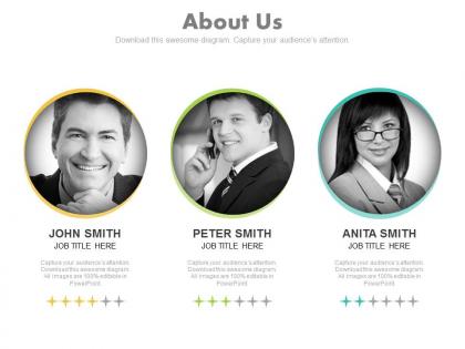




Try Before you Buy Download Free Sample Product
 Impress Your
 Audience
 100%
100% Editable
 Save Hours
 of Time


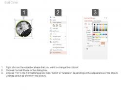
Construct a great career with our Our Team Slide Template For Business Powerpoint Slides. Acquire the framework to build a future.
People who downloaded this PowerPoint presentation also viewed the following :
Our team slide template for business powerpoint slides with all 4 slides:
Enjoy yourself at the dais. Have a ball with our Our Team Slide Template For Business Powerpoint Slides.
FAQs for Our team slide template for
Definitely include photos, names, and titles - that's like the bare minimum. Then add short bios with relevant experience or skills that matter. Honestly, throw in a fun fact or two because people remember the weird stuff (seriously, pet photos are weirdly effective). Contact info depends on your audience obviously. Make sure the layout looks consistent, especially if some slides have more people than others - that always looks messy otherwise. You're trying to build credibility while showing you're real humans, not some faceless company. Oh, and test it with someone who doesn't know your team first. They'll catch stuff you miss.
Honestly, team slide templates are a game changer. No more "what font should I use" panic moments when you're rushing to prep for a meeting. Everyone starts with the same foundation, which keeps things looking professional and consistent. Your team can actually focus on what they're saying instead of getting stuck on design choices. When you present to clients or stakeholders, everything looks like it came from one company instead of... well, a hot mess. Oh, and definitely make a few different versions - like one for client pitches, one for internal updates. Trust me on this one.
Honestly, white space is your best friend here. Don't cram everything together! Stick with 2-3 colors and make your font sizes consistent so people can actually scan the info. I see so many templates with like 20 tiny headshots scattered everywhere - it's painful. Get high-quality photos that are all the same size and lighting if you can. Everything should line up on a grid or it'll look sloppy. Oh, and definitely test it with different team sizes first because what looks great with 4 people might be a disaster with 15.
Colors can totally make or break your presentation - I've watched amazing content flop because someone thought neon green on yellow was a good idea (why??). Your audience's mood and how they process info depends heavily on what colors you pick. Warmer tones feel friendlier, while blues come across as more trustworthy. Keep it simple with 2-3 colors that actually work together. High contrast between text and background is crucial - people in the back row need to read your stuff too. Oh, and definitely test on the actual screen you'll be using beforehand.
Definitely go with clean headshots for your team slide - same lighting and backgrounds if you can swing it. Grid or circle layouts work well, maybe even do an org chart if you're feeling creative. Skip the cartoon avatars though, they always look unprofessional (unless your whole company is like that). Icons under each person are perfect for showing what they actually do. Names, titles, and one quick detail max - people just need to scan and figure out who's who. Oh, and make sure everyone's photo is the same size or it'll look totally off.
Honestly, I just keep like 2-3 versions of our team slide ready because different audiences want totally different things. Executives? Hit them with big wins, key numbers, and strategic stuff - they're busy and want the overview fast. When I'm presenting to other teams or collaborators, I go way deeper into actual processes and specific projects since they get the day-to-day grind. Client presentations are different too - focus on experience that's relevant to their world and outcomes they'd care about. Oh and switch up your language based on who's listening. Makes such a difference.
Honestly, just go with something clean like Calibri or Arial - they're boring but everyone can actually read them from across the room. Montserrat's my personal fave if you want something that looks a bit more current. Don't use anything fancy or super thin though, nobody wants to squint at your slides. Body text should be at least 24pt, headlines 36pt or bigger. Oh and definitely test it on whatever screen you'll actually be using beforehand! I learned that one the hard way when my "perfectly readable" slides looked tiny on the conference room projector.
Lock down your logos, colors, and fonts in the template so nobody can mess with them accidentally. I learned this after watching someone use Comic Sans in a client presentation - never again lol. Build everything into a master template with protected elements. Your brand colors should be in the default palette, fonts preset, logos always in the same spots. Then give your team super clear rules about what they can change vs. what's off-limits. Honestly, people will follow brand guidelines way better when you make it impossible to screw up in the first place.
Start with your mission at the top, then do roles, skills, contact stuff - whatever makes sense. Headshots are huge because honestly, people just connect with faces better than job titles. Make the role descriptions short but clear enough so people actually get what everyone does. Oh, and if your team's bigger, group similar roles together so it doesn't look like chaos. Maybe throw in some recent wins too? I'd test it on someone who doesn't know your team first. If they're confused about who handles what, you probably need to cut some fluff and make it cleaner.
Honestly, simple animations can really help guide people's attention when you're switching between presenters. I'd stick with basic stuff - fade ins for bullet points, maybe slide transitions between sections. Don't go overboard though (we've all seen those cringy PowerPoint disasters). The main thing is keeping it consistent so everyone's part flows together nicely. Test everything beforehand too - I learned this the hard way when my animations went haywire on someone else's laptop. Pick like 2-3 animation types max and call it good.
Dude, you've gotta tell stories about your team instead of just rattling off boring credentials. Like, "Sarah built the algorithm that cut processing time by 60%" hits way harder than "Sarah has 10 years experience." Connect each person's background to why they're perfect for *your* specific problem - that's where the magic happens. Honestly, investors remember stories, not résumés. Show how your team members complement each other too. It makes the whole pitch feel more human and trustworthy. The narrative thread is what sticks with people afterward.
Getting feedback on your slide templates is seriously worth it. Your coworkers will spot stuff you totally missed - like when the font's too tiny or the colors look weird to colorblind people. I used to pack way too much on each slide until someone finally called me out lol. They'll tell you what info they actually care about vs what you assume matters. Plus they catch flow issues better than you can. Just grab 3-4 people, show them a rough draft, and ask about readability and layout. Way better than finding out it sucks during the actual presentation.
Honestly, just start with Canva - their team templates are ridiculously easy to customize and you'll have something decent in like 10 minutes. Google Slides works great too, especially if you're already using their other stuff. The real-time editing is pretty smooth. PowerPoint... I mean it works but feels kinda dated? Figma's awesome if you want to get fancy with design, though it'll take you longer to figure out. Oh and pro tip - once you get your team's colors and fonts sorted, Google Slides becomes way more useful. But yeah, Canva first for sure.
Honestly, team slide templates are a lifesaver. You get clear sections for everyone's roles and responsibilities, so nobody's confused about who's doing what. Way better than those rambling meetings where people just tune out halfway through. I'd add sections for each person's background too - helps when you need to know who has experience with what. The visual format makes it easy to reference during projects, and you can tweak roles as things change. Trust me, it prevents those super awkward "wait, I thought YOU were handling that" conversations later. Just don't forget to actually update the thing when people leave or join.
Ugh, the worst thing you can do is cram everyone's life story onto one slide. Focus on key players only. Make those headshots big enough that people don't need binoculars - I've seen slides where faces are basically dots. Corporate stock photo vibes are the kiss of death too, so grab something with actual personality if you can. One thing that drives me crazy? When formatting is all over the place between team members. Pick a style and stick with it. Toss in LinkedIn handles or contact info where it makes sense. Really though, just highlight what makes each person matter for this specific project and call it good.
-
Excellent work done on template design and graphics.
-
Unique research projects to present in meeting.