


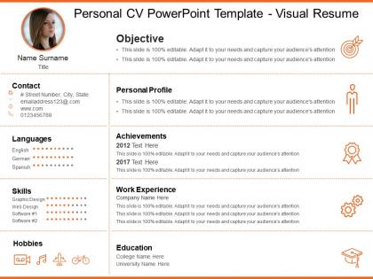
Personal cv powerpoint template visual resume




Try Before you Buy Download Free Sample Product
 Impress Your
 Audience
 100%
100% Editable
 Save Hours
 of Time


Our Personal Cv Powerpoint Template Visual Resume take care of the future. They ensure happy days ahead.
People who downloaded this PowerPoint presentation also viewed the following :
Personal cv powerpoint template visual resume with all 6 slides:
Expedite growth with our Personal Cv Powerpoint Template Visual Resume. Get your act going faster.
FAQs for Personal cv powerpoint
Okay so first things first - get your contact info right at the top where people can actually find it. Clean fonts, consistent colors, lots of white space. Nobody wants to squint at a cluttered mess. Write a summary that actually makes you sound interesting, not like every other candidate. For the layout, break it into clear sections - experience, skills, education. Maybe throw in some icons or lines to separate things visually. Oh and this might sound old school, but definitely save as PDF and print a copy to see how it looks. Some hiring managers are still doing things the analog way, believe it or not. The whole thing should grab attention fast - like 3 seconds max.
Honestly, color choice is huge for resumes - it's what makes recruiters actually look at the important stuff instead of getting lost. Bad colors will kill your chances fast (seriously, I've seen some terrible neon situations). Pick maybe 2-3 colors that fit your field and use one accent color for headers and key points. Keep the main text dark though - people need to actually read it. Oh, and definitely check how it looks in black and white since some places still print everything out. The whole point is guiding their eyes to your best info first without being distracting.
Honestly, icons and graphics are game-changers for resumes. They break up all that text and help hiring managers spot what they need fast - like your contact info or skills section. Most people process visuals way better than paragraphs anyway, so skill charts or career timelines just make more sense. Your resume will actually stand out instead of looking like every other boring Word doc in the pile. Just don't get too crazy with the design though - I've seen some wild ones that were pretty but totally unreadable. Keep it clean and make sure each icon actually serves a purpose.
Honestly, just match your resume design to whatever industry you're targeting. Tech jobs? Show off those programming languages with icons or skill bars - maybe even sneak in some code snippets as visual elements. Creative fields can go wild with bold colors and funky layouts, but finance or law needs to stay super clean and traditional. Don't overthink it though. Healthcare should definitely highlight certifications up front. Oh, and research the company vibe too - startups usually love creativity way more than some stuffy corporate bank would. Bottom line: make your visual style scream "I belong here" for that specific role.
Honestly, just keep it clean and purposeful. Stick to simple fonts and maybe 2-3 colors max – any more looks messy. White space is your friend here. Icons can be cool for showing off skills, but don't go crazy with fancy effects (we've all seen those overdone Canva disasters). The design should help people read your info easier, not distract from it. Short sentences work. Longer ones can flow nicely when they feel natural. Before you print it, imagine handing it to some exec – would you feel confident? That's usually a good test.
Honestly, visual resumes are risky with ATS systems. Those programs can't read graphics or fancy designs properly - they just get confused and might miss your qualifications completely. Kind of defeats the purpose, doesn't it? For online applications, you're better off with a plain text format. But here's what I'd do: save that visual version for the actual interview. Bring it along to impress them face-to-face once you've already gotten past the robot gatekeepers. That way you get the best of both approaches without shooting yourself in the foot early on.
Minimalist is huge right now - lots of clean white space and simple layouts. ATS compatibility is basically non-negotiable since those systems need to actually parse your info. Some people are adding QR codes to link portfolios, which is pretty smart. Color-wise, strategic pops work way better than going crazy with it (learned that one the hard way lol). The trick is looking polished without being boring. Interactive stuff is cool but don't sacrifice readability for flashy elements. Check out Behance for inspo - tons of solid examples there.
So basically make your name the biggest thing on there, then your job title or whatever skills matter most. Mix up your font sizes and don't be afraid of white space - cramped resumes look amateur honestly. Your contact info needs to jump out right away, same with any big wins or achievements. Keep similar sections formatted the same way though, or it'll look messy. I always tell people to think about it like a roadmap - what do you want them to notice first? Then second? Map that out before you even start designing. Short sentences help too. Makes it way easier to scan quickly.
Go with PDF for sure – it keeps all your design stuff intact no matter what device people open it on. Most job systems can read PDFs fine these days, though some ancient ones might be cranky about it. PNG works too if you run into weird upload issues, but that's honestly not common anymore. Keep your file under 2MB and name it something normal like "FirstName_LastName_Resume.pdf" instead of like "resume_final_v3.pdf" (we've all been there lol). Oh, and definitely check how it looks on your phone first!
Think of your visual resume like a mini comic strip - seriously, that's what clicked for me when I was redesigning mine. Start with your personal mission at the top, then use timelines and icons to show your career as an actual journey, not just job after job. Pick 2-3 moments where you solved big problems or made real change happen. Employers eat up the "why" behind your moves way more than just seeing where you worked. Each section should build on your story and show growth. Visual elements make it way easier to spot the challenges you've tackled and results you've gotten.
Keep it super clean for remote jobs - no fancy graphics or weird fonts. Those applicant tracking systems hate that stuff, plus it looks awful when you're screen sharing during interviews. Trust me on this one! Simple typography works best. Add some white space so it's not cramped. Maybe throw in a subtle color accent if you want, but don't go overboard. Since hiring managers are scrolling through tons of digital applications, make yours easy to scan quickly. Oh, and definitely test it as a PDF on your phone first - you'd be surprised how many people skip that step.
Oh man, this is such a good question! So like, in Germany or Japan they're super traditional about resumes - anything too flashy will probably backfire on you. But creative fields in the US or UK? They basically expect some visual pizzazz. It's honestly crazy how the same colorful resume could get you hired in San Francisco but completely tank in Frankfurt. I'd definitely look up what's normal for that specific country and industry first. And honestly, when you're unsure, go a bit more boring than you think - better safe than sorry, you know?
Dude, typography can make or break your resume honestly. Wrong fonts? Tiny text? Good luck getting anyone to actually read it. I learned this the hard way when I made mine 10pt font once - total disaster. Clean, professional fonts are your friend here. Make sure there's clear hierarchy so recruiters spot your name and job titles right away. Your name should be the biggest thing on there, obviously. Don't go crazy with fonts either - maybe 2 or 3 tops. It's wild how much difference good typography makes for looking polished vs amateur.
First figure out what you actually want to say about yourself - your skills, personality, what makes you stand out. Then pick design elements that match that vibe. Like if you're going for creative, maybe bold colors work. More corporate? Keep it clean and simple. I swear half the resumes I see look like people just grabbed whatever template was first on Google. Your fonts, colors, layout - they should all feel like they belong together and actually represent who you are professionally. It's kinda like getting dressed for an interview, but for your resume. Does this scream "innovative startup person" when you're applying to banks? Probably not the move.
Canva's probably your safest bet - they have tons of templates and it's pretty hard to screw up. Adobe InDesign or Illustrator are way better if you actually know design stuff and want more control. Figma works great too, especially if you like browser-based tools. Hell, even PowerPoint can work if you're decent with it (though don't tell anyone I said that lol). Whatever you pick, just export as PDF when you're done. Trust me on that one - keeps everything from getting weird when people open it.
-
Graphics are very appealing to eyes.
-
Visually stunning presentation, love the content.