


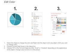
Pie chart showing sales team performance ppt examples slides




Try Before you Buy Download Free Sample Product
 Impress Your
 Audience
 100%
100% Editable
 Save Hours
 of Time


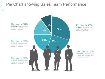
Foster harmony with our Pie Chart Showing Sales Team Performance Ppt Examples Slides. Convince them of the benefits of cohesive action.
People who downloaded this PowerPoint presentation also viewed the following :
Pie chart showing sales team performance ppt examples slides with all 5 slides:
Get all the aces at your disposal with our Pie Chart Showing Sales Team Performance Ppt Examples Slides. You will deal yourself a good hand.
FAQs for Pie chart showing sales team performance
Honestly, stick with metrics that actually add up to 100% - revenue share by rep is probably your safest bet since it shows real impact. Deal volume by territory works too, or you could break it down by product line. Just don't mix different types of metrics because that gets confusing super quick. Revenue share usually tells the best story anyway - way better than just tracking activities or whatever. You might also slice it by deal sizes or customer segments if that makes more sense for your team. The whole point is showing who's actually moving the needle and where you've got room to grow.
Dude, pie charts are perfect for this! You'll instantly see who's crushing it versus who's struggling - like when Sarah's doing 40% of sales and Mike's sitting at 8%. It's honestly wild how obvious the gaps become when you actually visualize the data. Plus you can quickly figure out if someone needs extra training or if your territories are totally unbalanced. I'd use those numbers for your next one-on-ones - some people probably deserve way more credit than they're getting. Makes it easier to decide who needs coaching too.
Make sure you use contrasting colors so each slice actually stands out. Always include data labels with both percentages and real numbers - trust me, nobody wants to play guessing games with your chart. I made that mistake once and watched my boss stare at it forever trying to figure out the numbers. Put your biggest slice at 12 o'clock and go clockwise from there. Keep it to 5-6 slices max or it'll look like a rainbow exploded. Clean sans-serif font works best, and maybe pop out your top performer's slice a tiny bit to show off those wins.
Honestly, just stick to 3-5 segments that actually help you make decisions. I'd go with something like top performers, solid middle, and needs improvement - keeps it simple. Don't create a nightmare pie chart with like 12 tiny slices (been there, it's awful). Each person should fit cleanly into one category, no overlap weirdness. Performance tiers work way better than individual names too. Oh, and here's the thing - figure out what decision you're trying to make first, then build your segments around that. Makes the whole process so much cleaner.
Ugh, pie charts are the worst for sales stuff. Your eyes can't tell the difference between similar slice sizes - like is Sarah at 23% or 25%? Plus they turn into a hot mess once you've got more than 4 people on the team. The real killer though? You can't show trends over time, which is literally what every sales manager wants to see. And don't even get me started on trying to compare quota vs actual performance. Just use bar charts instead - so much cleaner and you can actually compare who's crushing it vs who needs help.
Dude, pie charts are perfect for sales meetings! Each rep gets to see their slice of revenue or deals closed - way better than staring at boring spreadsheets. People actually get competitive when they can visualize where they stand. I usually color-code by performance levels, maybe highlight your top sellers differently. The whole team stays way more engaged honestly. Just don't be a jerk about it though - celebrate the wins but don't throw anyone under the bus for underperforming. Oh and definitely have actual next steps ready, not just the pretty charts.
Honestly just stick with Excel or Google Sheets first - everyone already knows them and they work fine for basic pie charts. If you want to get fancy later, Tableau makes everything look super professional without much work, and Power BI's great too if you need it to pull data automatically from your CRM. I've watched people waste hours trying to make the "perfect" chart when really the data's what matters. Though if you're showing this to your boss's boss, yeah the polish helps. Start simple, then upgrade if you actually need the bells and whistles.
Okay so this is actually a bigger deal than most people realize. Colors totally mess with how your data gets interpreted. Like if you're using bright red for your best performers and some boring beige for the worst ones, everyone's gonna focus on the wrong people. Red screams "problem!" while green says "all good here." Plus similar shades are impossible to tell apart - and don't get me started on colorblind teammates who can't see half your chart anyway. Honestly, just pick a logical color sequence from low to high performance, or give each person their own neutral color. Let the numbers do the talking instead of accidentally sabotaging your own presentation.
Know your audience - it changes everything with sales charts. Your team gets "Q4 enterprise deals" instantly, but executives? They'll be confused while you're trying to show actual performance. I've watched great analyses bomb because of jargon overload, honestly. When people don't know sales lingo, go way simpler with labels. The less familiar they are, the more basic you need to get. Ask yourself: are they gonna spend forever decoding what this means instead of getting the actual story? That's usually when presentations go sideways.
Honestly, pie charts work really well for this - you can see each team's chunk of total sales instantly. Way better than staring at numbers in a spreadsheet. Make separate pies for different months so you'll spot trends in who's killing it vs who's struggling. I'm weirdly a fan of these over bar charts sometimes? The slice visual just hits different when you're showing proportions. Use distinct colors for each team, makes patterns super obvious when you're comparing time periods. Just double-check your numbers actually add up to something meaningful first. Then boom - perfect for those coaching conversations or figuring out where to throw more resources.
Honestly, pie charts are perfect for catching those "wtf" moments in resource allocation. You'll instantly spot when one territory is eating up 40% of your budget but only bringing in 10% of revenue. They're clutch for showing percentage breakdowns - like where your sales resources actually go vs where they *should* go based on potential. I use them all the time to compare quarters too, which is super telling. Trust me, throw one of these in your next planning meeting and suddenly everyone gets why that reallocation makes sense. Nothing beats a visual slap in the face.
So I'd start with the pie chart showing team percentages - that's your big picture view. Then throw in some bar charts for the nitty gritty stuff like deals closed and revenue per person. Line charts are clutch for spotting trends over time, and honestly that's where you'll find the most interesting insights. Maybe add a heat map if you're doing regional stuff? The whole thing works because each chart tells a different part of the story. Your pie gives the overview, then everything else explains what's actually driving those numbers. Just don't go overboard - I've seen dashboards that are way too busy.
Honestly, keep it simple - 5-7 segments tops or people's eyes will glaze over. Start your biggest slice at the top and work clockwise by size. Trust me on this one, I once did a crazy 12-slice chart and it was a disaster! 3D effects are so outdated, don't even bother. When you're showing sales numbers, include both percentages and the actual dollar amounts in your labels. Oh, and here's the thing - tell them what they should notice BEFORE you show the chart. Otherwise you'll just get blank stares while everyone tries to figure out the point.
Oh dude, this is actually a bigger deal than people think. Different cultures read pie charts in opposite directions - clockwise vs counterclockwise. Plus colors are tricky as hell. Red screams "bad news" to Americans but means good luck in China. Some teams focus on the relationships between slices instead of the actual percentages, which can totally throw off your message. I'd definitely use neutral colors and clear labels. Maybe have someone from each region glance at it first? Trust me, I've watched whole meetings go sideways over this kind of stuff.
Honestly, pie charts are perfect for this - just line up a few quarters side by side and the trends pop out immediately. You'll see which reps are gaining momentum and who's slipping. The slice sizes show everything at a glance. What's cool is you can spot if sales are getting concentrated among your top performers or spreading out more evenly across the team. I always throw these in quarterly reviews because the visual changes are so obvious. Seasonal patterns become super clear too. Just make a simple slide deck with them side by side and you'll see what I mean.
-
Professional and unique presentations.
-
Easy to edit slides with easy to understand instructions.