


Pitch deck to raise private equity from investment bankers powerpoint presentation slides
Our Pitch Deck To Raise Private Equity From Investment Bankers Powerpoint Presentation Slides are topically designed to provide an attractive backdrop to any subject. Use them to look like a presentation pro.
Our Pitch Deck To Raise Private Equity From Investment Bankers Powerpoint Presentation Slides are topically designed to pro..














-

- Google Slides is a new FREE Presentation software from Google.
- All our content is 100% compatible with Google Slides.
- Just download our designs, and upload them to Google Slides and they will work automatically.
- Amaze your audience with SlideTeam and Google Slides.
-

Want Changes to This PPT Slide? Check out our Presentation Design Services
-

- WideScreen Aspect ratio is becoming a very popular format. When you download this product, the downloaded ZIP will contain this product in both standard and widescreen format.
-

- Some older products that we have may only be in standard format, but they can easily be converted to widescreen.
- To do this, please open the SlideTeam product in Powerpoint, and go to
- Design ( On the top bar) -> Page Setup -> and select "On-screen Show (16:9)” in the drop down for "Slides Sized for".
- The slide or theme will change to widescreen, and all graphics will adjust automatically. You can similarly convert our content to any other desired screen aspect ratio.
Compatible With Google Slides

Get This In WideScreen
You must be logged in to download this presentation.


Do you want to remove this product from your favourites?
PowerPoint presentation slides
This complete deck can be used to present to your team. It has PPT slides on various topics highlighting all the core areas of your business needs. This complete deck focuses on Pitch Deck To Raise Private Equity From Investment Bankers Powerpoint Presentation Slides and has professionally designed templates with suitable visuals and appropriate content. This deck consists of total of fourty five slides. All the slides are completely customizable for your convenience. You can change the colour, text and font size of these templates. You can add or delete the content if needed. Get access to this professionally designed complete presentation by clicking the download button below.

People who downloaded this PowerPoint presentation also viewed the following :
Content of this Powerpoint Presentation
Slide 1: This slide introduces Pitch Deck to Raise Private Equity from Investment Bankers. State your Company name and begin.
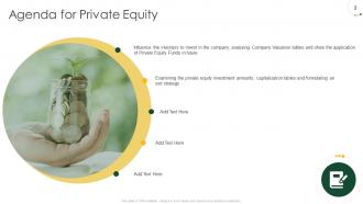
Slide 2: This slide displays Agenda for Private Equity.
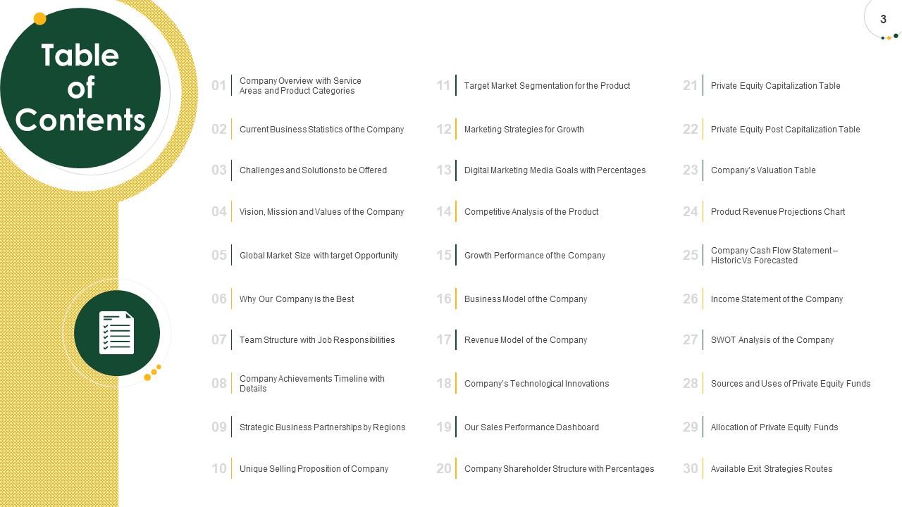
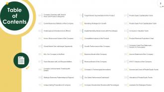
Slide 3: This slide displays Table of Contents.
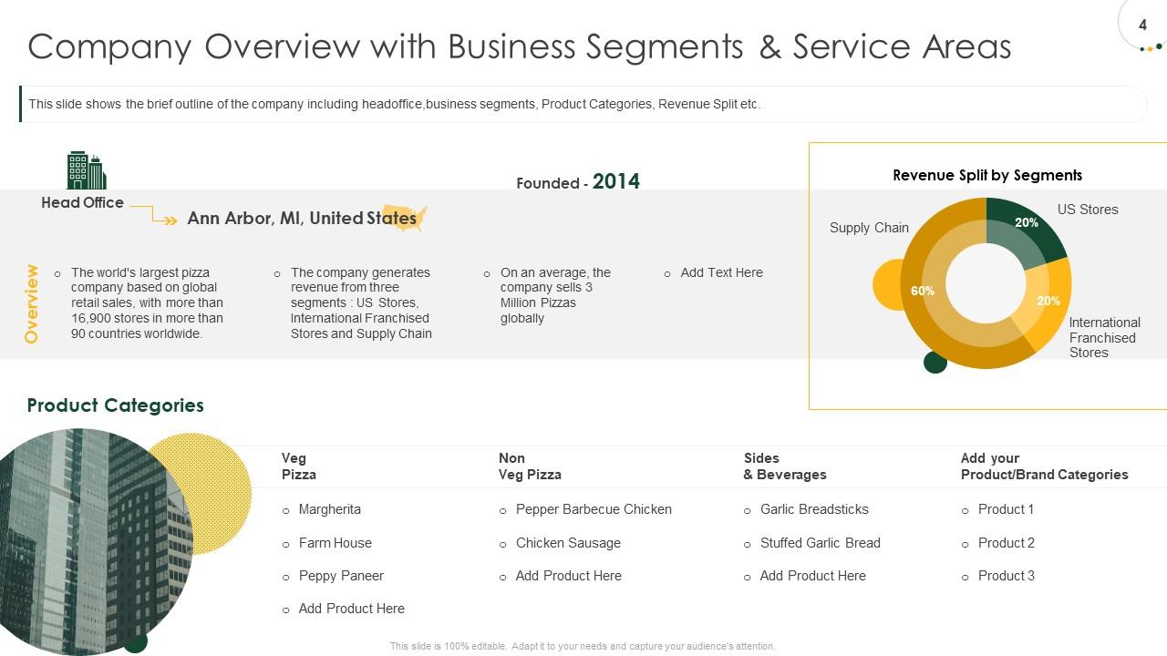
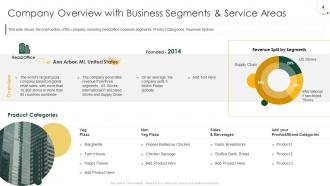
Slide 4: This slide shows the brief outline of the company including headoffice,business segments, Product Categories, Revenue Split etc.
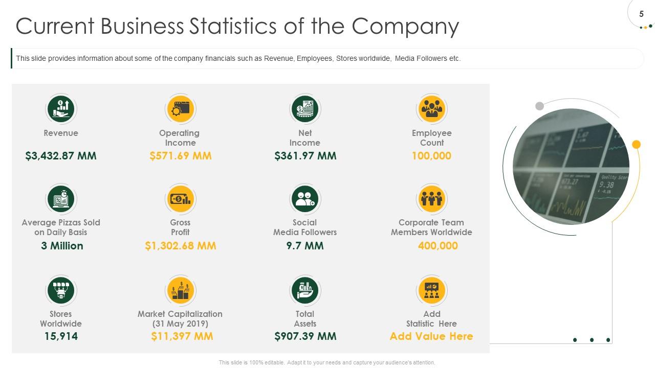
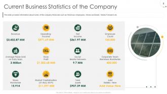
Slide 5: This slide provides information about some of the company financials such as Revenue, Employees, Stores worldwide, Media Followers etc.
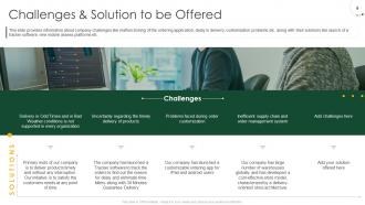
Slide 6: This slide provides information about company challenges like malfunctioning of the ordering application, delay in delivery, customization problems etc. along with their solutions like launch of a tracker software, new mobile assess platforms etc.
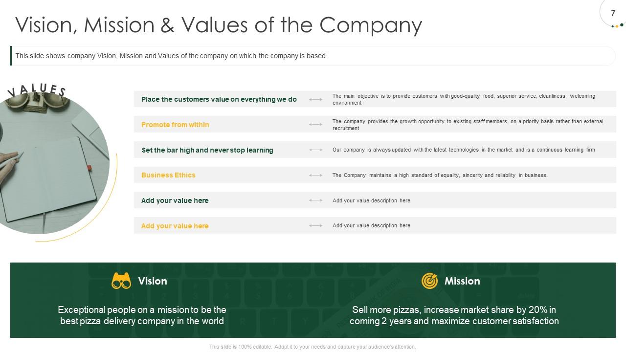
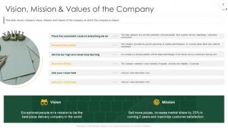
Slide 7: This slide shows company Vision, Mission and Values of the company on which the company is based
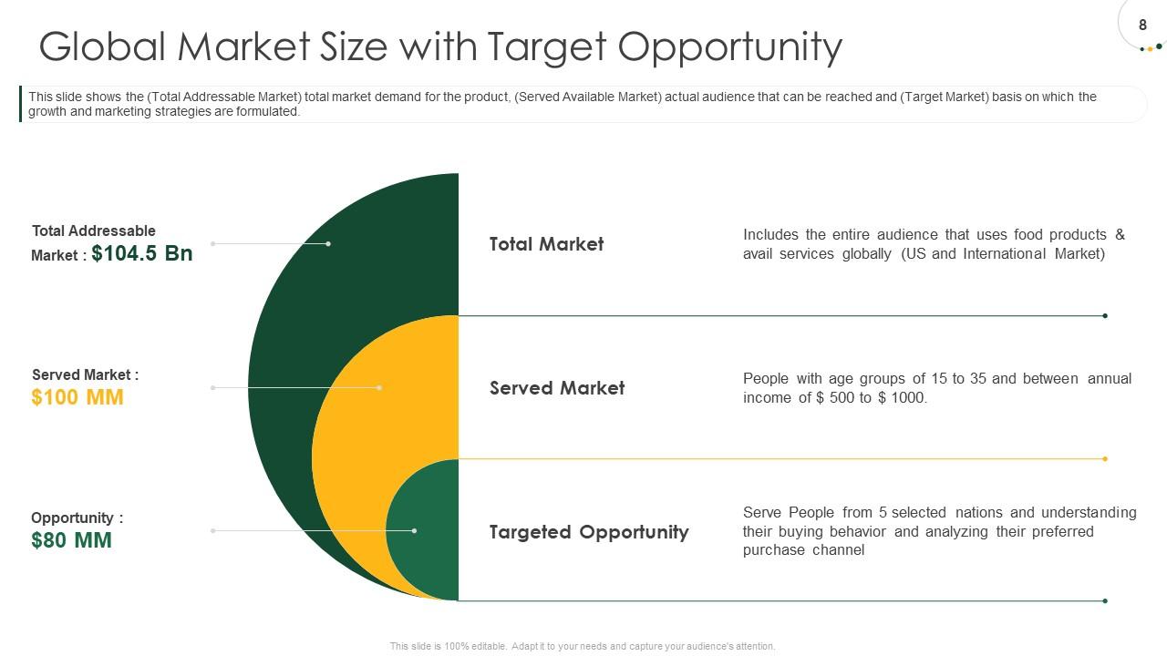
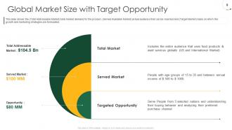
Slide 8: This slide shows the (Total Addressable Market) total market demand for the product, (Served Available Market) actual audience that can be reached and (Target Market) basis on which the growth and marketing strategies are formulated.
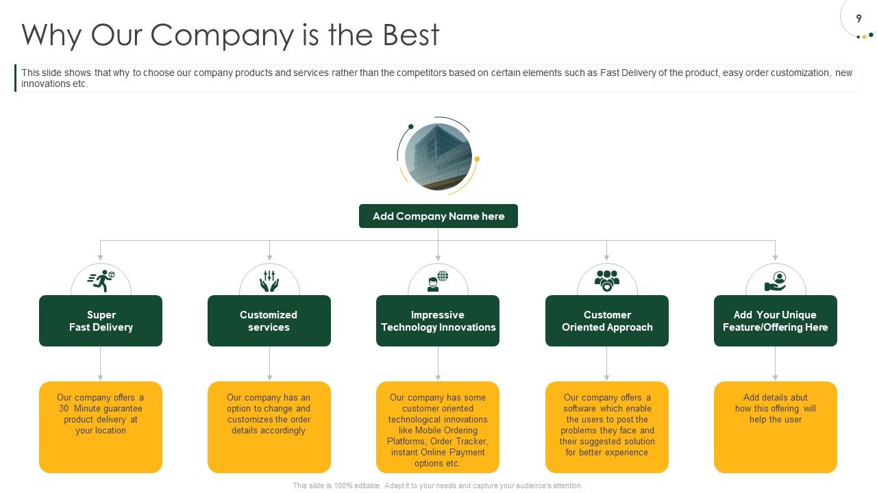
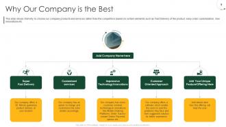
Slide 9: This slide shows that why to choose our company products and services rather than the competitors based on certain elements such as Fast Delivery of the product, easy order customization, new innovations etc.
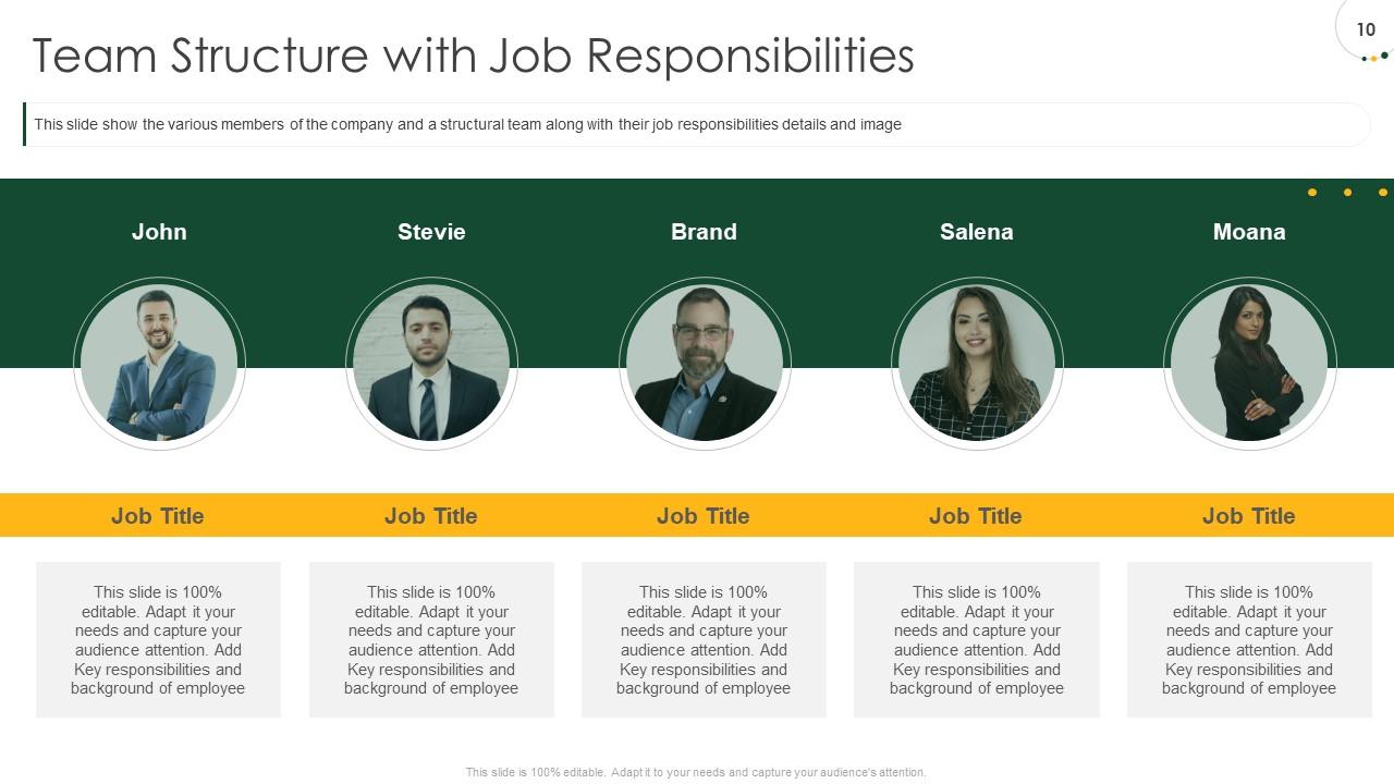
Slide 10: This slide show the various members of the company and a structural team along with their job responsibilities details and image
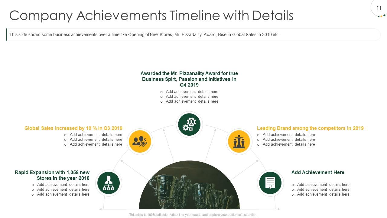
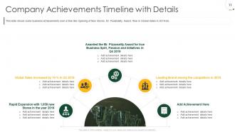
Slide 11: This slide shows some business achievements over a time like Opening of New Stores, Mr. PizzaNality Award, Rise in Global Sales in 2019 etc.
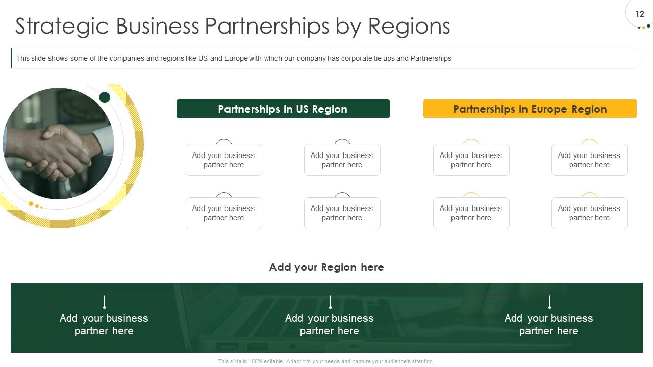
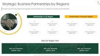
Slide 12: This slide shows some of the companies and regions like US and Europe with which our company has corporate tie ups and Partnerships
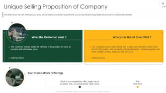
Slide 13: This slide shows the USP of the product along details related to customer requirements, your product/brand unique features and how the competitors are better
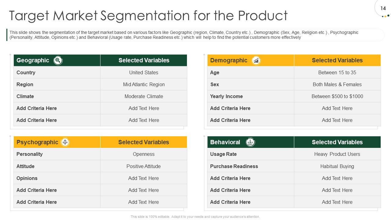
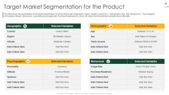
Slide 14: This slide shows the segmentation of the target market based on various factors like Geographic (region, Climate, Country etc.) , Demographic (Sex, Age, Religion etc.) , Psychographic (Personality, Attitude, Opinions etc.) and Behavioral (Usage rate, Purchase Readiness etc.) which will help to find the potential customers more effectively
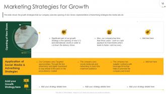
Slide 15: This slide shows the growth strategies that our company uses like opening of new stores, implementation of Advertising strategies like media ads etc.
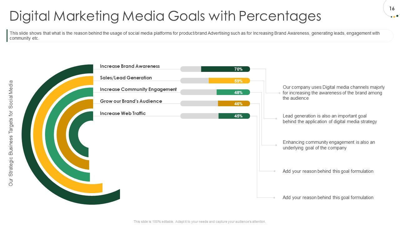
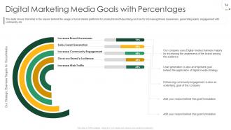
Slide 16: This slide shows that what is the reason behind the usage of social media platforms for product/brand Advertising such as for Increasing Brand Awareness, generating leads, engagement with community etc.
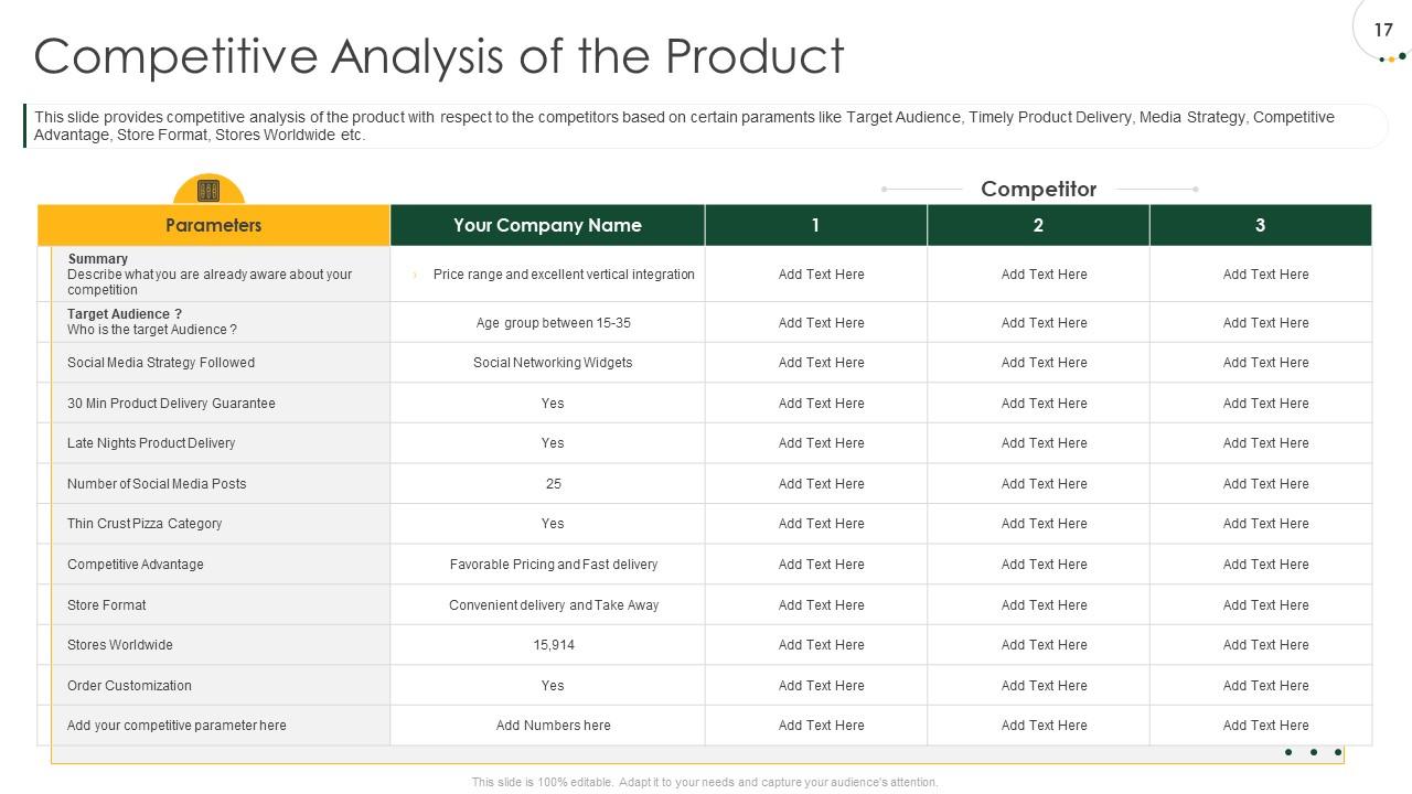
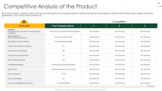
Slide 17: This slide provides competitive analysis of the product with respect to the competitors based on certain paraments like Target Audience, Timely Product Delivery, Media Strategy, Competitive Advantage, Store Format, Stores Worldwide etc.
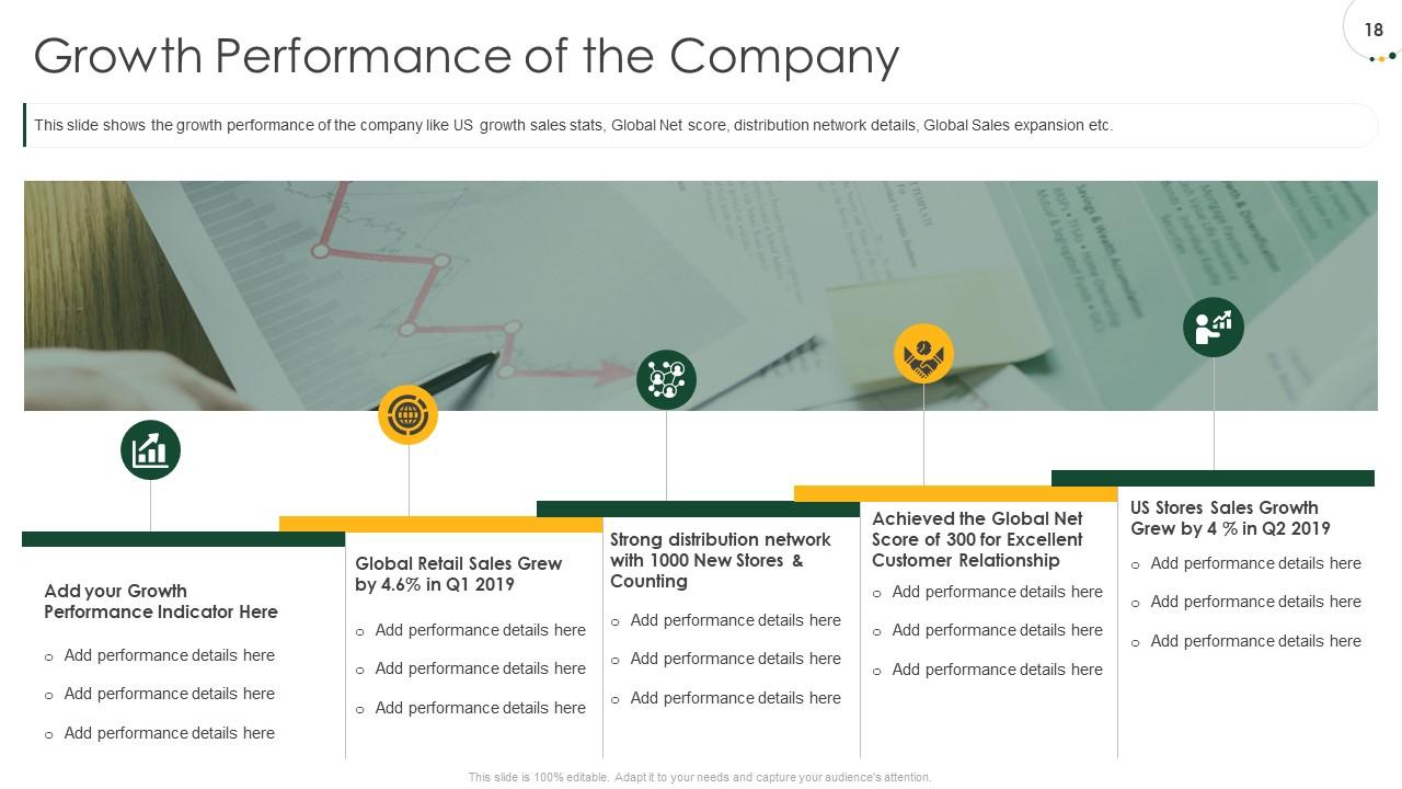
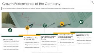
Slide 18: This slide shows the growth performance of the company like US growth sales stats, Global Net score, distribution network details, Global Sales expansion etc.
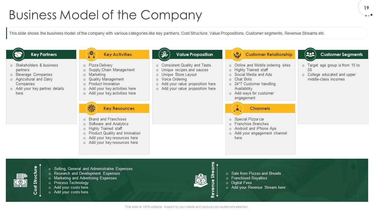
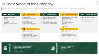
Slide 19: This slide shows the business model of the company with various categories like key partners, Cost Structure, Value Propositions, Customer segments, Revenue Streams etc.
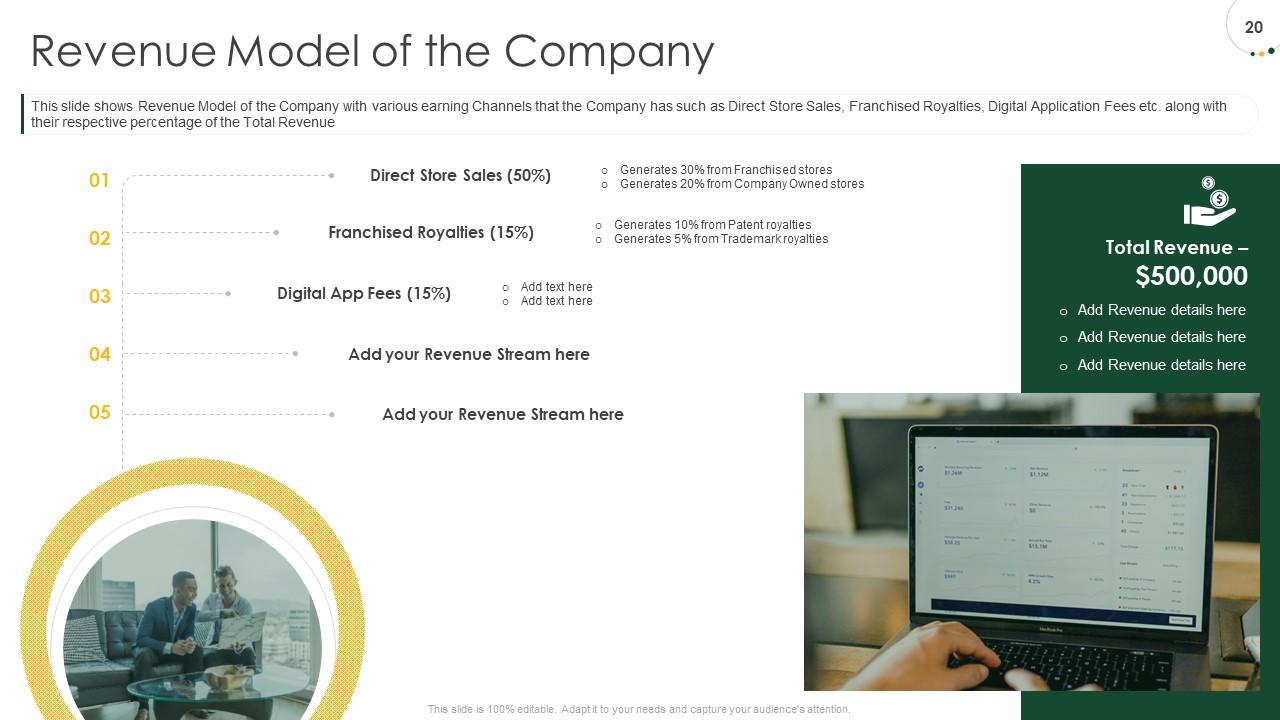
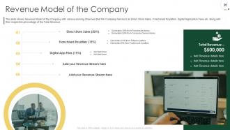
Slide 20: This slide shows Revenue Model of the Company with various earning Channels that the Company has such as Direct Store Sales, Franchised Royalties, Digital Application Fees etc. along with their respective percentage of the Total Revenue
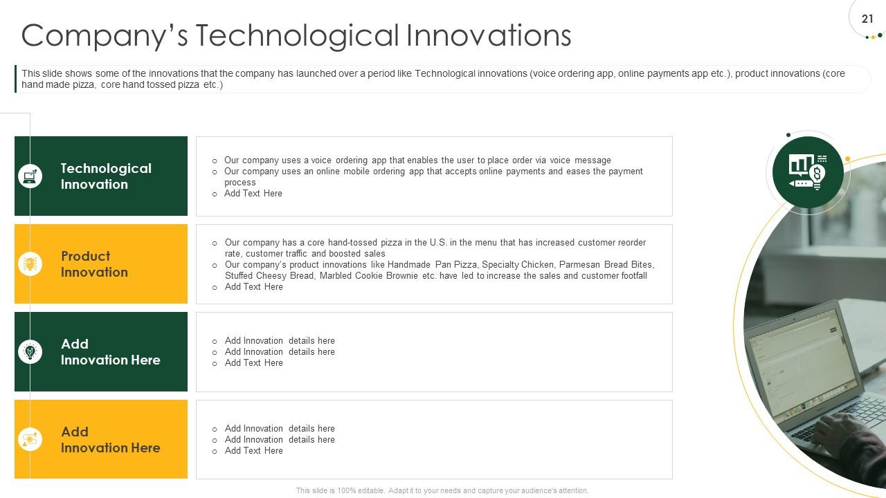
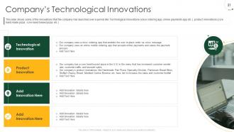
Slide 21: This slide shows some of the innovations that the company has launched over a period like Technological innovations (voice ordering app, online payments app etc.), product innovations (core hand made pizza, core hand tossed pizza etc.)
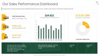
Slide 22: This slide shows the weekly sales performance dashboard of the with number of new customers, sales revenue, Profit earned, Average revenue etc.
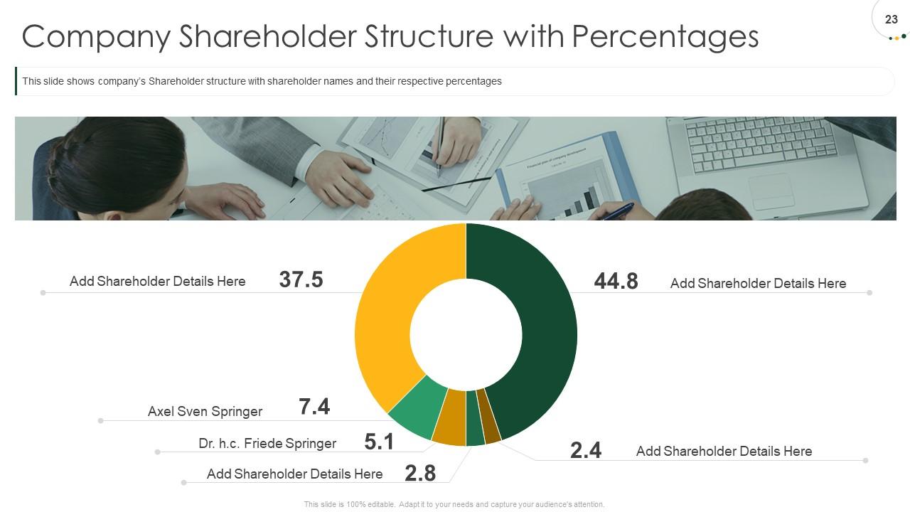
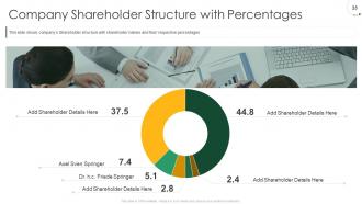
Slide 23: This slide shows company’s Shareholder structure with shareholder names and their respective percentages
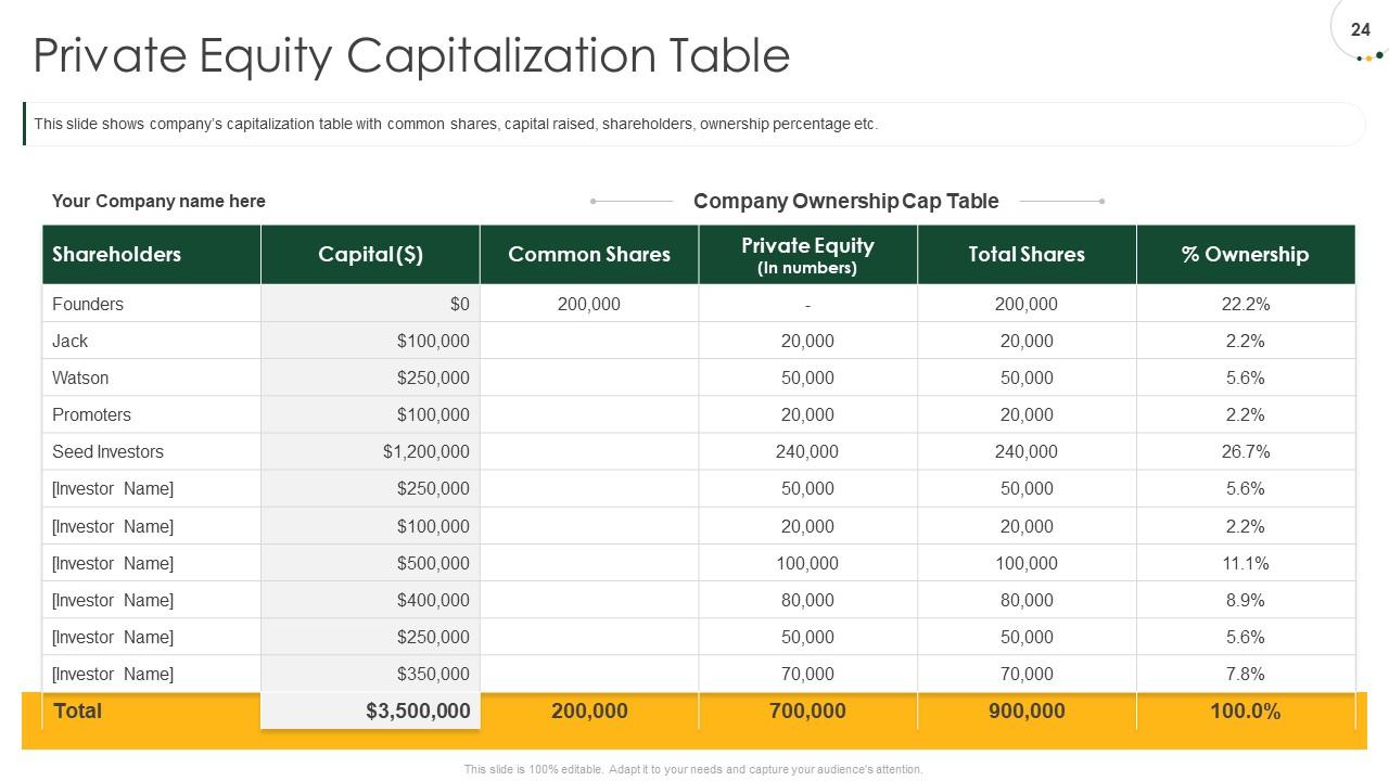
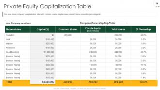
Slide 24: This slide shows company’s capitalization table with common shares, capital raised, shareholders, ownership percentage etc.
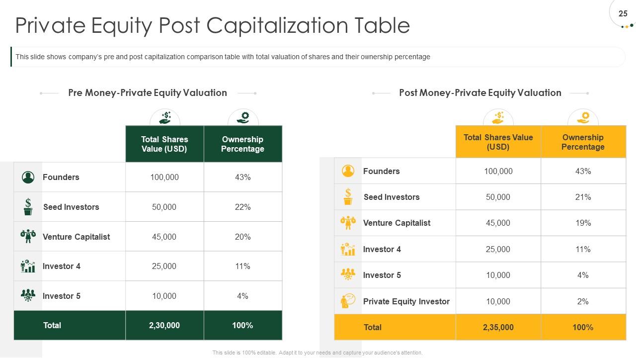
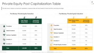
Slide 25: This slide shows company’s pre and post capitalization comparison table with total valuation of shares and their ownership percentage
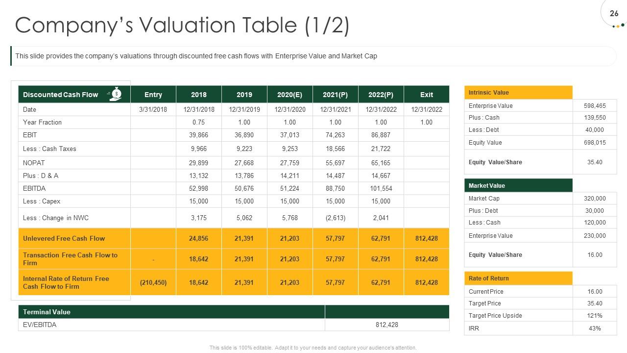
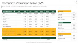
Slide 26: This slide provides the company’s valuations through discounted free cash flows with Enterprise Value and Market Cap
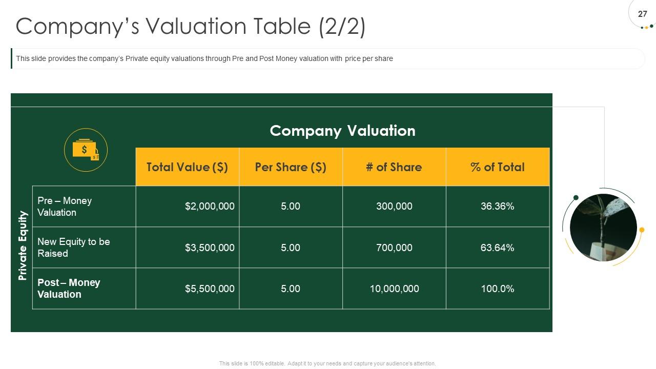
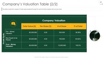
Slide 27: This slide provides the company’s Private equity valuations through Pre and Post Money valuation with price per share
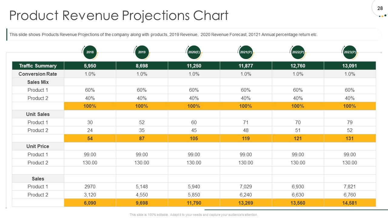
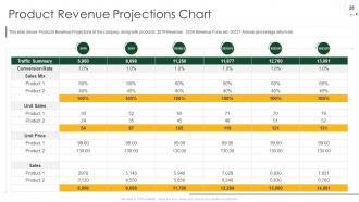
Slide 28: This slide shows Products Revenue Projections of the company along with products, 2019 Revenue, 2020 Revenue Forecast, 20121 Annual percentage return etc.
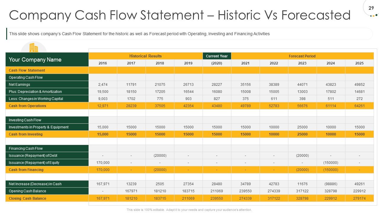
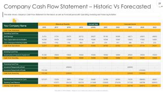
Slide 29: This slide shows company’s Cash Flow Statement for the historic as well as Forecast period with Operating, Investing and Financing Activities
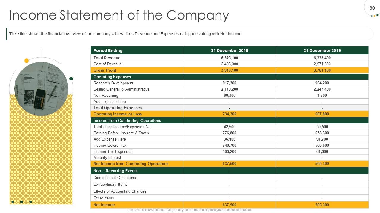
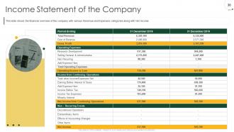
Slide 30: This slide shows the financial overview of the company with various Revenue and Expenses categories along with Net Income
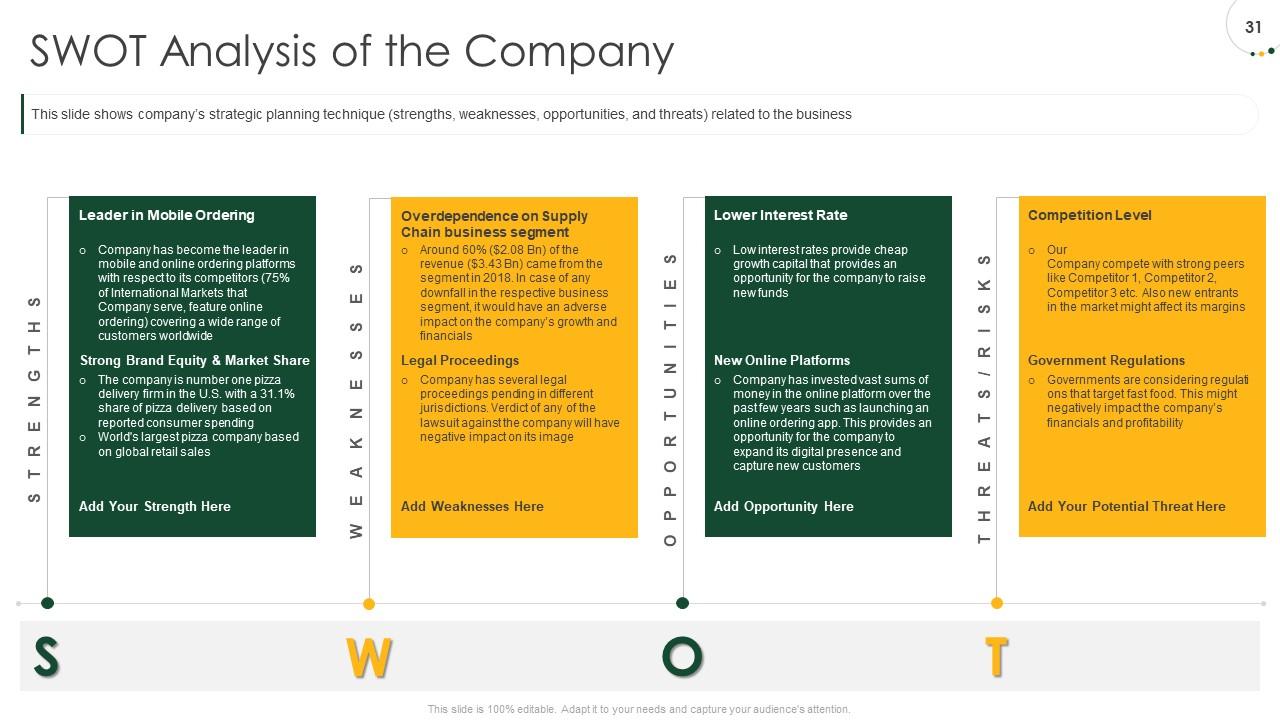
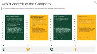
Slide 31: This slide shows company’s strategic planning technique (strengths, weaknesses, opportunities, and threats) related to the business
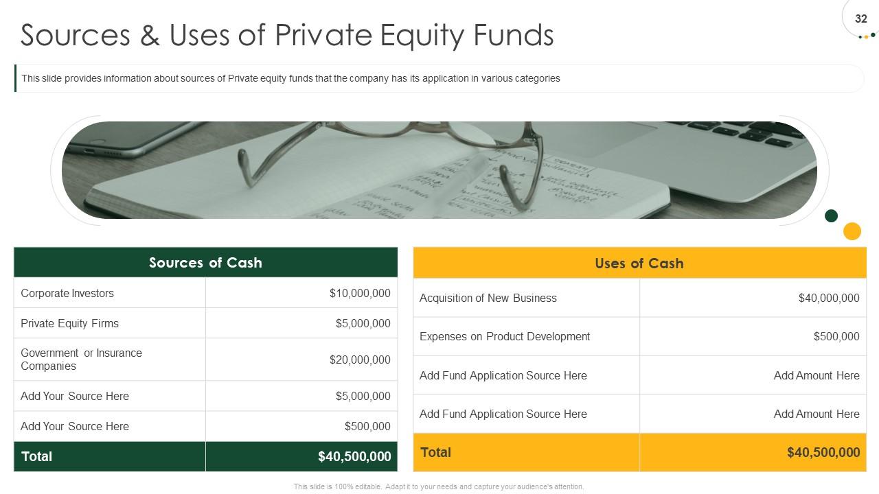
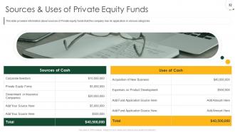
Slide 32: This slide provides information about sources of Private equity funds that the company has its application in various categories
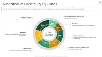
Slide 33: This slide shows that where the private equity funds that the company has gathered, will be allocated like Operations, Strategic Partners, Tech Expense, Marketing etc.
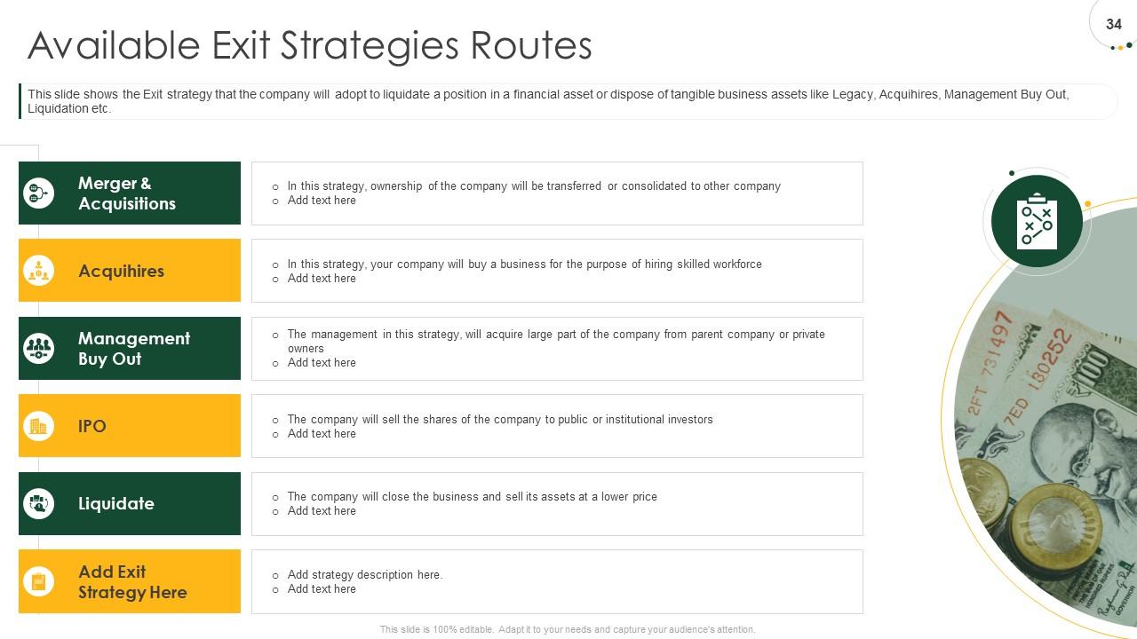
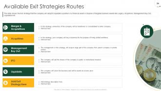
Slide 34: This slide shows the Exit strategy that the company will adopt to liquidate a position in a financial asset or dispose of tangible business assets like Legacy, Acquihires, Management Buy Out, Liquidation etc.
Slide 35: This is Pitch Deck To Raise Private Equity From Investment Bankers Icons Slide.
Slide 36: This slide is titled as Additional Slides for moving forward.
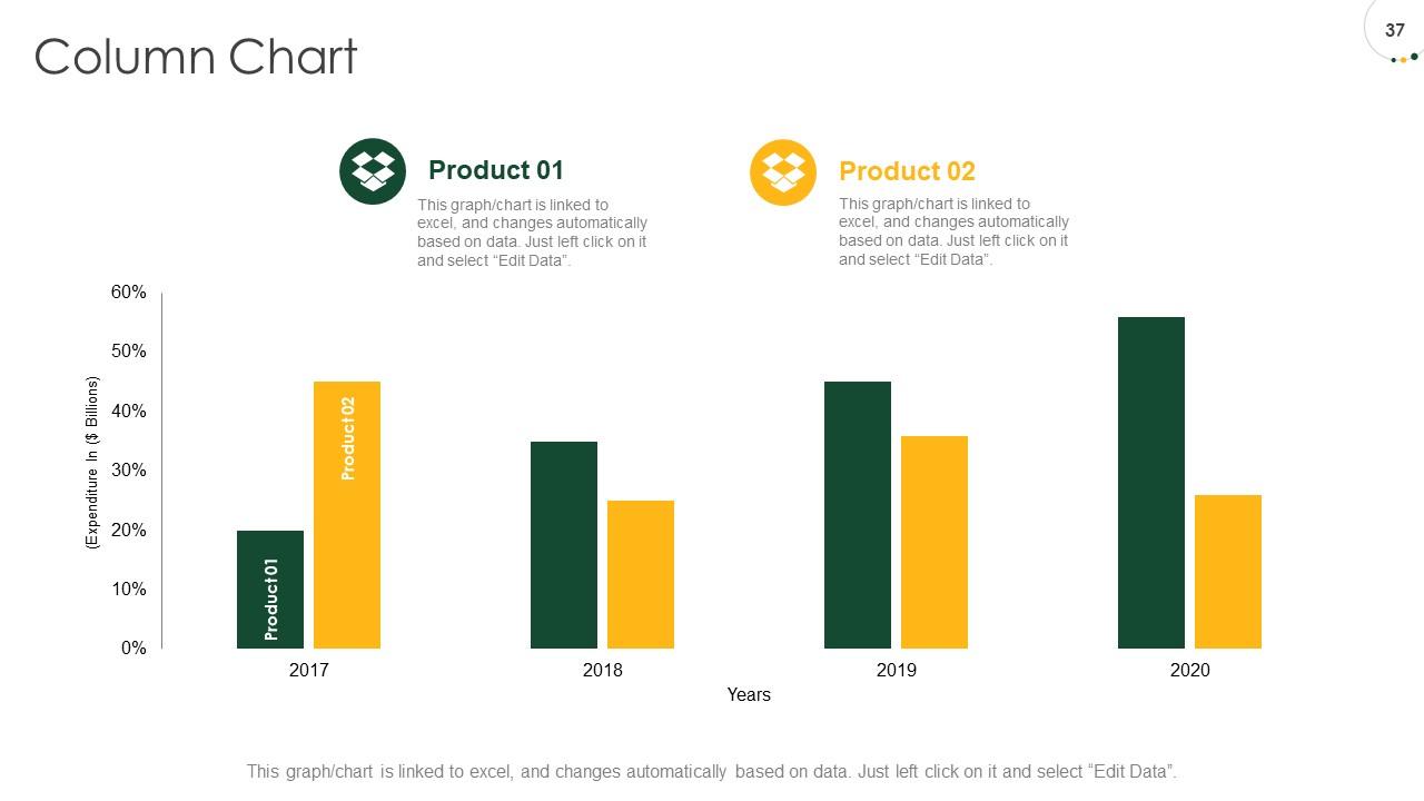
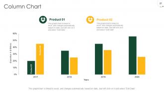
Slide 37: This slide displays Column Chart for product Comparison.
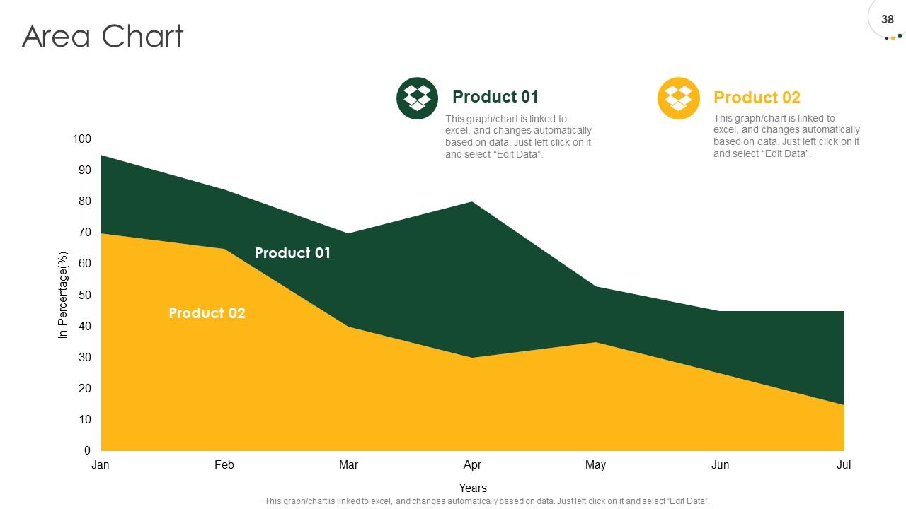
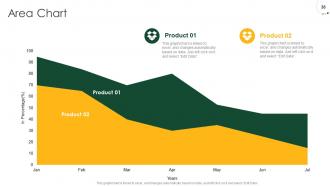
Slide 38: This slide displays Area Chart for Comparison of product Comparison.
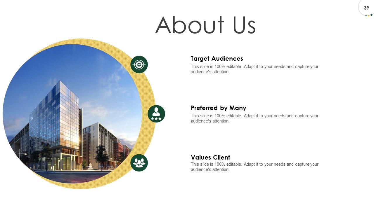
Slide 39: This is About Us slide to showcase Company specifications.
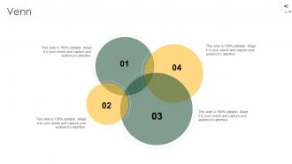
Slide 40: This slide displays Venn.
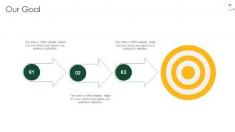
Slide 41: This slide displays Goals of the Company.
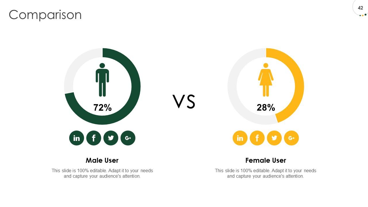
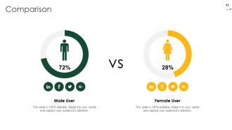
Slide 42: This slide showcases Comparison between Male and Female users.
Slide 43: This slide is titled as Importent Notes
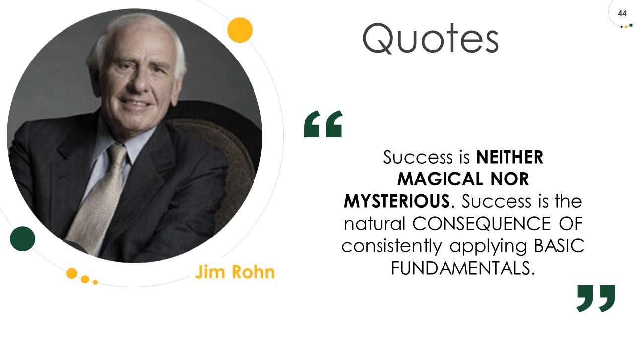
Slide 44: This slide represents Quotes
Slide 45: This is Thank you slide with Contact details.
Pitch deck to raise private equity from investment bankers powerpoint presentation slides with all 45 slides:
Use our Pitch Deck To Raise Private Equity From Investment Bankers Powerpoint Presentation Slides to effectively help you save your valuable time. They are readymade to fit into any presentation structure.
-
Colors used are bright and distinctive.
-
Easy to edit slides with easy to understand instructions.
-
Very well designed and informative templates.
-
Appreciate the research and its presentable format.
-
Understandable and informative presentation.
-
Best way of representation of the topic.
-
Colors used are bright and distinctive.
-
Great product with effective design. Helped a lot in our corporate presentations. Easy to edit and stunning visuals.
-
Understandable and informative presentation.
