


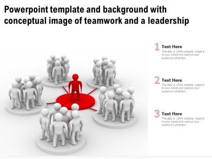
Powerpoint template with conceptual image of teamwork and a leadership ppt powerpoint




Try Before you Buy Download Free Sample Product
 Impress Your
 Audience
 100%
100% Editable
 Save Hours
 of Time


Our Powerpoint Template With Conceptual Image Of Teamwork And A Leadership Ppt Powerpoint are topically designed to provide an attractive backdrop to any subject. Use them to look like a presentation pro.
People who downloaded this PowerPoint presentation also viewed the following :
Powerpoint template with conceptual image of teamwork and a leadership ppt powerpoint with all 2 slides:
Use our Powerpoint Template With Conceptual Image Of Teamwork And A Leadership Ppt Powerpoint to effectively help you save your valuable time. They are readymade to fit into any presentation structure.

FAQs for Powerpoint template with conceptual image of teamwork and a
For your teamwork template, start with role definitions and communication stuff - that's your foundation. Add goal alignment and decision-making processes too. Conflict resolution is huge, don't skip that. Honestly, the visual elements like org charts make presentations way more engaging than just text blocks. Include feedback systems and recognition programs since those actually motivate people. Oh, and accountability measures - can't forget those! Keep everything in bullet points, not paragraphs. Maybe start with your collaboration philosophy as an intro, then dive into actionable strategies. I'd probably throw in some real examples if you have them.
Good visuals turn abstract teamwork stuff into things people can actually picture. Those connected circles or puzzle pieces? Way better than just talking about collaboration. I'd color-code different roles so viewers can follow who's doing what - seriously, I've watched decent visuals rescue terrible presentations before. Show communication with icons and arrows, keep your visual metaphors consistent throughout. The goal is creating those "oh, now I get it" moments where messy team dynamics suddenly click. Don't just list what teams should do - use your template to show how they actually work together.
Honestly, go with org charts that include role descriptions - way clearer than just names and titles. RACI matrices work great too since they show who actually does what vs who just gets blamed when things go wrong lol. Team spotlight slides with headshots are solid, but skip the boring bullet points that make everyone zone out. Try circular diagrams or visual hierarchies instead - they're way more engaging. My favorite trick is putting the org chart and responsibility matrix on the same slide. Gives you structure plus clarity without cluttering things up.
Honestly, these templates are lifesavers because they've already got the layouts figured out - timelines, before/after stuff, role breakdowns. Just plug in your actual examples instead of staring at a blank slide wondering where to start. I've watched coworkers spend forever trying to map out team dynamics visually (such a pain). The template does that work for you so you can focus on telling the story and what you learned. Oh, and having the same format across different case studies? Your audience can actually follow along and compare things way easier.
Puzzle pieces and gears work really well - they literally show teamwork without being too obvious about it. Flow diagrams are solid too. For data people, I'd go with bar charts comparing team vs solo performance. Before/after stuff always hits different when you're showing transformation. Network diagrams are clutch if you want that "connected" vibe. My favorite trick? Use contrasting colors for individual work that blends into one unified thing. Honestly depends on your audience though - visual people eat up the puzzle metaphors, but analytical types just want to see the numbers. Oh, and avoid anything that looks like a stock photo disaster.
Honestly, your color and font choices can totally kill people's focus if you're not careful. Blues and greens are your friends here - they feel chill and collaborative. Reds though? Way too aggressive for team stuff (trust me on this one). Clean fonts like Calibri work best. Nobody wants to decode fancy script during a meeting, right? Keep everything consistent too or people get distracted by the visual mess instead of listening. Oh, and definitely check your contrast beforehand - learned that lesson when half my team couldn't read my dark blue text!
For team animations, try having individual members fly in from different sides then meet in the center - looks way cooler than it sounds. Motion paths are clutch for showing communication flow between people. Honestly? The "Grow & Turn" animation is perfect for group elements since it shows teams evolving over time. You can also use connecting arrows or lines to demonstrate how everyone's linked. Oh, and entrance animations where everyone appears together really drives home that unity vibe. Just don't make the timing too random or it'll look messy. Run through it once before presenting!
Honestly, just swap out all the boring generic stuff for scenarios your people actually deal with. Healthcare teams? Ditch the basic "project collaboration" slides and use patient handoffs or emergency communication examples instead. Tech folks respond better to agile workflows and remote work challenges - way more relevant than cookie-cutter templates. Hunt down your industry's biggest teamwork headaches first, then find slides you can tweak to match. The terminology and case studies need to feel familiar, you know? Otherwise people just zone out. Short version: make it about their real problems and they'll actually pay attention.
Think about those crazy deadline moments when everyone's scrambling and you need the team to actually work together. Use real stories like that - the messy stuff your audience deals with too. I'd throw in some quick quotes from team members who've been there. Structure it like a journey, you know? Show how people went from just doing their own thing to being this cohesive unit. Personal stories work really well here, even small ones about fixing communication problems or celebrating wins. The whole point is making them think "oh that's totally us" - then they'll actually care about your leadership advice and want to try it.
Yeah, totally! Most templates already have spots for Q&A and discussion breaks - you just customize them for your needs. I'm obsessed with the ones that include "parking lot" slides for random questions that come up. You can easily add slides for live polls (Mentimeter's great for this) or simple show-of-hands moments. White space is your friend here. Templates with flexible layouts let you drop in audience participation without everything looking weird. Oh, and clear section dividers help too - makes it way easier to pivot when someone asks something unexpected. Just don't pick anything too rigid or you'll hate yourself later.
Start with team formation stages - that's your foundation right there. Then hit communication frameworks and conflict resolution stuff. Role clarity is huge, honestly way more important than people think. Goal setting and accountability structures come next, plus you'll need performance metrics so teams can actually see if they're improving. Throw in some real case studies too - audiences eat that up way more than theory. Oh, and don't skip feedback loops because teams just flounder without them. Actually, maybe put the formation stages first since everything else builds on that? Yeah, that flow makes more sense.
Skip the spreadsheet dumps - they're presentation death. Use clean charts that actually tell a story instead. Progress bars, before/after comparisons, color-coded stuff that people can read without squinting. Focus on the big metrics: completion rates, how well the team's working together, who's contributing what. One metric per slide works way better than cramming everything together. Oh, and make sure each number connects back to what you're actually trying to improve. People zone out fast when they can't see the point.
Honestly, the main issue with those pre-made teamwork templates is they assume everyone's wired the same way. But your team probably has people from different backgrounds who process info differently, right? Some folks might not connect with certain visuals or how the content's laid out. I'd ask your team upfront what actually works for them - maybe create a few versions of the same slides. Switch up the communication styles, use more inclusive images. One size fits all is basically a myth when it comes to teams. Oh, and don't be afraid to completely ditch parts that feel off.
Honestly, just ask people what worked and what sucked after your presentations. Quick surveys are annoying but they're worth it - ask about clarity, engagement, which leadership stuff actually clicked. Watch faces during your talk too. If everyone looks lost on slide 5, that slide's gotta go. Their feedback helps you nail the pacing and examples next time. Focus on frameworks that people actually connect with, not just the ones you think sound smart. I started doing this and spotted patterns super fast. Game changer.
Dude, cultural stuff can totally make or break your presentation. What looks "collaborative" to you might seem messy or even rude to someone else. I'd go with templates that have different layout options - some cultures love clear hierarchies, others prefer that circular teamwork vibe. Colors are tricky too... like red screams "danger" here but means good luck in China. Stick with neutral colors and simple icons that make sense everywhere. Oh, and definitely run it by teammates from different backgrounds first - saves you from those awkward "oops, didn't mean it that way" moments later.
-
Excellent products for quick understanding.
-
Easily Understandable slides.
-
Really like the color and design of the presentation.
-
Use of icon with content is very relateable, informative and appealing.