

Progress bar example powerpoint graphics





Try Before you Buy Download Free Sample Product
 Impress Your
 Audience
 100%
100% Editable
 Save Hours
 of Time


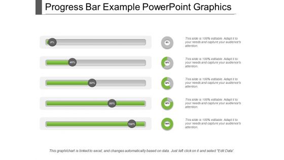
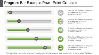
Our progress bar example PowerPoint graphics is not leaving you and your organisation with any incomplete assignment anymore. This business template can be used while monitoring the progress of an ongoing assignment regarding work as you can present it in the progress bar form. The bar shaped diagrams make the PPT look even more attractive followed by its background theme designs. The slideshow can turn out to be an effective measure of monitoring the workers' progress on a daily, weekly or monthly basis. This is a four stage process. The stages in this process are progress bar, progress indicators, performance bar and improvement bar. The progress bar example PowerPoint graphics slide of ours lets you measure how much work you’re already done and how much more you’re supposed to do. The PowerPoint PPT brings an order and discipline in the working of the company. It is surely going to grab your viewers' attention. Be the first choice for any assignment due to our Progress Bar Example Powerpoint Graphics. You are bound to get handpicked.
People who downloaded this PowerPoint presentation also viewed the following :
Progress bar example powerpoint graphics with all 5 slides:
Our Progress Bar Example Powerpoint Graphics ensure the journey becomes fun. Dish out information about attractions en route.

FAQs for Progress bar
Honestly, just keep them simple and use colors that actually pop - you want people to instantly see what's done vs what's left. Make them big enough that folks in the back aren't squinting (learned that one the hard way). Horizontal bars work way better than vertical ones for some reason. Always throw labels or percentages on there. Animation's cool if you're doing a step-by-step thing, but don't get carried away with fancy effects. The real test? Ask yourself if it's actually helping tell your story or just taking up space on the slide.
Honestly, progress bars are like magic for keeping people engaged. They show exactly where you are and how much is left - kills that "omg when will this end" feeling that makes everyone mentally check out. People get oddly invested in watching you fill up the bar too, which is kind of funny but it works! You can use them to tease what's coming next or just let people chill knowing there's an actual endpoint. I started using them in longer presentations and the difference is night and day. Give it a shot!
Dark blue on light gray works great, or bright green on white. You want people to actually see the progress without squinting at their phones during your presentation lol. Yellow on white is the worst - I've sat through way too many meetings where nobody could read anything. Make sure colors are at least 3 shades apart. Blue and orange combo? Chef's kiss since they're complementary. Just avoid red-green if you can (colorblind folks will thank you). Oh, and definitely test by shrinking your slides down or viewing them from across the room first.
Right-click the progress bar and hit "Format Shape" - that's where all the good stuff is. You can change fill colors to match your brand perfectly using the custom picker. I always end up obsessing over getting those hex codes exactly right lol. For the actual progress part, just duplicate the shape and resize it to show how much is done. Corner rounding looks way cleaner than sharp edges IMO. You can also throw in gradients or shadows if that's your thing. Oh, and definitely save it as a template once you're happy with it - trust me on this one.
You've got four main types to work with: horizontal bars (the go-to for timelines), circular ones that look clean for completion percentages, stepped bars when you have distinct phases, and vertical bars for comparing stuff. Horizontal is your best bet most of the time - people just get it instantly. Circular bars have that sleek dashboard feel if you're into that. Oh, and stepped ones are clutch when your process isn't continuous, like when there's actual breaks between stages. Honestly just match it to your data and what your audience expects. Don't get caught up picking the flashiest option.
Oh this is actually pretty easy! Just select your progress bar and hit the Animations tab. "Wipe" with "From Left" works perfectly for that filling effect. You can mess with the timing in Animation Pane to make it faster or slower. Here's what looks really slick though - if you've got multiple bars, don't let them all animate together. Stagger the timing so they fill one after another. Way more professional looking. Also throw some entrance animations on your labels and percentages so they pop up after the bar fills. Makes the whole thing feel more polished, you know?
Here's what trips people up - they make these super fancy progress bars that nobody can figure out. Just keep it simple, honestly. You'll want to actually update the thing between sections too (I've seen so many presentations where they're obviously on step 4 but the bar's stuck on step 2... yikes). Make your current step pop with color or whatever. Don't go crazy with animations either - gets annoying real quick. Stick with the same design throughout. Really, as long as people can tell where you are, you're golden.
Think of progress bars as little roadmaps for your audience - they show exactly where everyone is in your presentation. People can mentally prep for what's next instead of wondering "god, how much longer is this thing?" It's honestly like those episode progress bars on Netflix. Creates anticipation too. Your audience feels like they're actually getting somewhere instead of just sitting through random slides. Short presentations might not need them, but for longer stuff? Game changer. Throw in some percentage markers or milestone labels and you'll really help people follow your story from start to finish.
Check out SlideModel and GraphicRiver - they've got way better progress bar designs than the boring free stuff. You'll find everything from clean timeline bars to those fancy milestone graphics that don't look like garbage. Business and infographic sections are your best bet for professional options. Look for template packs with multiple colors and both horizontal/vertical layouts - gives you more flexibility. They work great for project timelines, tracking goals, whatever you need. Honestly though, avoid the free PowerPoint ones if you can. They're pretty meh and everyone's seen them a million times already.
Honestly, just watch your audience - are they actually looking at the screen when you mention where you are, or scrolling their phones? I do this thing where I pause mid-way and ask "questions before we jump to the next part?" Their faces tell you everything. You could also send a quick survey after asking if the flow made sense. The real proof is whether people remember your main points in the right order later (which rarely happens lol). Oh, and try presenting the same topic with and without progress bars to different groups. You'll notice the difference pretty fast.
Honestly, I'd go with Figma first - it's free and super clean for making progress bars. Adobe Illustrator works too but it's overkill unless you already have it. Canva's decent if you want templates without the learning curve. Oh, and PowerPoint's morph transition is actually pretty slick when you combine it with custom graphics - I was surprised how smooth it looked. Just export your designs as PNG or SVG and drop them in. Figma's probably your best bet though, especially if you're not used to design software. Way less intimidating than Illustrator.
Oh this is actually pretty cool! Link your progress bars to polling tools like Mentimeter or Kahoot, then just update them manually as responses roll in. I usually track stuff like response rates or how much people agree with different points. Real-time feedback scores work great too - honestly gets the audience way more invested than static slides. Just don't go crazy with it though. Stick to maybe 3-4 bars max or you'll be juggling updates instead of actually presenting. Been there, not fun lol.
Put them where people look first - usually top or bottom for horizontal bars, left side for vertical ones. Give it breathing room so it's not fighting with your main content. I learned this the hard way when mine was basically yelling at everyone during a client pitch. Size matters too; visible but not obnoxious. Stick with the same spot throughout your whole deck, and match your brand colors if you can. Oh, and definitely test it from the back of the room beforehand - you'd be surprised how stuff disappears from that distance.
Progress bars are perfect for this! They turn messy data into something people can actually understand without squinting at spreadsheets. You can show completion rates, survey results, budget stuff - whatever you need. Way more engaging than boring traditional graphs, honestly. People instantly get what percentages mean without having to decode some complicated chart (which let's be real, half your audience won't bother doing anyway). Just keep your colors consistent and label everything clearly. That way people can compare data points and spot trends super quickly.
Yeah, so most industries totally customize their progress bars based on what actually matters to their projects. Construction crews track stuff like foundation→framing→electrical→finishing. Tech teams do sprint milestones. Healthcare is crazy - they've got like a million regulatory checkpoints (honestly makes my head spin). Manufacturing goes design→prototype→testing→production. The trick is making each segment mean something real to whoever's watching. Skip the boring generic percentages. When you match the bar to how people actually think about the work, they'll pay way more attention to it.
-
Content of slide is easy to understand and edit.
-
Great designs, really helpful.