


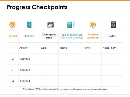
Progress checkpoints ppt icon design inspiration




Try Before you Buy Download Free Sample Product
 Impress Your
 Audience
 100%
100% Editable
 Save Hours
 of Time


Find an answer to the impasse with our Progress Checkpoints Ppt Icon Design Inspiration. Bring about an end to the deadlock.
People who downloaded this PowerPoint presentation also viewed the following :
Progress checkpoints ppt icon design inspiration with all 5 slides:
Our Progress Checkpoints Ppt Icon Design Inspiration giveyou greater credit. And they add to it with their interest.



FAQs for Progress checkpoints ppt
Effective PPT icon design includes consistent visual style, appropriate size and spacing, meaningful symbolism, complementary color schemes, and clear visual hierarchy. These elements enhance storytelling by creating intuitive navigation, reinforcing key messages, and maintaining audience engagement throughout presentations, with many organizations finding that well-designed icons significantly improve information retention and professional credibility.
Icons can be tailored through color scheme adjustments, style modifications, contextual adaptations, and thematic integration to match specific presentation themes or industries. Through strategic customization, organizations in healthcare, finance, and technology seamlessly align visual elements with brand identity and audience expectations, ultimately delivering cohesive presentations that enhance professional credibility and audience engagement.
Color psychology significantly influences icon effectiveness by triggering specific emotional responses and cognitive associations, with warm colors conveying energy and urgency while cool colors suggest trust and professionalism. Strategic color choices enhance audience comprehension and retention, with financial presentations often leveraging blue for credibility and healthcare sectors using green for wellness messaging, ultimately delivering more impactful communication.
Icons can be scaled without losing quality by using vector-based formats like SVG, maintaining high-resolution source files, and leveraging PowerPoint's built-in scaling tools that preserve clarity. Professional presentation designers increasingly rely on vector icons and proper DPI settings, with many finding that strategic icon libraries deliver consistent visual quality across multiple slide formats, ultimately enhancing audience engagement and brand professionalism.
Common mistakes include using inconsistent visual styles, choosing overly complex designs, selecting icons that don't match content meaning, mixing different design aesthetics, and using low-resolution graphics. These design missteps create visual confusion, distract audiences from key messages, and undermine professional credibility, with many presenters finding that cohesive, simple iconography significantly enhances audience comprehension and engagement.
Iconography simplifies complex information by replacing lengthy text with visual symbols, creating immediate recognition patterns, and enabling faster cognitive processing of data relationships. Through strategic icon placement, presenters can guide audience attention, reduce information overload, and enhance memory retention, with many organizations finding that well-designed iconography increases comprehension rates while streamlining presentation flow.
Best practices for combining text and icons in slides include maintaining consistent sizing ratios, using complementary color schemes, ensuring adequate white space, aligning elements systematically, and selecting icons that directly reinforce your message. These design principles streamline visual communication by reducing cognitive load, enhancing message retention, and creating professional presentations, with many organizations finding that strategic icon-text combinations ultimately deliver clearer stakeholder engagement and more impactful business communications.
Cultural considerations significantly influence icon design by affecting color symbolism, religious sensitivities, reading patterns, and visual interpretations across different regions. These factors shape how audiences perceive symbols, with many global organizations finding that culturally-adapted icons enhance communication effectiveness, reduce misunderstandings, and ultimately deliver more engaging presentations that resonate with diverse international stakeholders.
**INPUT**: What platforms or tools are recommended for customizing icons for PowerPoint? **OUTPUT**: Recommended platforms include Adobe Illustrator, Canva, Figma, PowerPoint's built-in icon library, and Iconify for comprehensive customization capabilities. These tools streamline icon creation by offering vector editing, brand alignment features, and seamless integration, with many organizations finding that strategic icon customization enhances presentation clarity and professional impact.
Minimalist icon design improves audience engagement by reducing visual clutter, accelerating information processing, and directing attention to key messages rather than decorative elements. These streamlined icons enhance comprehension across diverse audiences, especially in corporate and educational settings, with many presenters finding that simplified visuals increase retention rates and maintain focus throughout longer presentations.
Current presentation icon trends include flat design with subtle shadows, monochromatic color schemes, outlined styles, geometric shapes, and scalable vector graphics that maintain clarity across devices. These design approaches enhance visual consistency, reduce cognitive load, and ensure professional aesthetics, with many organizations finding that streamlined iconography significantly improves audience comprehension and engagement during presentations.
Icons can guide presentation narratives by serving as visual anchors, transition markers, process indicators, section dividers, and storytelling elements that create logical flow. These design components streamline audience comprehension by establishing clear pathways, reinforcing key messages, and maintaining engagement throughout complex topics, with many presenters finding that strategic icon placement ultimately delivers more memorable and impactful presentations.
Icon consistency significantly enhances PowerPoint presentations by creating visual harmony, establishing professional credibility, reducing cognitive load, and strengthening brand identity throughout slides. These design principles streamline audience comprehension by maintaining uniform style, color palette, and sizing conventions, with many corporate presentations finding that consistent iconography ultimately delivers clearer messaging and more engaging viewer experiences.
Accessibility in icon design includes high contrast ratios, colorblind-friendly palettes, scalable vector formats, alternative text descriptions, and intuitive visual metaphors. These approaches streamline user experiences by enhancing readability, ensuring universal comprehension, and meeting compliance standards, with many organizations finding that accessible design ultimately delivers broader audience reach and improved usability across diverse user groups.
Custom icons offer brand consistency, unique visual identity, perfect alignment with content themes, and complete creative control over style and messaging. While pre-designed icons provide cost efficiency and speed, custom icons ultimately deliver stronger brand recognition and competitive differentiation, with many organizations finding that tailored iconography significantly enhances audience engagement and professional credibility.
No Reviews