


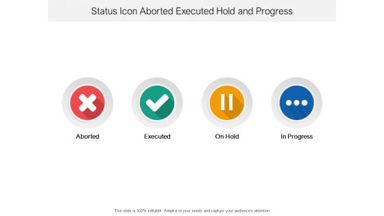
Status icon aborted executed hold and progress





Try Before you Buy Download Free Sample Product
 Impress Your
 Audience
 100%
100% Editable
 Save Hours
 of Time


Our Status Icon Aborted Executed Hold And Progress ensure you are never helpless. They are always at hand to give all assistance.
People who downloaded this PowerPoint presentation also viewed the following :
Status icon aborted executed hold and progress with all 5 slides:
Charm them with the goodness of our Status Icon Aborted Executed Hold And Progress. Their designs are an absolute delight.


FAQs for Status icon aborted executed
Most people go with checkmarks for done stuff, red X's for problems, and clock icons when things are waiting. Green usually means good to go. Red's obviously bad news. Those yellow circles? Could mean in progress or needs attention - honestly depends on what mood the designer was in that day. You'll probably want some arrows if there's any kind of flow or process. Simple colored dots work great for priority levels too. Oh, and lightbulbs if you're showing ideas or suggestions. Just make sure everyone knows what you picked before you present!
Dude, status icons are a game changer for presentations. Green checkmarks for done stuff, red X's for problems, yellow triangles when things might go sideways - people just *get* it instantly. Way better than making everyone read paragraphs of text. Executives especially love this because they want the overview super fast. Your audience can glance at a dashboard and boom, they understand everything in like 3 seconds. I'd stick with maybe 3 or 4 icons max and use them consistently throughout. Trust me, it's basically a universal language that actually works.
Start simple - clean lines, consistent sizing across everything. Your icons should make sense immediately, no thinking required. Stick with obvious color choices (red = bad, green = good) but skip red/green combos since some people can't tell them apart. Test different sizes early, especially small ones where details disappear. Honestly, what feels super obvious to you might confuse everyone else, so get feedback if possible. I'd tackle your most-used statuses first instead of trying to design everything at once. Build up from there once you've nailed the basics.
Colors hit people's emotions before they even process what they're reading. Red screams danger or error - classic traffic light stuff we all know. Green feels safe and successful. Yellow means "hold up, something's pending" and blue's pretty neutral for info. But here's where people mess up: throw red on something that's not actually urgent and users will start tuning out your warnings completely. Honestly, I've seen apps cry wolf so much that nobody takes their alerts seriously anymore. Stick with what people expect so they can scan status updates without having to think about it.
Honestly, status icons are a game-changer for project updates and dashboards. Executive meetings especially - nobody wants to squint at spreadsheets trying to figure out what's broken. I've watched so many presentations where people are just lost in the data. Perfect for project health, system alerts, that kind of stuff. Green/yellow/red is classic but yeah, make your legend crystal clear or you'll confuse everyone. Quick visual scanning is everything when stakeholders need to spot problems fast. Trust me, if people need to identify urgent stuff quickly, you really can't skip the icons.
Status icons are basically visual shortcuts - your brain processes a spinner or checkmark way faster than reading "loading" or "complete." Users can scan through dashboards super quickly without getting bogged down in text. A warning triangle instantly screams "problem" no matter what language you speak, which is pretty neat. They also save tons of screen space when you're cramming info into mobile layouts. Just pick one consistent icon set and stick with it - don't use a checkmark for "done" in one place and a green dot somewhere else. Trust me, consistent icons make everything feel more polished.
So the old status icons were pretty boring - just those static red/yellow/green dots sitting there doing nothing. Now they're way more interactive and actually respond to what's happening in real time. You can hover over them, click for details, even take quick actions without opening a whole new page. They also adapt better to different screens and devices, which honestly makes a huge difference when you're switching between your phone and laptop. The animations are subtle but they help you understand what's actually going on instead of just "something's wrong." Way more useful than those old-school indicators that told you basically nothing.
Check your admin settings - there's usually an "Appearance" or "Branding" section where you can upload custom icons. Most platforms let you swap out those boring default green/yellow/red circles for something that actually matches your brand colors. Honestly, it's such a small change but people notice way more than you'd expect. I'd start with just tweaking the colors first before getting fancy with custom shapes. Oh, and don't get too creative - users still need to instantly recognize what "available" versus "busy" means. Keep it obvious but branded, you know?
Oh these are super helpful! Basically they're like GPS for your audience - shows them where they are in your presentation and what's coming up. People don't have to mentally track everything themselves, which honestly makes a huge difference. Long presentations especially... that's where folks get totally lost without some kind of visual guide. Just keep the icons simple and use the same style throughout. Otherwise people spend time figuring out what each one means instead of listening to you. Trust me, once you start using them you'll wonder why you didn't before!
Honestly, animated status icons are kind of genius for presentations. They pull people's attention right where you need it without adding more text clutter. I've watched audiences perk up when a simple checkmark appears or a warning icon does a subtle pulse - way more engaging than boring static images. The little movement actually gives viewers a beat to absorb what they're seeing. Though you can definitely overdo it (I've seen some... questionable PowerPoints). Stick with basic stuff like fade-ins or gentle pulses. Works every time.
So it totally depends on what you do, but here's what works. Tech people love progress bars, loading spinners, and those classic green checkmarks. Healthcare? Go with red alerts and patient status stuff. Finance presentations need trend arrows and dollar signs - basically anything money-related hits different with that crowd. Manufacturing folks want safety symbols and those colored status lights. Oh, and quality control icons too. The whole point is picking stuff your audience already knows. Don't make them think too hard about what some random symbol means, you know?
So first thing - add proper alt text or aria-labels that actually explain what each icon means ("error," "warning," "completed"). Don't just rely on colors since colorblind users can't tell the difference (totally screwed this up on a project last year, whoops). When you've got space, throw in text labels next to the icons too. Oh and check your contrast ratios between icons and backgrounds - some combinations are basically invisible. Honestly, the best test is firing up a screen reader yourself. You'll instantly hear what users experience and catch stuff you'd never notice otherwise.
Minimalist outlined icons are totally taking over - those super detailed ones from a few years back look ancient now. Red for urgent stuff, green for done, amber for waiting... basically color coding everything. Oh and those little animated loading states? Game changer for keeping people's attention. You'll want simple symbols that work tiny on phones or massive on projectors. Trust me, if your icon needs explaining, it's probably too complex. The micro-interactions thing might seem extra but honestly makes such a difference when people are waiting for something to load.
Oh man, status icons can totally backfire across cultures. Red screams "danger" here but in China it's lucky - awkward! Right-to-left languages mess with your positioning too. Don't even get me started on hand gesture icons, those'll offend someone guaranteed. Checkmarks aren't as universal as you'd think either. Honestly? Test with people from different backgrounds first, or just go super basic with geometric shapes plus text labels. Way safer than accidentally telling half your users the wrong thing because you picked the "obvious" icon.
Figma's my go-to for status icons - super clean for vector work and they scale perfectly. Sketch works too if you're on Mac. I get way too obsessed with pixel-perfect details but honestly it matters since these things show up everywhere at different sizes. IconJar's decent for inspiration when you're stuck. Adobe Illustrator's solid if you're already paying for Creative Suite anyway. Keep them stupidly simple though - like, think basic shapes that your grandma would understand. Universal symbols are your friend. Nobody should have to guess what your little circle or triangle means, you know?
No Reviews