


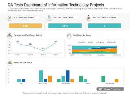
Qa tests dashboard of information technology projects powerpoint template




Try Before you Buy Download Free Sample Product
 Impress Your
 Audience
 100%
100% Editable
 Save Hours
 of Time


Our QA Tests Dashboard Of Information Technology Projects Powerpoint Template are topically designed to provide an attractive backdrop to any subject. Use them to look like a presentation pro.
People who downloaded this PowerPoint presentation also viewed the following :
Qa tests dashboard of information technology projects powerpoint template with all 2 slides:
Use our QA Tests Dashboard Of Information Technology Projects Powerpoint Template to effectively help you save your valuable time. They are readymade to fit into any presentation structure.

FAQs for Qa tests dashboard of information technology
Focus on test execution rate and pass/fail ratios first - those are your bread and butter. Defect density matters too, plus test coverage percentage. Oh, and definitely track how long it takes to fix failed tests. Flaky tests are the absolute worst, so count those suckers or they'll make you want to quit. Time your full regression suite runs because nobody wants to wait forever. The trick is finding that sweet spot between good coverage and reasonable speed. Start simple with these basics, then add fancier stuff once your team's used to checking dashboards regularly.
Honestly, charts beat staring at endless spreadsheet rows any day. You'll catch patterns instantly - like which tests keep bombing or where performance drops over time. Raw data hides bottlenecks that jump out in a good visualization. Plus stakeholders actually pay attention when you show them a dashboard with red spikes instead of just telling them "things are broken." I always start with whatever metrics I'm checking daily anyway, then build charts around those. Makes way more sense than trying to visualize everything at once.
Put the critical stuff right at the top - pass/fail rates, test coverage, any blockers. People need to see that immediately. After that, organize by what matters most: current sprint results, then recent failures that need fixing, then historical trends for context. Honestly, most folks just want the green/red status front and center so they know if everything's broken or not. Group similar tests together and stick with the same colors throughout - consistency is key. Oh, and make your filters dead simple. Nobody's got time to figure out a confusing interface when they're trying to debug something urgent.
Honestly, aim for real-time updates if you can swing it - like within 5-15 minutes after tests finish. Your devs will thank you when they can catch failures before they snowball into bigger problems. Most teams I know do fine with 15-30 minute refreshes, but during crunch time? Push for real-time. There's nothing worse than debugging issues from hours-old data (been there, not fun). Set up auto-refresh so you're not constantly hitting F5 all day. Short story: the faster you spot problems, the faster you fix them.
Dude, there's so many options it's kinda overwhelming tbh. Jenkins is solid for CI/CD stuff, and Jira handles test cases/bugs really well. TestRail and Selenium can dump results straight into your dashboard. Oh, and Postman too if you're doing API testing. MySQL or PostgreSQL work if that's where your data sits. Grafana makes the actual connections pretty painless - way easier than I expected when I first tried it. I'd honestly just figure out where all your QA data lives first, then tackle the most important ones. Don't try to connect everything at once or you'll go crazy.
Build separate views for each group - trust me, this makes life so much easier. Devs want the nitty-gritty stuff like test logs, error traces, and coverage data to debug problems fast. Managers just need the overview: pass rates, sprint status, quality trends for planning decisions. Role-based permissions help too, so people only see what's relevant to them. Some tools have these cool toggle modes between "developer view" and "executive summary." Honestly though, just ask each person what numbers they actually check daily, then design around that.
Real-time data is a game changer for QA dashboards, trust me. You'll catch failing builds immediately instead of hours later when fixing them costs way more time and sanity. I made this mistake once during a big release - never again! Live updates keep everyone on the same page about quality status too. Sprint planning becomes so much more accurate when you're not guessing. Oh, and definitely set up alerts for critical failures. Nobody wants to sit there refreshing a dashboard all day like it's 2005. Let the system ping you when something actually breaks.
So the historical data basically shows you patterns you'd totally miss day-to-day. Like which test types catch the most bugs, or when defect rates always spike during certain sprints. Really eye-opening stuff honestly. You can spot team velocity trends and see which product areas are constantly problematic. Plus it helps predict what resources you'll need before things get messy. I'd start with your defect density trends from the last six months - that's usually where the obvious patterns jump out first.
So for QA dashboards, I'd probably go with Grafana first - it just plays nice with most testing stuff and CI/CD setups. Tableau and Power BI are solid too if you need heavy customization. Kibana's great if you're already running ELK (which honestly, who isn't these days?). Google Data Studio works fine for basic metrics, though it's pretty limited. The main thing is picking whatever connects easiest to your current tools - Jenkins, TestRail, whatever APIs you've got. Don't overthink it, just start with what meshes with your existing setup and you can always migrate later.
Your team using the dashboard every day? That's where the real insights come from. They'll catch stuff you missed - like metrics buried too deep or sections nobody actually checks. Quick story: saw one dashboard get flipped upside down because users were like "we ignore half this screen but need the error rates right up top." Feedback through casual check-ins works better than formal surveys, honestly. People are more honest that way. Focus on what you hear repeatedly, not every random suggestion. The workflow has to match how they actually work, not how you think they should.
Dude, bad dashboards will absolutely wreck your QA workflow. You'll miss obvious bugs because the data's buried somewhere weird. Stakeholders get frustrated when they can't figure out if testing is actually on track. I've literally spent entire meetings just explaining charts that should've been self-explanatory - such a waste of time. Your team ends up making decisions with incomplete info, which obviously leads to delayed releases. The worst part? Everyone loses trust in your process when they're constantly confused about quality status. Honestly, just ask your team what they actually need to see each day, then build from there.
Oh man, dashboards are a lifesaver for this stuff. You can see your test pass/fail rates in real-time, which beats scrolling through endless logs any day. When regression tests start breaking after code changes, you'll spot it immediately. Coverage tracking is great too - shows you exactly what code isn't getting tested and how your coverage changes over time. I usually set up alerts when coverage dips below like 80% or whatever threshold makes sense. Start with basic widgets showing pass rates and coverage by module. Honestly makes the whole testing workflow way less stressful.
Dude, color coding makes all the difference on QA dashboards. Your team won't have to dig through endless data when they can just glance and see red = failed, green = passed, yellow = warnings. Pretty standard stuff but it works. Make sure there's good contrast though - nobody wants to squint at pale colors during those late-night bug hunts. I'd stick with maybe 3-4 colors tops and go with what people expect. Once everyone gets used to it, spotting problems becomes automatic. Oh and throw in some icons too if you can. Really helps when you're rushing through results.
Yeah, definitely include both! Manual testing covers all the exploratory stuff and usability checks that are impossible to automate - plus those weird edge cases that always pop up. Automated tests are perfect for showing regression coverage and CI/CD health. I'd split them into separate sections so you can filter between them or view everything together. The whole point is matching your actual workflow, right? Stakeholders need to see both your automated safety net and the human testing side. Oh, and make sure the dashboard actually reflects how your team works - I've seen too many that look pretty but don't tell the real story.
Honestly, QA dashboards are a game changer because everyone can actually see what's going on - not just the testing people. Developers can spot exactly which tests are breaking. Product managers know what's actually ready to ship. Stakeholders get real-time updates without bugging you every five minutes (thank god). Non-technical folks love the visual stuff too, way easier than parsing through test logs or whatever. Just make sure it updates automatically or you'll forget and then it's useless. Oh and tell everyone where to find it - sounds obvious but you'd be surprised how many people don't know it exists.
-
Good research work and creative work done on every template.
-
Perfect template with attractive color combination.
-
Great product with effective design. Helped a lot in our corporate presentations. Easy to edit and stunning visuals.
-
Unique design & color.
-
Very well designed and informative templates.
-
Unique design & color.