

Quality control tools and techniques powerpoint presentation slides




Try Before you Buy Download Free Sample Product
 Impress Your
 Audience
 100%
100% Editable
 Save Hours
 of Time


Find issues related to the quality using Quality Control Tools And Techniques PowerPoint Presentation Slides. Solve most quality related issues with the help of professionally designed quality control tools and techniques PPT templates. These templates showcase necessary tools required to control the quality within an organization or project. These templates have the relevant content to detect and control the loopholes. This deck comprises of quality tools such as cause and effect diagram, check sheet, control charts, histogram, pareto chart, scatter diagram, and more. Implement these tools to enhance the quality of the product and services or the quality of an organization. These tools and techniques are apt for quality planning and quality assurance. Prioritize objectives and discover problem areas by adding quality control charts and graphs. These PPT templates are completely customizable. Edit the color, text, icon and font size as per your requirement. Download quality control tools or also known as Kaoru Ishikawa’s quality tools presentation slideshow to achieve the desired goals and outcomes. Develop a feel for difficulties ahead with our Quality Control Tools And Techniques Powerpoint Presentation Slides. They help anticipate hassles.
People who downloaded this PowerPoint presentation also viewed the following :
Content of this Powerpoint Presentation
Slide 1: This slide introduces Quality Control Tools and Techniques. State Your Company Name and begin.
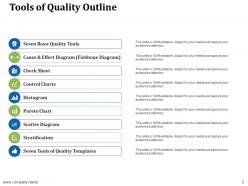
Slide 2: This slide shows Tools of Quality Outline with- Seven Basic Quality Tools, Cause & Effect Diagram (Fishbone Diagram), Check Sheet, Control Charts, Histogram, Pareto Chart, Scatter Diagram, Stratification and Seven Tools of Quality Templates.
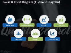
Slide 3: This slide presents Seven Basic Quality Tools which contains- Check Sheet, Fishbone Diagram, Pareto Chart, Run Chart, Scatter Diagram, Histogram and Flow Chart.
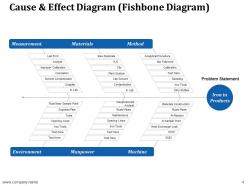
Slide 4: This slide displays Cause & Effect Diagram (Fishbone Diagram) with related information and text.
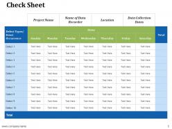
Slide 5: This slide represents Check Sheet on day basis to record any occurence of event or any defect.
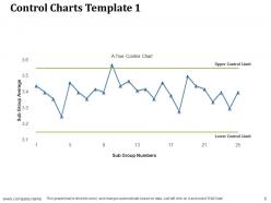
Slide 6: This slide showcases Control Charts Template 1 with line chart showing upper and lower control limit.
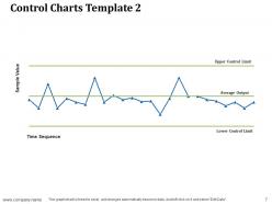
Slide 7: This slide shows Control Charts Template 2 with line chart describing Upper control limit, Lower control limit and Average output.
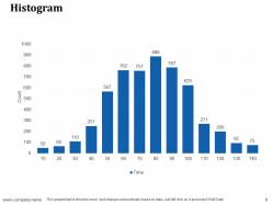
Slide 8: This slide displays Histogram as a quality control tool. Show relevant data accordingly.
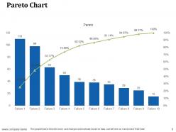
Slide 9: This slide represents Pareto Chart as another quality control tool.
Slide 10: This slide presents Scatter Diagram in percentage to show quality control techniques.
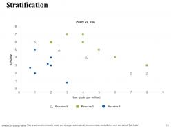
Slide 11: This slide shows Stratification describing Purity vs Iron along with three different reactors. You can change the data as per requirements.
Slide 12: This slide shows Quality Control Tools and Techniques Icons.
Slide 13: This slide is titled Additional slides for moving forward. You may change the content as per need.
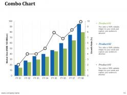
Slide 14: This slide shows Combo Chart with three products comparison.
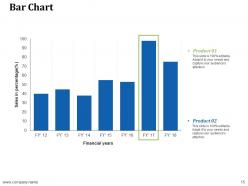
Slide 15: This slide displays Bar Chart with financial years and sales in percentage.
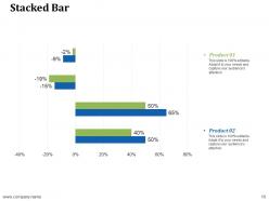
Slide 16: This slide presents Stacked Bar graph chart with two products comparison.
Slide 17: This is an About us slide to state company specifications etc.
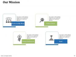
Slide 18: This is Our mission slide with imagery and text boxes to go with.
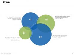
Slide 19: This is a Venn slide with text boxes to show information.
Slide 20: This is Our team slide with names and designation.
Slide 21: This is a Thank You slide with Address# street number, city, state, Contact Number, Email Address.
Quality control tools and techniques powerpoint presentation slides with all 21 slides:
There is nothing funny about our Quality Control Tools And Techniques Powerpoint Presentation Slides. They are always up front and factual.





FAQs for Quality control tools and techniques
You'll definitely want to start with SPC charts for your critical stuff - they're like the bread and butter. Pareto charts, fishbone diagrams, histograms are all part of those "Seven Basic Tools" everyone talks about. Most places do sampling inspection too, whether it's incoming or finished goods. Honestly though? Sometimes the simple things work better than expensive software - go/no-go gauges and visual boards can be surprisingly effective. Oh, and checklists obviously. I'd say begin with control charts since your team probably isn't drowning in data yet, then build from there once everyone's comfortable.
So Six Sigma is basically this data-driven approach that helps you actually fix quality problems instead of just putting band-aids on them. The DMAIC process (Define, Measure, Analyze, Improve, Control) walks you through finding root causes systematically. What I like about it is the statistical tools - you're working with real numbers instead of guessing. Creates good team communication too since everyone's speaking the same language. Honestly, just pick one problem that keeps bugging you and run it through DMAIC. You'll probably be shocked at what you find.
So SPC is like having an early warning system for quality problems. Instead of waiting to inspect finished stuff, you're watching your process in real-time with statistical charts. Think of it like checking your car's dashboard while driving rather than waiting for a breakdown - way smarter approach. The cool part is you're tracking patterns and trends, not just random data points. Honestly, control charts make everything so much clearer once you get used to them. Just pick your most critical process first and set up a simple chart to monitor it. You'll catch issues way before they become headaches.
So basically qualitative is all the non-number stuff - customer feedback, looking at things visually, watching how processes actually work. It helps you spot patterns and figure out root causes. Quantitative uses hard data like defect rates and cycle times. Honestly you need both because - and this might sound obvious but - the numbers show you what's broken while the qualitative stuff tells you why. I'd start with quantitative for tracking trends, then use qualitative to understand what customers actually think. Map out which techniques work for your specific situation first though.
Honestly, just start with plotting your data over time - upper and lower limits should be about three standard deviations from your mean. Watch for the obvious stuff: points jumping outside those limits, or when you get seven straight points hanging out on one side. Trending patterns are red flags too. I used to think this was total overkill, but it's way simpler than I expected. The trick is staying consistent with collecting data and actually doing something when you see weird signals. Pick one process that really matters first, then build from there once you've got the hang of it.
Pareto charts are clutch when you've got multiple problems but can't fix everything at once. They show you which issues are actually killing your process vs. the small stuff that feels urgent but isn't. Perfect for defects, complaints, whatever - just categorize your data and the chart literally highlights your biggest pain points. Honestly, they're lifesavers during those "where do we even start" meetings with leadership. The 80/20 rule becomes super obvious visually. I've seen teams waste months on tiny issues while ignoring the real problem. Gather your data first, then let the chart guide where you attack.
So fishbone diagrams are actually pretty cool - they help you map out all the possible causes of whatever's going wrong. You break everything into categories like people, process, materials, that kind of thing. Makes your team think more systematically instead of just randomly guessing. Plus you'll start seeing patterns emerge, like if everything points back to equipment issues or whatever. Honestly saves you from missing the obvious stuff that's right in front of you. Just write your problem at the head and brainstorm causes into each category. Super simple but works.
Match your tool to the problem first - control charts for tracking defects, fishbone diagrams for root cause stuff. People waste so much time debating which tool to use instead of just picking one and starting. I've literally watched teams argue for weeks about this. Your team's skill level matters too. Don't pick some crazy statistical method if half your people will be lost. Checklists and Pareto charts are solid starting points, then you can get fancier later. The tool that gets used consistently beats the "perfect" one sitting on a shelf.
Honestly, checklists save your butt in QA. Everyone follows the exact same steps, which cuts down on those "oops, I forgot to check that" moments. New team members pick things up way faster when everything's written out clearly. Plus you've got proof of what actually got tested - not just what was supposed to happen (we've all been there). The documentation side helps with compliance stuff too, which is nice I guess. I'd start with whatever processes are most critical first. You'll notice the difference in consistency pretty much right away, trust me.
Dude, the speed difference is insane - we're talking like 10x faster than manual inspection. These systems never get tired or zone out, so they catch defects your team might miss during long shifts. Real-time data is probably the biggest win though. Instead of spot-checking random samples, you're monitoring everything continuously and spotting patterns before they blow up into costly recalls. Your people can actually focus on solving problems instead of doing the same boring tests over and over. Honestly, just pick one critical process to automate first and see how it goes.
So Gage R&R is your sanity check for measurement systems - tells you if your data's legit or just garbage. You've got repeatability (same person, same setup) and reproducibility (different people/conditions). Here's the thing: if measurement error is hogging your tolerance band, you can't trust any quality calls you're making. Honestly, I've seen way too many shops ignore this stuff. Shoot for under 10% if you want solid acceptance, though 30% might work in a pinch depending on what you're doing. Just run the study first - don't wing it.
Think of benchmarking as your quality reality check - it shows exactly where you stack up against the competition. You'll spot gaps in your processes and figure out what improvement targets actually make sense. Honestly, it's way better than just guessing what "good" looks like. The smart move is picking 2-3 key quality metrics first, then digging into how the top players hit those numbers. What's really useful is catching new best practices before everyone else jumps on them. It's basically your roadmap for getting better without shooting in the dark.
Honestly, the hardest part is just getting people to care. Everyone hates extra paperwork and new processes - can't really blame them. Plus you won't see results for months, which makes leadership get all antsy about ROI. I've seen so many TQM programs die because executives lose patience. Measuring success is tricky too since quality improvements take forever to show up in your data. My take? Don't go big right away. Pick a small pilot project, nail it, then wave those wins around to convince everyone else. Way easier than trying to transform everything at once.
Audits are basically health checks for your quality system - they catch where you're not following processes before regulators show up at your door. Trust me, finding your own problems first is so much better. They also reveal those random workarounds people have been doing that nobody ever mentions in meetings (there's always at least one). The trick is actually treating findings as chances to improve stuff, not just paperwork to close out. Run internal audits regularly and - this is key - actually do something with what you find. That's honestly where most of the value is.
Training your team is honestly everything when it comes to quality control. People need to get the "why" behind your standards, not just memorize steps. Bad training = good processes that nobody follows properly (trust me on this one). Your staff will catch problems way earlier when they actually understand what they're looking for. Plus they'll feel more comfortable flagging issues instead of staying quiet. Oh, and don't do generic training - figure out where your biggest quality problems are happening first. Then build sessions around fixing those exact spots. Way more effective.
No Reviews