


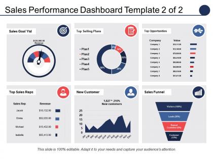
Sales Performance Dashboard Top Selling Plans Top Opportunities





Try Before you Buy Download Free Sample Product
 Impress Your
 Audience
 100%
100% Editable
 Save Hours
 of Time


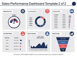
Have a look at our sales performance dashboard top selling plans top opportunities presentation design. The PPT template has been designed using an editable charts and visuals to understand the concept of sales and marketing management in today's time. Whether you are looking to launch a new product or service or planning to re-launch the existing one, you have to ensure that you choose the best marketing strategy to engage the consumer. Our sales and marketing PPT slide helps you to present the information about the customer decision making process as how your marketing plan persuade them to go for the product or service you are offering. The important aspects shown in the PowerPoint slide are sales funnel, sales goals, top selling plans, top sales reps, etc. People engaged in the sales and marketing work can get the best value out of this presentation diagram as it perfectly delivers the message of consumer decision making and purchase. So, download our sales performance dashboard PowerPoint graphic now. Get your career going fast forward with our Sales Performance Dashboard Top Selling Plans Top Opportunities. Your engine will be firing an all cylinders.
People who downloaded this PowerPoint presentation also viewed the following :
Sales Performance Dashboard Top Selling Plans Top Opportunities with all 5 slides:
Deliver accurate blows with our Sales Performance Dashboard Top Selling Plans Top Opportunities. Ensure the contest goes in your favor.
FAQs for Sales Performance Dashboard Top Selling
Honestly, just track what actually matters for decisions. Revenue, conversion rates, pipeline value, and how long deals take - those four tell the real story. Deal size and win rates show you if you're crushing it or not. Yeah, activity stuff like calls and meetings matters, but I see way too many people obsessing over busy work instead of actual results. Super annoying. Lead sources help you figure out what's working. Keep it dead simple though - if you can't look at your dashboard for 30 seconds and immediately know where you stand, you've overcomplicated it.
Honestly, charts are a game-changer for sales data. You'll spot trends instantly instead of squinting at spreadsheets for hours. Bar charts are perfect when you're comparing how different team members are doing. Line graphs? Those show your trends over time really well. I always use them to catch which regions are killing it or if there's some seasonal pattern I missed. The trick is matching the right chart type to whatever question you're trying to answer. Once you do that, the story basically tells itself – like you can see underperforming products right away before they become a real headache.
Honestly, real-time data is huge for catching stuff as it's happening instead of weeks later when you're screwed. Your team missing targets? You'll know instantly. Pipeline deals going nowhere? Boom, right there on your dashboard. I used to hate waiting for those monthly reports - felt like driving with a blindfold on. Now you can spot revenue trends and conversion rates immediately, then actually do something about it. Oh, and set up alerts for whatever metrics matter most to you. Game changer for sure.
So basically just figure out what each team actually looks at first thing Monday morning, then build around that. Inside sales probably wants lead conversion and call volumes right up front. Field reps? They're more about pipeline stuff and how their territory's doing. Most tools let you set up different access for different roles - honestly saves so much headache. Oh and definitely adjust timeframes since some people need daily numbers while others are fine with monthly. Role-based dashboards are seriously underrated though.
Honestly, if you're already using Salesforce, just stick with their built-in dashboards - they're pretty solid. Tableau and Power BI are the big names if you want fancy visualizations, but there's definitely a learning curve there. Google Data Studio is free and works better than you'd expect. HubSpot's got decent reporting too. Really depends on your budget and how complicated you want things to get. I'd probably start with whatever plays nicest with your current CRM setup - no point making life harder than it needs to be, you know?
Honestly? Just start with basic sales forecasting widgets - way less overwhelming than diving into everything at once. Pull your historical data and seasonal patterns into something like Tableau or Power BI (they've got ML stuff built right in now, which is pretty sweet). You can add lead scoring and pipeline probability later once people aren't freaked out by the predictions. The key is training models on customer behavior and past sales to predict monthly revenue or which deals will actually close. I'd probably avoid going crazy with ten different predictive dashboards right away though - learned that the hard way at my last job when everyone just ignored them.
Ugh, honestly the worst part is all your data comes from different places - CRM, billing, random spreadsheets. Nothing syncs right. You get duplicate records everywhere and manual entry mistakes constantly. Sales reps are terrible at updating their pipeline on time (some never do it). Timing gets weird too - same deal shows up differently across systems. What even counts as a "qualified lead" anyway? Every team defines it differently. Set up some automated validation rules if you can. Regular check-ins with sales help catch the mess early, but it's still a headache.
Dude, you absolutely need user feedback for dashboards. Sales reps will straight up tell you when something's confusing or buried too deep. What you think matters vs what actually helps them close deals? Totally different things. I've watched teams ignore gorgeous dashboards because they were useless day-to-day. Your users reveal weird workflow stuff too - like needing to drill into specific accounts or compare performance differently than you expected. Build something basic first. Then let them break it and complain. That's where the real insights come from, honestly.
Line charts are your best bet for sales data - stick to consistent time periods like weekly or monthly. Start your y-axis at zero or you'll make tiny dips look like the apocalypse (trust me on this one). Different colors work great for products or regions, but don't go crazy with more than 5-6 lines. Gets way too cluttered. Trend lines help smooth out the seasonal weirdness. Also, throw in some annotations for stuff like product launches or when the competition did something dumb. You want people to spot patterns quickly but still dig deeper when they need to.
Dude, you absolutely need filtering and segmentation or your dashboard will be useless. Think of it like this - instead of staring at a massive pile of data, you can actually zoom in on specific regions, time periods, whatever. Super helpful when something looks off and you're like "wait, why did sales tank in Q3?" Without being able to slice things up, you're just stuck with these generic views that don't tell you anything meaningful. Start with the filters your team's always bugging you about - that's usually the sweet spot.
Your dashboard has to actually connect to what the company's trying to accomplish. Growing market share? Track new customer acquisition and competitive wins, not just revenue totals. Focused on profits? Watch margin per deal and customer lifetime value instead. Honestly, most dashboards I see are just full of vanity metrics that look pretty but don't actually matter. You've got to talk with leadership regularly about what they really care about. Then make your dashboard tell that story - whether you're crushing those goals or falling behind. Can't let them ignore what's actually moving the business forward.
So trend lines with confidence intervals are your best friend here - way more honest than pretending you know exactly what'll happen. Color-code the historical stuff vs your projections so people can see where the crystal ball kicks in. Rolling averages smooth out all that seasonal weirdness. Oh, and do scenario planning! Best case, worst case, realistic case - covers your butt and sets proper expectations. I always stick methodology notes somewhere visible because people love asking "how'd you get this number?" Update regularly and show how accurate your old forecasts were. Nothing builds trust like admitting when you were wrong before.
Honestly, mobile makes such a huge difference for dashboard adoption. Your sales team will actually use the thing when they can quickly check their numbers between client meetings or at the airport. I've watched usage rates shoot up 60-70% once people get decent mobile access - not just some cramped desktop version that's impossible to read. Fast loading is key, plus clear display on small screens. Reps need to spot their main metrics without all that annoying zooming and scrolling around. Really though, skip mobile and your field team's gonna ignore your dashboard completely.
Honestly, start simple with conversion rate - how many leads actually close. Then track your average deal size and how long your sales cycle takes. MRR if you're subscription-based, otherwise just total revenue. Pipeline velocity is clutch though - shows how fast deals actually move. I used to obsess over call/email counts but those are kinda meaningless if they're not quality touches. Oh, and lead response time is weirdly important, especially for warm inbound stuff. Stick to those six first. You can always add more later once you've got the basics down.
Honestly, sales dashboards are a game changer for this stuff. You can see exactly who's struggling with what - like if someone's conversion rates are trash or they can't close deals to save their life. Way better than trying to figure it out from random comments, you know? The cool thing is you'll spot patterns across your whole team, plus track if your training actually moves the needle over time. I always tell people to look for whatever metrics are consistently missing targets - that's your next training focus right there. Saves so much guesswork.
-
Visually stunning presentation, love the content.
-
Visually stunning presentation, love the content.