


Scorecard highlighting expected team performance organizational team building program




Try Before you Buy Download Free Sample Product
 Impress Your
 Audience
 100%
100% Editable
 Save Hours
 of Time


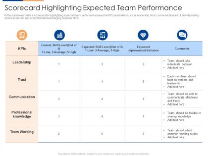
In this slide we provide a scorecard for highlighting expected team performance based on KPI parameters such as leadership, trust, communication etc. It provides rating based on current and expected skill level ranging between 1 to 5.
People who downloaded this PowerPoint presentation also viewed the following :
Scorecard highlighting expected team performance organizational team building program with all 2 slides:
Use our Scorecard Highlighting Expected Team Performance Organizational Team Building Program to effectively help you save your valuable time. They are readymade to fit into any presentation structure.
FAQs for Scorecard highlighting expected team performance organizational
So a scorecard is basically like a report card for your business - tracks your key metrics against whatever goals you set. Most people use colors: green when you're crushing it, yellow for almost there, red when things suck. Pick maybe 3-5 things that actually matter (don't go crazy tracking everything). Sales numbers, customer happiness, efficiency stuff - whatever drives real results for you. Honestly, the best part is it stops those awkward "how am I doing?" conversations since everyone can just look at the numbers. Way less guesswork involved.
So balanced scorecards basically split your strategy into four buckets - financial stuff, customer happiness, internal processes, and team development. Instead of obsessing over just revenue numbers (which everyone does), you're looking at how everything connects. Honestly, most companies are terrible at seeing these connections. Map out specific goals and metrics for each area - it makes your big-picture strategy actually measurable. Your team will finally understand how their daily grind ties to company objectives, which is pretty cool. Just start by defining what winning looks like in those four areas for your next quarter.
Start with 5-7 metrics max - honestly, people get overwhelmed if you throw too much at them right away. You'll want clear targets vs actual numbers, plus some kind of simple scoring system. Traffic light colors work great, or just do 1-5 ratings. Make sure someone's actually responsible for each metric, otherwise these things just become fancy paperweights. Include trend arrows so you can see if stuff's getting better or worse over time. Oh, and leave space for quick explanations - numbers without context are pretty useless. Keep it visual since most people will be skimming through these fast. Once everyone gets comfortable with the format, then you can add more metrics.
Okay so basically each industry picks the metrics that actually matter to them. Healthcare obsesses over patient satisfaction and readmission rates. Retail? It's all about conversion and how fast inventory moves. Manufacturing companies track quality and production efficiency - which honestly makes sense since one hour of downtime can cost them crazy money. Financial services care most about risk and compliance stuff. Tech companies watch user engagement and uptime religiously. Here's what I'd do: figure out what actually drives success in your specific industry first. Then build your scorecard around just those metrics. Don't overcomplicate it.
So for financial scorecards, you're gonna see the usual suspects - revenue growth, profit margins, ROI, cash flow, cost ratios. EBITDA and debt-to-equity ratios pop up a lot too. Honestly feels like drowning in acronyms half the time! Mix backward-looking stuff (what already happened) with forward projections. Here's the thing though - don't go crazy trying to track everything. Pick maybe 5-8 metrics that your executives actually care about. I'd start by figuring out what questions your leadership team asks most in meetings, then work backwards from there. Way easier than guessing what matters.
Honestly, scorecards work because nobody wants their crappy numbers up there for everyone to see. It's like healthy peer pressure - when Sarah's hitting 120% and you're at 60%, you're gonna feel that. The visibility thing is huge. Pick maybe 3-4 metrics that actually move the needle for your team (not just busy work stats). When people can see how their work connects to the bigger goals, they usually care more. I've seen teams completely turn around just from putting numbers on a shared dashboard. The trick is making sure those metrics aren't total BS - track what matters, not what's easy to measure.
Dude, color-coding changes everything - red/yellow/green makes performance levels so obvious at first glance. Charts show trends way better than boring number columns. Icons work too for quick status updates. I mean, who has time to decode rows of data when you need answers fast? The whole point is guiding your eye to what actually matters first. Consistent formatting helps you catch weird patterns or outliers right away. Honestly just start with basic traffic light colors for your main KPIs. You'll see the difference immediately - it's like night and day.
Honestly, just connect your scorecard to whatever data you're already using - don't make people enter stuff twice. APIs or database connections work way better than manual exports (learned that the hard way). Your scorecard should update on the same schedule as your regular reports so nobody's confused about which numbers are right. Think of it like adding a dashboard on top of what you already have, not building something totally new. Oh, and start with maybe two metrics max - once that's running smooth, then you can get fancy with more stuff.
Scorecards are honestly a game-changer for performance reviews. Pick 3-5 metrics that actually matter for each person's role - sales numbers, project deadlines, customer ratings, whatever works. Track them monthly or quarterly instead of waiting for that dreaded annual sit-down. What I really like is it kills those weird "so... how do you think you're performing?" moments. Your reviews become about actual data and trends instead of vague stuff like "needs improvement." Way less awkward for everyone. Oh, and don't overthink it at first - just use metrics you're already tracking anyway.
So basically your tech does all the boring math stuff for you - pulls data straight from your systems and spits out reports automatically. You can set it to refresh dashboards daily, send alerts when numbers hit certain targets, that whole deal. Honestly, the best part is not having to worry about screwing up calculations or spending hours on data entry. Frees you up to actually think about what the numbers mean instead of just collecting them. I'd probably just start with whatever tools you're already using since most can handle this kind of automation pretty easily.
Honestly, scorecards are kind of a game-changer for getting teams on the same page. You put all the key metrics in one spot where everyone can see them – no more marketing obsessing over engagement while sales only cares about pipeline numbers. When teams actually look at the same dashboard, the pointless arguments just... stop. It's wild how fast that happens. Everyone starts seeing how their work connects to the bigger picture, which breaks down those annoying departmental walls. Oh, and definitely do regular reviews with all departments together to keep it working.
Getting buy-in from different teams is brutal - everyone's got their own agenda. Data quality will bite you in the ass too. If your source data is garbage, the whole scorecard falls apart. Honestly, the maintenance piece is what kills most projects because nobody thinks about it upfront. Oh, and picking metrics that actually move the needle? Harder than it sounds. Start with maybe 3-4 solid metrics first. Get those dialed in before you try to boil the ocean. Once people see it's actually useful, then you can add more stuff.
Yeah, totally different game with nonprofits. Forget revenue/profit - you want metrics that actually show if you're making a difference. Track stuff like how well your programs work, what outcomes you're getting for the people you serve, donor retention rates. Oh and volunteer engagement is massive (something regular companies barely think about). Cost per participant is solid too, plus fundraising efficiency. Honestly though? Pick your 3-4 most critical mission areas first, then build simple metrics around those. Your board needs to actually understand this stuff to make good decisions with it.
Honestly, you gotta stay on top of those scorecard metrics or they'll become useless fast. I'd do quarterly check-ins to see if your KPIs still make sense - business priorities shift constantly and last quarter's "must-have" metric might be pointless now. Get your stakeholders involved too since they're the ones actually living with this data every day. Oh, and focus on leading indicators instead of just lagging ones so you can actually do something about the results. Maybe start with a review session this month? Ask people what they'd ditch or add - you'll be surprised what they say.
So scorecards are pretty much your way to stop saying "we're getting better" without any proof. Pick like 3-5 things you can actually measure that matter to your goals. Then check them weekly or monthly - honestly, monthly works fine unless you're in crisis mode. The whole point is turning fuzzy improvement stuff into real numbers you can track. When everything's laid out visually, you'll spot what's working and what's not way faster. Plus nobody can BS about progress when the data's right there. Start small though - don't go crazy with too many metrics at first.
-
Excellent template with unique design.
-
Top Quality presentations that are easily editable.
-
Great product with highly impressive and engaging designs.
-
It saves your time and decrease your efforts in half.
-
It saves your time and decrease your efforts in half.