

Small Business Company Profile Powerpoint Presentation Slides




Try Before you Buy Download Free Sample Product
 Impress Your
 Audience
 100%
100% Editable
 Save Hours
 of Time


A company profile is a professional description that aims to inform clients about product and service offerings, their structure, resources, financial performance, etc. Check out our efficiently designed template on Small Business Company Profile. It showcases the executive summary and company introduction, including our mission, specialities, achievements, and core values. Also, it covers our global presence across different regions, key products and support services. Further, this PPT represents our management team, company history, strategic partnerships, business model, key clients, and their reviews. Moreover, it focuses on financial highlights such as revenues, net profit, ratio analysis, revenue split by geography, and R and D expenses. Also, it captures market share and comparison with competitors based on financials and services. It also focuses on a strategic approach to improving client base, marketing mix, SWOT analysis, CSR activities, and case study approach. Customize our 100 percent editable company profile ppt through assistance from our highly-skilled research or design team. Get access now.
People who downloaded this PowerPoint presentation also viewed the following :
Content of this Powerpoint Presentation
Slide 1: This slide introduces Small Business Company Profile. State Your Company Name and begin.
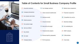
Slide 2: This slide presents Table of Content for the presentation.
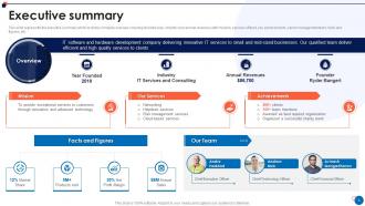
Slide 3: This slide represents the executive summary which includes company overview.
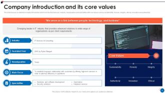
Slide 4: This slide focuses on detailed company introduction which includes founded year, industry, headquarters and specialities.
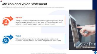
Slide 5: This slide represents the mission and vision statement of company.
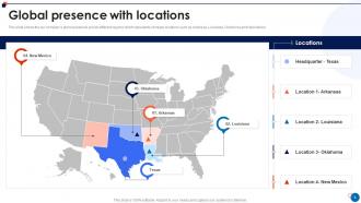
Slide 6: This slide shows the our company’s global presence across different regions.
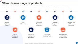
Slide 7: This slide covers the range of products offered by our company such as network operating systems, data security applications, etc.
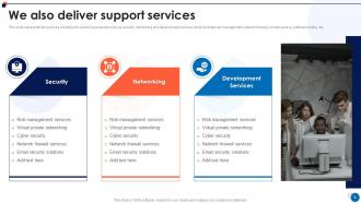
Slide 8: This slide represents the services we deliver to various businesses such as security, networking and development services.
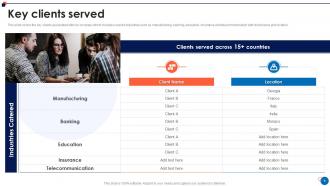
Slide 9: This slide covers the key clients associated with our company which includes covered industries.
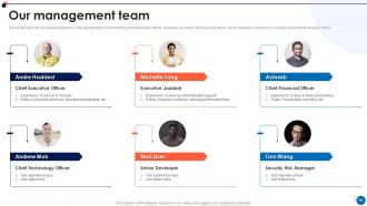
Slide 10: This slide shows the key people involved in management team.
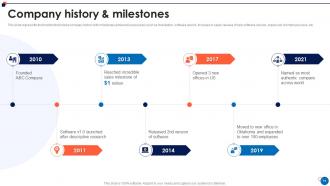
Slide 11: This slide represents the timeline that shows company history with milestones achieved.
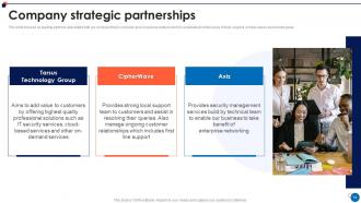
Slide 12: This slide focuses on leading partners associated with our company.
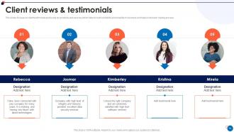
Slide 13: This slides focuses on client testimonials post using our products and services.
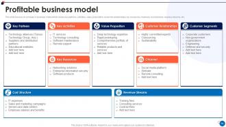
Slide 14: This slide focuses on company’s business model which covers key partners, activities, value proposition, etc.
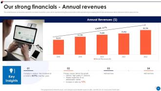
Slide 15: This slide focuses on revenues earned by company in past five years which reported strong financial position.
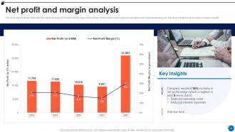
Slide 16: This slide represents the net profits and margin analysis of company for five years.
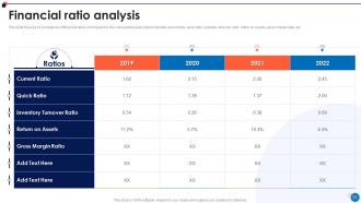
Slide 17: This slide focuses on comparison of financial ratios of company for four consecutive years.
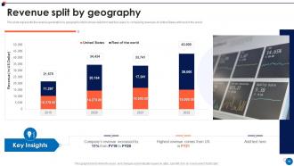
Slide 18: This slide represents the revenue generation by geography which shows data from last four years.
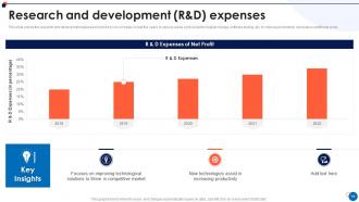
Slide 19: This slide shows the research and development expenses incurred by our company.
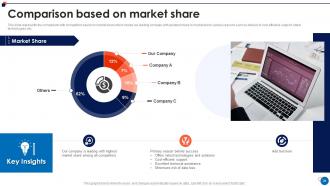
Slide 20: This slide represents the comparison with competitors based on market share.
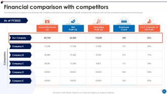
Slide 21: This slide showcases Financial comparison with competitors.
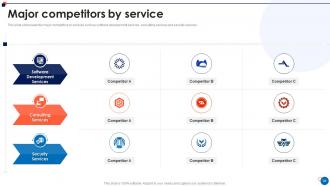
Slide 22: This slide presents the major competitors by services such as software development services, consulting services and security services.
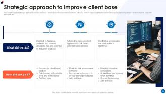
Slide 23: This slide displays Strategic approach to improve client base.
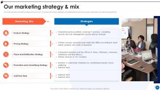
Slide 24: This slide shows the marketing strategy and mix of our IT company.
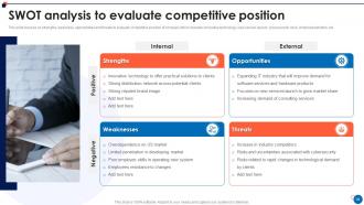
Slide 25: This slide presents SWOT analysis to evaluate competitive position.
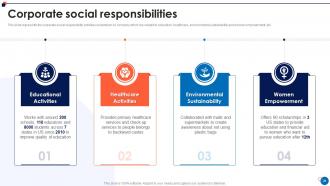
Slide 26: This slide represents the corporate social responsibility activities undertaken by company.
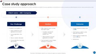
Slide 27: This slide shows the case study which includes challenge faced by client in establishing cloud platform.
Slide 28: This slide displays Icons for small business company profile.
Slide 29: This slide is titled as Additional Slides for moving forward.
Slide 30: This is About Us slide to show company specifications etc.
Slide 31: This is Our Mission slide with related imagery and text.
Slide 32: This is Our Team slide with names and designation.
Slide 33: This is Our Target slide. State your targets here.
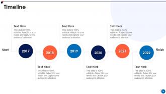
Slide 34: This is a Timeline slide. Show data related to time intervals here.
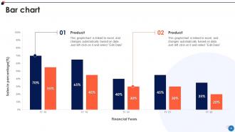
Slide 35: This slide presents Bar chart with two products comparison.
Slide 36: This slide describes Line chart with two products comparison.
Slide 37: This slide shows Post It Notes. Post your important notes here.
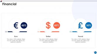
Slide 38: This is a Financial slide. Show your finance related stuff here.
Slide 39: This is a Thank You slide with address, contact numbers and email address.
Small Business Company Profile Powerpoint Presentation Slides with all 44 slides:
Use our Small Business Company Profile Powerpoint Presentation Slides to effectively help you save your valuable time. They are readymade to fit into any presentation structure.








FAQs for Small Business Company Profile
Honestly, it's brutal out there. You're going up against companies that drop more on ads in a week than you make in months. Amazon has spoiled everyone - customers expect that same smooth experience from your little shop. Meanwhile, you're juggling everything yourself while Google changes its rules every other Tuesday. The algorithm stuff alone will drive you crazy if you let it. I learned this the hard way, but pick maybe two platforms and actually get good at them. Way better than posting randomly everywhere and sucking at all of it.
Honestly, templates are a lifesaver. You won't waste hours picking fonts and getting distracted by color schemes (which happens way more than I'd like to admit). Your brand stays consistent across all your pitches too - makes you look way more professional. The time-saving aspect is huge since you just plug in new content each time. I probably sound lazy but starting from a blank slide deck is the worst. Focus goes straight to your actual message instead of design stuff. Plus clients notice when everything looks polished and cohesive.
So for your presentation, focus on three things: what problem you're fixing, how you fix it differently, and proof that it actually works. Don't make people guess why they should care - hit them with the pain point first. Then explain your solution and why it's better than what's out there. Honestly, most people totally blow the proof section - you need real numbers or customer stories, not just pretty promises. Keep slides clean with mostly visuals. Practice those transitions between sections or you'll sound like a robot up there. Oh and definitely end with something concrete they can do right after, not just "contact us sometime."
Honestly, mini-presentations are a game changer for social media. Break your expertise into short slide decks - stuff like "5 mistakes people make with X" or quick tutorials. Visual content that actually teaches something always performs well. Don't make it too polished though, people want to see the real you. Oh, and you can totally recycle one presentation across different platforms which saves so much time. Pick something you're passionate about and could talk about forever, then chunk it into 3-5 slides. Trust me, it's way easier than you think!
Dude, you definitely need good visuals for your presentation. People absorb images like 60,000 times faster than text - which honestly sounds made up but I've seen that stat everywhere. Charts and photos help people actually remember your stuff instead of zoning out. Nobody wants to sit through slides crammed with bullet points, trust me. Makes you look way more professional too. Oh, and keep the text super minimal on each slide. High-quality images that actually relate to what you're saying. I learned this the hard way after bombing a pitch with text-heavy slides.
Stories are way more powerful than just throwing data at people. Start with how you launched your business or maybe that time everything went sideways and you had to pivot. Our brains are literally wired to remember narratives over numbers - it's wild how that works. Just make sure whatever you share actually connects to what your audience is dealing with. I'd open with part of a story, then finish it at the end for a nice bookend effect. Oh, and definitely include how your product changed someone's life. That stuff hits different than spreadsheets.
So it really depends on what kind of business you're running. Consulting and agency work? Go minimal - clean templates where your data is the star. Retail needs way more visuals and bold product shots. Tech startups honestly should lean into that sleek, modern look because clients expect it now. B2B and manufacturing companies though - keep it conservative and professional, builds way more trust. I'd grab maybe 2-3 solid templates max: internal meetings, client presentations, and one for pitches. Don't overthink it too much.
Honestly, I'd start by grabbing feedback right after you present - did people get your main points? Were they asking good questions or wanting to follow up? That tells you if you connected. But here's the thing - the real test comes in the next few weeks. Are you getting meeting requests, sales calls, referrals? I track stuff like new LinkedIn connections too if I'm pitching prospects. Polite clapping doesn't pay the bills, you know? Set up a basic spreadsheet to log this after each presentation. Business action beats nice compliments every time.
Ugh, the worst thing people do is cram walls of text on slides then just read them word for word. Like, we have eyes! Also everyone forgets to explain WHY anyone should care - that's honestly the most important part. Oh and timing is huge. I've seen so many good presentations tank because someone had to rush through their ending. Keep it visual, tell actual stories instead of bullet points, and start with the problem you're fixing. Honestly? Just practice it once with a friend first. They'll catch the confusing stuff you missed.
Honestly, your brand needs to show up everywhere in those slides. Same colors, fonts, logo spots - you know the drill. I've watched so many small businesses just grab random templates and wonder why their message gets lost. Your tone has to match too - if you're normally chill and casual, don't flip into some weird corporate robot mode just because it's a presentation. Short story: people should feel like they're hanging with your brand, not staring at slides with your logo randomly stuck on. Keep everything looking like it actually belongs together.
Dude, so many good options these days! PowerPoint and Google Slides are the usual suspects, but honestly Canva is where it's at - their templates look way more professional than anything I could design myself. Prezi's cool if you want that zoomy interactive thing (though it can be kinda distracting tbh). Pitch is solid too. I've watched people make incredible presentations using just Canva's free version, which is nuts. Oh and skip the stock photo sites with those weird corporate handshake pics - Unsplash and Pexels have way better stuff. Just pick a template that matches your colors and you're basically done.
Oh man, this stuff really matters! Japanese clients love super detailed slides and formal structure. Germans want all the data - like, ALL of it. Americans are into storytelling and getting the audience involved. Latin American cultures? They'll want to build that relationship first before jumping into business (honestly smart approach). Middle Eastern presentations tend to be more hierarchical. Research your audience beforehand because what works in one place totally bombs in another. If you're unsure, find someone local to give you the real scoop on what flies there.
Dude, just ask your audience what they actually want to hear! After your next presentation, survey people or straight up ask what would make it better. I swear, most people skip this step and wonder why their slides bomb. Use their exact words when you talk about problems they face. Cut the boring stuff they don't care about. Address their biggest concerns right upfront instead of burying them halfway through. Oh, and pay attention to what confuses them most - that's usually gold for improving next time. Trust me, once you start tailoring things to what they've told you matters, you'll see way more head nods.
So right now everyone's obsessed with interactive stuff - polls, Q&A sections, clickable elements if you're doing virtual presentations. Bold typography is huge too, paired with tons of white space. Dark mode is literally everywhere (makes everything look sleek honestly). People want visual storytelling instead of text-heavy slides that put you to sleep. Oh, and sustainability messaging is having a moment - definitely highlight any eco-friendly practices you've got. Keep it minimal, stick to your brand colors consistently. Your audience expects presentations to feel more like actual conversations now, which is way better than the old lecture-style format anyway.
Okay so first thing - practice in front of a mirror, then record yourself on your phone. Yeah it's cringey watching it back but you'll catch all those "ums" you don't even know you're doing. Get some friends to listen to a run-through too, they'll tell you if you're talking too fast or being unclear. Speaking of fast - slow way down when you're actually presenting. Nerves make everyone speed up. If you start getting anxious, just pick one friendly face and talk to them. Oh and know your stuff inside out so you can actually have a conversation about it instead of just reading slides like a robot.
-
Great work on designing the presentation. I just loved it!
-
“I required a slide for a board meeting and was so satisfied with the final result !! So much went into designing the slide and the communication was amazing! Can’t wait to have my next slide!”