

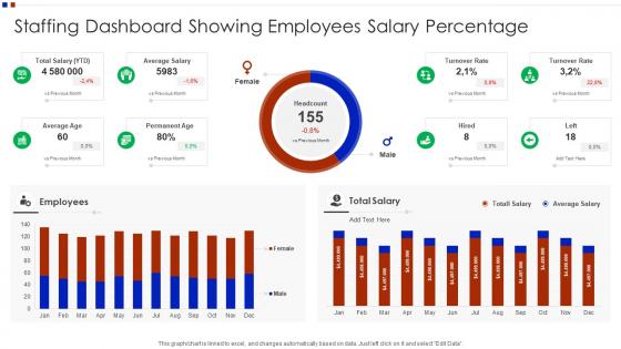
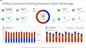
Staffing Dashboard Showing Employees Salary Percentage




Try Before you Buy Download Free Sample Product
 Impress Your
 Audience
 100%
100% Editable
 Save Hours
 of Time


Our Staffing Dashboard Showing Employees Salary Percentage are topically designed to provide an attractive backdrop to any subject. Use them to look like a presentation pro.
People who downloaded this PowerPoint presentation also viewed the following :
Staffing Dashboard Showing Employees Salary Percentage with all 7 slides:
Use our Staffing Dashboard Showing Employees Salary Percentage to effectively help you save your valuable time. They are readymade to fit into any presentation structure.





FAQs for Staffing Dashboard Showing
Start with the basics: headcount by department, open positions, and how long it takes to fill roles. Turnover and retention rates are huge - trust me, constantly refilling the same spots gets old fast. Track utilization if you've got billable people, plus absenteeism and overtime to catch burnout before it spirals. Finance will want to see budget vs actual staffing costs (they always do). Employee satisfaction scores are gold if you can get them - happy people don't leave. Build from there and add fancier stuff later once this foundation is solid.
So basically, a staffing dashboard maps out what skills your team actually has versus what you need for projects. Super helpful for spotting gaps - like if you're missing key technical people or have way too many in one area. Way better than those messy spreadsheets we used to use (ugh, never again). You'll see patterns too, like which departments lose people constantly or when Bob from IT finally retires and takes all that knowledge with him. Then you can figure out where to spend your hiring and training money instead of just guessing.
Honestly, line charts are clutch for tracking headcount over time - you'll spot those seasonal hiring dips right away. Heat maps show staffing across departments super clearly. Bar charts work well when you're comparing actual vs target numbers. I'm weirdly into donut charts for team breakdowns, but my coworker thinks they're confusing (fair point). Color coding is huge though - red/yellow/green instantly shows where you're understaffed. Oh, and don't cram everything into one chart. Pick one clear thing per visual and you're golden.
Daily updates are your best bet, honestly. Real-time is even better if you can swing it. Most teams don't need hourly changes unless you're in retail during Black Friday or something crazy like that. Weekly? Way too slow - you'll spot problems when it's already too late to do anything about it. Find that balance where your data actually reflects what's happening without driving everyone nuts with constant updates. Automated feeds help a ton here. Just do a quick manual check once a week to catch any wonky numbers or glitches in the system.
So you can build in predictive analytics a few different ways. Start with turnover prediction - that's where you'll see results fast and it actually impresses the higher-ups. Historical data plus engagement scores will show you who's likely to quit before they do. Super helpful for retention planning. The system can also forecast hiring needs based on seasonal patterns and growth projections. Oh, and it identifies skill gaps early, which honestly saves so much scrambling later. You can even predict how long recruiting will take for different roles. I'd definitely begin with the turnover stuff though - gives you the best bang for your buck and proves the whole analytics thing works.
Honestly, a staffing dashboard is a game changer because everyone's working off the same numbers in real-time. No more playing phone tag over headcount stuff. Your department heads can actually see where their hiring requests are instead of bugging HR every week. HR gets to share all the metrics - open positions, hiring progress, budget status - without writing a million emails. The transparency thing really works too. You'll catch problems before they blow up. I'd do weekly check-ins with your main department heads using the dashboard data. Makes those budget meetings so much less of a nightmare, trust me.
Look, turnover data is like your crystal ball for staffing issues. It shows patterns of who's leaving and when, so you can actually get ahead of the chaos. I've seen departments that looked fine on paper but were bleeding people left and right. You can break it down by team, role, whatever - helps you spot the red flags early. Short sentences hit different sometimes. The cool part is predicting your hiring needs before you're desperately posting job ads at 2am. Plus budgeting for recruitment costs becomes way less of a guessing game when you can see the trends coming.
Dude, you'll catch staffing problems while they're actually happening instead of finding out days later when everyone's already pissed. I can see which shifts are train wrecks, who's legitimately sick vs just flaking - trust me, there's a huge difference. Moving people around becomes way easier when you spot gaps early. The dashboard thing is clutch though - set up alerts for when you're dangerously short-staffed so it pings you automatically. Otherwise you'll be refreshing that thing every five minutes like you're checking Instagram. Way better than scrambling to fix disasters after customers start losing it.
Honestly, I'd go with **Power BI** if you're already using Microsoft stuff - it connects to Excel super easily which is clutch. **Tableau** is more robust but costs way more and takes forever to learn (learned that the hard way). **Google Data Studio** is free and actually not terrible for basic stuff, though I forget they renamed it to Looker Studio or something. Power BI lets you get something up and running pretty fast. Works great with HR data too. I mean, you could try the Google one first since it's free, but you'll probably end up wanting Power BI's features anyway.
Honestly, the worst thing you can do is cram everything onto one screen - total information overload. Also, don't make everything real-time because some metrics actually make more sense as trends. Your executives want completely different stuff than your team leads do, so think about who's actually looking at this thing. Oh, and definitely validate your data sources first - learned that one the hard way when numbers didn't match up during a big presentation. Super awkward. Start with maybe 3-5 metrics people genuinely care about, then add more based on what they tell you.
Throw some quick rating buttons right on your dashboard - maybe a feedback form that pops up every so often. Talk to your power users regularly, they'll straight up tell you what sucks and what they're begging for. Analytics show you where people bail out or totally ignore features. Honestly? Just make a Slack channel for suggestions. That's where people complain anyway, might as well capture it. The magic happens when you actually fix stuff and tell people "hey, we changed this because of what you said." Otherwise you're just collecting feedback for no reason.
Ugh, the time zone thing is brutal - you're always looking at yesterday's data when decisions need to happen now. Tracking productivity gets weird too when everyone's working different hours and has their own style. What really sucks is missing those early warning signs of burnout or staffing problems that you'd normally catch just by walking around. Communication lags mean issues don't hit your dashboard until after they've already messed up deadlines. Honestly? Set up some automated alerts for the stuff that matters most. Also do regular check-ins across zones - it's the only way to stay ahead of problems.
Honestly, these dashboards are game-changers for tracking diversity stuff. You can see exactly where people drop off in your hiring process - like if certain groups aren't making it past phone screens or whatever. The visual breakdowns by department and interview stage? Mind-blowing when you actually see the patterns laid out. I'd definitely set up alerts for when your diversity numbers tank, because waiting until year-end reviews is way too late. Oh, and don't forget the promotion/retention tracking - that's where you'll catch the real bias happening after people get hired.
So for your staffing dashboard - forecasting is honestly what makes or breaks the whole thing. You'll want current numbers right next to projected ones so managers can spot the gaps early. Nobody wants that "oh crap we're short-staffed" panic on Monday morning. Some departments need weekly forecasts, others can work with quarterly views. The key is making sure you can zoom in from the big picture down to specific team needs. And here's the thing - if your dashboard doesn't help managers get ahead of problems, it's just pretty charts that nobody uses.
Your dashboard needs to track stuff that actually matters to the business - time-to-fill for critical roles, cost-per-hire, retention rates in key departments. The real win is connecting your staffing data to business results. Like, show how faster sales hiring drives revenue growth. I've honestly seen way too many dashboards tracking meaningless vanity metrics that don't move anything forward. Leadership cares about specific KPIs tied to strategic goals. So start backwards - what business problems are you trying to solve first? Then build your metrics around that. Makes way more sense than the other way around.
-
Much better than the original! Thanks for the quick turnaround.
-
Awesome presentation, really professional and easy to edit.