


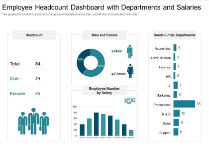
Employee headcount dashboard with departments and salaries




Try Before you Buy Download Free Sample Product
 Impress Your
 Audience
 100%
100% Editable
 Save Hours
 of Time


Our Employee Headcount Dashboard With Departments And Salaries are topically designed to provide an attractive backdrop to any subject. Use them to look like a presentation pro.
People who downloaded this PowerPoint presentation also viewed the following :
Employee headcount dashboard with departments and salaries with all 2 slides:
Use our Employee Headcount Dashboard With Departments And Salaries to effectively help you save your valuable time. They are readymade to fit into any presentation structure.
FAQs for Employee headcount dashboard with
Start with the obvious stuff - headcount, new hires, who's leaving, turnover rates by department and month. Then layer in headcount by role/level, cost per hire, time-to-fill. Diversity metrics are basically mandatory now. I'd throw in projected vs actual headcount too, plus span of control if leadership cares about management structure (they usually do). The whole point is catching trends fast and being ready when executives ask "wait, why did our numbers jump?" - which honestly happens every single meeting. Oh, and make sure you can slice everything by time period.
Honestly, visuals beat the hell out of staring at spreadsheet rows all day. Pie charts work great for gender breakdowns, heat maps show you where everyone's located geographically. Bar charts are solid for age groups or departments. Tree maps are actually kind of neat for showing team hierarchies - though I feel like people don't use them enough. Don't just throw bar charts at everything though. Interactive filters are a game changer because then your bosses can click around and answer their own questions instead of bugging you for new reports constantly.
Okay so your headcount dashboard is basically useless without real-time data. Think about it - if someone quits or gets hired and your numbers don't update immediately, you're making decisions off old info. That's how you end up with wonky budget planning. Connect your HRIS directly to the dashboard through APIs instead of doing manual uploads (trust me on this one). When everything syncs automatically, you'll actually know what's happening with your team right now. Otherwise you're just guessing based on last week's headcount, which honestly defeats the whole purpose.
Start with role-based access - people only see what they need for their actual job. Anonymize sensitive stuff when you can, like showing headcount trends instead of individual salaries and names. Trust me, I've watched dashboards turn into office drama central! Use data masking for personal info and set up proper authentication. You'll need to audit access regularly too. GDPR compliance matters if that applies to you. But honestly, just ask yourself this first - does Sarah from marketing really need John's exact salary, or would a department average do the trick? That question alone solves half your problems.
Honestly, the real-time syncing is a game changer - no more manually pulling data from three different systems every week. Your dashboard just updates automatically from payroll, HRIS, whatever you connect. Saves so much time since you're not constantly exporting spreadsheets (I used to spend like half my Friday doing that). Way more accurate too without the copy-paste errors. You can actually drill down by department without switching between systems. Oh, and start with payroll integration first - that's where you'll see the biggest impact right away.
Look at your hiring and turnover data from the past 2-3 years - you'll start seeing clear patterns. Which departments always seem to be growing or shrinking? When do people quit most? (Spoiler: probably right after they get their bonus checks.) Track how long it takes to fill key positions too. This stuff helps you predict staffing problems before they hit. You can actually plan your recruiting instead of scrambling when someone puts in their two weeks. Budget planning gets way easier when you know March is historically your biggest turnover month or whatever.
Start with color contrast and alt text - that's where most people mess up. Don't just use red/green for different data points since colorblind folks won't see the difference. Throw in some patterns or labels too. Screen readers hate charts, so write decent alt text and maybe add a basic data table backup. Font size matters - 12pt minimum or people will squint at your beautiful dashboard. Oh, and test keyboard navigation yourself by unplugging your mouse. Trust me, you'll find issues fast. It's honestly surprising how many dashboards fail this basic test.
So headcount dashboards basically let you see who's actually in your workforce instead of just assuming you know. Break it down by gender, ethnicity, departments - whatever matters to you. Honestly? The data can be pretty shocking when you first look at it. You'll spot patterns like certain groups leaving way more or getting passed over for promotions. Track hiring and retention rates too. I'd probably set up monthly check-ins with leadership about these numbers - sounds boring but it actually drives real changes in how you recruit and develop people. Way better than flying blind.
Don't cram everything onto one screen - seriously, less is more here. Mixing different date ranges or data sources without labels? Recipe for disaster. Also watch out for privacy stuff with employee data (learned that one the hard way). Keep your metrics simple and actually useful for decisions. Stale headcount numbers are basically worthless, so update regularly. I'd start with maybe 3-5 key things and build from there once people get used to it.
Oh yeah, the dashboard thing! Just keep your HR profile updated whenever stuff changes - new role, different team, whatever. I know it's annoying when you're swamped, but the dashboard pulls straight from those records so outdated info messes up everyone's numbers. Actually, I've seen departments look way understaffed because people forgot to update their transfers. If you spot something that looks wrong on the dashboard, definitely tell HR right away. Those little fixes from everyone really do add up and keep the data clean.
Definitely automate your HRIS feeds instead of manual updates - I wasted so many hours fixing copy-paste errors when I first started. Weekly refreshes work best for catching new hires and departures. Cross-check against payroll monthly because discrepancies show up constantly (still don't know why). Document your definitions clearly - like how you're counting contractors vs FTEs - and put it somewhere people can actually find it. Oh, and train someone else on the process. You'll thank me when you're sick and everything breaks.
Honestly, it's a total game-changer. Your leadership team can see staffing trends instantly instead of waiting around for HR to pull reports together. High turnover in marketing? You'll spot it right away. Budget planning becomes way less of a headache when you've got real numbers. I'd focus on metrics that actually matter to your business goals first - don't get lost in the weeds with every possible data point. The whole thing just makes workforce decisions so much easier because you're not flying blind anymore. Problems get caught early, and you can optimize team sizes before things get messy.
Okay so first thing - most dashboards are just glorified spreadsheets that everyone ignores after like a week. Don't do that. Get your key metrics front and center at the top, use actual charts instead of boring number tables. Color code different stuff so it's not all gray and depressing. Hover tooltips are clutch - people can get details without navigating away from what they're looking at. Definitely add filters for time periods and departments, that's usually the easiest way to get people actually clicking around. Oh and throw in some simple up/down arrows for trends. People love those.
Honestly, headcount dashboards are a game changer for this exact problem. You'll stop getting those "wait, how big is the marketing team again?" questions every week. Real-time numbers on team sizes, open positions, hiring plans - all right there. No more weird guessing games about who's swamped and who's got bandwidth. When you can actually see that another department is short-staffed or hiring like crazy, it makes planning so much easier. I'd start dropping the dashboard link in your cross-team meetings. Everyone works off the same data instead of random assumptions.
Honestly, just focus on what actually matters for your specific industry. Retail? You'll want seasonal patterns and part-time vs full-time splits. Tech companies obsess over contractor breakdowns and skill categories. Healthcare gets weird with all the certification tracking - super annoying but necessary. Manufacturing needs shift views and safety training status. The trick is figuring out which employee categories and timeframes are crucial for your sector. Then build those filters right into your dashboard. Don't overthink it - start with what you check most often and expand from there.
No Reviews