


Study on customer preference for dairy products case competition powerpoint presentation slides




Try Before you Buy Download Free Sample Product
 Impress Your
 Audience
 100%
100% Editable
 Save Hours
 of Time


Todays consumers place greater importance than ever on food quality, food safety, and environmental quality. In today's world of increasing competition, where numerous brands sell the same products, consumers have abundant choices, and many different factors affect their buying behavior. Consumer perception towards dairy products can be positive and negative, which are affected by the companys strategies. Check out our professionally designed template on Study on Customer Preference for Dairy Products to help you study various issues faced and solutions to overcome them. This will help the companies to identify the new strategies, recommendations, and solutions to overcome the challenges, i.e. decline in dairy product sales due to change in customers perception towards dairy products. These strategies might help the company positively shift the customers perception towards dairy products and help boost sales. The main objective of this proposal is to analyze the reasons behind dairy product sales decline and identify the key strategies to change the customers perception of dairy products. It also covers the financial forecasts with dairy products sales forecasts for the next five years and dashboards related to dairy companies. Talk to our experts for all your queries and access the 100 percent editable template on Study on Customer Preferences for Dairy Products. Download it now.
People who downloaded this PowerPoint presentation also viewed the following :
Content of this Powerpoint Presentation
Slide 1: This slide introduces Study on Customer Preference for Dairy Products. State Your Company Name and begin.
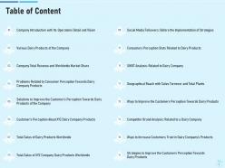
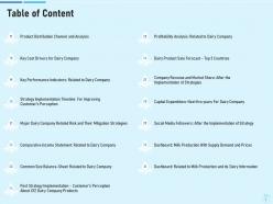
Slide 2: This slide shows Table of Content for the presentation.
Slide 3: This is another slide continuing Table of Content.
Slide 4: This slide shows Company Introduction with Its Operations Detail and Vision.
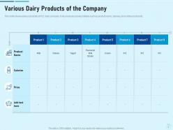
Slide 5: This slide presents Various Dairy Products of the Company.
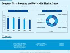
Slide 6: This slide displays Company Total Revenue and Worldwide Market Share.
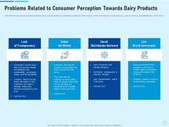
Slide 7: This slide shows Problems Related to Consumer Perception Towards Dairy Products.
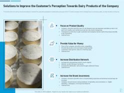
Slide 8: This slide displays Solutions to Improve the Customer’s Perception Towards Dairy Products of the Company.
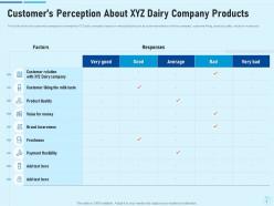
Slide 9: This slide presents Customer’s Perception About XYZ Dairy Company Products.
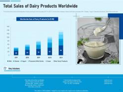
Slide 10: This slide shows Total Sales of Dairy Products Worldwide.
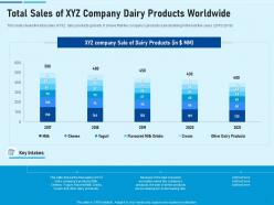
Slide 11: This slide displays the total sales of XYZ dairy products globally.
Slide 12: This slide shows Social Media Followers: Before the Implementation of Strategies.
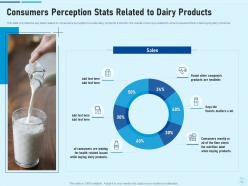
Slide 13: This slide provides the key stats related to consumers perception towards dairy products.
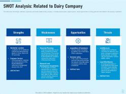
Slide 14: This slide shows the strength, weakness, opportunity and threats related to dairy company.
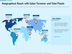
Slide 15: This slide presents Geographical Reach with Sales Turnover and Total Plants.
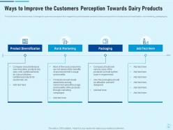
Slide 16: This slide shows Ways to Improve the Customers Perception Towards Dairy Products.
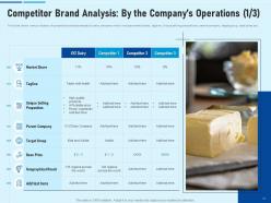
Slide 17: This slide displays various factors of competitive analysis related to dairy company which includes market share, tagline, Unique selling propositions, parent company, target group, base price etc.
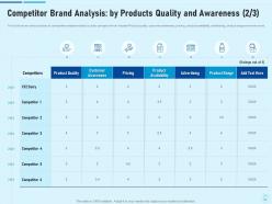
Slide 18: This slide shows Competitor Brand Analysis: by Products Quality and Awareness.
Slide 19: This slide displays various factors of competitive analysis related to dairy company which includes Management, organizational structure, most favored SKU, product categories, highest selling product and many more.
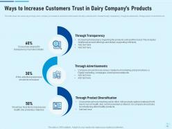
Slide 20: This slide presents Ways to Increase Customers Trust in Dairy Company’s Products.
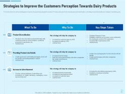
Slide 21: This slide shows Strategies to Improve the Customers Perception Towards Dairy Products.
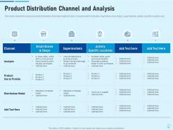
Slide 22: This slide displays the various product distribution channels related to dairy company which includes small stores and shops, supermarkets, activity specific locations etc.
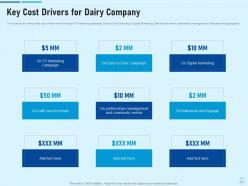
Slide 23: This slide shows Key Cost Drivers for Dairy Company.
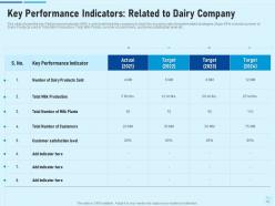
Slide 24: This slide displays Key Performance Indicators: Related to Dairy Company.
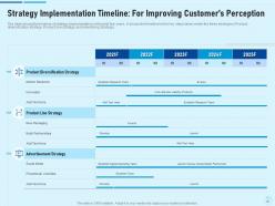
Slide 25: This slide presents Strategy Implementation Timeline: For Improving Customer’s Perception.
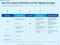
Slide 26: This slide shows Major Dairy Company Related Risk and Their Mitigation Strategies.
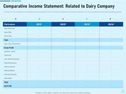
Slide 27: This slide displays Comparative Income Statement: Related to Dairy Company.
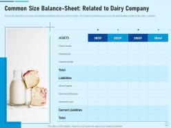
Slide 28: This slide shows Common Size Balance-Sheet: Related to Dairy Company.
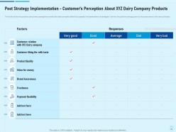
Slide 29: This slide displays Post Strategy Implementation - Customer’s Perception About XYZ Dairy Company Products.
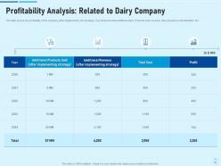
Slide 30: This slide presents Profitability Analysis: Related to Dairy Company.
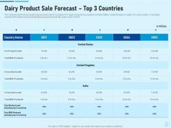
Slide 31: This slide shows Dairy Product Sale Forecast – Top 3 Countries.
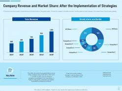
Slide 32: This slide represents Company Revenue and Market Share: After the Implementation of Strategies.
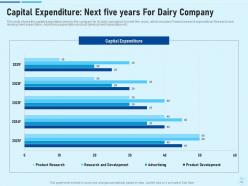
Slide 33: This slide displays Capital Expenditure: Next five years For Dairy Company.
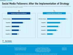
Slide 34: This slide shows Social Media Followers: After the Implementation of Strategy.
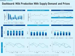
Slide 35: This slide presents Dashboard: Milk Production With Supply Demand and Prices.
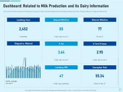
Slide 36: This slide represents the dashboard related to company’s milk production details which includes lactating cows' info, shipped milk/cow, metered milk/cow etc.
Slide 37: This slide displays Study on Customer Preference for Dairy Products Icons.
Slide 38: This slide is titled as Additional Slides for moving forward.
Slide 39: This is About Us slide to show company specifications etc.
Slide 40: This is Our Mission slide with related imagery and text.
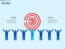
Slide 41: This is Our Goal slide. State your firm's goals here.
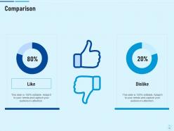
Slide 42: This is a Comparison slide to state comparison between commodities, entities etc.
Slide 43: This slide shows Venn diagram with text boxes.
Slide 44: This slide shows 30 60 90 Days Plan with text boxes.
Slide 45: This slide shows Puzzle with related icons and text.
Slide 46: This slide shows Post It Notes. Post your important notes here.
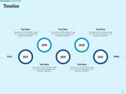
Slide 47: This is a Timeline slide. Show data related to time intervals here.
Slide 48: This is a Thank You slide with address, contact numbers and email address.
Study on customer preference for dairy products case competition powerpoint presentation slides with all 48 slides:
Use our Study On Customer Preference For Dairy Products Case Competition Powerpoint Presentation Slides to effectively help you save your valuable time. They are readymade to fit into any presentation structure.
-
Study on customer preference for dairy products case competition powerpoint presentation slides
-
Study on customer preference for dairy products case competition powerpoint presentation slides
-
Study on customer preference for dairy products case competition powerpoint presentation slides
-

Study on customer preference for dairy products case competition powerpoint presentation slides
-
Study on customer preference for dairy products case competition powerpoint presentation slides
-
Study on customer preference for dairy products case competition powerpoint presentation slides
-
Study on customer preference for dairy products case competition powerpoint presentation slides
-
Study on customer preference for dairy products case competition powerpoint presentation slides
-
Study on customer preference for dairy products case competition powerpoint presentation slides
-
Study on customer preference for dairy products case competition powerpoint presentation slides
-
Study on customer preference for dairy products case competition powerpoint presentation slides
-

Study on customer preference for dairy products case competition powerpoint presentation slides
-
Study on customer preference for dairy products case competition powerpoint presentation slides
-
Study on customer preference for dairy products case competition powerpoint presentation slides
-
Study on customer preference for dairy products case competition powerpoint presentation slides
-
Study on customer preference for dairy products case competition powerpoint presentation slides
-
Study on customer preference for dairy products case competition powerpoint presentation slides
-
Study on customer preference for dairy products case competition powerpoint presentation slides
-

Study on customer preference for dairy products case competition powerpoint presentation slides
-
Study on customer preference for dairy products case competition powerpoint presentation slides
-
Study on customer preference for dairy products case competition powerpoint presentation slides
-
Study on customer preference for dairy products case competition powerpoint presentation slides
-
Study on customer preference for dairy products case competition powerpoint presentation slides
-
Study on customer preference for dairy products case competition powerpoint presentation slides
-
Study on customer preference for dairy products case competition powerpoint presentation slides
-
Study on customer preference for dairy products case competition powerpoint presentation slides
-
Study on customer preference for dairy products case competition powerpoint presentation slides
-
Study on customer preference for dairy products case competition powerpoint presentation slides
-
Study on customer preference for dairy products case competition powerpoint presentation slides
-
Study on customer preference for dairy products case competition powerpoint presentation slides
-
Study on customer preference for dairy products case competition powerpoint presentation slides
-
Study on customer preference for dairy products case competition powerpoint presentation slides
-
Study on customer preference for dairy products case competition powerpoint presentation slides
-
Study on customer preference for dairy products case competition powerpoint presentation slides
-
Study on customer preference for dairy products case competition powerpoint presentation slides
-
Study on customer preference for dairy products case competition powerpoint presentation slides
-
Study on customer preference for dairy products case competition powerpoint presentation slides
-
Study on customer preference for dairy products case competition powerpoint presentation slides
-
Study on customer preference for dairy products case competition powerpoint presentation slides
-
Study on customer preference for dairy products case competition powerpoint presentation slides
-
Study on customer preference for dairy products case competition powerpoint presentation slides
-
Study on customer preference for dairy products case competition powerpoint presentation slides
-
Study on customer preference for dairy products case competition powerpoint presentation slides
-

Study on customer preference for dairy products case competition powerpoint presentation slides
-
Study on customer preference for dairy products case competition powerpoint presentation slides
-
Study on customer preference for dairy products case competition powerpoint presentation slides
-
Study on customer preference for dairy products case competition powerpoint presentation slides
-

Study on customer preference for dairy products case competition powerpoint presentation slides
FAQs for Study on customer preference for dairy products case competition
Honestly, visual appeal is everything - people want something that looks good without tons of work. But they still need to customize it for their brand, so flexibility matters too. Industry fit is crucial because imagine using some cute template for a board meeting lol. Also think about fonts that are actually readable and layouts that make sense when you're up there presenting. Oh and color schemes that won't clash with company colors. I'd focus on clean designs that work across multiple industries instead of getting too specific with niches.
Oh man, cultural stuff can totally make or break your designs. Colors are tricky - red means good luck in China but screams danger here. Reading patterns flip everything too since Middle Eastern folks read right-to-left. Even fonts hit different - some cultures love clean sans-serif while others want something fancier. I actually bombed once because my "minimal" design felt way too cold to the client. Research your audience first, obviously, but honestly? Just ask locals what they think during the process. Saves you from looking like an idiot later.
Honestly, I'd start with user surveys plus A/B testing real templates. Ask people about their specific use cases and what bugs them about current options. Here's the thing though - sometimes what people say they want is totally different from what they actually pick, so definitely look at your download data too. Focus groups could work but they're kind of a pain to organize. A simple survey asking about industry, how often they present, and their biggest template headaches should give you good starting insights. Oh and design preferences obviously - can't forget that part!
Just bake feedback collection right into your workflow - don't make it a separate thing. I'd start with simple thumbs up/down ratings since people actually use those. Also throw in quick surveys about what's frustrating users or what features they're missing. Pay attention to which templates people use most and where they bail out. Honestly, tracking abandonment spots tells you more than most surveys do. Then just fix the stuff that comes up repeatedly and affects the most people. Start with one feedback method though - you can always add more later once you see what works.
Oh totally, branding makes a huge difference with templates! People see a recognizable brand and instantly think "okay, this'll probably look professional." It's weird but true - I've watched friends pick Canva templates over cheaper options just because they trust the name. Your colors and fonts need to match across everything though, otherwise it looks sloppy. Think about how Microsoft templates just *feel* reliable, you know? That visual consistency becomes this mental shortcut when people are deciding. Just make sure whatever makes you different actually shows up in your design style.
Your customers are totally spoiled now - they want presentations that feel more like apps than slides. Mobile-friendly stuff, interactive dashboards, videos embedded right in there. Honestly, regular PowerPoint is starting to feel ancient to people. They expect real-time collaboration and everything to look perfect on their phone too. I'd probably start experimenting with some of the newer presentation tools out there. Ask your customers what they actually prefer though - their expectations change so fast it's hard to keep up. The Netflix effect is real, even for business presentations apparently!
Honestly, age is the biggest factor by far. Gen Z and millennials want interactive stuff with lots of visuals and quick pacing, while older professionals prefer the traditional structured approach they can follow step by step. Industry plays a role too - tech and creative people love flashy presentations, but try that in finance or legal and you'll get blank stares. Profession matters but it usually just mirrors the industry norms anyway. My advice? Just ask them beforehand what they prefer, or throw up a quick poll. Way easier than guessing wrong.
So everyone's obsessed with clean, minimal stuff now - bold fonts, tons of white space. Remember those awful cluttered PowerPoints from like 2015? Yeah, total opposite of that. Interactive elements are huge, plus smooth animations since people present on their phones constantly. Data viz is way more sophisticated too - think infographic-style charts instead of boring bar graphs. Oh, and storytelling templates are everywhere now, which actually makes sense since they walk you through a narrative instead of just info-dumping. Honestly? Ditch the bullet points and focus on visual hierarchy.
Honestly? Most people go for looks first - they want something that screams "professional" and fits their brand. But if it's a pain to customize or missing basic layouts, they're gone. Functionality is what actually closes the deal though. It's kinda like dating - initial attraction gets you in the door, but personality keeps you around. I'd say nail the visuals for your preview shots since that's what grabs attention. The backend stuff matters too, obviously, but lead with what looks good. People are visual creatures, even when they pretend they're not.
Start with audience segmentation - break people down by behavior, demographics, and what they've bought before. Here's the thing though: what people actually purchase vs what they say they want? Totally different sometimes. Use your data to spot those patterns. Email campaigns are honestly your best friend for this since you can personalize everything. Social media targeting gets super specific too - like, scary specific with interests and behaviors. Oh, and always test with smaller groups first! No point blowing your budget on something that might flop. Scale up whatever actually works.
Dude, people's attention spans are basically nonexistent now. Everyone wants bite-sized, visual stuff instead of those marathon PowerPoint sessions we used to sit through. Mobile viewing is everything since people are constantly on their phones - even during meetings, let's be real. Interactive features and real-time collaboration aren't just cool extras anymore, they're expected. Video integration too. Personalization is huge because nobody wants generic content. Oh, and AI tools are becoming standard pretty fast. My suggestion? Actually ask your audience what they prefer and test different formats. What worked last year probably doesn't anymore.
So you basically want to track what users are actually doing - their download patterns, which colors and layouts they're gravitating toward. Social media buzz helps too. The annoying thing is figuring out what's a real trend versus just some random template going viral for a week. I'd focus on engagement rates and how much time people spend tweaking templates. User feedback is gold for this stuff. Honestly, just start with dashboards for your top 10 categories and check monthly. You'll start seeing patterns pretty quick once you have that baseline data.
Ugh, choice paralysis is the worst part honestly. People scroll through like 500 templates and can't decide. Then they pick something that looks amazing but totally breaks when they dump in their actual messy data - not those perfect placeholder graphics, you know? Most templates are designed for some fancy boardroom pitch when really it's just Sarah updating the team on Q3 numbers. Super annoying. Smart filters help a ton though - filter by industry or audience size. Show them what templates actually look like with real content, not stock photos. Better to have 20 solid options than 200 mediocre ones.
Honestly, customizable templates win every single time. People will pick the flexible option over the prettier rigid one - it's not even close. You know that feeling when you find something that's *almost* perfect but you can't fix that one stupid thing that bugs you? Nobody wants that headache. Being able to tweak colors, fonts, layouts - that's what actually matters to customers because they need it to fit their brand. Also, modular designs just work better long-term anyway. So yeah, focus on flexibility over making it look perfect out of the box.
Okay so social proof is HUGE for template sales. People are terrified of picking something that'll make their presentation look amateur, you know? I always check reviews first too - straight to the comments! Testimonials give you that instant confidence boost when you see hundreds of positive ratings. Plus reviews tell you the real deal about whether a template actually works for sales vs academic stuff. Oh and here's the thing - customers absolutely rely on that feedback to figure out if it's worth buying. You should definitely be collecting reviews and putting them front and center on your site.
-
Excellent template with unique design.