


Estudio sobre la preferencia del cliente por los productos lácteos Presentación de Powerpoint de la competencia de casos Diapositivas




Try Before you Buy Download Free Sample Product
 Impress Your
 Audience
 100%
100% Editable
 Save Hours
 of Time


Los consumidores de hoy en día dan más importancia que nunca a la calidad de los alimentos, la seguridad de los alimentos y la calidad ambiental. En el mundo actual de competencia creciente, donde numerosas marcas venden los mismos productos, los consumidores tienen abundantes opciones y muchos factores diferentes afectan su comportamiento de compra. La percepción del consumidor hacia los productos lácteos puede ser positiva y negativa, las cuales se ven afectadas por las estrategias de la empresa. Consulte nuestra plantilla diseñada profesionalmente sobre el Estudio de la preferencia del cliente por los productos lácteos para ayudarlo a estudiar los diversos problemas que enfrenta y las soluciones para superarlos. Esto ayudará a las empresas a identificar las nuevas estrategias, recomendaciones y soluciones para superar los desafíos, es decir, la disminución de las ventas de productos lácteos debido al cambio en la percepción de los clientes hacia los productos lácteos. Estas estrategias podrían ayudar a la empresa a cambiar positivamente la percepción de los clientes hacia los productos lácteos y ayudar a impulsar las ventas. El objetivo principal de esta propuesta es analizar las razones detrás de la disminución de las ventas de productos lácteos e identificar las estrategias clave para cambiar la percepción de los clientes sobre los productos lácteos. También cubre los pronósticos financieros con pronósticos de ventas de productos lácteos para los próximos cinco años y tableros relacionados con las empresas lácteas. Hable con nuestros expertos para todas sus consultas y acceda a la plantilla 100 por ciento editable en Estudio sobre las preferencias del cliente para productos lácteos. Descárguelo ahora.
People who downloaded this PowerPoint presentation also viewed the following :
Contenido de esta presentación de Powerpoint
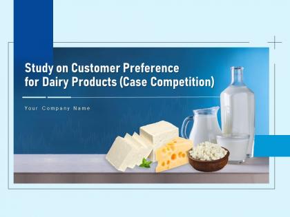
Diapositiva 1 : Esta diapositiva presenta el Estudio sobre la preferencia del cliente por los productos lácteos. Indique el nombre de su empresa y comience.
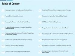
Diapositiva 2 : esta diapositiva muestra la tabla de contenido de la presentación.
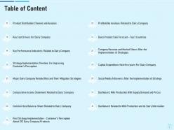
Diapositiva 3 : Esta es otra diapositiva que continúa con la Tabla de contenido.
Diapositiva 4 : Esta diapositiva muestra la introducción de la empresa con sus operaciones detalladas y su visión.
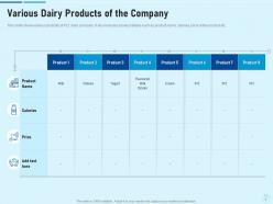
Diapositiva 5 : Esta diapositiva presenta varios productos lácteos de la empresa.
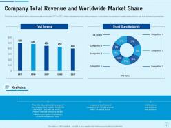
Diapositiva 6 : esta diapositiva muestra los ingresos totales de la empresa y la cuota de mercado mundial.
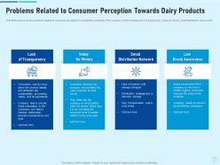
Diapositiva 7 : Esta diapositiva muestra problemas relacionados con la percepción del consumidor hacia los productos lácteos.
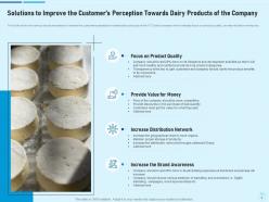
Diapositiva 8 : Esta diapositiva muestra Soluciones para Mejorar la Percepción del Cliente Hacia los Productos Lácteos de la Empresa.
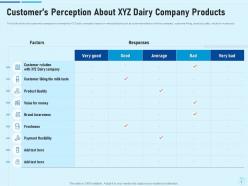
Diapositiva 9 : Esta diapositiva presenta la percepción del cliente sobre los productos de la empresa láctea XYZ.
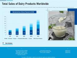
Diapositiva 10 : Esta diapositiva muestra las ventas totales de productos lácteos en todo el mundo.
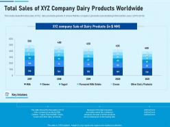
Diapositiva 11 : Esta diapositiva muestra las ventas totales de productos lácteos XYZ a nivel mundial.
Diapositiva 12 : Esta diapositiva muestra Seguidores en redes sociales: antes de la implementación de estrategias.
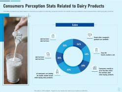
Diapositiva 13 : Esta diapositiva proporciona las estadísticas clave relacionadas con la percepción de los consumidores sobre los productos lácteos.
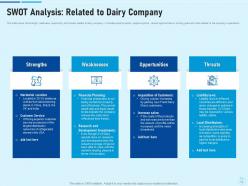
Diapositiva 14 : Esta diapositiva muestra la fortaleza, la debilidad, la oportunidad y las amenazas relacionadas con la empresa láctea.
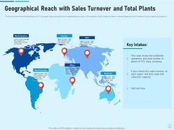
Diapositiva 15 : esta diapositiva presenta el alcance geográfico con la rotación de ventas y las plantas totales.
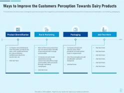
Diapositiva 16 : Esta diapositiva muestra formas de mejorar la percepción de los clientes hacia los productos lácteos.
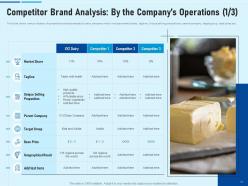
Diapositiva 17 : esta diapositiva muestra varios factores de análisis competitivo relacionados con la empresa láctea, que incluyen participación de mercado, eslogan, propuestas de venta únicas, empresa matriz, grupo objetivo, precio base, etc.
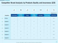
Diapositiva 18 : esta diapositiva muestra el análisis de la marca de la competencia: por calidad y conocimiento de los productos.
Diapositiva 19 : esta diapositiva muestra varios factores de análisis competitivo relacionados con la empresa láctea, que incluyen la administración, la estructura organizativa, el SKU más favorecido, las categorías de productos, el producto de mayor venta y muchos más.
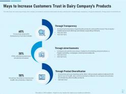
Diapositiva 20 : Esta diapositiva presenta formas de aumentar la confianza de los clientes en los productos de la empresa láctea.
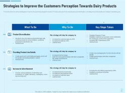
Diapositiva 21 : Esta diapositiva muestra estrategias para mejorar la percepción de los clientes hacia los productos lácteos.
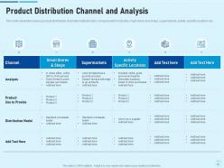
Diapositiva 22 : Esta diapositiva muestra los diversos canales de distribución de productos relacionados con la empresa láctea, que incluye pequeñas tiendas y comercios, supermercados, ubicaciones de actividades específicas, etc.
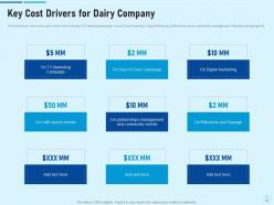
Diapositiva 23 : Esta diapositiva muestra los factores clave de costos para la empresa láctea.
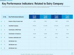
Diapositiva 24 : Esta diapositiva muestra Indicadores clave de rendimiento: relacionados con la empresa láctea.
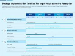
Diapositiva 25 : esta diapositiva presenta el cronograma de implementación de la estrategia: para mejorar la percepción del cliente.
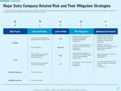
Diapositiva 26 : Esta diapositiva muestra el riesgo relacionado con las principales empresas de productos lácteos y sus estrategias de mitigación.
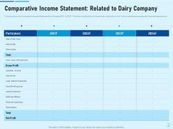
Diapositiva 27 : esta diapositiva muestra el estado de resultados comparativo: relacionado con la empresa de productos lácteos.
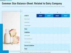
Diapositiva 28 : Esta diapositiva muestra el balance general de tamaño común: relacionado con la empresa láctea.
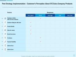
Diapositiva 29 : esta diapositiva muestra la implementación de la estrategia posterior: la percepción del cliente sobre los productos de la empresa láctea XYZ.
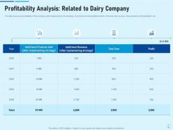
Diapositiva 30 : Esta diapositiva presenta el Análisis de rentabilidad: relacionado con la empresa láctea.
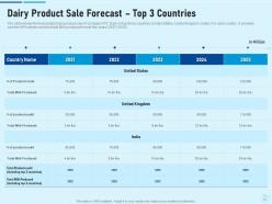
Diapositiva 31 : Esta diapositiva muestra el pronóstico de venta de productos lácteos: los 3 países principales.
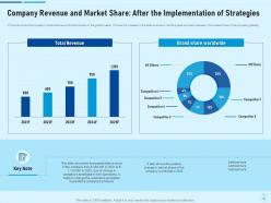
Diapositiva 32 : esta diapositiva representa los ingresos de la empresa y la participación de mercado: después de la implementación de estrategias.
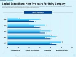
Diapositiva 33 : Esta diapositiva muestra Gastos de capital: Próximos cinco años para empresa láctea.
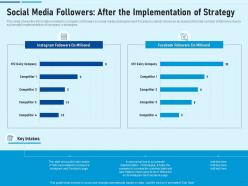
Diapositiva 34 : Esta diapositiva muestra Seguidores en las redes sociales: después de la implementación de la estrategia.
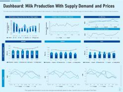
Diapositiva 35 : Esta diapositiva presenta el Tablero: Producción de leche con oferta, demanda y precios.
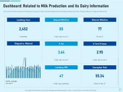
Diapositiva 36 : Esta diapositiva representa el tablero relacionado con los detalles de producción de leche de la empresa, que incluye información de vacas lactantes, leche/vaca enviada, leche/vaca medida, etc.
Diapositiva 37 : Esta diapositiva muestra el Estudio sobre la preferencia del cliente por los íconos de productos lácteos.
Diapositiva 38 : Esta diapositiva se titula Diapositivas adicionales para avanzar.
Diapositiva 39 : Esta es la diapositiva Acerca de nosotros para mostrar las especificaciones de la empresa, etc.
Diapositiva 40 : Esta es la diapositiva Nuestra misión con imágenes y texto relacionados.
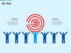
Diapositiva 41 : Esta es la diapositiva Nuestro objetivo. Indique los objetivos de su empresa aquí.
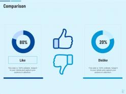
Diapositiva 42 : Esta es una diapositiva de comparación para establecer la comparación entre productos básicos, entidades, etc.
Diapositiva 43 : Esta diapositiva muestra el diagrama de Venn con cuadros de texto.
Diapositiva 44 : Esta diapositiva muestra el Plan de 30 60 90 días con cuadros de texto.
Diapositiva 45 : Esta diapositiva muestra Rompecabezas con íconos y texto relacionados.
Diapositiva 46 : Esta diapositiva muestra Post-It Notes. Publique sus notas importantes aquí.
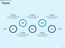
Diapositiva 47 : Esta es una diapositiva de la línea de tiempo. Mostrar datos relacionados con los intervalos de tiempo aquí.
Diapositiva 48 : Esta es una diapositiva de agradecimiento con dirección, números de contacto y dirección de correo electrónico.
Estudie sobre la preferencia del cliente por los productos lácteos Case Competition Diapositivas de presentación de Powerpoint con las 48 diapositivas:
Utilice nuestro Estudio sobre la preferencia del cliente por las diapositivas de presentación de Powerpoint de la competencia de casos de productos lácteos para ayudarlo a ahorrar su valioso tiempo de manera efectiva. Están listas para encajar en cualquier estructura de presentación.





FAQs for Study on customer preference for dairy products case competition
Honestly, visual appeal is everything - people want something that looks good without tons of work. But they still need to customize it for their brand, so flexibility matters too. Industry fit is crucial because imagine using some cute template for a board meeting lol. Also think about fonts that are actually readable and layouts that make sense when you're up there presenting. Oh and color schemes that won't clash with company colors. I'd focus on clean designs that work across multiple industries instead of getting too specific with niches.
Oh man, cultural stuff can totally make or break your designs. Colors are tricky - red means good luck in China but screams danger here. Reading patterns flip everything too since Middle Eastern folks read right-to-left. Even fonts hit different - some cultures love clean sans-serif while others want something fancier. I actually bombed once because my "minimal" design felt way too cold to the client. Research your audience first, obviously, but honestly? Just ask locals what they think during the process. Saves you from looking like an idiot later.
Honestly, I'd start with user surveys plus A/B testing real templates. Ask people about their specific use cases and what bugs them about current options. Here's the thing though - sometimes what people say they want is totally different from what they actually pick, so definitely look at your download data too. Focus groups could work but they're kind of a pain to organize. A simple survey asking about industry, how often they present, and their biggest template headaches should give you good starting insights. Oh and design preferences obviously - can't forget that part!
Just bake feedback collection right into your workflow - don't make it a separate thing. I'd start with simple thumbs up/down ratings since people actually use those. Also throw in quick surveys about what's frustrating users or what features they're missing. Pay attention to which templates people use most and where they bail out. Honestly, tracking abandonment spots tells you more than most surveys do. Then just fix the stuff that comes up repeatedly and affects the most people. Start with one feedback method though - you can always add more later once you see what works.
Oh totally, branding makes a huge difference with templates! People see a recognizable brand and instantly think "okay, this'll probably look professional." It's weird but true - I've watched friends pick Canva templates over cheaper options just because they trust the name. Your colors and fonts need to match across everything though, otherwise it looks sloppy. Think about how Microsoft templates just *feel* reliable, you know? That visual consistency becomes this mental shortcut when people are deciding. Just make sure whatever makes you different actually shows up in your design style.
Your customers are totally spoiled now - they want presentations that feel more like apps than slides. Mobile-friendly stuff, interactive dashboards, videos embedded right in there. Honestly, regular PowerPoint is starting to feel ancient to people. They expect real-time collaboration and everything to look perfect on their phone too. I'd probably start experimenting with some of the newer presentation tools out there. Ask your customers what they actually prefer though - their expectations change so fast it's hard to keep up. The Netflix effect is real, even for business presentations apparently!
Honestly, age is the biggest factor by far. Gen Z and millennials want interactive stuff with lots of visuals and quick pacing, while older professionals prefer the traditional structured approach they can follow step by step. Industry plays a role too - tech and creative people love flashy presentations, but try that in finance or legal and you'll get blank stares. Profession matters but it usually just mirrors the industry norms anyway. My advice? Just ask them beforehand what they prefer, or throw up a quick poll. Way easier than guessing wrong.
So everyone's obsessed with clean, minimal stuff now - bold fonts, tons of white space. Remember those awful cluttered PowerPoints from like 2015? Yeah, total opposite of that. Interactive elements are huge, plus smooth animations since people present on their phones constantly. Data viz is way more sophisticated too - think infographic-style charts instead of boring bar graphs. Oh, and storytelling templates are everywhere now, which actually makes sense since they walk you through a narrative instead of just info-dumping. Honestly? Ditch the bullet points and focus on visual hierarchy.
Honestly? Most people go for looks first - they want something that screams "professional" and fits their brand. But if it's a pain to customize or missing basic layouts, they're gone. Functionality is what actually closes the deal though. It's kinda like dating - initial attraction gets you in the door, but personality keeps you around. I'd say nail the visuals for your preview shots since that's what grabs attention. The backend stuff matters too, obviously, but lead with what looks good. People are visual creatures, even when they pretend they're not.
Start with audience segmentation - break people down by behavior, demographics, and what they've bought before. Here's the thing though: what people actually purchase vs what they say they want? Totally different sometimes. Use your data to spot those patterns. Email campaigns are honestly your best friend for this since you can personalize everything. Social media targeting gets super specific too - like, scary specific with interests and behaviors. Oh, and always test with smaller groups first! No point blowing your budget on something that might flop. Scale up whatever actually works.
Dude, people's attention spans are basically nonexistent now. Everyone wants bite-sized, visual stuff instead of those marathon PowerPoint sessions we used to sit through. Mobile viewing is everything since people are constantly on their phones - even during meetings, let's be real. Interactive features and real-time collaboration aren't just cool extras anymore, they're expected. Video integration too. Personalization is huge because nobody wants generic content. Oh, and AI tools are becoming standard pretty fast. My suggestion? Actually ask your audience what they prefer and test different formats. What worked last year probably doesn't anymore.
So you basically want to track what users are actually doing - their download patterns, which colors and layouts they're gravitating toward. Social media buzz helps too. The annoying thing is figuring out what's a real trend versus just some random template going viral for a week. I'd focus on engagement rates and how much time people spend tweaking templates. User feedback is gold for this stuff. Honestly, just start with dashboards for your top 10 categories and check monthly. You'll start seeing patterns pretty quick once you have that baseline data.
Ugh, choice paralysis is the worst part honestly. People scroll through like 500 templates and can't decide. Then they pick something that looks amazing but totally breaks when they dump in their actual messy data - not those perfect placeholder graphics, you know? Most templates are designed for some fancy boardroom pitch when really it's just Sarah updating the team on Q3 numbers. Super annoying. Smart filters help a ton though - filter by industry or audience size. Show them what templates actually look like with real content, not stock photos. Better to have 20 solid options than 200 mediocre ones.
Honestly, customizable templates win every single time. People will pick the flexible option over the prettier rigid one - it's not even close. You know that feeling when you find something that's *almost* perfect but you can't fix that one stupid thing that bugs you? Nobody wants that headache. Being able to tweak colors, fonts, layouts - that's what actually matters to customers because they need it to fit their brand. Also, modular designs just work better long-term anyway. So yeah, focus on flexibility over making it look perfect out of the box.
Okay so social proof is HUGE for template sales. People are terrified of picking something that'll make their presentation look amateur, you know? I always check reviews first too - straight to the comments! Testimonials give you that instant confidence boost when you see hundreds of positive ratings. Plus reviews tell you the real deal about whether a template actually works for sales vs academic stuff. Oh and here's the thing - customers absolutely rely on that feedback to figure out if it's worth buying. You should definitely be collecting reviews and putting them front and center on your site.
-
Excellent template with unique design.