


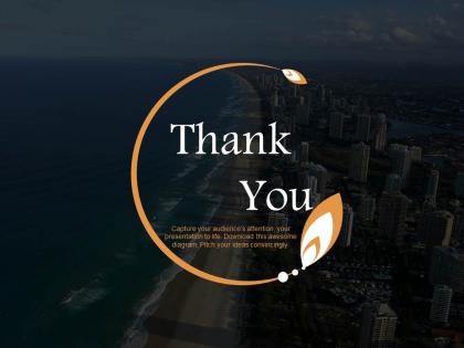
Obrigado, slide para apresentações de viagens e turismo




Try Before you Buy Download Free Sample Product
 Impress Your
 Audience
 100%
100% Editable
 Save Hours
 of Time


Você faz parte de uma agência de viagens e está procurando criar uma apresentação sobre isso? Se sim, então nosso slide de PowerPoint de agradecimento de viagem e turismo é perfeito para você. Este design maravilhoso de PPT permite que você agradeça aos seus clientes ou clientes da maneira mais eficaz. A personalização é necessária se você faz parte da indústria de atendimento ao cliente. Você precisa estar agradecido aos seus clientes por demonstrarem interesse em seus produtos ou serviços. Além das agências de viagens, o slide de apresentação também pode ser utilizado pelos clientes para agradecer à agência de viagens por fazer todos os arranjos para a sua viagem. Os depoimentos são importantes para o crescimento da organização, se você tiver clientes que estão agradecidos pelos seus serviços, então você pode pensar em sobreviver na indústria por um período mais longo. Então, deixe seus clientes ficarem gratos por seus valiosos comentários e os façam se sentir especiais com este design incrível. Melhore sua capacidade de prever eventos com nosso Slide de Agradecimento para Viagens e Turismo em Powerpoint.
People who downloaded this PowerPoint presentation also viewed the following :
Obrigado Viagem e Turismo Apresentação de slides do PowerPoint Todas as 5 slides
Nossos slides de agradecimento para apresentações de viagens e turismo são um investimento astuto. Ganhos abundantes são uma certeza.


FAQs for Thank you slide for travel and
Okay so you'll want a genuine message first - none of that corporate "thanks for choosing us" garbage. Grab those epic photos from their trip, like that sunset shot or the group pic at whatever landmark they hit. Personal touches are everything here, way better than generic stuff. Oh and definitely throw in your contact details plus maybe a discount code for next time? Design-wise, keep it clean but warm - you're going for "fond memories" vibes, not some stuffy brochure. The whole thing should feel like saying bye to a friend, not pushing another sale.
Honestly, photos make thank you slides so much better than boring text blocks. Use those amazing shots from your presentation – that Santorini sunset or the group pic at Machu Picchu. Group photos are actually perfect because they show real people having a blast. Toss your company logo in a corner somewhere, maybe add a QR code for feedback or contact stuff. Keep it clean but eye-catching, you know? I'd probably use a photo as the background with your thank you text overlaid in contrasting colors so it pops.
Honestly, go for colors that feel like actual vacation spots - sunset oranges with deep blues, or those earthy greens with cream. Blues and teals are solid choices too since they scream ocean vibes. Just don't make it look like some boring corporate presentation when it should feel fun! I'd pull colors straight from any destination photos you're using. Oh, and skip the harsh neons - they're way too jarring after people sat through your whole presentation. Keep text readable obviously, but warm colors will give people those good travel feels you want.
Okay so instead of the boring "thanks for booking with us" stuff, try sharing a quick story that actually means something. Like "When Sarah from Denver told us this trip helped her reconnect with her daughter after years apart, we remembered why we do this." Way more powerful, right? You could also pull from their actual trip - that sunset dinner they posted about or the local guide they loved. The whole point is making it feel real and personal. Honestly, most companies just send template garbage, so weaving their destination into a mini story about real impact will totally stand out. People remember stories way better than generic thank-yous anyway.
Honestly, just go with basic sans-serif fonts - Arial, Helvetica, Calibri. They're way more readable than anything fancy. I learned this the hard way when someone couldn't read my serif font from the back row once. Super awkward. Make your body text at least 24pt and headers 36pt or bigger. Oh, and don't forget about contrast between text and background colors. Here's what I always do: pull up the slide on my phone. If it looks good there, you're set. People view presentations on all sorts of screens these days.
So basically, you can't just copy-paste the same thank you slide everywhere. Japanese audiences want formal, understated stuff - no flashy graphics or over-the-top language. Americans? Go bold, be direct, they eat that up. Middle Eastern cultures appreciate the flowery, elaborate approach (like, really lean into it). Here's the thing though - most Asian cultures prefer thanking the whole group rather than calling out individuals. Western crowds don't mind personal shoutouts at all. You'll want to research your specific audience first because even within regions there's variation. Don't be lazy with your default template!
Honestly, photo collages work really well - like highlights from their actual trip or a map showing where they went. Makes it way more personal. A video message from those local guides they met would be amazing too, or maybe create a custom quote about their specific adventure. Some agencies do these animated journey paths that show the client's route, which looks pretty cool honestly. Oh, and throw in something unexpected! Maybe a discount for next time or a link to download any photos you snapped during the tour. Just don't make it feel like every other generic thank-you thing, you know?
Grab 2-3 short testimonials that cover different angles - like one about your guide, another about cool moments, and maybe one on value. Keep them super punchy, just one sentence each because honestly nobody's reading paragraphs on slides. Use real names and photos if you can - people can spot fake stock photos from a mile away and it kills trust. Put them somewhere prominent but don't let them steal thunder from your main thank you. Oh, and pick ones that mention stuff your audience literally just experienced on the tour. Creates that perfect "omg yes!" connection.
Your thank you slides need to match your brand - same logos, colors, fonts, all that stuff. Think of it as the last impression when customers are feeling good about you. If everything looks consistent from booking to the actual tour to this final slide, it builds trust. Plus it makes you look way more professional. Honestly, I've seen so many companies mess this up and it's such an easy win. When people see that cohesive look, they're more likely to book again or tell their friends. Just use the same brand guidelines you have for your website.
Honestly, just ask people what they think! Send out quick surveys after trips or check what they're saying on your social posts. Group photos usually hit different than discount codes - depends on your crowd though. Some people get super weird about fonts (ignore them mostly). Track which slides actually get people booking again - that's what matters. Try switching up photo layouts or testimonials based on feedback patterns. What made them feel good about the trip? Short surveys work better than long ones. Test different call-to-action buttons too. The slides that generate actual follow-up bookings? Those are your winners.
Keep it simple - your thank you slide shouldn't be a hot mess of text and random visuals. I've seen people cram their entire contact list, social media, AND a novel-length message on there. Big mistake. Pick one great photo from your actual trip instead of those cheesy stock images (seriously, why do people use generic handshake photos?). Your contact info should be readable, not microscopic. Add something personal about the journey, but keep it short. Oh, and test those QR codes beforehand - nothing's more awkward than broken links during your presentation.
Honestly, timing is everything here. Right after you thank them is perfect - they're still buzzing from the experience. I'd stick to 2-3 CTAs max because people's attention spans are basically nonexistent. Put your most important ask first, like "Book your next trip" or whatever drives revenue. Then maybe add "Leave us a review" and something fun like sharing pics with your hashtag. Make them stand out visually but don't go overboard with fancy buttons. Oh, and skip the corporate speak - keep it casual and focus on what's in it for them, not you.
Honestly, just use Canva - their travel templates are actually pretty good and you won't spend hours fiddling around. If you need something more custom though, Figma's where it's at, especially if other people are helping you design stuff. PowerPoint surprised me lately too, they've stepped up their game. Oh and Adobe Express has some gorgeous travel photos already loaded in, which is nice. I'd probably start with Canva's templates and tweak from there. Way easier than building something from nothing, and you'll be done in like 10 minutes instead of procrastinating for three hours like I always do.
Your thank you slide is the last impression clients get, so don't mess it up. Stick your logo in a top corner - visible but not fighting with your main text. Contact info needs to be big and readable. I can't tell you how many presentations I've seen where people squint at tiny phone numbers like they're reading an eye chart. Make your email and phone large enough that someone could snap a photo and actually use it later. This slide is basically your digital business card, so treat it that way.
Oh dude, you want to use actual photos from their trips - that's what makes people feel special. Like show them at that crazy viewpoint you recommended or trying local food. Airbnb nails this by creating little montages of guest moments with personal notes. Before/after shots work great too (nervous travelers turned into total adventurers lol). Honestly, skip the generic "thank you for choosing us" garbage. Real testimonials with their actual faces? Gold. Tour companies do this thing where they highlight specific memories from the trip. Just make it feel authentic, not like some template you found online.
-
Much better than the original! Thanks for the quick turnaround.
-
Top Quality presentations that are easily editable.