


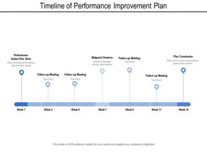
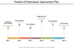
Timeline of performance improvement plan




Try Before you Buy Download Free Sample Product
 Impress Your
 Audience
 100%
100% Editable
 Save Hours
 of Time


Generate interest in your financial endeavour with our Timeline Of Performance Improvement Plan. Get investors going gung ho.
People who downloaded this PowerPoint presentation also viewed the following :
Timeline of performance improvement plan with all 6 slides:
You may have the best ideas but you may not be skilled to present it correctly. You can make use of our well designed Timeline Of Performance Improvement Plan to ensure you pass across the message correctly.


FAQs for Timeline of
Get your start and end dates locked down first. Space out your milestones evenly - don't cram everything together. Keep those descriptions super short or it'll look messy. Colors help a ton for grouping different event types or phases. Make sure people can actually read your font from however far they'll be standing (I've seen way too many tiny timeline disasters). Throw in a title and maybe a legend if you're using lots of categories. The whole point is making complicated stuff easy to scan quickly, so resist the urge to write paragraphs.
Honestly, good visual design is what separates boring timelines from ones people actually remember. I'd start by sketching it out on paper first - way easier than wrestling with software right away. Use consistent colors to group related stuff together, and definitely vary your fonts to show what's most important. White space is your friend here! Nobody wants to stare at cramped text. Throw in some icons or simple graphics too. The flow should be super obvious with arrows or connecting lines so people can scan it quickly and get the progression immediately. Trust me, anything beats those awful walls of text everyone seems to love.
Timeline JS is honestly your best bet - it's free and syncs with Google Sheets so you can just edit stuff without dealing with complicated interfaces. I probably wasted like 3 hours last week just messing around with Tiki-Toki's themes (they're actually pretty nice if you don't mind spending some money). Sutori and Preceden work well too, especially when you've got multiple people adding content. Adobe has timeline stuff if you're already using their products. But yeah, start with Timeline JS. You'll have something decent running in like 20 minutes.
Okay so colors totally change how people read your timeline. Warm ones like red and orange scream "urgent!" and grab attention for big milestones. Blues and greens feel calmer - perfect for showing steady progress or finished stuff. I made this mistake once where everything was red and it looked like the world was ending lol. Stick to a simple system - maybe green for done, yellow for working on it, red for delays. Three or four colors tops, otherwise it gets messy. Oh and definitely check if colorblind people can tell them apart!
Oh man, don't cram everything on there - it'll look like a mess. Pick consistent date formats and stick with them! The spacing thing trips people up too. And seriously, don't jump from tracking days to suddenly skipping decades, that's just confusing. Some events matter more than others, so make the big ones stand out visually. I always see timelines where everything looks identical and you can't tell what's actually important. Also explain why dates matter - context is everything. Keep colors simple and readable fonts only. Nobody's squinting at your timeline if they can't see it properly.
Timelines are honestly perfect for breaking down messy historical stuff. They show cause-and-effect way clearer than those giant blocks of text nobody wants to read. You'll see how everything connects - like with WWI, you can track how one political decision led to social changes, then major battles, all in order. The visual aspect just clicks better for most people. One thing I learned the hard way: if there's tons happening at once, organize by themes or regions. Otherwise it gets overwhelming fast. Works great for Civil Rights Movement too - you can follow parallel developments across different states while seeing the bigger picture unfold chronologically.
Icons are lifesavers for timelines - they cut through all the text clutter and show info at a glance. Different phases, milestones, team colors? Perfect for icons. One good icon beats a whole paragraph of explanation every time. Your stakeholders will actually want to look at it instead of glazing over. Just don't go crazy with them or you'll create a mess. Stick to one style throughout. I learned this the hard way when I made a timeline that looked like a kindergarten art project! Keep it simple and you're golden.
Think about what each group actually cares about first. Academics want all the nerdy details - methodologies, research phases, technical stuff. They're totally fine with longer timelines too, honestly they expect things to take forever. But executives? They want the big picture deliverables and firm dates, period. So your academic timeline might say "data collection phase" while the corporate one just says "market research done." Business folks also need to see budget impact and contingency plans upfront. I usually start with one detailed version then strip out the technical jargon for the corporate crowd. Works way better than trying to make one timeline fit everyone.
So horizontal timelines are perfect when you've got tons of events or need to show detailed stuff happening over time. Way easier to read left-to-right, plus they don't get all squished together like vertical ones sometimes do. But vertical timelines? They're actually amazing for storytelling - like when you're showing company milestones or someone's career journey. Mobile screens work way better with vertical layouts too, honestly. I'd go horizontal if you're dealing with lots of data and dates. Vertical if you want that flowing narrative vibe. When in doubt, just mock up both real quick!
Match your visuals to specific moments instead of just throwing them everywhere. Photos from actual events work great, or charts when you're showing data. Honestly, variety makes such a huge difference - I've seen boring timelines come alive just from mixing up the media types. Keep file sizes small so nothing takes forever to load. Maybe use thumbnails people can click to expand? Each piece should actually illustrate something, not just look pretty. Oh and definitely test everything first - there's nothing worse than broken media during a presentation.
Honestly, timelines are clutch for project presentations. You can map out phases, milestones, deadlines - all that stuff. Executive summaries especially benefit since stakeholders get the "when things happen" picture instantly. I'm always throwing them into kickoff meetings because it stops those annoying "wait, when's this due again?" questions later. Progress updates work great too, plus you can spot bottlenecks before they wreck your schedule. Way better than boring bullet points with dates. Oh, and comparing planned vs actual delivery? Game changer for lessons learned. Start big picture with major milestones, then drill down into details.
Honestly, there's so much you can do besides just listing dates! I've seen people make these cool visual roadmaps that branch off when they switched careers. Some build interactive timelines on their websites where you click through different phases - way more engaging than a boring resume. Oh, and I love the subway map style infographics. Video works great too if you're comfortable on camera. Personal websites with scrolling timelines are huge right now - you can throw in photos, projects, all that good stuff. Just think about where you're sharing it first. LinkedIn calls for something cleaner, but your own portfolio? Go wild with it.
Ugh, text-heavy timelines are the worst - nobody wants to read through all that. Visual stuff makes it way easier to scan. Color coding works great for different event types, and you can play with bar sizes or bubbles to show how long things lasted or how important they were. Icons help too, obviously. For project stuff, Gantt charts are honestly perfect (I use them all the time). Interactive features are clutch - let people zoom in or filter things so they're not drowning in details. Just pick whatever visual approach actually fits your timeline's goal and who's gonna be looking at it.
Dude, everyone's obsessed with interactive timelines now. People want to zoom in, click around, and actually explore stuff instead of just staring at boring static dates. Videos and animations are everywhere - makes the whole thing feel way more engaging. Oh, and definitely go vertical since we're all doom-scrolling on our phones anyway lol. The coolest part? Users can filter by categories or build their own custom views. Honestly feels like we're finally catching up to what people actually want. Just make sure it works well on mobile first - that's where most people will see it.
Look, feedback seriously changes everything about how you design timelines. People get confused by branching stuff? Strip it down and make your hierarchy super obvious. Can't see how events connect? Add more visual links between things. Honestly, the pacing feedback hits different though - some crowds want to dive deep into certain eras while others just want the quick version. Watch where they zone out or start asking tons of questions. That's your goldmine right there. Then you can totally flip your structure around and focus on what actually grabs them. It's wild how much better presentations get when you listen.
No Reviews