

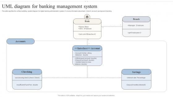
UML Diagram For Banking Management System




Try Before you Buy Download Free Sample Product
 Impress Your
Audience
 100%
Editable
 Save Hours
of Time


This slide signifies the unifies modelling system diagram for digital banking administration system. It covers information about bank, branch, account, savings and checking
People who downloaded this PowerPoint presentation also viewed the following :
UML Diagram For Banking Management System with all 6 slides:
Use our UML Diagram For Banking Management System to effectively help you save your valuable time. They are readymade to fit into any presentation structure.






FAQs for UML Diagram For
So basically you've got classes (those rectangle boxes), relationships between them, and the attributes/methods inside each class. The rectangles are split into three parts - name on top, then attributes, methods at the bottom. Different arrows and lines show how everything connects, like inheritance or associations. Honestly the arrow symbols are kind of a pain to memorize at first. You'll also see numbers like "1..*" that tell you how many objects can relate to each other. My advice? Just start with simple boxes and basic connections - don't overthink it initially.
Honestly, UML diagrams are kind of a game changer for getting everyone on the same page. Business people can finally see how users actually move through the system instead of just hearing tech speak. Developers get their blueprint. Testers spot weird edge cases right away - I've seen this save so much time. Everyone's looking at the same visual, so there's way less "wait, I thought you meant..." moments. Oh, and sketching a quick use case diagram in meetings works way better than talking through everything. Trust me on that one.
So class diagrams are like blueprints - they show what classes you've got, their attributes, methods, and how they connect. Static stuff basically. Sequence diagrams are way different though. They map out how your objects actually talk to each other when something happens, like step by step through a process. I usually think of it as class diagrams = "what exists" and sequence diagrams = "what happens when." You'll want class diagrams for planning your overall structure, but sequence diagrams are clutch when you need to trace through how a specific feature actually works. Makes debugging so much easier too.
Honestly, break out use case diagrams right at the start when you're trying to figure out what users actually need to do. Perfect for client meetings since they're visual and people won't glaze over like they do with other UML stuff. I always sketch one when someone goes "okay but what can users actually do with this thing?" They're great for catching missing features early and having those awkward scope conversations. Plus stakeholders can actually read them - which is rare for technical diagrams. Basically anytime you need to map user interactions before diving into code.
Honestly, UML diagrams work great with agile if you keep them simple. During sprint planning, just sketch out some class or sequence diagrams - helps everyone get on the same page about architecture stuff. Don't go overboard with documentation though. Nobody reads that anyway. They're really clutch for those messy user stories where you've got tons of components talking to each other. Just update them as things change (which they will). Oh, and try using them in retrospectives to map out where your technical debt is piling up. Makes those conversations way more productive.
Honestly, I'd just start with Draw.io - it's free and runs in your browser, so zero hassle. Lucidchart's really solid if you need your team collaborating on stuff together (the real-time editing is pretty smooth). Visual Paradigm gets into more advanced territory if you're doing complex modeling. Then there's Enterprise Architect which is like... the full enterprise beast, but probably overkill unless you're at a huge company. I mean, Draw.io handles most things just fine. But if you're presenting to clients or whatever, Lucidchart's paid version looks way more professional.
So state diagrams are all about tracking what condition something's in - like is the user logged out, logging in, or already logged in? Activity diagrams are different. They map out step-by-step workflows from beginning to end. I always think of it this way: state diagrams ask "what's the current status?" while activity diagrams ask "what happens next in this process?" You'll want state diagrams when you're modeling object behavior. Activity diagrams work way better for stuff like order processing or deployment flows - honestly anything with a clear sequence of steps.
UML diagrams are like visual maps for your code - way better than explaining everything with words. Class diagrams show your data structure, sequence diagrams map out how components interact, and deployment diagrams reveal where stuff actually runs. They're clutch for code reviews and getting new people up to speed. Plus your stakeholders can finally see what you're building without glazing over. Honestly, I wish more teams used them - saves so many "wait, why did we do it this way?" conversations. Just pick one or two types that solve your biggest headaches first.
UML diagrams are honestly a game-changer for catching design problems early. You can actually see where your architecture falls apart instead of just guessing. Map out your classes and how they talk to each other - weird dependencies become super obvious. I always start with use case diagrams to make sure I'm not building the wrong thing entirely. Then dive into sequence diagrams. They'll show you bottlenecks you'd never think of otherwise. Plus stakeholders can actually understand the visual stuff and catch business logic mistakes. Way better than trying to explain everything in meetings that drag on forever.
Honestly, the biggest thing is avoiding spaghetti diagrams - those crossed lines will drive you insane. Use consistent naming and give everything room to breathe. Don't try cramming your entire system into one diagram either, that's a nightmare to read. Break complex stuff into smaller, focused views instead. Related components should be grouped together, obviously. Pick the right diagram type for what you're showing too. I always start with the main flow, then layer in details after. If someone stares at your diagram for more than 30 seconds looking confused, you've overcomplicated it.
Start with use case diagrams when you're gathering requirements - they help map what users actually want. Then during design, I always do class and sequence diagrams to figure out the architecture stuff. Seriously saves me hours of debugging headaches down the road! Activity diagrams work great for messy workflows, and deployment diagrams... well, those are clutch for infrastructure planning. Don't treat them like homework you finish once though. Keep updating as your code changes - they're supposed to evolve with your project. Pick the right diagram for each phase instead of going crazy with all of them everywhere.
Yeah totally! UML isn't just for coding stuff. I've seen people map out manufacturing workflows with activity diagrams, and use case diagrams work pretty well for service design too. Even organizational charts can benefit from the relationship modeling approach. The trick is not getting caught up in the technical jargon - just focus on how things connect and interact. Activity diagrams are probably your best bet to start with since they're more intuitive for non-tech projects. Class diagrams can work for database planning, though that's still kinda techy I guess. But honestly, once you get the hang of it, you'll find ways to use them everywhere.
Dude, automating UML from code is a game changer - saves so much time. Your diagrams actually stay synced with what the code looks like right now, not whatever ancient version exists in some dusty wiki. Nobody ever updates those manually anyway because it's such a tedious pain. I learned this the hard way on my last project. You can generate different views for different people without redrawing the whole thing each time. Set it up in your CI pipeline so it auto-updates when stuff gets merged. Trust me on this one.
Honestly? Just start with class diagrams - they're way easier since your students probably get OOP already. Don't throw all 14 types at them right away or you'll lose half the class. Stick to the big three: class, sequence, and use case diagrams. Real examples work so much better than boring theoretical stuff. Library systems, shopping carts - things they actually use. Make them sketch by hand first before touching any software. Lucidchart's great but later. Oh, and tons of practice with simple stuff before you complicate things. Build that confidence first, then expand from there. Trust me on this one.
Yeah, UML's gotten way more chill lately. Most teams just do quick sequence diagrams or class diagrams now - none of that heavy documentation stuff from before. PlantUML and Mermaid are pretty sweet because you can actually version control your diagrams with your code (took long enough, right?). There's this cool thing happening where diagrams just generate themselves from code annotations too. Honestly, that old approach of planning every diagram upfront? Dead. Just make the diagrams that help your team talk through problems and keep them somewhat updated. Oh, and don't go overboard - I've seen people waste weeks on diagrams nobody looks at.
-
World-class PowerPoint designs that are fully customizable!
-
A beautiful, professional design paired with high-quality images and content that is sure to impress. It is a must-use PPT template in my opinion.