

User Interface Design Proposal Powerpoint Presentation Slides




Try Before you Buy Download Free Sample Product
 Impress Your
 Audience
 100%
100% Editable
 Save Hours
 of Time


The competition is increasing every day, and corporations are striving hard to please the customers with the best products and a smooth user experience. That is what user interface design is for. In short, user interface design is all about improving usability and providing a seamless user experience while using an app or website. A website that is easy to navigate helps users understand your products and services better. Assist your customers in gaining a competitive edge by employing our User Interface Design Proposal PowerPoint Presentation Slides and captivate your viewer's attention. Explain the importance of UI/UX design and its benefits with our content-ready Command line interface PowerPoint theme. Provide expert services to your clients with our explicitly-designed cover letter and help them develop an easy-to-navigate mobile app. Label down the sections of your proposal in the table of contents slide. Take the help of our readily available Menu-driven interface PowerPoint theme to outline project goals and objectives distinctively. Analyze user feedback to understand the shortcomings of UI design of the mobile app and then highlight the plan of action accordingly, such as project initiation, design, testing, and development support. With the help of our topic-specific graphical user interface PPT theme, provide a detailed account of the scope of services such as research, UI/UX flow charts, app screen wireframes, initial mockups, and interactive prototype. Showcase the activities completion time by utilizing our innovatively-built time frame slide. Mention the additional services provided by your company for clients' convenience like website designing, logo designing, game development, and augmented reality. Showcase your financial chart to discuss the cost finalized for each activity. Convince your clients and put a better impression on them by sharing your reviews and testimonials. Help your customers know your company better by sharing your company’s history and introducing your team members.
People who downloaded this PowerPoint presentation also viewed the following :
Content of this Powerpoint Presentation
Slide 1: This slide introduces User Interface Design Proposal. Mention Client name, Submission date, User assigned.
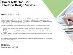
Slide 2: This slide displays Cover Letter.
Slide 3: This slide displays Table of Contents.
Slide 4: This slide displays Table of Content contaning- Project Context and Objectives.
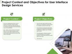
Slide 5: This slide describes Project Context and Objectives.
Slide 6: This slide displays Table of Content contaning Our Process, Plan of Action, Scope of Services, Time Frame, Additional Service Offerings.
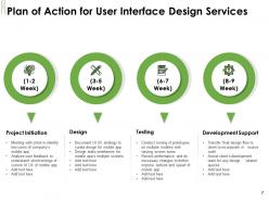
Slide 7: This slide showcases Plan of Action.
Slide 8: This slide shows Scope for User Interface Design Proposal.
Slide 9: This slide depicts Timeframe for User Interface Design Proposal.
Slide 10: This slide displays Additional Service Offerings for User Interface Design Proposal.
Slide 11: This slide displays Table of Content with- Investment, Your Investment.
Slide 12: This slide represents Investment details.
Slide 13: This slide represents Investment details.
Slide 14: This slide also represents Investment details.
Slide 15: This slide showcases Table of Content with- Company Overview, Why Us, About Us, Awards and Recognition, Our Team.
Slide 16: This is About Us slide to showcase Company specifications.
Slide 17: This slide showcases Awards for User Interface Design Services.
Slide 18: This is Our Team slide with Names and Designations.
Slide 19: This is Our Team slide with Names and Designations.
Slide 20: This slide showcases Our Past Experience with- Client Testimonials, Case Study.
Slide 21: This slide displays Client Testimonials for User Interface Design Services.
Slide 22: This slide displays Client Testimonials for User Interface Design Services.
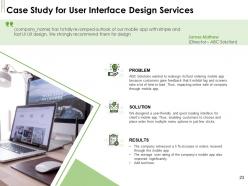
Slide 23: This slide showcases Case Study for User Interface Design Services
Slide 24: This slide displays Statement of Work and Contract.
Slide 25: This slide displays Statement of Work and User Interface Design Services
Slide 26: This slide depicts Next Steps.
Slide 27: This slide showcases Next Steps for User Interface Design Services
Slide 28: This is Contact Us for User Interface Design Services.
Slide 29: This is User Interface Design Proposal Icons Slide.
Slide 30: This slide is titled as Additional Slides for moving forward.
Slide 31: This is About Us slide to showcase Company specifications.
Slide 32: This is 30 60 90 Days Plan slide.
Slide 33: This slide displays Timeline for User Interface Design Proposal
Slide 34: This slide depicts Roadmap process.
User Interface Design Proposal Powerpoint Presentation Slides with all 34 slides:
Use our User Interface Design Proposal Powerpoint Presentation Slides to effectively help you save your valuable time. They are readymade to fit into any presentation structure.
-
User Interface Design Proposal
-
Cover Letter for User Interface Design Services
-
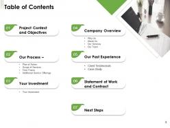
Table of Contents
-
Project Context and Objectives
-
Project Context and Objectives for User Interface Design Services
-
Our Process Plan of Action Scope of Services Time Frame Additional Service Offerings
-
Plan of Action for User Interface Design Services
-
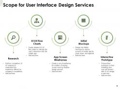
Scope for User Interface Design Services
-
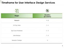
Timeframe for User Interface Design Services
-
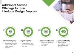
Additional Service Offerings for User Interface Design Proposal
-
Investment
-
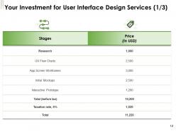
Your Investment for User Interface Design Services 1 3
-
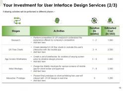
Your Investment for User Interface Design Services 2 3
-
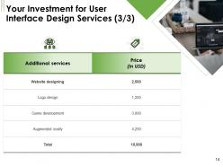
Your Investment for User Interface Design Services 3 3
-
Company Overview
-
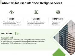
About Us for User Interface Design Services
-
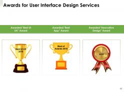
Awards for User Interface Design Services
-
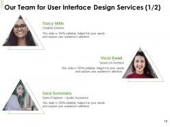
Our Team for User Interface Design Services 1 2
-
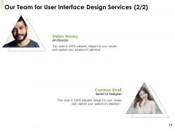
Our Team for User Interface Design Services 2 2
-
Our Past Experience
-
Client Testimonials for User Interface Design Services 1 2
-
Client Testimonials for User Interface Design Services 2 2
-
Case Study for User Interface Design Services
-
Statement of Work and Contract
-
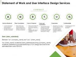
Statement of Work and User Interface Design Services
-
Next Steps
-
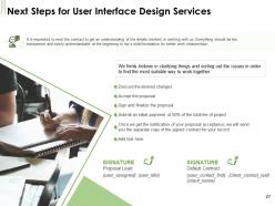
Next Steps for User Interface Design Services
-
Contact Us for User Interface Design Services
-
User Interface Design Proposal Icons Slide
-
Additional Slides
-
About Us for User Interface Design Proposal
-
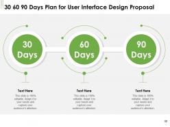
30 60 90 Days Plan for User Interface Design Proposal
-
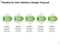
Timeline for User Interface Design Proposal
-
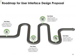
Roadmap for User Interface Design Proposal
FAQs for User Interface Design Proposal
Honestly, focus on three big things: consistency, simplicity, and feedback. Your interface should work the same way everywhere - users hate surprises. Keep it simple (I can't stress this enough). Always show what's happening when someone clicks or taps something. Visual hierarchy is huge too. Guide people's eyes to the important stuff first. Don't forget mobile and accessibility - that's just basic now. Error messages should actually help, not just say "something went wrong" like it's 1999. Quick tip: audit what you have now against these ideas. You'll find obvious fixes immediately.
So you know how most designers just make stuff that looks pretty? User-centered design is totally different - you actually figure out how people think first. Map out their goals and behaviors before you touch anything visual. Put navigation where they'd naturally look for it, organize info the way their brain works. Honestly, way too many teams just wing it without doing user research (huge mistake). The whole layout should reduce mental effort, not show off your fancy design chops. Short version: understand your users' flows, then design around that. Makes everything click better.
Colors are basically mind tricks for your users. Red screams urgency - perfect for errors or "buy now" buttons. Blue makes people trust you (every bank ever uses it). Green means success or growth, orange gets people clicking. You wouldn't catch McDonald's using boring gray for a reason, you know? Pick colors based on what emotions you're going for. Want users calm? Don't blast them with neon yellow. Figure out the vibe first, then choose your palette. It's honestly crazy how much a simple color change can affect whether someone actually uses your app or bounces immediately.
Oh man, typography is huge for UX! Bad fonts will literally make people bounce from your site because they can't read anything properly. Good typography though? It guides users exactly where you want them to go. The emotional vibe matters too - Comic Sans hits different than Times New Roman, you know? Size and spacing are accessibility game-changers. Some people genuinely can't use your product if the text is tiny or there's no contrast. I always start with super readable fonts first, then test on different devices. Honestly, I've seen beautiful designs fail just because nobody could read the damn text.
Accessibility guidelines make you step outside your own bubble when designing stuff. At first it feels like a pain - checking color contrast, making sure keyboard navigation works, thinking about screen readers. But honestly? It ends up making everything cleaner and more intuitive. Better hierarchy, simpler layouts that actually work for everyone. I always tell people to start with contrast ratios and keyboard functionality first. Those two will solve like 80% of your problems right there. Plus your regular users will thank you too since the interface just flows better.
Dude, cramming too much stuff on one screen is the worst mistake I see. Also inconsistent navigation - like why does the menu work differently on every page? Makes zero sense. Small text that's impossible to read will kill your user experience, and honestly, putting delete buttons right next to save buttons without making them look different is just cruel. Don't bury important features three menus deep either. Oh, and loading screens matter more than you'd think. Test it with real people though - you're gonna miss obvious problems when you've been staring at the same design for weeks.
Honestly, user feedback is like a cheat sheet for fixing your UI. Grab it from usability tests, surveys, analytics - or just watch people get frustrated with your design (brutal but so helpful). Pattern spotting is where the magic happens - find those common complaints and drop-off spots, then hit those first. Oh, and don't forget to actually close the loop! Make your fixes, then test them again with real users. I'd say pick your worst three pain points and crush those before you even think about the fancy stuff. Short bursts work better than trying to fix everything at once.
Honestly, consistency is everything for UI. Users get confused when buttons look different on every page or your navigation keeps moving around. Think about it - you want people to build that muscle memory so they're not hunting for stuff every time. Short sentences work. But when your colors, fonts, and layouts follow the same rules throughout, users can actually focus on getting things done instead of figuring out how your interface works. Makes you look way more professional too. I'd start with a basic style guide covering your main elements and then just... don't break your own rules, even when you're tempted to.
Dude, mobile design is a total mindset shift. Start with the tiniest screen and build up - trust me on this one. Everything's gotta be thumb-friendly now, so buttons need to be huge compared to desktop. Your fancy navigation? It's becoming a hamburger menu whether you like it or not. Screen space is so limited that you'll ruthlessly cut features you thought were "essential." I remember spending hours perfecting hover effects that obviously don't work on touch screens anyway. Focus hard on what users actually need because there's nowhere to hide fluff. Content hierarchy becomes make-or-break since users are scrolling with their thumbs while walking or whatever.
So many cool things happening in UI design right now! Design systems are making it way less painful to keep everything consistent across teams. Figma's AI features are honestly kind of mind-blowing - they're cranking out wireframes and ideas super fast. Voice and gesture stuff is getting big too, which is cool but also kinda makes me wonder if we'll all be waving at our screens soon lol. Progressive web apps are basically making web feel native now. Oh and responsive frameworks obviously help with the whole "works on everything" thing. I'd mess around with the AI design tools first - biggest time saver for sure.
Honestly, prototyping tools are a game changer. They let you test ideas without building the actual expensive thing first. Quick mockups help you spot usability problems early - way cheaper to fix then than later. When stakeholders can actually click through something instead of staring at boring wireframes, they finally understand what you're going for. Figma and Framer are solid for simulating real app behavior. You can gather user feedback and iterate super fast. Trust me, you'll thank yourself later because you won't be stuck in endless revision cycles after launch.
Honestly, the biggest trends I'm seeing are AI-driven personalization and spatial design for AR/VR stuff. Voice and gesture controls don't suck anymore, which is nice. Everyone's also going crazy for "digital wellness" features - you know, focus modes and usage tracking built right in. Dark modes and energy-efficient animations are pretty much expected now too. Oh, and conversational UI patterns are everywhere. If I were you, I'd mess around with AI personalization first since that's probably where you'll get the most bang for your buck. The wellness thing feels a bit trendy but it's not going anywhere.
Oh man, culture affects UI design way more than you'd think. Western users scan left-to-right, but Arabic users go the opposite direction - completely flips your whole layout strategy. Colors are tricky too since red screams "danger" here but means good luck in China. Some cultures actually prefer cramped, info-heavy screens while others need tons of breathing room (wild, right?). My advice? Research your target markets super early and test with real users from those areas. Don't just assume your design will magically work everywhere - learned that one the hard way.
Honestly, I'd start with task completion rate - super straightforward and if people can't even finish what they came to do, nothing else matters. Time-on-task and error frequency are solid too for spotting where things go wrong. Heat maps are actually amazing for this stuff, you can literally see where users get confused and start clicking random things. User satisfaction scores help but they're kinda subjective sometimes. Oh and conversion rates obviously matter if you're trying to get people to buy something or sign up. Session recordings are clutch too - watching someone struggle through your interface is pretty eye-opening.
Honestly, it's about treating your users like they're going through an actual story. Map out their journey - where do they start? What problems hit them? How does your app help them win? Your onboarding should feel like opening chapters, not just boring steps. Progress bars become "hey, you're getting somewhere!" moments. Even tiny text can have personality instead of sounding corporate and bland. The real trick is nailing their emotional journey. I'd start small though - pick one user flow and figure out where you can sprinkle in some narrative magic. Microcopy is probably the easiest place to begin.
-
Visually stunning presentation, love the content.
-
Excellent products for quick understanding.
-
Excellent products for quick understanding.
-
Informative design.
-
Innovative and Colorful designs.