

User Onboarding Process Flow Chart




Try Before you Buy Download Free Sample Product
 Impress Your
Audience
 100%
Editable
 Save Hours
of Time


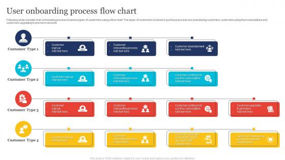
Following slide consists of an onboarding process of various types of customers using a flow chart. The types of customers involved in purchase process are abandoning customers, customers using free subscriptions and customers upgrading to premium versions
People who downloaded this PowerPoint presentation also viewed the following :
User Onboarding Process Flow Chart with all 6 slides:
Use our User Onboarding Process Flow Chart to effectively help you save your valuable time. They are readymade to fit into any presentation structure.


FAQs for User Onboarding
Honestly, it's all about getting rid of friction while making people feel confident. Show your value upfront - don't make them guess what you're about. Then guide them to that first win super fast, whether it's finishing their profile or whatever action actually matters for your app. I'd skip the long tutorials though, nobody reads those anyway. Instead, give little hints right when they need them. Oh and don't blast them with every feature at once - that's just overwhelming. You want them hitting their "aha moment" quickly, then they'll stick around. Give them ways to skip stuff or get help if they're stuck.
Templates are honestly a lifesaver for onboarding presentations. You're not starting from zero each time, which is huge. Focus on customizing the actual content instead of worrying about design consistency. Users get a logical flow too - intro, main features, what's next. That structure keeps people from getting overwhelmed (learned this the hard way). I'd start with maybe 3-4 basic template slides, then swap out the middle sections depending on who you're presenting to. Everything looks way more professional when it matches your branding. Takes the guesswork out of it.
Oh man, the worst thing you can do is dump everything on users right away. They'll bounce so fast. Skip asking for personal info until they actually see why your app matters. Those tooltip tours? Total waste - nobody follows them anyway lol. Focus on one meaningful action that gets them hooked instead of showing off every feature you built. I know it's tempting to showcase everything, but resist! Get them to that first "wow" moment fast. Test it with actual people and ruthlessly cut anything that slows them down.
Honestly, I'd focus on completion rates for each step first - that's where you'll spot the biggest issues. Time-to-first-value is huge too (basically how fast users get their "wow" moment). Drop-off points are my favorite though - they literally show you where people bail. Track retention at 7, 30, and 90 days since good onboarding keeps people around longer. Cohort analysis helps compare different versions. Oh, and don't sleep on actual user feedback through quick surveys. Start with maybe 3-4 metrics max - tracking everything just gets overwhelming.
Dude, personalization is a game changer for onboarding. Like, when you customize stuff based on someone's role or what they're trying to do, they actually feel like your product gets them instead of just dumping the same boring walkthrough on everyone. Nobody has time to scroll through features they'll never touch - honestly drives me crazy when apps do that. You don't need to go overboard either. Just ask what their main goal is upfront, then show them the relevant tutorials first. Even that small tweak can seriously boost your activation rates. Way better than the one-size-fits-all approach most people default to.
Dude, you gotta tell stories instead of just listing features. Like instead of "click here to add contacts," show how Sarah just got promoted and needs to organize her growing network. Our brains eat up narratives way better than boring step-by-step stuff - honestly, those tutorials are where attention goes to die. People actually remember workflows when there's emotion attached. I'd build your whole onboarding around some day-in-the-life thing that feels real to your users. Stories just stick better, you know?
For onboarding feedback, I'd start with those quick in-app surveys - literally just 1-2 questions after someone completes a step. Follow-up emails work too, maybe 24-48 hours later asking what tripped them up most. Session recordings are honestly amazing for this - you'll see exactly where people get confused or stuck. Exit intent surveys can help but don't go overboard with them. Oh, and skip the generic "rate your experience" questions. Ask specific stuff instead. Start simple with one method first, then add more as you figure out what actually helps.
Keep it simple - start with making their first slide and adding basic content. Then move to formatting and sharing stuff later. Honestly, those giant 20-step checklists just scare people away before they even start. Make each step super specific like "add your company logo to slide 1" instead of boring vague instructions. Quick wins early on are clutch so they feel like they're actually getting somewhere. I'd definitely test it with real users first - you'll probably end up cutting half the stuff that seemed important but doesn't actually help them finish their first presentation.
Try progress bars and badges - like Duolingo does it really well, honestly. Users can earn points for stuff like uploading their profile pic or finishing their first project. Basically turns boring tasks into mini wins. Streaks are solid too if people log in daily. Oh, and maybe unlock features as rewards? Don't go crazy though - start with just a simple progress bar and maybe two badges to see what actually works. The whole point is making each step feel less like work and more like you're actually getting somewhere.
Dude, onboarding is everything - like 50-60% better retention when you nail it. First impressions are brutal honestly, if people get lost right away they're gone forever. What you want is showing them quick wins super fast, get them to that "oh shit this actually works" moment during their first time using it. I'm talking within the first session or two max. People need to immediately get what your product does for them, otherwise why would they stick around? It's kinda like dating - mess up that first interaction and good luck getting another shot.
Honestly, you've gotta figure out who your users are first - like are they total newbies or power users jumping ship from competitors? Create different flows for each group. Newbies don't need to see every feature right away (overwhelming much?), but experienced folks will get annoyed if you baby them through basics. Ask a few smart questions upfront to sort people into the right path. Map out what each type actually wants to do in that first session, then get them there quickly. Skip the fluff and focus on their real goals from day one.
Dude, video tutorials are seriously a lifesaver for onboarding. Most people would way rather watch a quick 2-minute video than slog through boring documentation - I mean, who has time for that? When users can actually see where to click and what buttons to press, they pick things up so much faster. The engagement rates are way better too, and people actually remember what they learned instead of forgetting it immediately. I'd start with making short videos for whatever's tripping up your users the most. Trust me, the visual stuff makes all the difference for complex workflows.
Honestly, most people underestimate how many steps cause drop-offs. Track completion rates and see where users actually bail - heat mapping will shock you because they click totally different stuff than expected. Time spent per step matters too. Run A/B tests on your worst performing sections first since that's where you'll see the biggest wins. Different user types need different flows, so segment your data by persona. I'd start with funnel analysis to find your biggest leak, then experiment from there. Oh and don't forget to test copy changes - sometimes it's just confusing wording that kills conversions.
Honestly, I'd grab Miro or Figma first - they're perfect for mapping out your whole onboarding flow visually. Mixpanel tracks where people bail out (and trust me, this data will surprise you). For the actual implementation, Appcues is solid for creating those little guided tours without bugging your developers every five minutes. UserTesting's worth it if you want real humans to poke holes in your design before you ship. Oh, and don't go crazy with tools initially. Pick one main platform and get good at it rather than juggling a bunch of different services - learned that the hard way.
So the thing about multi-channel is you're basically meeting people wherever they hang out. I'd start with in-app tooltips for the quick stuff, then send follow-up emails with more detail. SMS works great for urgent things - though honestly, don't overdo it or people get annoyed. Everyone learns differently too. Some want those step-by-step visual guides, others just need written instructions they can bookmark. Map out your user journey first, then figure out which channel makes sense for each moment. Just keep your messaging consistent so you're not confusing people across platforms.
-
Content of slide is easy to understand and edit.
-
“Detailed and great to save your time.”