


Web Design Company Profile Powerpoint Presentation Slides




Try Before you Buy Download Free Sample Product
 Impress Your
 Audience
 100%
100% Editable
 Save Hours
 of Time


Web Design Company Profile is a professional description that aims to inform clients about service offerings, structure, resources, financial performance, etc. This profile showcases the executive summary and company introduction, which includes our core values, headquarters, number of employees, specialties, industry, company type, etc. It also covers the mission, vision, employee count and breakdown, and design services offered by our company. Further, this PPT represents the service pricing structure, web development procedure, project portfolio, web designing technologies, business model canvas, company history and milestones, global presence, management team, etc. Moreover, the module exhibits our major clients, their reviews, global partners, and awards and accolades. Also, it represents financial highlights such as revenue, net profits, operating income, EBITDA margin, and revenue split by geography and industry. Additionally, the deck captures a comparison with competitors based on financials, services, and market share. At last, the presentation highlights marketing strategies to promote business, future expansion plans, SWOT analysis, CSR expenditure, breakdown, and initiatives and case study approach. Get access to this powerful template now.
People who downloaded this PowerPoint presentation also viewed the following :
Content of this Powerpoint Presentation
Slide 1: This slide introduces Web Design Company Profile. State your company name and begin.
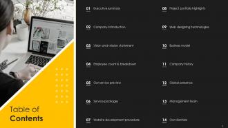
Slide 2: This slide shows Table of Content for the presentation.
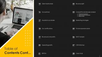
Slide 3: This is another slide continuing Table of Content for the presentation.
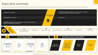
Slide 4: This slide shows the executive summary which includes company overview.
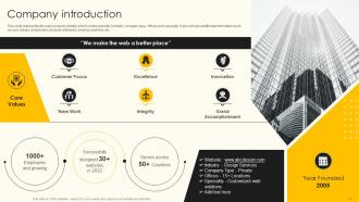
Slide 5: This slide represents the web company details which covers website, industry, company type, offices and specialty.
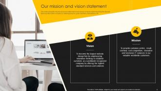
Slide 6: This slide presents Our mission and vision statement.
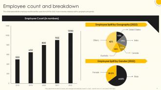
Slide 7: This slide represents the employee count for last five years from 2018 to 2022.
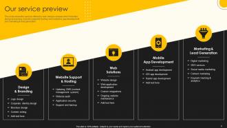
Slide 8: This slide shows the services offered by web design company.
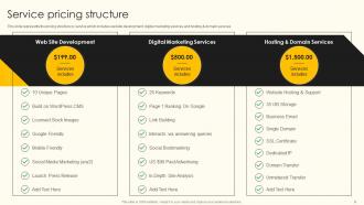
Slide 9: This slide represents the pricing structure by service.
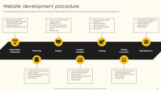
Slide 10: This slide showcases website development procedure .
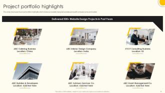
Slide 11: This slide showcases the project portfolio highlights which shows successfully designed websites.
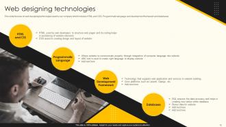
Slide 12: This slide focuses on web designing technologies used by our company.
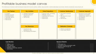
Slide 13: This slide displays Profitable business model canvas.
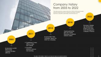
Slide 14: This slide represents Company history from 2005 to 2022.
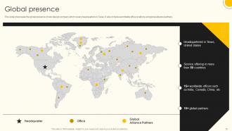
Slide 15: This slide showcases the global presence of web design company.
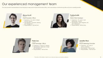
Slide 16: This slide shows Our experienced management team.
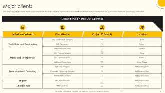
Slide 17: This slide represents the clients of web design company.
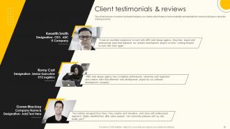
Slide 18: This slide showcases Client testimonials & reviews.
Slide 19: This slide shows global partners of our company which includes technology partners, advertising partners, etc.
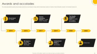
Slide 20: This slide represents the awards and accolades received by our web design company.
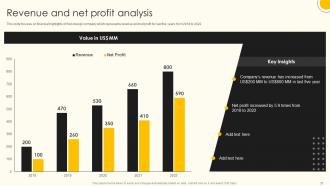
Slide 21: This slide showcases Revenue and net profit analysis.
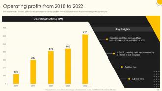
Slide 22: This slide shows Operating profits from 2018 to 2022.
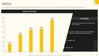
Slide 23: This slide represents the earning before interest, taxes, depreciation and amortization of web design company.
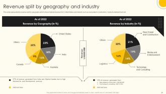
Slide 24: This slide showcases Revenue split by geography and industry.
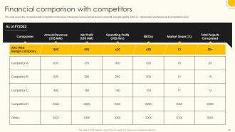
Slide 25: This slide shows Financial comparison with competitors.
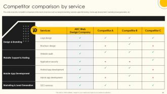
Slide 26: This slide presents Competitor comparison by service.
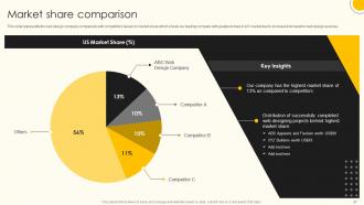
Slide 27: This slide represents the web design company comparison with competitors based on market share.
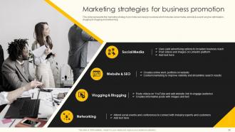
Slide 28: This slide showcases Marketing strategies for business promotion.
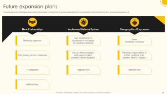
Slide 29: This slide represents the future expansion plans of web design company.
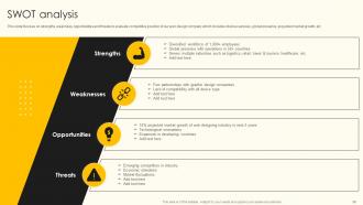
Slide 30: This slide focuses on strengths, weakness, opportunities and threats to evaluate competitive position.
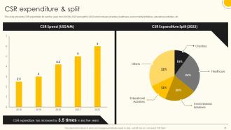
Slide 31: This slide shows the CSR expenditure for last five years from 2018 to 2022.
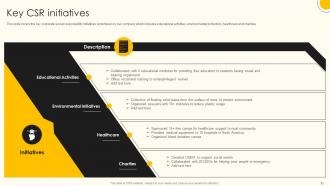
Slide 32: This slide covers the key corporate social responsibility initiatives undertaken by our company.
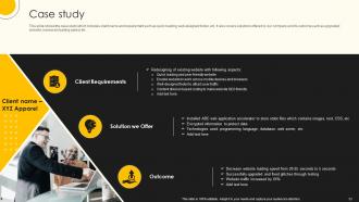
Slide 33: This slide shows the case study which includes client name and requirement .
Slide 34: This slide contains all the icons used in this presentation.
Slide 35: This slide is titled as Additional Slides for moving forward.
Slide 36: This is Our Mission slide with related imagery and text.
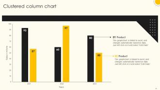
Slide 37: This slide provides Clustered Column chart with two products comparison.
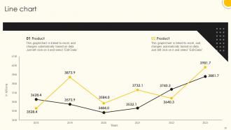
Slide 38: This slide describes Line chart with two products comparison.
Slide 39: This slide shows Post It Notes. Post your important notes here.
Slide 40: This slide provides 30 60 90 Days Plan with text boxes.
Slide 41: This is Our Target slide. State your targets here.
Slide 42: This is a Timeline slide. Show data related to time intervals here.
Slide 43: This is a Thank You slide with address, contact numbers and email address.
Web Design Company Profile Powerpoint Presentation Slides with all 48 slides:
Use our Web Design Company Profile Powerpoint Presentation Slides to effectively help you save your valuable time. They are readymade to fit into any presentation structure.





FAQs for Web Design Company Profile
Honestly, most agencies just chase whatever design trend is hot right now. We're kinda obsessed with figuring out who's actually using your site and what they need before we even think about colors or layouts. Super nerdy about it, but it works. The real game-changer though? We're pretty good at explaining techy stuff without making your eyes glaze over during meetings. Everything gets built around actual user data and psychology, not just what looks cool. Your site ends up converting way better while still looking awesome. Check our case studies - you'll see what I mean.
Honestly, testing with actual users from the start changes everything - way better than just guessing what works. We stick to WCAG stuff but the real magic happens when you get feedback early and keep getting it. Basic things like good color contrast, alt text, keyboard navigation, semantic HTML - all that matters but you gotta test it on different devices and with screen readers too. Oh and don't bolt accessibility on at the end, that's a nightmare. Start each project by thinking about who's using it and what barriers they might hit. Design around those limits from day one and you'll save yourself so much headache later.
So I always kick things off with a brand audit - gotta understand what you're working with first. Then I map out user journeys using design thinking, but honestly? Mood boards are where the magic happens. Saves us tons of back-and-forth later on. From there it's atomic design - I build up from your core stuff (colors, fonts, brand voice) to complete layouts. Regular check-ins keep everything feeling authentically you through iterative prototyping. The real trick is nailing down those brand guidelines upfront so every choice has solid reasoning behind it.
So we always start with mobile design first, then work our way up to bigger screens. Honestly, it just makes sense since like 70% of people browse on their phones now. We throw in flexible grids and CSS media queries to make everything adapt properly. The real trick though? Testing on actual phones and tablets - not just shrinking your browser like some people do lol. Touch-friendly buttons are huge too. Mobile users will bounce if your site takes forever to load. I can show you some examples of sites we've done if you want!
Honestly, start with site speed and mobile - those two will give you way more ranking boost than people think. Clean code matters too since Google cares about user experience now. I always do keyword research next (the fun part) and work those terms into content naturally - none of that weird stuffed feeling. Your URL structure should make sense, and don't forget alt text for images. Oh, and schema markup helps search engines understand your pages better. The semantic HTML stuff is boring but crawlers love it. Mobile responsiveness is huge though - can't stress that enough.
Honestly, I just bake feedback right into each phase now - after wireframes, initial designs, all that. Figma's been a lifesaver because clients can drop comments directly on stuff instead of those brutal email threads. Here's the thing though: don't just go "thoughts?" Be specific about what you need feedback on - like does this feel on-brand, or is the flow making sense? I learned this the hard way, but document everything and get written sign-off before moving to the next step. Otherwise you'll end up redoing work for free later.
Look, content management is huge - it's literally what makes or breaks your site after we hand it over. WordPress is my go-to recommendation because let's be real, you don't want to bug us every time you need to update your hours or post something new. The trick is finding that sweet spot between giving you enough control and keeping things simple enough that you won't accidentally mess everything up. Oh, and we should definitely talk about what kind of content you'll be managing early on so I can set up the right system for how you actually work.
Honestly, I just browse Smashing Magazine and CSS-Tricks when I'm bored. Twitter's great too - following actual designers gives you way better inspo than those generic trend articles. Half my best discoveries happen when I'm supposed to be working on something else lol. Between client projects, I mess around with new frameworks just to see what breaks. Online communities are clutch for seeing what actually works in practice. Oh, and webinars if they don't suck. But here's the thing - you gotta physically build stuff with new CSS features or libraries. Reading about it won't stick.
Honestly, Figma's our go-to for pretty much everything - the real-time collab thing is clutch when you're working with clients. Framer's been incredible lately for those fancy micro-animations (clients eat that stuff up). We still use ProtoPie sometimes for really complex interactions, but Framer's kind of taking over there. Oh, and we've got Sketch hanging around for old projects, though we're slowly ditching it. Adobe Creative Suite handles the heavy lifting when Figma can't - like serious photo editing or complex graphics. Start with Figma, then grab Framer once you need fancier prototyping. That combo'll cover like 90% of what you need.
Honestly, bounce rate and time on site are your best friends here - they'll tell you if people actually stick around or nope out immediately. Conversion rates matter too, obviously. Page speed is critical (Google will punish you for being slow, and users hate it even more). I always set up Analytics from the start so you have something to compare against later. Track the business stuff like leads and sales to see if it's actually working. Oh, and don't skip user feedback - surveys or quick tests reveal things your data might miss. Short sentences work. Longer ones help you understand the full picture of what's happening.
Most of our work is in healthcare, professional services, and e-commerce - probably like 70% of what we do. Healthcare's all about trust and making sure you don't get sued for compliance stuff. Professional services clients want something clean that actually turns visitors into paying customers. E-commerce is just... well, if people can't check out easily, you're screwed. We've done some cool startup and nonprofit projects too, but honestly those big three pay the bills. Oh, and if you're in any of those industries, I can definitely show you similar examples.
So we usually do different support tiers after launch. Basic stuff covers monitoring and security patches. Premium gets you content updates and new features too. Most people end up picking our monthly plan - and trust me, sites always crash at 3am on weekends when you need them most. Priority support, automatic backups, plugin updates, constant uptime monitoring. Pretty standard stuff but it works. Oh, and definitely talk money upfront. Be clear about what's covered vs what costs extra. I always tell clients to factor support into their initial budget because nobody expects their "finished" website to need help later.
So for eCommerce, you gotta map out that whole customer journey first. Fast-loading product pages with crisp images are key - nobody's waiting around for stuff to load anymore. Keep your checkout super simple because that's where people nope out (I'm definitely guilty of this lol). Guest checkout is a must, plus throw in multiple payment options. Oh and mobile is huge now - like, most people shop on their phones. Your search and filtering better work smoothly too. Just walk through your site like you're actually buying something and see where it gets annoying. Those friction points will kill your conversions.
Honestly, I'm kind of obsessed with getting sites under 3 seconds because anything slower kills your bounce rate. Start with compressing images and minifying your code - that's usually the low-hanging fruit. CDNs help serve content from closer servers, and lazy loading is clutch for image-heavy sites. Don't just test on your nice laptop though - use actual slow connections and older devices. Tools like PageSpeed Insights will show you what's dragging things down. Oh, and lightweight frameworks over bloated ones every time. Run a speed test first and fix whatever's hurting you most.
Oh totally! Our portfolio page has like 8-10 solid case studies with all the before/after numbers and client quotes. That furniture company e-commerce redesign is insane - 340% conversion boost in three months. The SaaS dashboard one shows our process really well too. I'd grab 2-3 that actually match what your prospect does, you know? Way more relevant that way. Should I send the links so you can check them out before your call? Always helps to have the good stuff ready to go.
-
Really like the color and design of the presentation.
-
The best and engaging collection of PPTs I’ve seen so far. Great work!