

Diapositivas de presentación de Powerpoint de propuesta de diseño web





Try Before you Buy Download Free Sample Product
 Impress Your
Audience
 100%
Editable
 Save Hours
of Time


¿Necesita presentar una propuesta de proyecto web? Aquí traemos diapositivas de presentación de PowerPoint de propuesta de diseño web que pueden impresionar a sus compradores. Aproveche la diapositiva PPT de la propuesta de desarrollo del sitio web mientras presenta su empresa a los clientes potenciales. Este paquete completo de PowerPoint contiene diapositivas sobre el esquema de la propuesta, los arquetipos demográficos de la audiencia objetivo, los objetivos del proyecto, el proceso de diseño, el enfoque de marketing, las aplicaciones móviles, el enfoque de las redes sociales, el marketing de búsqueda, las fases del proyecto y la línea de tiempo, sobre nosotros, nuestro equipo, la clientela, un registro de éxito, estudio de caso y logotipo de la empresa, etc. Diseño de sitios web y propuesta de desarrollo El diseño de PowerPoint se puede utilizar para presentar la experiencia, las herramientas y las técnicas de su empresa que utiliza en el proceso de diseño de su sitio web. Informe a su comprador cómo completa exactamente cada etapa del proceso de diseño web, desde la planificación y el diseño hasta las pruebas y la implementación. Descargue el diseño de presentación de la propuesta de desarrollo web para asegurar un trato para su empresa. Difunda el entusiasmo con nuestras diapositivas de presentación de PowerPoint de propuesta de diseño web. Genere interés con sus puntos de vista.
People who downloaded this PowerPoint presentation also viewed the following :
Contenido de esta presentación de Powerpoint
Diapositiva 1 : esta diapositiva presenta la propuesta de diseño web. Agregue el nombre de su empresa y comience.
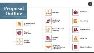
Diapositiva 2 : Esta diapositiva muestra el esquema de la propuesta con los siguientes componentes para indicar: lo que escuchamos de usted, público objetivo, proceso de diseño, mapa del sitio, enfoque de marketing, fases y cronograma del proyecto, costo del proyecto, dónde normalmente nos asociamos con los clientes, nuestro equipo , Estudio de caso, Nuestra clientela, Acerca de nosotros, Comentarios de los clientes.
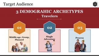
Diapositiva 3 : Esta es una diapositiva para el público objetivo que muestra en particular 3 arquetipos demográficos Viajeros: mediana edad, grupo, planificado, aventura individual, proceso.
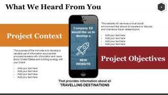
Diapositiva 4 : Esto es lo que escuchamos de usted, diapositiva con: contexto del proyecto, objetivos del proyecto.
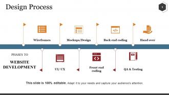
Diapositiva 5 : Esta es una diapositiva del proceso de diseño que muestra las diferentes fases del desarrollo del sitio web: estructuras metálicas, maquetas / diseño, codificación de back-end, entrega, control de calidad y pruebas, codificación de front-end, UI / UX.
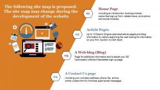
Diapositiva 6 : Esta diapositiva describe el mapa del sitio con: página de inicio, páginas de artículos, un blog web (blog) y una página de contacto.
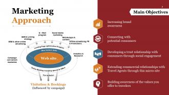
Diapositiva 7 : Esta diapositiva presenta el enfoque de marketing con: visitas y reservas (influidas por la campaña), reservas en línea que incluyen ofertas y especiales, programa de optimización de la página de destino, sitio web, nuevas unidades de contenido, can to action, SEM y otra publicidad en línea, aplicaciones móviles y contenido, marketing en redes sociales, estrategia de SEM y enlaces, programa de correo electrónico, maestrías de conversión de campañas, promociones y relaciones públicas de publicidad fuera de línea, análisis e investigación, aumento del conocimiento de la marca, conexión con consumidores potenciales, desarrollo de una relación de confianza con los consumidores a través del compromiso social, Extendiendo las relaciones comerciales con Agentes de Viajes a través de este micrositio, Creando conciencia de los valores que ofreces a los viajeros, Objetivos Principales.
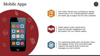
Diapositiva 8 : esta diapositiva muestra aplicaciones móviles con imágenes e íconos relevantes.
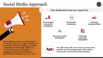
Diapositiva 9 : Esta diapositiva muestra el enfoque de las redes sociales. También muestra los departamentos en los que nuestro equipo dedicado son expertos: alcance y gestión de KOL y bloggers, publicidad en redes sociales, actividades de siembra y alimentación, desarrollo de contenido estructurado, planificación y gestión de medios de pago.
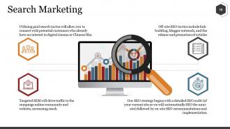
Diapositiva 10 : Esta es la diapositiva de marketing de búsqueda con imágenes de lupa y los siguientes cuatro puntos: el SEM dirigido dirigirá el tráfico a la comunidad en línea y al sitio web de la campaña, lo que aumentará el alcance. interés en el cine digital o el cine chino, las tácticas de SEO fuera del sitio incluyen la creación de enlaces, la divulgación de blogueros y el lanzamiento y promoción de artículos.Nuestra estrategia de SEO comienza con una auditoría de SEO detallada (de su sitio actual, ya que automáticamente buscaremos el mini -sitio) seguido de recomendaciones e implementación de SEO en el sitio.
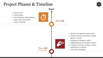
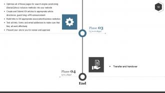
Diapositiva 11 : Esta diapositiva muestra las fases y la línea de tiempo del proyecto. Agregue sus fases aquí y haga uso de esta diapositiva.
Diapositiva 12 : esta diapositiva también muestra las fases y la línea de tiempo del proyecto. Mencione aquí las fases.
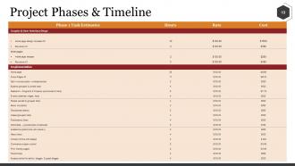
Diapositiva 13 : esta diapositiva muestra otra variación de las fases y la línea de tiempo del proyecto.
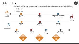
Diapositiva 14 : Esta es una diapositiva Acerca de nosotros. Mencione brevemente su empresa, la oferta de servicios clave y las competencias clave.
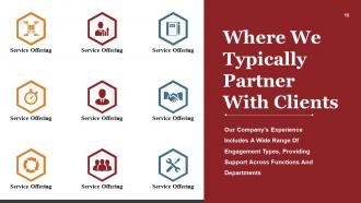
Diapositiva 15 : Esta diapositiva muestra dónde solemos asociarnos con los clientes indicando los servicios que ofrece su empresa.
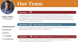
Diapositiva 16 : Esta es la diapositiva de Nuestro equipo con nombre, designación e imágenes para agregar. También muestra información general, experiencia, educación e información de contacto de los miembros.
Diapositiva 17 : Esta diapositiva muestra Nuestra clientela con imágenes de iconos y cuadros de texto. Agregue el nombre de sus clientes en estos cuadros de texto.
Diapositiva 18 : Esta diapositiva muestra Un historial comprobado de éxito con nombre y designación para agregar.
Diapositiva 19 : Esta es una presentación de diapositivas de un estudio de caso: el objetivo del cliente, nuestro enfoque.
Diapositiva 20 : Esta diapositiva muestra el "LOGOTIPO DE LA COMPAÑÍA" junto con el nombre de las personas y los detalles de contacto si se requiere más información.
Diapositiva 21 : Esta es una diapositiva de la hora del café para detener. Modifique el contenido de la diapositiva según sus necesidades.
Diapositiva 22 : esta diapositiva muestra el título Cuadros y gráficos. Puede modificar el contenido de la diapositiva según sus necesidades.
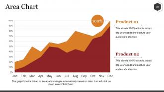
Diapositiva 23 : Esta es una diapositiva de gráfico de áreas para mostrar el crecimiento de productos / entidades, comparación, especificaciones, etc.
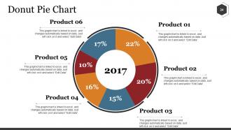
Diapositiva 24 : Esta es una diapositiva de gráfico circular de anillos para presentar la comparación de productos / entidades, especificaciones, etc.
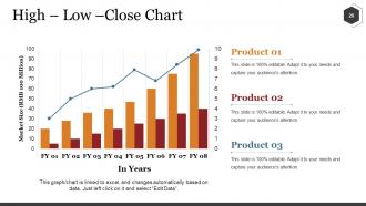
Diapositiva 25 : Esta es una diapositiva de gráfico de alto-bajo-cierre para presentar la comparación de producto / entidad, especificaciones, etc.
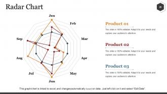
Diapositiva 26 : Esta es una diapositiva de gráfico de radar para presentar la comparación de productos / entidades, especificaciones, etc.
Diapositiva 27 : esta diapositiva se titula Diapositivas adicionales. Puede cambiar el contenido de la diapositiva según sus necesidades.
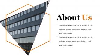
Diapositiva 28 : Esta es una diapositiva Acerca de nosotros. Indique aquí las especificaciones del equipo / empresa.
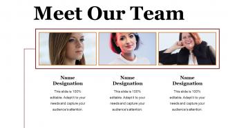
Diapositiva 29 : Esta es la diapositiva Conozca a nuestro equipo con el nombre y la designación para completar los cuadros de texto proporcionados.
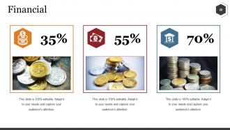
Diapositiva 30 : Esta es una diapositiva de puntuación financiera. Indique aspectos financieros, información, etc. aquí.
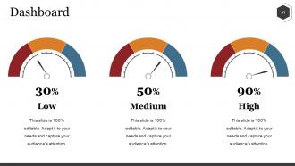
Diapositiva 31 : Esta es una diapositiva del Panel para indicar aspectos bajos, medios y altos, kpis, métricas, etc.
Diapositiva 32 : Diapositiva Esta es nuestra meta. Indique sus metas aquí.
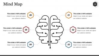
Diapositiva 33 : Esta es una diapositiva de imagen de mapa mental para mostrar la segmentación del comportamiento, información o cualquier cosa relativa.
Diapositiva 34 : Esta es una diapositiva de Bombilla o Idea para enunciar una nueva idea o resaltar especificaciones / información, etc.
Diapositiva 35 : Esta es una diapositiva de agradecimiento con dirección # número de calle, ciudad, estado, número de contacto, dirección de correo electrónico.
Propuesta de diseño web Presentación en Powerpoint Diapositivas con las 35 diapositivas:
La gente se siente bien con su marca con nuestras diapositivas de presentación de PowerPoint de propuesta de diseño web. Sus diseños gráficos provocan emoción.



FAQs for Web Design Proposal
Okay so you'll definitely want project scope, timeline, and pricing broken down clearly. Show examples of past work - visuals are everything since most clients can't picture stuff from descriptions alone. I always add a discovery section because it shows you actually listened to what they want. Payment terms and revision process should be upfront too, trust me on this one. Technical specs matter, plus don't forget post-launch stuff like maintenance. Mockups or wireframes help a ton if you can swing it. Honestly, the clearer you are about deliverables, the fewer headaches you'll have later.
Look, a solid proposal shows you actually get their business instead of just copy-pasting the same pitch everywhere. Being upfront about timelines and costs? Game changer. Clients relax when they see you've thought things through. Focus on the specific results they'll get rather than rattling off features - nobody cares about your fancy tech stack if it doesn't solve their problem. Honestly, I've seen too many proposals that read like feature lists from a software catalog. The whole thing just prevents those messy "wait, what am I paying for again?" conversations down the road.
Honestly, competitor analysis is a game-changer for proposals. You get to see what's working in your client's industry and what's totally bombing. I always grab 3-4 screenshots of competitor sites and jot down quick notes about what I'd change. It's weirdly satisfying to critique other people's design choices, not gonna lie. But the real value comes when you can point to specific examples and say "look, everyone else is doing X, but here's why we should go with Y instead." Helps you spot those gaps where your design can actually shine. Makes your whole proposal way more convincing.
Okay so here's what actually works - map out your whole process visually first. Discovery, wireframes, mockups, then dev and testing. Clients need to see a timeline or flowchart, doesn't have to be fancy. The key thing is explaining WHY each step matters and what they're getting. Like "you'll see 3 wireframe options" or "we'll show 2 design directions." Honestly, being this specific upfront saves you from scope creep nightmares later. Oh and build in feedback points so they don't feel left out - nobody wants surprise design decisions dropped on them.
First, get their baseline numbers so you can show real before/after results. Focus on the money stuff - conversion rates, lead gen, average order value. Bounce rates and session time matter too since redesigns usually bump those up 20-30%. Mobile conversion is huge - honestly, that's where most businesses are just hemorrhaging cash right now. Page speed improvements are worth tracking because even one second slower can tank your conversions. Oh, and make sure you frame everything around ROI projections. Numbers don't lie, and neither will their increased sales.
Break your proposal into sections that hit each site's specific pain points. E-commerce needs payment stuff, product catalogs, shopping carts - all the conversion magic that actually gets sales. Informational sites? Focus on content management, SEO, lead forms, smooth user flow. Honestly, the biggest mistake I see is people just listing random web features instead of showing they get what each business actually needs. Pull examples from your portfolio that match their vibe. Oh, and don't forget to adjust your timeline - e-commerce builds take way longer than basic info sites.
Definitely throw in wireframes and mockups so they can see the actual layout. A mood board with your colors and fonts is clutch too. Screenshots from similar projects you've done? Gold. Clients eat that stuff up because it's proof you can actually deliver. Before/after examples are amazing if you have any lying around - even from totally different projects. Oh, and don't make it a wall of text. Use charts or timelines to break things up. Makes the whole scope feel way more real. Keep it clean but not sterile, you know? Lots of white space and clear headings so they can scan through quickly and get what you're offering.
Dude, yes - super important part of any proposal. You want clear timelines so everyone knows what's happening when. Break everything into chunks with actual deliverables and dates. I've watched projects completely fall apart because nobody was on the same page about deadlines. Plus it saves your ass when clients try to add random stuff later (which they will). Build in extra time though - seriously, everything takes way longer than you think. Oh and tie your payments to these milestones so you're not waiting forever to get paid.
Startups want cheap, fast solutions that can scale up later - show them MVPs and flexible pricing. Bigger companies? Totally different story. They need proven results, detailed case studies, and everything has to match their brand perfectly. The budget's usually better but holy hell, so many people have to sign off on decisions. Focus your startup pitches on growth potential. For established businesses, hammer home the ROI numbers and how you'll minimize risk. Oh, and definitely stalk their recent news first - I learned that one the hard way!
Get ridiculously detailed about what you're actually building and what you're NOT doing. I'm talking every single page, feature, how many rounds of changes you'll make - the whole thing. Trust me on this one... I had a client who kept saying "oh just add this tiny thing" and suddenly I'm working for free for three weeks. Also spell out exactly what costs extra money - new pages, different functionality, going over your revision limit. Whatever. Get them to agree to all this stuff in writing before you touch any code. Honestly, clients respect you more when you're super clear upfront anyway.
Dude, biggest mistake is being vague about what you're actually delivering and when. Clients freak out over uncertainty. Never lowball your prices to land the gig - scope creep will destroy you every single time. Your proposal can't look like some generic template either. Research their actual business and show you get what they need. Skip the tech jargon that confuses people. Oh, and spell out exactly what's included vs what costs extra. Seriously though, map out your revision process upfront or you'll hate yourself later when they want their logo "more purple" seventeen times.
Definitely drop 2-3 solid case studies right in the main proposal - don't hide them in some appendix nobody reads. Before/after screenshots are gold, plus throw in hard numbers like "boosted conversions 40%." Client testimonials as pull quotes? Chef's kiss. Honestly way more convincing than anything you'll write yourself. Match the examples to their industry though - nobody cares about your e-commerce wins if they're B2B. Focus on business results, not just what you built. Oh, and connect each case study back to what you'll do for them specifically.
Definitely hit the big three: who owns what IP, payment details, and project boundaries. Seriously, spell out ownership of code, designs, all that stuff upfront. Payment schedules are huge - include late fees because clients will test you on this. Liability limits are your friend so you're not responsible for every random thing. Oh, and termination clauses! What happens if someone bails halfway through? That's saved my butt before. Get a lawyer to look at your template once, then you can just tweak it for each new proposal.
Mood boards are a game changer - they turn vague ideas into something clients can actually see. You're basically showing them the vibe before diving into real work. Plus it proves you get their brand, which already puts you ahead of people sending boring text-only proposals. My favorite part? No more "can you make it more fun" feedback later since everyone's on the same page visually. Just don't go crazy with like 20 images - stick to 6-8 max or you'll overwhelm them. Trust me, I learned that one the hard way.
Honestly, Slack's a lifesaver for quick daily stuff and updates. For project tracking, go with Asana or Monday.com - both handle timelines pretty well. Figma's clutch for design work since clients can drop comments right on mockups instead of those nightmare email threads with random screenshots everywhere. Set up a shared Google Drive folder too, obviously. Oh and definitely do weekly Zoom calls to stay synced up. But here's the thing - ask what they're already using first. Getting clients to switch platforms is seriously painful sometimes.
-
Easily Editable.
-
Excellent work done on template design and graphics.