

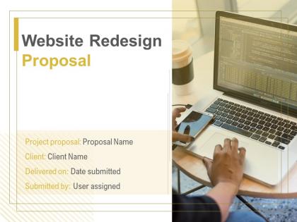
Website Redesign Proposal Powerpoint Presentation Slides




Try Before you Buy Download Free Sample Product
 Impress Your
 Audience
 100%
100% Editable
 Save Hours
 of Time


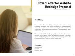
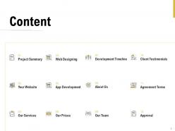
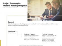
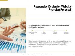
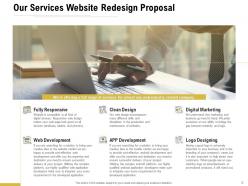
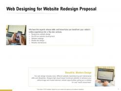
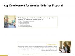
An impressive website is where you can share the relevant information with your customers that also increases your conversion leads. To enhance the functionality of the website, new technologies and advanced tools are introduced by the digital marketing team. Redesigning creates your website into a newly refurbished website. Pitch your services and land new clients by using our topic-specific Website Redesign Proposal PowerPoint Presentation Slides. You can create a responsive website for your client’s target audience that can be accessed through the multiple screen sizes. With the aid of this attention-grabbing website redesign proposal PPT layout, you can create an interesting cover letter for your landing page. Take the assistance of our outwardly engaging website redesign proposal presentation template to explain how the customers can interact with your client’s brand and website. Use this visually-attractive website redesign proposal presentation template to highlight the services your company offers that includes things like fully responsive, digital marketing, clean design, web development, app development, and logo designing. showcase the type of app development you offer. With the help of this eye-catching website redesign proposal PowerPoint theme, you can talk about your app development services like hybrid mobile app development, iPhone development, android development, windows development, and enterprise mobility solutions. Employ our creatively designed website redesign proposal PPT slide to portray your sample design and accomplished projects that hold the interest of your client. Take advantage of this visually-appealing redesign proposal PowerPoint presentation to highlight the acknowledgement and recognition your company has received from the different clients over the years. Provide a brief introduction of your company and its background to the clients with the help of this website redesign proposal PPT theme. Showcase various strategies to build a perfect website for the client. Assist your clients in achieving their mission by downloading our ready-to-use website redesign proposal PowerPoint presentation template.
People who downloaded this PowerPoint presentation also viewed the following :
Website Redesign Proposal Powerpoint Presentation Slides with all 26 slides:
Use our Website Redesign Proposal Powerpoint Presentation Slides to effectively help you save your valuable time. They are readymade to fit into any presentation structure.
FAQs for Website Redesign Proposal
Dude, we're trying to get people to actually stick around and buy stuff - the site's been gathering dust since 2019 which is kinda embarrassing. Mobile looks terrible right now, checkout's a mess, and nobody can find anything. People bounce way too fast according to our analytics, so we're bleeding potential sales. Time on site is pretty awful too. Honestly the whole thing needs work, but maybe think about which pages bug your team the most? That might be a good starting point.
So we're targeting small business owners, mostly 30-50, who just want pricing info fast. Honestly? Our current site is a total mess – even I can't find stuff half the time lol. The redesign puts "Get Quote" right upfront with way cleaner navigation. Mobile-first too since most people hit us from their phones. Right now it takes like five clicks to actually do anything useful, we're cutting that down to two. Oh and definitely look at those wireframes from yesterday if you haven't yet – shows exactly how much smoother everything flows.
Dude, your site is hemorrhaging users - 73% bounce rate and conversions down 40% this quarter. Mobile is completely busted (couldn't even checkout on my phone yesterday, super frustrating). Load times are brutal at 8+ seconds, and honestly? The navigation is confusing as hell. Users can't find anything they need. Your design looks like it's stuck in 2018, and there's no real path for capturing leads. I'd tackle mobile and speed issues first - that's probably killing you the most right now. Then work on the whole user experience flow.
Okay so I'm thinking clean and modern - way more white space, better typography that doesn't make people scroll past immediately. That bright orange has got to go, it's honestly painful to look at. Deep blues and grays would be so much better. The whole layout needs work too - better mobile stuff, clearer hierarchy, those smooth little animations that actually feel good to use. We'd look way more professional, less like we're still figuring things out. Oh and I made a mood board that shows exactly what I mean - you should definitely check it out.
So we're hitting three big things with the redesign. Navigation's getting a complete overhaul - the search actually works now, thank god. Mobile layout was way overdue since everyone's on their phones anyway. Oh, and we fixed that contact form that kept breaking. The resource hub is pretty cool though - people can grab case studies and whitepapers without jumping through hoops. Load times should be way faster too. I threw in some accessibility updates because, you know, it's 2024. Wanna jump on a call this week? I can show you the wireframes.
Oh totally! I've been checking out Shopify's onboarding lately - they break everything down so nicely without making your brain explode. Stripe's docs are honestly beautiful too, all that clean white space and those code snippets that expand when you click them. The thing I'd totally copy is how they let you go deeper into stuff only if you want to. Progressive disclosure or whatever it's called. Also their visual hierarchy just makes sense - you can skim through everything super easily. Want me to grab some screenshots and throw together a quick comparison? Could be helpful.
So we're going mobile-first this time around - your site will actually work on phones without people wanting to throw them across the room. Touch-friendly navigation, responsive breakpoints, the whole deal. Color contrast and keyboard navigation are getting fixed too (honestly should've done this years ago but whatever). We're hitting WCAG 2.1 AA standards which is great for SEO as a bonus. Screen readers will love it. Want to test with real mobile users once we've got mockups? That'd be smart.
So WordPress keeps screwing us over - every update breaks something with our custom plugins. Total pain. For the redesign we're thinking Webflow or Contentful instead. Your team could actually update content without bothering us devs all the time, which honestly would be amazing. Webflow's got this visual editor that's super easy to use. Contentful's headless though, so probably better long-term even if there's more of a learning curve. What do you think works better for how you guys handle content? Want to nail this decision before we commit.
Okay so first thing - we'll audit everything and map your current URLs to new ones with 301 redirects. Keep your existing URL structure if you can, that's huge. All your meta tags and content hierarchy need to stay intact too. Honestly, redirects aren't as scary as people think when you do them properly. After launch we'll submit fresh sitemaps to Google and watch your rankings like hawks for a few weeks. Oh and here's the thing that trips everyone up - don't touch URLs unless you absolutely must. That's where most redesigns tank their SEO.
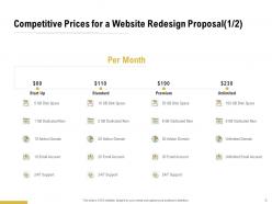
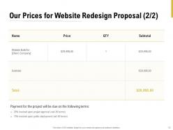
Looking at around $15K-25K for the whole thing. Lower end gets you a solid refresh with better mobile experience, but if you want those custom features like the product finder, you're hitting closer to $25K. Our current site is honestly pretty rough, so I'm pushing for that $20K sweet spot. Get quotes from maybe 3 or 4 agencies first though - then you can show leadership what each price range actually delivers. Plus it's always smart to have options when you're asking for that much budget.
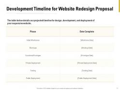
So we're talking like 12-14 weeks total for the whole thing. If we start next week, we'd wrap up mid-March, which is cutting it close since marketing needs the site live before that March 20th launch event - that's the hard deadline we can't blow. Oh, and there's this Feb 15th thing where homepage and main pages need to be done for user testing. It's gonna be tight but totally doable unless something goes sideways. Just heads up, you'll probably want to save some time in January for those design reviews we always end up doing.
So we're doing this whole feedback thing in phases. Starting with user surveys to catch pain points and what people actually want. Then usability testing with prototypes - honestly that's where the magic happens because you see people either nail it or totally bomb with your design. Also throwing feedback widgets on the staging site so users can drop comments right on specific pages. Focus groups for the big stakeholders too, obviously. The trick is getting input constantly, not waiting until the end when you're basically screwed if something's wrong.
Google Analytics 4 is your best bet for tracking traffic and conversions. Hotjar's amazing for heatmaps - seriously, you'll be shocked seeing where people actually click. PageSpeed Insights will show you performance issues, and Mixpanel's great if you want detailed funnel analysis. Oh, and Core Web Vitals monitoring too. Here's the thing though - figure out your success metrics first. Like, before you even launch. Otherwise you'll end up with tons of data but no clue what actually moves the needle for your business.
First thing - grab all your brand stuff (colors, fonts, messaging docs, the whole deal) before starting anything. Your site needs to actually feel like YOUR company, not some cookie-cutter template disaster. I'd start by going through your brand guidelines and values with a fine-tooth comb. Then figure out how those translate into real design choices - like if you're all about inclusivity, accessibility better be front and center. Your brand's personality should show up everywhere: the colors, messaging tone, even how users navigate around. Honestly, this groundwork phase is where most people rush and regret it later.
Your website needs to scream "we totally get your problem" the second someone lands on it. Most sites read like they were written by committee - boring as hell. Instead, focus on the transformation you create. Where do clients start vs. where they end up after working with you? That's your money story right there. Pick 2-3 core messages and thread them through every page. Keep it conversational and results-focused. You're not trying to impress people with fancy words - you want them thinking "finally, someone who speaks my language." Oh, and ditch the corporate speak. Nobody talks like that in real life.
-
Wonderful templates design to use in business meetings.
-
Topic best represented with attractive design.