


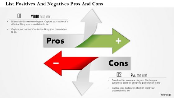
1114 list positives and negatives pros and cons powerpoint presentation





Try Before you Buy Download Free Sample Product
 Impress Your
 Audience
 100%
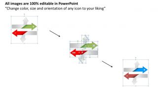
100% Editable
 Save Hours
 of Time


Our 1114 List Positives And Negatives Pros And Cons Powerpoint Presentation are always on call. They appear before you can blink.
People who downloaded this PowerPoint presentation also viewed the following :
1114 list positives and negatives pros and cons powerpoint presentation with all 5 slides:
Folks develop the faith to follow your advice with our 1114 List Positives And Negatives Pros And Cons Powerpoint Presentation. You will definitely earn their belief.
FAQs for 1114 list positives and negatives pros and
Dude, templates are a lifesaver - no more staring at blank slides forever. Your branding stays consistent, which honestly makes you look way more professional than you probably are lol. They remind you to include the important stuff like objectives and next steps that you'd totally forget otherwise. Also super helpful when teammates need to jump in and edit. They won't have to deal with whatever weird fonts you picked. The real game-changer though? You actually get to focus on writing good content instead of spending three hours making slides look decent. Find one template you like and just keep using it.
Honestly, templates are a lifesaver. You get structure without having to figure out the whole visual thing from scratch - and trust me, nobody wants to see another Comic Sans disaster. They guide people through your story naturally, like problem → solution → results. Sure, you might end up looking like everyone else, but who cares? I'd rather have a solid pitch that looks clean than spend hours messing with fonts when I should be perfecting my actual content. Save the creativity for your storytelling. That's what actually matters anyway.
Templates are honestly everything when it comes to keeping people engaged. I mean, when you actually customize stuff for your audience, it looks way more professional and people stay focused instead of getting distracted by boring default layouts. Visual consistency really does guide where people look. But don't go overboard - I've seen presentations that were so busy they hurt my eyes. You want something that makes your content shine, not compete with it. My advice? Start basic and only add things that actually help tell your story better.
Honestly? Templates make everything look the same and boring. You end up cramming your ideas into their weird structure instead of what actually makes sense. Half of those designs are ugly anyway lol. Your brand gets totally lost because you're stuck with someone else's layout choices. Worst part is you stop thinking about what YOUR specific audience needs. I mean, it's so easy to just plug and play without considering if it's right for your message. Use them to get started sure, but definitely customize the hell out of them. Don't let the template drive - you should.
Dude, templates are seriously clutch when you're drowning in work. Skip all the design headaches - someone already figured out the layout and colors for you. Your slides will actually look decent instead of like... well, whatever disaster I usually create at midnight. I swear the real magic is focusing on your actual content instead of spending two hours picking fonts. Just grab something that fits your topic and swap in your text. Way less stress, way better results.
Oh for sure! Consulting, finance, and sales teams see the biggest payoff since they're always presenting to clients. Startups and tech companies are huge fans too - they don't have design teams but still need to look professional for investors. Healthcare and education use them a lot for breaking down complex stuff. Creative agencies though? They usually skip templates entirely because they want to show off their design chops (makes sense honestly). Bottom line - if you're presenting to outside people or just don't have time for custom design, templates will save your life.
Yeah, templates can totally make you look more professional! Just don't pick those basic ones everyone's seen a million times - you know the ones I'm talking about. Find something clean that actually fits your topic and audience. Then tweak it so it doesn't look like a cookie-cutter presentation. I've sat through way too many meetings where someone clearly just slapped their content into the first template they found. Honestly, spending time on good content matters way more than the prettiest design. But a decent template definitely doesn't hurt your credibility.
Go with clean layouts that have lots of white space - trust me, most templates are way too cluttered. Stick to 2-3 fonts max and pick colors that won't fight with your content. You'll want different slide options beyond just title slides... comparison charts, timelines, image layouts, all that. Double-check the text is readable when projected because some look fine on your laptop but disappear on screen. If you need company branding, make sure it plays nice with that too. Here's the thing though - test it with your actual content first! Empty templates always look better than they actually are once you dump real data in there.
Templates definitely help keep your ideas organized and stop you from going off on random tangents. Your audience can actually follow what you're saying instead of getting lost. But here's the thing - they can make everything sound boring and cookie-cutter if you just fill in the blanks. I always start with a template to get my structure down, then I go back and make it sound like me talking, not some corporate manual. You want that backbone but with your own voice coming through. Otherwise people tune out because it feels too formulaic, you know?
Honestly, I go custom when the stakes are high - like investor pitches or brand launches. Templates are super efficient but they make everything look the same, you know? If you're presenting something totally unique, standard layouts just won't cut it. The extra time is worth it when you need to wow a client or show off creative work. I mean, everyone's seen those same PowerPoint templates a million times. My approach is pretty simple: if this presentation could make or break something important, skip the template. Make it yours instead.
Oh totally! Templates are a game changer for teams. No more dealing with Sarah's weird font choices while Tom's over there using comic sans or whatever. Everyone starts with the same layout and colors, so you can actually jump in and edit stuff without everything looking like a mess. Dividing up work becomes way easier too since everyone knows the structure. Honestly, the best part? You're not wasting time arguing about fonts and spacing - you can actually focus on the content. Just pick something decent at the start and everyone stick to it.
Think of templates as your company's style guide - they keep everyone using the same fonts, colors, and layouts so everything looks cohesive. Nobody's wasting time picking between Arial and Helvetica (again). Your presentations actually look professional instead of like five different people made them. Plus clients start recognizing your brand instantly. I swear, once you set up a shared folder with 2-3 good templates, your whole team's work looks so much better. Without them? You'll get this weird mix of designs that screams amateur hour.
Honestly, your design choices matter way more than most people think. Cool colors make you look professional, warm ones feel friendly and approachable. Font-wise? Serif feels traditional (think newspapers), sans-serif is cleaner and modern. I've literally watched good content flop because the visuals felt weird to people. Sans-serif is probably safer if you're unsure. Keep everything consistent though - your audience will start recognizing your stuff, which builds trust. Just match what your audience expects and test different combos. Watch your engagement numbers to see what actually works for your specific crowd.
Oh man, yes! Cluttered backgrounds are the absolute worst - nobody can read anything. Also skip the tiny fonts that make people squint. Those cheesy stock photos? Hard pass. I learned this the hard way when I crammed way too much text on slides once and watched everyone's eyes glaze over. Don't use clashing colors either, and keep your formatting consistent throughout or it looks sloppy. Really though, clean and readable beats fancy every time. Your actual content should shine, not get buried under messy design choices.
Honestly, templates are perfect for this. Use them as your starting point, not your final destination. The structure and flow? Keep that - it's tested and works. But go wild with everything else. Switch up colors, fonts, images, whatever fits your vibe. I actually think templates make you MORE creative because you're not stressing about basic layout stuff. You can focus on telling your story instead. Here's what I do: pick one element to completely redesign each time. Maybe it's how I do title slides, or I'll totally rework how data looks. Works every time.
-
Thanks for all your great templates they have saved me lots of time and accelerate my presentations. Great product, keep them up!
-
Best way of representation of the topic.