


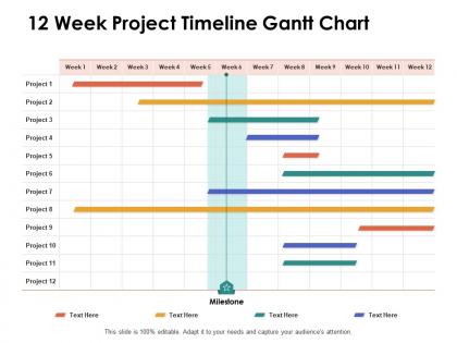
12 week project timeline gantt chart ppt powerpoint presentation show inspiration




Try Before you Buy Download Free Sample Product
 Impress Your
 Audience
 100%
100% Editable
 Save Hours
 of Time


Ensure you don't give in to baseless apprehensions with our 12 Week Project Timeline Gantt Chart Ppt Powerpoint Presentation Show Inspiration. It will end the jitters.
People who downloaded this PowerPoint presentation also viewed the following :
12 week project timeline gantt chart ppt powerpoint presentation show inspiration with all 2 slides:
Address jittery feelings with our 12 Week Project Timeline Gantt Chart Ppt Powerpoint Presentation Show Inspiration. Initiate action to calm apprehensions.
FAQs for 12 week project timeline gantt chart ppt powerpoint
So you need tasks listed down the side, timeline across the top, then horizontal bars showing when stuff starts and ends. Dependencies are huge - those connecting lines between tasks that show what needs finishing before other things can start. Seriously, that's where everyone screws up their first one! Add milestones for big deliverables and assign owners to each task. Oh, and progress tracking so you can see what's actually done vs what you planned. My advice? Start basic with just these elements. You can get fancy later once people aren't confused by it.
Honestly, Gantt charts are like having a crystal ball for your projects. You can see everything laid out visually - when stuff's due, what's blocking what, the whole nine yards. The best part? Catching problems before they blow up. Like if Task A gets delayed, you'll know immediately how it screws with your deadline. I probably spend way less time in those awful "where are we at?" meetings now. Most tools let you just drag things around and everything else updates automatically, which is pretty sweet. Try something basic like Monday or Asana first - don't overthink it.
So for Gantt charts - Microsoft Project is still the best if you can swing the cost, but honestly it's super overkill unless you're managing like massive projects. I'd start with Asana's free version, it's pretty intuitive. Monday.com and Trello (they have this timeline view now) are solid too. Oh, and don't sleep on Google Sheets - sounds weird but it actually handles basic Gantt charts better than you'd think. Just try Asana first though, you can always upgrade if you need fancier stuff later.
Honestly, Gantt charts are game-changers for keeping projects organized. They show exactly who's doing what and when everything's due - no more confusion about deadlines. The best part? You can see which tasks depend on others, so bottlenecks become obvious before they screw you over. When your boss inevitably changes priorities (ugh), you'll have a clear visual to show how it affects everything else. I'd start simple - just map out your main milestones first. Don't overthink it. Once you see how much clearer your project timeline becomes, you won't want to work without one.
Honestly, the worst thing you can do is go overboard with details - you'll end up babysitting the chart instead of your actual project. Buffer time is huge too, especially between connected tasks. When one thing runs late, it's like dominoes falling. I see people create these gorgeous, super complicated charts that look amazing but nobody can realistically keep updated. Simple task names work better than fancy ones. And yeah, you actually have to update it regularly or it becomes useless pretty fast. I learned that the hard way! Start basic, then add stuff as you go.
Yeah, totally! Just don't try to map out your whole project like the old-school way. Stick to short 2-4 week chunks and update constantly - priorities will shift, that's just how agile works. I'd focus more on showing dependencies and who's working on what rather than hard deadlines. Honestly, the trick is treating it like a living doc that changes after each retrospective. Update yours right after sprint planning sessions. Makes stakeholder updates way easier too, and they actually stay relevant instead of becoming this outdated mess nobody looks at.
Gantt charts are built around timelines - you see tasks mapped out chronologically with all their dependencies. Kanban boards are more about workflow status (like to-do, in progress, done). Network diagrams show task relationships but skip the time aspect entirely. I'll be honest, Gantt charts looked super overwhelming when I first saw one. But now? They're perfect for complex stuff where timing actually matters. You can spot right away if one delay will mess up everything else downstream. For projects with tight deadlines and tasks that depend on each other, Gantt beats simpler tools every time.
Honestly, I'd do weekly updates - that seems to hit the sweet spot for most stuff I've worked on. Track your real progress against what you planned, and when things inevitably go sideways (they always do), adjust those task times and shift everything that depends on them. The trickiest part? Getting people to actually admit they're running late instead of pretending everything's fine. I always bring it up in team meetings now. Don't stress about making it look perfect either - I'd rather have something that's accurate but a bit messy than a gorgeous timeline that's completely wrong. Oh, and if the project scope changes dramatically, just rebuild the whole thing. Trust me on that one.
Your Gantt chart's got tons of good tracking info built right in. Look for percentage complete on individual tasks and the whole project, plus schedule variance - basically how behind or ahead you are. Critical path delays are huge to watch too. Resource patterns jump out pretty quick, and you'll spot bottlenecks where stuff gets jammed up. Those visual progress bars? Sometimes they tell the story better than numbers do. Really makes it obvious when something's completely stalled out. Just keep updating it regularly though - otherwise you're looking at fantasy instead of reality.
Yeah totally! Gantt charts work with pretty much any methodology you throw at them. Agile teams use them for release planning and sprint tracking - honestly way better than trying to visualize timelines in your head. Waterfall projects basically live and die by Gantt charts since everything's sequential anyway. You can even slap one onto Kanban if you want that timeline view next to your board. Just don't make it your only dashboard, you know? Let it handle the big picture stuff while your actual methodology does the heavy lifting for daily work and team coordination.
Dude, Gantt charts are seriously clutch for remote work. You get this visual breakdown of who's doing what and when everything's due - super helpful when you can't just peek over cubicle walls anymore. No more of those awkward Zoom moments where everyone's like "oh wait, wasn't that your thing?" Plus you can catch problems before they blow up your timeline. I'd start with something basic like Asana or Monday.com (Monday's interface is honestly prettier if that matters to you). Trust me, once you see everything laid out like that, you'll wonder how you managed without it.
Honestly, Gantt charts are a lifesaver for this stuff. They show exactly when tasks need specific people or equipment, so you can spot those nightmare scenarios where three projects all want your best developer the same week. The visual timeline makes it way easier to move non-critical tasks around when your team actually has time. I always color-code by resource type first - conflicts basically highlight themselves. You can track who's swamped versus who's twiddling their thumbs. It's wild how much smoother things run when you can see those resource peaks and valleys laid out like that.
Dude, colors are game-changers for Gantt charts. I use different ones for departments, priority levels, project phases - whatever makes sense. Makes spotting patterns so much easier. Those charts with just blue bars everywhere? Ugh, might as well not bother. Quick tip: stick with the same color system across projects so your team doesn't get confused. Also super helpful for flagging critical path stuff or overdue tasks. I actually got a bit obsessed with color-coding after my last disaster of a project timeline, but honestly it's worth the extra few minutes upfront.
So I'd start by setting up planning sessions where everyone can look at the timeline and dependencies together. Send them a draft Gantt chart beforehand - like 3-4 days ahead so they're not seeing it for the first time in the meeting. Use Miro or just a shared Google sheet where people can drop comments on specific tasks. Honestly, getting their input upfront saves you so much drama later when someone inevitably says "wait, this timeline is impossible." Schedule regular check-ins too. Oh, and workshops work great early on - stakeholders know their stuff better than you do about realistic timeframes.
Okay so first thing - be smart about colors. Don't just pick random ones, actually assign them to different phases or team members or whatever makes sense. And seriously, give everything room to breathe or you'll end up with this chaotic rainbow mess that nobody can read. I like doing alternating row colors with light grays - helps your eyes follow the lines better. Make your critical path tasks thicker so they stand out. Oh, and if you're running out of space, swap long labels for little icons or symbols. But honestly? Just show it to your team first before you finalize anything, because what looks obvious to you might be total gibberish to them.
No Reviews