


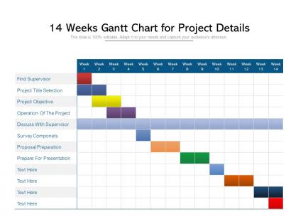
14 weeks gantt chart for project details




Try Before you Buy Download Free Sample Product
 Impress Your
 Audience
 100%
100% Editable
 Save Hours
 of Time


Capture the imagination of your clients with our 14 Weeks Gantt Chart For Project Details. Include all the incentives they could expect.
People who downloaded this PowerPoint presentation also viewed the following :
14 weeks gantt chart for project details with all 2 slides:
Include all the incentives folks could expect with our 14 Weeks Gantt Chart For Project Details. Capture the imagination of your clients.
FAQs for 14 weeks gantt chart
So you'll need tasks down the left side and your timeline across the top. Task bars show how long stuff takes and how much is done. Dependencies connect related work - honestly the most annoying part to set up but super helpful once you do it. Those diamond milestone markers? Took me ages to figure out what they were for lol. Don't forget who's assigned to what or people get confused about responsibilities. Colors and symbols need a legend obviously. But here's the thing - if you don't update it regularly, it just becomes useless decoration that everyone ignores.
Honestly, Gantt charts are lifesavers for spotting which tasks are gonna block everything else before it's too late. You can see who's drowning in work and where you might squeeze tasks in parallel to speed things up. Stakeholders eat up the visual timeline thing - way better than drowning them in details. I swear the key is actually updating them regularly (which nobody does lol). Use them in team meetings to keep everyone on track. My advice? Start basic with just your big milestones and main dependencies first.
Don't get too crazy with details right away - start simple. Buffer time is huge, trust me on this one. I see people connecting every single task to each other and it becomes this nightmare web of dependencies. Keep your time estimates realistic (we all think stuff will take 2 hours when it's really 6). Update it weekly or you'll forget what you were even doing. Oh, and don't cram everything onto one chart - looks like chaos. Honestly, the biggest thing is treating it like a living doc instead of something you make once and never touch again.
Start with your team size and budget honestly. Asana's solid for smaller groups, Monday.com too. Microsoft Project if you're dealing with enterprise-level chaos. Don't get sucked into features you'll never touch - I've watched teams pay for bells and whistles they ignore completely. Drag-and-drop is clutch. Real-time collaboration matters if you're not all in the same room. Check what integrates with your current tools first though. Most platforms have free trials anyway, so test a few before you commit to anything expensive.
Think of dependencies as the rules for which tasks have to wait for others to wrap up first. Without them, your Gantt chart is basically useless - just colorful bars with no real meaning. You'll see arrows connecting different task bars showing these relationships. Here's the best part: when something gets delayed, everything that depends on it automatically shifts forward too. So if your first task runs two days late, the whole chain updates itself. Perfect for spotting potential bottlenecks early. I learned this the hard way on my last project!
Yeah, just focus on the big stuff - epics and releases instead of getting into every little story. Map your major features across sprint cycles. I actually think Gantt charts get a bad rap for being too waterfall, but honestly? They're perfect for showing stakeholders what's coming down the pipeline. Keep it high-level and just update after retrospectives. Don't use it for daily sprint stuff though - that's what your board is for. Oh, and try swim lanes if you're juggling multiple teams. Makes those gnarly dependencies so much easier to spot when everyone's stepping on each other.
Honestly, digital Gantt charts are so much better than paper ones. When one task gets delayed, everything else automatically shifts - no more erasing and redrawing constantly. You can update them instantly, share with your team without making copies (who has time for that?), and actually click into tasks to see details or attach files. Real-time collaboration is huge too since everyone sees changes immediately. I probably spend way too much time color-coding mine, but whatever works! The notifications for overdue stuff are lifesavers. Try Asana or Monday.com - you'll see what I mean.
Honestly, just keep your Gantt charts super simple - nobody wants to see a hot mess of every tiny task. Show the big milestones and where things might get stuck instead. Color coding helps tons for different teams or priorities. One thing I learned the hard way? Know your audience. Your boss wants the 30,000-foot view, but your team needs all the details. Oh, and actually update the thing regularly - there's nothing worse than a stale timeline that's totally off. Start/end dates should be crystal clear too, obviously.
Yeah definitely! Most Gantt tools these days play nice with other project management stuff. Jira, Trello, Asana, Monday - you can sync with pretty much all of them. Your updates and deadlines flow between systems automatically, which is clutch because nobody wants to update the same thing twice. Some let you embed the Gantt view right into your team dashboard too, which is kinda nice. I'd probably just check what your current tools support and test a couple out. Oh, and the integration setup is usually way easier than you'd expect.
Honestly, update that thing every week - or whenever something major shifts. I made the mistake of ignoring mine for like three weeks once and it was a disaster. Mark off what's done, adjust timelines for stuff that's running long, and move dependent tasks when delays hit (which they will). The trick is being brutally honest about where you actually are versus where you wanted to be. Color-code everything so people can instantly see what's complete, in progress, or totally behind. Set a phone reminder or you'll definitely forget.
Color coding is seriously helpful for Gantt charts. I usually do different colors for each department - like blue for marketing, green for dev work. Makes it super quick to spot patterns without reading every single task name. Red works great for anything overdue, yellow for risky stuff. The trick is not getting carried away though - I learned that the hard way after making one chart look like a unicorn threw up on it. Stick to maybe 4-6 colors tops and add a little legend. Trust me, you'll catch bottlenecks and resource issues way faster.
Honestly, Gantt charts are amazing for getting teams on the same page. Everyone can see who's doing what and when stuff is due - like having a bird's eye view of the whole project. What I love most is how you can catch problems early, like when Sarah's deliverable is gonna mess up Tom's timeline. No more "oh crap" moments in meetings! They're also great for showing stakeholders what's happening without long explanations. Pro tip: actually keep the thing updated though - I've seen too many teams create beautiful charts then never touch them again. Share it during your weekly check-ins and you'll be golden.
Oh man, Gantt charts are everywhere in big projects! NASA used them for the Apollo missions - imagine coordinating all those teams and contractors without going insane. The Empire State Building? Done in 410 days thanks to Gantt scheduling. Microsoft does their software releases this way, and honestly Marvel's entire cinematic universe timeline is basically one massive Gantt chart. Film studios are obsessed with them too. They're great when you've got clear deadlines and stuff that depends on other stuff finishing first. Definitely try one next time you have a complex project.
Honestly, Gantt charts are a lifesaver for this stuff. You can literally see when someone's drowning in work while another person has nothing to do. Like Sarah being triple-booked - happens all the time, right? The visual bars show exactly who's needed when, so you can actually fix the mess before it happens. Spotting bottlenecks becomes super obvious. I always map out resources on the Gantt before setting any deadlines now (learned that one the hard way). You can track if your plan's working as things move along too.
Ugh, Gantt charts become absolute nightmares with complex projects. One delay hits and suddenly you're updating dates across like 15 different tasks - it's honestly exhausting. Plus they're terrible at showing resource conflicts. Sarah can't actually work on three things at once, but the chart makes it look fine? The whole thing gets cluttered and impossible to read too. I'd stick to using them for big picture stuff and milestones. For the nitty-gritty resource planning, you'll need something else entirely.
No Reviews