


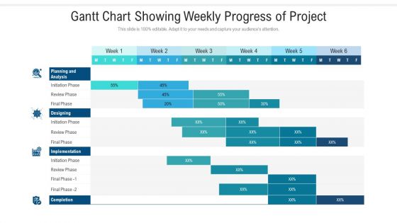
Gantt chart showing weekly progress of project




Try Before you Buy Download Free Sample Product
 Impress Your
 Audience
 100%
100% Editable
 Save Hours
 of Time


Our Gantt Chart Showing Weekly Progress Of Project are topically designed to provide an attractive backdrop to any subject. Use them to look like a presentation pro.
People who downloaded this PowerPoint presentation also viewed the following :
Gantt chart showing weekly progress of project with all 2 slides:
Use our Gantt Chart Showing Weekly Progress Of Project to effectively help you save your valuable time. They are readymade to fit into any presentation structure.
FAQs for Gantt chart showing weekly
So basically a Gantt chart has three key parts - your task list down the left side, timeline across the top, and these horizontal bars that show duration and timing. Those bars are honestly where the magic happens since you can see everything at once - what overlaps, what's running late, dependencies between stuff. Pretty neat actually. Timeline keeps you honest about deadlines while the task list stops things from getting messy. My advice? Start with mapping out all your tasks first, then add realistic timeframes. Once you throw in the dependencies, you'll see how everything connects and flows together.
Honestly, Gantt charts are game-changers for cutting through all that "wait, who's doing what?" chaos. You'll instantly spot which tasks are holding everything up and how your stuff affects everyone else. No more sitting through those painful status meetings trying to figure out if Sarah's behind schedule means the whole launch is screwed. When your boss asks for updates, just show them the chart instead of digging through a million emails. I update mine every week and drop it in our team chat - saves so much back-and-forth nonsense. The visual timeline thing really helps everyone stay on the same page with deadlines too.
Look, Gantt charts are clutch when you've got tasks that depend on each other - like construction or software launches where step B can't start until step A is done. Perfect for showing your boss exactly when stuff will be ready too. They're honestly overkill for simple projects, but once you're juggling multiple people and deadlines? Game changer. I'd say use one when timing dependencies matter more than being able to pivot quickly. Oh, and they're great for spotting potential bottlenecks before they screw you over.
Honestly, the two big traps are making it way too complicated and being wildly optimistic about how long stuff takes. Don't put every little task in there - just focus on the big milestones. Always add buffer time because I swear everything takes at least 50% longer than you think it will. Been burned by that so many times! Watch out for dependencies that don't actually make sense in real life. Keep it basic at first. You can always make it fancier later, but if you don't update it regularly the whole thing becomes pointless pretty fast.
Yeah, totally doable! Most people think Gantt charts are way too rigid for agile, but honestly they work great if you don't treat them like gospel. Focus on your current sprint instead of mapping everything out months ahead. Keep it to 1-4 week chunks and show dependencies between user stories. Perfect for release planning too. The trick is updating them constantly - like after every sprint review when priorities inevitably shift. My old PM used to say treat them like a living doc, not some carved-in-stone masterplan. Works way better that way.
Microsoft Project's pretty powerful but honestly? Total overkill unless you're managing something huge. Asana and Monday.com hit that sweet spot - clean design, everyone can collaborate without wanting to throw their laptop. Already using Google Workspace? Their Sheets has basic Gantt stuff that actually doesn't suck. GanttProject's free if budget's tight, or you could do Trello with timeline view. Oh, and here's the thing - whatever your team's already comfortable with usually wins. Best tool means nothing if half the people never update it.
Okay so dependencies are basically what make Gantt charts actually useful instead of just pretty timelines. You connect tasks that rely on each other, and suddenly you can spot your critical path - like which delays will totally screw you over. Think of it like dominoes falling. Miss one deadline and boom, you see exactly what gets pushed back automatically. I learned this the hard way on a project last year, ugh. Without linking tasks properly, you're just staring at disconnected boxes that don't tell you squat about reality. Map out what actually needs to happen first - trust me, it prevents those "oh crap" moments later.
Honestly, Gantt charts are so much better than regular timelines. You can actually see how tasks connect instead of just random start/end dates. Resource allocation becomes way clearer too - like who's doing what and when they'll be free. I'm weirdly obsessed with how organized those colored bars look? Makes even chaotic projects seem doable. You'll catch scheduling disasters before they happen, which is huge. Stakeholders love them because progress is super obvious. Just try one for your next project - I bet you'll never go back to basic timelines.
Honestly, Gantt charts are kind of a game-changer for this stuff. You can literally see who's drowning in work while others are twiddling their thumbs. The cool thing is you'll spot task dependencies and timelines right next to who's assigned what - makes it super obvious when you need to shuffle things around. I always color-code by person because it makes the workload gaps jump out at you. Plus you can see exactly when people finish their current stuff, which helps with planning ahead. Way better than trying to keep track of everything in your head or some messy spreadsheet.
Yeah totally - Gantt charts play nice with basically everything these days. Hook them up to Asana, Monday, whatever task manager you're using. The Slack/Teams integration is honestly a game changer though. Timeline shifts? Boom, everyone gets notified automatically. No more "wait what's the deadline again" messages clogging your DMs. You can also connect budget stuff from your accounting software, file storage, time tracking apps. Oh and calendar syncing obviously. I'd say pick whichever integration fixes your biggest headache first, then add more as you go. Don't try to connect everything at once - you'll just confuse yourself.
So milestones are basically your "yes, we actually finished something!" moments in a Gantt chart. Put them at natural stopping points - like when you wrap up a prototype, get that client sign-off, or finish testing. Honestly, they're lifesavers for keeping teams focused and catching delays early. I space mine every 2-4 weeks usually, but it depends on your project timeline. Just make sure they're specific - none of that wishy-washy "make design progress" stuff. You want clear wins you can point to and say "done."
Gantt charts are great for catching risks before they blow up your project. Dependencies become super obvious - you'll see bottlenecks and critical paths right away. Those are your warning signs. When deadlines start sliding, you can instantly see which delays will mess up everything else downstream. Build buffer time around risky stuff too. I probably check mine more than I should, but updating weekly keeps you on top of things. During risk meetings, pull it up to show people exactly where the sketchy parts are. Way easier than trying to explain it without visuals.
Honestly, update that thing weekly or whenever something major shifts - otherwise it becomes useless pretty fast. I'd focus on the real dates (not the wishful thinking ones), progress percentages, and moving dependent tasks around when stuff inevitably gets delayed. The worst thing you can do is pretend everything's still on the original timeline when it's clearly not. Your team needs to see what's actually happening, not some outdated fantasy version. Oh, and definitely set a calendar reminder because you'll 100% forget otherwise. Trust me on that one.
Dude, Gantt charts are game-changers for getting stakeholders actually engaged. Instead of staring at boring spreadsheets, people can see the whole project timeline laid out visually. Dependencies become obvious, bottlenecks jump out at you, and everyone instantly gets where their stuff fits in. Delays? You can literally point to how they mess up everything downstream. I swear, meetings get so much better when you're just pointing at colored bars instead of explaining complex scheduling stuff. My boss always zones out during regular updates, but throw up a Gantt chart and suddenly he's asking detailed questions. Try it next time – you'll be surprised how much more people actually participate in discussions.
Yeah totally! I've been using them for my side hustle and honestly they're perfect for bigger personal stuff - wedding planning, job hunting, home reno projects. Don't go overboard though and track every tiny thing or you'll drive yourself nuts. Focus on the deadlines that actually matter. I color-code mine by category which helps a ton. Try Google Sheets first since it's free - no point dropping money on fancy software until you know if you'll stick with it. Takes some getting used to but once you do, it really does help visualize everything.
-
Enough space for editing and adding your own content.
-
Top Quality presentations that are easily editable.
-
Informative design.
-
Topic best represented with attractive design.
-
Unique research projects to present in meeting.