


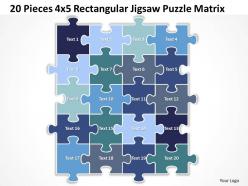
20 pieces 4x5 rectangular jigsaw puzzle matrix powerpoint templates 0812





Try Before you Buy Download Free Sample Product
 Impress Your
 Audience
 100%
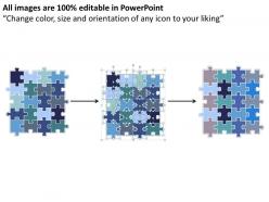
100% Editable
 Save Hours
 of Time


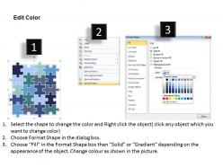
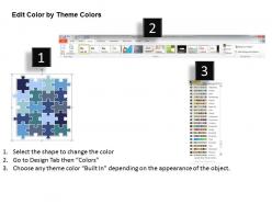
Acheive your aims with our 20 Pieces 4x5 Rectangular Jigsaw Puzzle Matrix Powerpoint templates ppt presentation slides 0812. They will outline the process till the final outcome.
People who downloaded this PowerPoint presentation also viewed the following :
20 pieces 4x5 rectangular jigsaw puzzle matrix powerpoint templates 0812 with all 7 slides:
Deck out your thoughts with our 20 Pieces 4x5 Rectangular Jigsaw Puzzle Matrix Powerpoint templates ppt presentation slides 0812. They will come out looking good.
FAQs for 20 pieces 4x5 rectangular jigsaw puzzle matrix
Honestly, jigsaw puzzle templates are perfect when you're trying to explain how stuff connects. I use them all the time for showing processes or how different team roles work together - way more engaging than those death-by-PowerPoint bullet lists, you know? People immediately understand the whole "pieces fitting together" thing. What's cool is you can reveal one piece at a time during presentations, which keeps everyone actually paying attention. They're clutch for explaining department collaboration or walking through complex strategies. The visual aspect just clicks with people in a way that regular slides don't.
Dude, jigsaw puzzle templates are honestly genius for presentations. Instead of people just sitting there zoning out, they're actually doing something while you talk. You reveal info bit by bit as they solve sections - keeps everyone curious about what's coming next. There's also something weirdly satisfying about puzzle pieces snapping together (I don't know why but it just works). The whole thing helps people see how different ideas connect to make the bigger picture. Perfect for complex stuff or when you're building up to something big. Way better than watching everyone scroll through Instagram halfway through your talk.
Pick images with lots of contrast and different sections - photos with varied colors, artwork with defined areas, that kind of thing. Trust me, don't go with something like a solid color background (learned that lesson with a sky photo that was basically torture to solve). Logos work great since they have multiple parts. Educational diagrams are solid too. Complex illustrations tend to be more fun than simple ones, honestly. Just make sure you're starting with a high-res image so the pieces don't look pixelated when you cut them up.
Oh totally! First thing - make sure those tabs and blanks actually lock together properly. Nothing worse than a puzzle that just slides apart lol. Your cut lines need to be visible but not crazy bold, and throw in some alignment guides for manufacturing. Corner markers help too. Piece count indicators are clutch. Honestly, I always space on this part, but add a reference grid or numbering for complex stuff - saves so much headache later. Maybe do a small test run first? Way cheaper than screwing up a whole batch.
So basically you just swap out the pictures, colors, and content depending on what you're going for. Educational stuff works great with maps or science diagrams. Corporate clients eat up branded puzzles with their logos - weird but true! Adjust the piece count based on who's solving it. Healthcare companies might want anatomical stuff, tourism ones use pretty destination shots. Oh, and keep your template setup flexible so you're not rebuilding the whole thing every time. Just drop in new visuals and you're good to go. Way easier than starting fresh each project.
Honestly, I'd go with Inkscape first since it's free and perfect for this stuff. The vector tools make those interlocking pieces so much cleaner than trying to mess around in Photoshop. Adobe Illustrator is obviously the gold standard if you've got the budget. GIMP works too but feels clunky for this kind of work. There are dedicated puzzle apps like Puzzle Maker Pro, though I've never actually tried them - might be overkill? Inkscape has tons of tutorials online anyway. Just remember vector beats raster every time when you're making templates since you can resize without everything looking terrible.
Oh totally! I use puzzle templates with my students all the time. Kids absolutely love the hands-on aspect - way better than worksheets, honestly. You can customize them for whatever you're teaching... geography, vocab, math problems, whatever. Visual learners especially eat this stuff up since they get to physically see how concepts connect. Start simple with younger kids, then make them trickier as they get better at spatial thinking. There's tons of pre-made educational ones you can buy too if you don't want to create your own. Actually works great for adults learning new topics as well!
Honestly, jigsaw puzzle templates are perfect for this. You reveal info piece by piece - your audience actually stays engaged because they're trying to figure out how everything connects. Start with scattered pieces (problems, random data points, whatever) then slowly fit them together as you tell your story. It's kind of like those mystery movies but way less dramatic and more... quarterly report-ish? Each section should be one story beat or problem-solution combo. People get weirdly invested in seeing the full picture come together. Way better than just dumping everything upfront.
Don't go crazy with tiny pieces or super complex templates - you'll hate yourself later. Check your resolution before printing too, because blurry puzzles are the worst. Oh, and think about where you're actually gonna put this thing when it's done. A 1000-piece puzzle is cool until you realize your kitchen table isn't big enough lol. Your image needs good contrast so pieces don't all look identical. Definitely test print a few pieces first to make sure everything lines up right with your design.
Honestly, jigsaw puzzles are perfect for this stuff. Drop them into PowerPoint where each piece reveals your next point - way better than boring bullet lists, trust me. I've used them in training materials and they actually keep people awake. Works great with flowcharts too. Start with your complete puzzle showing the big picture, then break it apart to explain each piece. Mind maps + puzzle pieces = those satisfying "oh I get it now" moments. You can layer them with timelines or process stuff to show connections. Sounds cheesy but it really works.
Track how long people stick around and actually finish the activities - that's your biggest clue if it's working. See if they're really getting the concepts through your puzzle format. Honestly, test with a small group first because what makes perfect sense to you might totally confuse someone else. Ask about navigation and clarity directly. Short sentences work. Then iterate based on what trips people up before you launch it everywhere. Oh, and don't just look at completion rates - check if they're actually learning anything meaningful from it.
Oh man, color choice makes such a huge difference! Bright colors with high contrast basically make the puzzle easier because you can see piece edges way better. Muted or single-color schemes? Total nightmare - everything looks the same. I always go with darker backgrounds now since they're easier on your eyes. Found that out after a brutal 6-hour puzzle session that left me basically blind lol. Warmer colors like reds make things feel intense, while blues and greens are super chill. Just keep your template backgrounds neutral so they don't clash with the actual image.
Honestly, tons of companies do this smart. Scholastic uses puzzle templates for their learning stuff and saw 40% better engagement - pretty solid results. Ravensburger's the obvious one since they're puzzle kings, but their template system cuts manufacturing costs like crazy. Oh, and Nike did this cool branded puzzle giveaway that totally blew up online. Marketing agencies love this approach too. The thing is, nobody's starting from scratch anymore - they just build on what already works. I'd probably look at Ravensburger's case study first though, their efficiency numbers are honestly kind of nuts.
Yeah totally! They're actually pretty solid for virtual stuff. People get weirdly competitive about revealing puzzle pieces during webinars - honestly keeps everyone way more engaged than I expected. You can use them as icebreakers or to show how your topics connect together. Obviously you can't do physical pieces, so just reveal sections of your image as you go through content. Make sure it's clear enough to see on screen though - learned that one the hard way. I'd start simple, maybe 6-9 pieces max for your first try.
Honestly, just start with surveys and playtesting sessions - ask people about piece difficulty and how clear the images look. I totally messed up my first batch because the pieces were way too similar looking! Reviews help too, but focus groups give you better details about what's actually frustrating. Track the specific problems people mention, then tweak your cutting algorithms or piece shapes based on those patterns. A/B testing different template versions works great once you've got the basics down. Oh, and don't roll out changes to everyone right away - test with smaller groups first so you're not stuck fixing a huge mess later.
-
Illustrative design with editable content. Exceptional value for money. Highly pleased with the product.
-
I discovered this website through a google search, the services matched my needs perfectly and the pricing was very reasonable. I was thrilled with the product and the customer service. I will definitely use their slides again for my presentations and recommend them to other colleagues.