


Action plan for enhancing team capabilities team performance observation dashboard




Try Before you Buy Download Free Sample Product
 Impress Your
 Audience
 100%
100% Editable
 Save Hours
 of Time


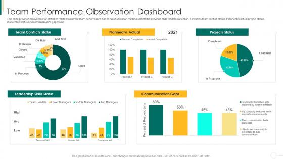
This slide provides an overview of statistics related to current team performance based on observation method selected in previous slide for data collection. It involves team conflict status, Planned vs actual project status, leadership status and communication gap status.
People who downloaded this PowerPoint presentation also viewed the following :
Action plan for enhancing team capabilities team performance observation dashboard with all 10 slides:
Use our Action Plan For Enhancing Team Capabilities Team Performance Observation Dashboard to effectively help you save your valuable time. They are readymade to fit into any presentation structure.








FAQs for Action plan for enhancing team capabilities team
Focus on stuff that actually changes how your team works day-to-day. Sprint velocity, bug rates, customer satisfaction scores - those matter. Code review turnaround time is huge too, honestly people underestimate that one. Skip the vanity metrics that just look good in meetings but don't help anyone. Team health stuff is clutch - like workload distribution and deadline risks coming up. Oh, and pipeline health if you're doing CI/CD. Make it visual and keep updating it regularly. Otherwise it just becomes another ignored dashboard collecting digital dust.
Honestly, charts and visuals are game-changers for team data. You'll spot trends instantly instead of drowning in spreadsheet hell. Heat maps show you who's killing it vs who needs help - I literally check ours every morning now. Real-time dashboards catch problems early too. Bar charts work great for comparing people, line graphs for tracking progress over time. Oh, and those little gauge things for goals? Super satisfying when they hit green. Start basic though - don't go crazy with fancy stuff right away.
Tableau and Power BI are your best bets if you want something that actually works well - both handle messy data and let people click around to dig deeper. Grafana's great for real-time stuff too. Honestly though, I've seen teams do pretty decent work with Google Data Studio or even souped-up Excel if money's an issue (Excel gets annoying with multiple sources but whatever). Before you pick anything, figure out what metrics your team actually cares about first. Then just go with whatever connects easiest to your data. No point getting fancy if it can't pull from where your info lives.
Just go talk to each team first - seriously, don't skip this step. Sales cares about pipeline numbers and conversions. Dev teams? Sprint velocity and bug tracking. Marketing loves flashy charts showing campaign wins, but finance wants boring tables with budget stuff. I learned this the hard way when I built what I thought was amazing and nobody used it lol. Also customize everything - the data you pull AND how it looks. After you roll out each version, grab people for quick feedback sessions. Trust me, you'll need to tweak things based on how they're actually using it.
Honestly, real-time data is a total game changer. You catch problems while you can still fix them instead of getting that "oh crap" moment three weeks later. Like when someone's drowning in work or absolutely killing it - you'll know immediately and can jump in to help or give props. Way better than those dusty monthly reports that feel ancient by the time you read them. Oh, and set up alerts for your most critical stuff so you're not glued to dashboards all day. Trust me on this one.
Honestly, just automate your data validation checks and pick one source of truth for each metric. Connect dashboards straight to your main systems - manual updates are a nightmare waiting to happen. I learned that the hard way lol. Set alerts for weird spikes or missing data, then audit regularly by comparing dashboard vs source numbers. Document what each metric actually means and update schedules too. Oh, and build these checks into your workflow upfront. Way easier than explaining to confused teammates why the numbers don't match later.
Weekly updates are the bare minimum, but daily's way better if things move quickly on your team. Pick a time that actually works - Monday mornings or Friday afternoons, whatever clicks. Focus on metrics that tie to real goals, not just flashy numbers. Honestly, who cares about traffic if your conversions are garbage? Double-check any weird data jumps before you share them. Set up alerts for important thresholds so problems don't blindside you later. Oh, and start simple - maybe 3-5 key metrics max, then expand from there once you've got the routine down.
So team dashboards are basically your window into what's actually happening with performance day-to-day. You'll catch bottlenecks before they become disasters. Plus you can see who's crushing it and which projects are worth the effort versus total time-wasters. Honestly, most companies mess this up by tracking vanity metrics that don't matter. Start with whatever keeps your leadership up at night - usually 3-5 big goals - then figure out how your team's work connects to those. Real-time data beats quarterly check-ins every time. Build your dashboard around those connections and you're golden.
Look, team feedback is like your cheat sheet for dashboard design. Ask them what KPIs they actually check every day and what's missing from their current reports. How do they like seeing data - charts, tables, whatever? I swear I've watched people build these elaborate dashboards that just sit there collecting dust because nobody asked what the team wanted. Their input helps you figure out which widgets matter most and how to organize everything. Maybe shoot them a quick survey first? Or just grab coffee and chat about it before diving in.
Honestly, the worst thing you can do is track everything at once. You'll just confuse everyone and nobody will know what actually matters. Pick like 3-5 metrics that connect to your real goals - skip the vanity stuff that just looks pretty. Oh and here's what kills me - people set up these dashboards then completely abandon them! Someone needs to own keeping it updated or your team will ignore it entirely. I'd start super basic, get people actually using it first, then add fancier tracking later. Trust me on this one.
Tell a story with your data instead of just dumping charts on them. Lead with the big win - "response times are up 30%" - then explain what caused it. Trust me, people's eyes glaze over if you start with methodology crap, so save that boring stuff for the end. Your visuals should show trends and weird outliers, not every damn data point. Connect everything back to actual business stuff - customer happiness, money, whatever matters to them. Oh and always wrap up with 2-3 things they can actually do about it, not vague suggestions.
Honestly, I'd focus on two main things - actual usage numbers and whether it's helping your team get stuff done better. Check who's logging in regularly and what features they're actually clicking on. But the real test? See if project completion rates improved or if your managers are making decisions faster since rolling it out. Maybe throw a quick survey at your team every few months too - sometimes people use tools just because they have to, not because they're helpful. Oh, and don't go crazy tracking everything at first. Pick like 3-4 metrics that matter most. You can always add more later once you figure out what's actually moving the needle.
Just throw text boxes right next to your charts - honestly, data without story is useless. Add weekly team notes, customer feedback bits, or quick explanations when metrics go crazy. Color-coded flags work great too so people can mark wins or blockers. The trick is connecting your qualitative stuff directly to what the numbers show. Oh, and set up someone to update these weekly or they'll get stale fast. I swear, teams that skip this step wonder why their dashboards don't actually help anyone make decisions.
Focus on making it actually useful first - I've seen way too many pretty dashboards that tell you absolutely nothing. Real-time updates are crucial, plus let people customize what they're seeing. Color-coded status stuff works great for quick scanning. Don't dump everything on one screen though, that's overwhelming as hell. Start with maybe 3-5 key metrics, then add drill-down options so people can dig deeper when they need to. Basic filtering by dates or team members is a must. Oh, and keep the interface clean - cluttered dashboards just sit there unused.
Honestly, data storytelling is what makes dashboards actually useful instead of just confusing number soup. Like instead of slapping "productivity up 15%" on there, tell people WHY it happened - was it that new software you rolled out? The team workshop? I always think of it as being a detective walking someone through your case. You can drop in little context boxes next to big changes, highlight the interesting trends, connect dots between what the data shows and stuff that actually went down. Once people see the story behind the numbers, they'll actually give a damn about your dashboard.
-
Best Representation of topics, really appreciable.
-
Visually stunning presentation, love the content.
-
Qualitative and comprehensive slides.