

Architecture And Construction Services Firm Organization Chart




Try Before you Buy Download Free Sample Product
 Impress Your
 Audience
 100%
100% Editable
 Save Hours
 of Time


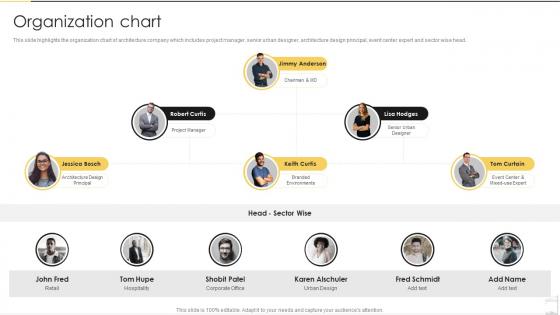
This slide highlights the organization chart of architecture company which includes project manager, senior urban designer, architecture design principal, event center expert and sector wise head.
People who downloaded this PowerPoint presentation also viewed the following :
Architecture And Construction Services Firm Organization Chart with all 6 slides:
Use our Architecture And Construction Services Firm Organization Chart to effectively help you save your valuable time. They are readymade to fit into any presentation structure.





FAQs for Architecture And Construction Services
So you'll need the obvious stuff first - names, job titles, who reports to who. Group people by departments so it makes sense. Contact info is helpful if you're sharing it around. Visual-wise, keep it simple and clean. Nobody wants to decode some tangled mess of lines going everywhere (trust me, I've seen some disasters). The hierarchy should flow top to bottom without making people squint. Oh, and this is crucial - actually update the thing regularly. There's literally nothing more useless than an org chart from six months ago that still shows people who don't even work there anymore.
So basically it shows who reports to who and connects all the teams together. Saves you from those awkward "um, who do I even ask about this?" situations. You'll know exactly who handles what instead of sending emails to random people and hoping for the best. Plus it helps you see the big picture - like how your stuff connects to other departments and who actually makes decisions around here. I used to ignore ours but honestly? It's super helpful when you need to escalate something or work with other teams. Worth keeping it bookmarked or whatever.
Honestly, Lucidchart's probably your best bet - super clean and professional looking. Visio's solid too if you want that polished corporate vibe. Canva actually surprised me lately, they've got some really modern templates that don't look cheesy. PowerPoint works fine for basic stuff (assuming you're already paying for Office anyway), but it gets annoying with bigger teams. Oh, and Miro's clutch if multiple people need to edit it at once. I'd just start with whatever your company already pays for and see how it goes.
Honestly, just map out what's actually happening right now instead of trying to build some perfect system from scratch. Who's making the real decisions? Who talks to who every day? I'd start there because I've watched companies waste months on org charts that look amazing but make no practical sense. Think about your industry too - some need more hierarchy, others work better flat. Size matters obviously. Also consider where you want people to grow into roles later, but don't overthink that part. Take what's already working and tweak it from there rather than reinventing everything.
Honestly, org charts are a lifesaver for new people. They can actually see who reports to who instead of guessing. Plus it shows them where they fit in - which sounds obvious but isn't always clear on day one. New hires can figure out who to bug with different questions without awkwardly asking around. Career paths become way more visible too. I'd definitely walk through it with them that first week (maybe not Monday though, they're already drinking from a fire hose). Keep a digital copy handy they can check whenever.
Org charts are honestly pretty great for this - you can see the gaps right away when everything's mapped out visually. Look for spots with no clear owner, managers drowning in direct reports, or important stuff buried too deep in the hierarchy. Also keep an eye out for your rising stars who might be ready for more responsibility. I mean, it's basically like doing a puzzle and realizing you're missing half the corner pieces. Worth doing this every few months since things change fast. Any areas looking sketchy for coverage or succession? Those should be your priority fixes.
So hierarchical charts are basically your typical corporate pyramid - executives up top, middle managers below them, then all the regular employees. Flat structures just have leadership and everyone else, way fewer layers. Big companies usually need the hierarchy thing because someone has to be in charge of all those moving parts. Startups and creative teams do better with flat structures since decisions happen faster and people get more freedom to do their thing. Though honestly? Most "flat" companies I've seen still have some hidden hierarchy somewhere, they just don't want to admit it lol. Pick whatever matches your company size and how fast you need stuff to get done.
Honestly, just update it whenever something actually changes - new hires, people leaving, promotions, team shuffles. Most places I've seen do it monthly or quarterly depending on how crazy things get. Nothing's worse than some new person wandering around trying to figure out the reporting structure because nobody touched the chart in like 6 months. Super awkward. Some companies just make one person responsible for keeping it current. My take? Set a monthly reminder to at least glance at it. Even if nothing's changed, you'll catch stuff you missed.
Honestly, org charts are a lifesaver for project stuff. They show you who reports to who and where the real decision-making power sits. You can spot your key stakeholders right away and figure out the approval chain without playing guessing games. Plus they help you catch potential bottlenecks early - like when you realize two departments both think they're in charge of the same thing (awkward). When you're planning your kickoff meetings, definitely check the chart first so you don't accidentally leave out someone important. Trust me, that's happened to me before and it wasn't fun.
Ugh, people HATE change - that's your biggest hurdle right there. They'll freak out about losing their spot in the hierarchy or having their responsibilities shift. Communication becomes a total mess too because nobody knows who reports to who anymore. I swear, half your day becomes people asking "wait, who do I even talk to about this now?" Plus all the boring admin stuff - updating systems, org charts, employee directories. What a pain. But seriously, talk to your team constantly during the switch and find someone in each department who's actually excited about the changes to help sell it to everyone else.
Definitely put your org chart somewhere everyone can actually find it - team wiki or shared drive works great. When you're stuck figuring out who approves what or need someone from another department, you'll thank yourself later. Keep the contact info current, plus time zones (learned that one the hard way). Oh, and add how people like to communicate - some are Slack people, others get annoyed if you don't email them first. Trust me, it saves so much awkward "sorry, who should I be talking to about this?" moments.
Ugh, those super rigid org charts are the worst. People start with the whole "not my department" thing instead of just working together. Everything gets stuck going up and down the chain - takes forever to make simple decisions. You're basically wasting all the cool skills people have because they can't step outside their little boxes. Talented folks will bounce for companies that actually let them collaborate. I mean, you still need some structure so people know who's responsible for what, but don't make it so tight that nothing gets done.
Yeah, industries totally change how you'd set up org charts. Tech companies go flat with cross-functional teams everywhere. Manufacturing? Super hierarchical with clear departments - makes sense for their workflow. Healthcare gets messy because you're showing both admin and clinical reporting lines, which honestly can look like spaghetti sometimes. Financial services pile on compliance roles and risk management layers like crazy. But here's the thing - don't just copy what looks "normal" for your industry. Map out how decisions actually get made first, then build your chart around that real workflow. Otherwise you'll end up with something that looks pretty but doesn't match reality.
Honestly, start with a quick survey about role clarity and decision bottlenecks - those'll give you the biggest bang for your buck. Check how fast decisions actually get made vs getting stuck in approval hell. Employee engagement scores are super telling too, especially if people are confused about who they report to (nightmare scenario). Look at your manager-to-employee ratios - some departments might be drowning while others are overstaffed. Communication surveys help spot where info just... dies between levels. Oh, and compare promotion rates across teams. If one department's promoting way more people, that's probably a red flag about structure. Decision speed is probably your best starting point though.
Dude, colors totally save org charts from looking like complete chaos. Pick different ones for each department - maybe blue for engineering, green for sales, whatever works. I swear half the charts I see look like someone just randomly dropped boxes everywhere! Short sentences help. So does consistent spacing and clean fonts that don't make people squint. Try using bigger boxes for higher-level roles too. Just don't go crazy with it - stick to 3-4 colors max and keep everything aligned so people can actually follow who reports to who without getting a headache.
-
Presentation Design is very nice, good work with the content as well.
-
A fantastic collection of templates. I'll likely use this as my go-to resource for future templates and support.