


Brand labelling powerpoint presentation slides




Try Before you Buy Download Free Sample Product
 Impress Your
 Audience
 100%
100% Editable
 Save Hours
 of Time


Showcase the steps that maximize the brand value of your organization by using our content ready Brand Labelling PowerPoint Presentation Slides. With the aid of this brand positioning presentation template, you can create a strategy that makes your brand unique from your competitors. Use product marketing PowerPoint graphic and explain how to monitor product performance in the market. You can demonstrate your brand message with the help of a brand strategy PPT theme and grab the attention of your target audience. Take the assistance of this brand awareness presentation slides and outline the sales tools that enhance the development of your business. Employ this professionally designed product branding strategy PPT visuals and present the advantages of your product to your customers. Use brand positioning framework PowerPoint layout and talk about the positioning or stability of your product in the marketplace. Therefore, download our ready-to-use product marketing PPT deck and display the durability and reliability of your brand or item.
People who downloaded this PowerPoint presentation also viewed the following :
Content of this Powerpoint Presentation
Slide 1: This slide introduces Brand Labelling. State Your Company Name and begin.
Slide 2: This slide shows Content of the presentation.
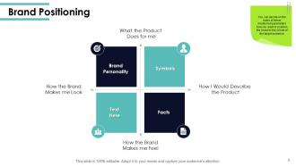
Slide 3: This slide presents Brand Positioning describing- Symbols, Facts, Brand Personality, etc.
Slide 4: This slide displays Positioning Strategy describing- Clear Positioning, Key Message, Touch Points.
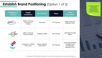
Slide 5: This slide represents Establish Brand Positioning in tabular form.
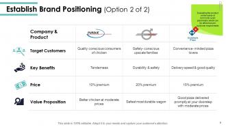
Slide 6: This is an optional slide to Establish Brand Positioning.
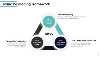
Slide 7: This slide showcases Brand Positioning Framework describing- What Competition has to give, What You have to offer, and What Customers Want.
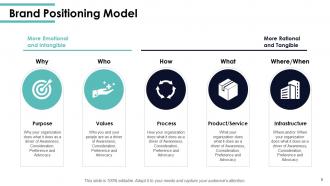
Slide 8: This slide shows Brand Positioning Model describing- Purpose, Values, Product/Service, Infrastructure, Process.
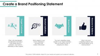
Slide 9: This slide presents Create a Brand Positioning Statement describing- Brand Promise, Reasons to Believe, Market Definition, Target Customer.
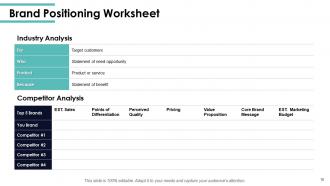
Slide 10: This slide displays Brand Positioning Worksheet with industry analysis and competitor analysis.
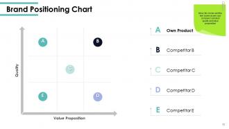
Slide 11: This slide showcases Brand Positioning Chart.
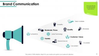
Slide 12: This slide represents Brand Communication describing- Customer Value, Personal Service, Accessible, Authenticity, Quality, Variety, Latest Technology, etc.
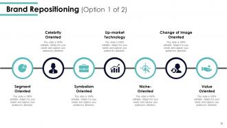
Slide 13: This slide shows Brand Repositioning describing- Value Oriented, Change Of Image Oriented, Niche-oriented, Up-market Technology, Symbolism Oriented, Celebrity Oriented, Segment Oriented.
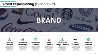
Slide 14: This is an optional slide for Brand Repositioning.
Slide 15: This slide displays Brand Labelling Icons.
Slide 16: This slide is titled as Additional Slides for moving forward.
Slide 17: This is Our Mission slide with related imagery and text.
Slide 18: This is Our Team slide with names and designation.
Slide 19: This is About Us slide to show company specifications etc.
Slide 20: This slide shows Mind Map for representing entities.
Slide 21: This is a Puzzle slide with text boxes to show information.
Slide 22: This is a Target slide. State your targets here.
Slide 23: This slide is titled as Post It Notes. Post your important notes here.
Slide 24: This is an Idea or Bulb slide to state a new idea or highlight information, specifications etc.
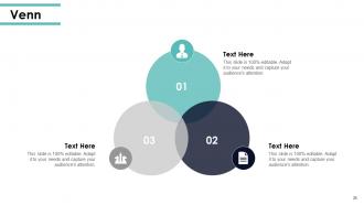
Slide 25: This is a Venn slide with text boxes.
Slide 26: This is a Thank You slide with address, contact numbers and email address.
Brand labelling powerpoint presentation slides with all 26 slides:
Use our Brand Labelling Powerpoint Presentation Slides to effectively help you save your valuable time. They are readymade to fit into any presentation structure.



FAQs for Brand labelling
Honestly, it's all about making sure people get what your product is right away. Your logo needs to be front and center, plus clear product names and descriptions. Keep your colors and fonts consistent with your brand - sounds obvious but you'd be surprised how many people mess this up. Don't forget the boring legal stuff like ingredients or warnings either, because regulatory issues are a nightmare. The tricky part? Fitting everything without making it look like a hot mess. I'd sketch out your must-haves first, then build the design around those core pieces. Short sentences work better than cramming everything together.
Colors totally mess with people's heads when they're shopping. Blue screams "trust me" - that's why banks love it so much. Red gets your heart pumping and makes you want to buy NOW (hello, Coke). Green obviously works for anything healthy or natural. Orange is super friendly but honestly kind of cheap-looking, so skip it if you're going premium. Here's the crazy part though - customers decide how they feel about your product in literally 90 seconds. So whatever vibe you're going for, your colors better match it or you're screwed.
Think of typography as your brand's personality showing through. Like, you wouldn't use the same font for a craft beer as you would for baby formula, right? Good fonts make your product feel premium or fun or whatever vibe you're going for. Coca-Cola in boring Times New Roman would be so wrong. Keep it consistent so people recognize your stuff, and honestly, readability matters more than being fancy. Test your fonts on actual packaging first - what looks good on screen can be totally different printed. Stick to max 2 fonts or it'll look messy.
Oh man, don't cram everything onto the front - I see brands do this all the time and it's a mess. Use bigger fonts that people can actually read, and make sure your colors pop against the background. Stick to maybe 2-3 fonts tops or it looks super amateur. Your brand name should be the biggest thing on there, obviously. Here's something I learned the hard way - print out a mockup and slap it on a real product to see how it actually looks on the shelf. Trust me, what looks good on your computer screen might be completely unreadable from across the aisle.
Honestly, a solid brand label is like having a built-in "trust me" button with customers. People will literally pay more just because they recognize your brand - look at Nike vs some random sneaker brand, right? Same shoe basically, but that swoosh means something to people. Your customers won't waste time comparing every little detail when they already know what you're about. The trick is actually following through on whatever your brand promises (seems obvious but you'd be surprised), then making sure your label gets that message across clearly. It's kinda wild how much a good reputation can boost your prices.
Dude, clear labels are everything for building trust. People want to know what they're actually buying without having to decode some mysterious ingredient list. When you're upfront about what's in your product or where it comes from, customers don't feel like you're trying to hide something sketchy. Nothing pisses people off more than squinting at tiny print wondering if they're getting scammed. Plus, you'll get way fewer returns when people know exactly what to expect. I swear, customers will keep coming back once they realize your labels actually match what's inside. It's such a simple thing but most brands mess it up.
Oh man, cultural stuff can totally make or break your branding. Red screams "lucky!" in China but here it's all danger vibes - crazy how different that is, right? You can't just translate your labels either. Religious stuff, local shopping habits, even regulations vary so much between markets. What crushes it in one place might be a complete disaster somewhere else. I'd definitely work with local teams who actually get the cultural nuances. My friend learned this the hard way when their "edgy" packaging bombed in more conservative markets. Do your homework first - deep research pays off way more than you'd expect.
Okay so three big things to watch out for. First, don't accidentally copy someone's trademark - that's how you end up in court. Then there's all the regulatory stuff which honestly gets super complicated depending on what you're selling. FDA rules for food/beauty products, FTC guidelines if you're making any claims about what your product does. The accuracy thing is huge too - can't mislead people about ingredients or where stuff comes from. I'd probably get a lawyer to look it over before you launch, especially if you're saying it'll make people healthier or whatever. Better safe than sorry with this stuff.
Honestly, recycled or biodegradable materials are your biggest win here. Water-based inks beat solvent ones every time. Shrink those label sizes too - less waste is always better. I saw this cool company using seed paper labels that people could literally plant afterward, which is genius if you ask me. QR codes work great for linking to product details instead of cramming everything onto the label. Oh, and definitely call out your sustainable choices right on the packaging - customers eat that stuff up. Don't try to overhaul everything at once though. Pick one thing and go from there.
Honestly, sustainability stuff is everywhere right now - like, every brand's doing eco-friendly materials and messaging about recycling. QR codes are blowing up too. People scan them for ingredient details, videos, whatever. Minimalist designs are totally taking over the cluttered look from before. Clean fonts, simple layouts, you know? Oh and transparency is huge - brands are being way more upfront about where ingredients come from and what's actually in products. Interactive elements let you link to personalized content which is pretty cool. I'd probably start with the sustainability updates first since that's what actually influences buying decisions these days.
Honestly, storytelling on labels is a game-changer. You're basically turning boring product specs into something people actually give a damn about. Craft breweries nail this - they'll tell you about the brewmaster's weird inspiration or whatever, instead of just "hops and barley." Way more interesting, right? Your label becomes this little conversation piece rather than just... packaging. The trick is staying real about it though. Don't force some random backstory that makes no sense. Just find what connects to your audience's vibe and run with that.
Honestly, Canva's probably your best starting point - super easy to mess around with ideas. Once you get more serious though, you'll want Adobe Illustrator for the real design work. Figma's actually pretty decent too, I've thrown together quick mockups there before. If you're working with a team, Artwork Flow or Ziflow handle all the back-and-forth approval stuff (saves so much headache). LabelJoy's specifically for labels if that's what you need. My take? Don't overthink it initially. Play around in Canva first, then graduate to Illustrator when you need precise control over fonts and colors.
So you'll want to keep your core stuff locked down - logo, main colors, brand voice. But then switch up the visual style for different audiences. Premium markets? Go fancy with the typography and materials. Mass market gets bold, simple designs that pop. It's kinda like dressing for different events - same person, different vibe. Just don't go nuts with the variations or you'll confuse people (I've watched brands totally bomb doing this). Start by figuring out what absolutely can't change, then see what elements you can flex based on how each segment actually shops and what they respond to.
So your brand labeling is basically how you make all that abstract brand stuff visible to people. Colors, fonts, images - they all need to match your brand's personality and values. I always think of it like this: if your brand was a person going to a job interview, what would they wear? That's your label design right there. It's literally a tiny billboard sitting on the shelf doing all the talking for you. Oh and definitely make sure whatever you choose connects back to your bigger brand strategy. Otherwise you're just making pretty packaging that doesn't actually work for your business.
Honestly, I'd start with basic brand recognition surveys - just ask people if they remember your labels. Sales data before and after changes is pretty obvious but super telling. Customer reviews will show you if your labeling actually makes sense, though people complain about everything packaging-related so don't stress too much. Returns are a big tell - confusing labels = wrong purchases. A/B testing different designs gives you the cleanest data if you've got time for it. Oh, and direct customer surveys work too, but surveys are kinda hit or miss depending on who actually responds.
-
Great designs, Easily Editable.
-
Informative design.
-
It saves your time and decrease your efforts in half.
-
Use of icon with content is very relateable, informative and appealing.
-
Great product with highly impressive and engaging designs.