


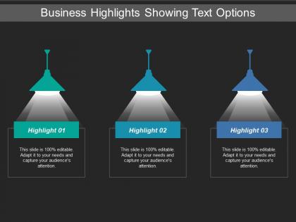
Business highlights showing text options





Try Before you Buy Download Free Sample Product
 Impress Your
 Audience
 100%
100% Editable
 Save Hours
 of Time


Add drama to your thoughts with our Business Highlights Showing Text Options. Your ideas will take centrestage.
People who downloaded this PowerPoint presentation also viewed the following :
Business highlights showing text options with all 5 slides:
Expose them to the benefits with our Business Highlights Showing Text Options. They will find your facilities attractive.
FAQs for Business highlights
Honestly, the biggest thing I'm noticing is everyone's ditching those text-heavy slides for more visual stuff. Interactive presentations are huge now - way better than just talking at people. Data viz has gotten so much better too, probably because of all the new tools. Since we're all doing remote meetings, people want shorter, snappier content. Nobody has attention spans anymore lol. Personalized decks are becoming standard instead of using the same generic presentation for everyone. AI's making it easier to create decent visuals quickly. Oh, and everything needs to work on mobile since that's where people view stuff now. Try adding some interactive bits to your next presentation - polls work great for keeping people engaged.
Honestly, just make a bunch of branded templates for the stuff you do all the time - pitch decks, quarterly reports, project updates, whatever. Your team will thank you because nobody wants to start from zero every single time. Make sure they've got your branding baked in and some kind of logical structure. Oh, and add placeholder text so people know what actually goes where (you'd be surprised how much this helps). Stick them in a shared folder everyone can find. Also pick someone to keep them fresh - outdated templates are almost worse than no templates.
Dude, design literally makes or breaks presentations. I've watched amazing ideas completely flop because someone used Comic Sans with neon green backgrounds - it's painful to watch. Clean layouts keep people focused on your actual message instead of wondering what font disaster they're looking at. Good design also shows what's most important first. Your audience will take you way more seriously too. Honestly, just grab a simple template and stick to maybe 2-3 colors max. The difference is night and day once you stop making your slides look like a ransom note.
Oh man, this is such a big deal! You basically need to completely rethink your whole approach. Some cultures want super formal presentations with clear hierarchy, while others expect tons of back-and-forth discussion. Research your audience first - like, actually look into their communication styles. Skip any inside jokes or cultural references that won't land. Visual aids are your friend since they're more universal. And honestly? Keep your language simple. Idioms just confuse people whose English isn't perfect. The formality thing especially trips people up.
Honestly, I'd focus on two things - what happens during your presentation and what comes after. Watch how engaged people are, count the questions, see if they're actually paying attention or scrolling their phones. Then track the stuff that matters: did they download your materials, book follow-ups, whatever you were pushing for? But here's the thing - the real data comes later when you reach out. Response rates tell you everything. Oh, and definitely send a quick survey afterward, even just 2-3 questions. My biggest mistake was not setting up tracking beforehand, so learn from that one!
Honestly, storytelling just works because people actually give a damn about your data when there's a narrative. Instead of bullet points that put everyone to sleep, try the whole "here's what sucked, here's what we did about it, here's how it turned out" approach. We've been hooked on stories since we were little kids anyway. Real customer examples hit different than abstract charts. Paint that before/after picture and structure your points like you're building to something. Oh, and ditch the agenda slide next time - start with an actual scenario that people can picture. Trust me, you'll see the difference in how they respond.
Know your audience's biggest headaches first - that's where you start, not with some generic intro. Don't bury the good stuff on slide 15! Lead with your main point right away. Honestly, I've watched so many presentations crash because people throw in every chart they made. Pick 3-5 data points max per slide. Your visuals should actually mean something, not just look fancy. Always tell them what the numbers mean for their business - like right there next to the data. Oh, and end each section with what you want them to do about it. They need to walk out knowing exactly what decision you're asking for.
Honestly, templates are a lifesaver for remote teams. Everyone ends up looking way more professional when you're not starting with a blank slide every time. Just make a few standard layouts with your company colors and fonts, then stick them in a shared folder. Your marketing person and sales guy will actually look like they work at the same company - no more random font choices that make you want to hide under your desk. Takes like 10 minutes to set up but saves hours later. I'd do maybe 3-4 different ones for different meeting types. Trust me, your presentations will look so much cleaner.
Ugh, the worst thing people do is just slapping their content into templates without changing anything else. It looks so obvious and boring. Also - and I cannot stress this enough - stop cramming paragraphs into those text boxes! Nobody wants to read a novel on your slides. Check that you've replaced ALL the dummy text (I've seen people miss this and it's embarrassing). Change the colors to match your brand or whatever. Think about whether each slide actually helps tell your story, you know? Templates are just the starting point, not the final product.
Know your audience first - angels care about passion and market potential, VCs want scalability and exit plans. Institutional investors? Pure numbers game. Think of it like dating honestly - same you, different approach each time. With angels, start with the problem you're solving. VCs want market size right upfront. Institutions need financial stability and compliance stuff. Oh, and build modular presentations so you can literally swap sections depending who's sitting across from you. Makes prep way easier.
Honestly, AI presentation tools are crushing it right now. Gamma and Tome can build entire decks from just typing what you want - it's wild. Canva's AI stuff is solid too. Real-time collaboration keeps getting better, and you can throw in interactive elements without wanting to cry. VR/AR presentations exist but... yeah, most of us aren't dealing with that yet. Voice-to-slide tools actually work now, which is kinda scary. The best part isn't even how good they look - it's the hours you'll save not fiddling with layouts. I'd pick one AI tool and mess around with it this month, see what clicks.
Honestly, feedback loops are a game changer for presentations. After your next talk, grab three people and ask for one specific thing they'd change. Could be your slides, delivery, whatever. Then here's the part most people mess up - actually use that feedback next time instead of letting it collect dust in your notes app. I like watching people's faces during the talk too, tells you way more than surveys sometimes. Quick conversations work great if surveys feel too formal. Look for patterns in what people tell you, then tweak your content or how you present it. You'll be shocked how much tighter your presentations get when you're not just winging it.
Dude, animated templates are honestly game-changers for keeping people awake during presentations. Static slides? Everyone's mentally checked out by slide 3. Motion catches the eye naturally and helps you emphasize the stuff that actually matters. Complex data becomes way less overwhelming when you can reveal bits progressively instead of info-dumping everything at once. I was skeptical at first - thought animations were just show-offy - but they genuinely work. Only downside is they're more work to create and might glitch on ancient laptops. My advice? Start with subtle transitions on your key slides first.
Focus on three main things: visual stuff, audio, and how easy it is to navigate. High contrast colors are huge, plus readable fonts (18pt minimum) and alt text for images. Captions or transcripts for any video content too. Clear language without tons of jargon makes everything better for literally everyone. Structure things with proper headings and bullet points - people scan way more than they actually read. Oh, and definitely test it with real users first if you can, or at least run it through those online accessibility checkers. They're pretty decent these days.
Ok so first thing - break your complex stuff into small pieces. Use visuals and analogies, plus that "rule of three" thing where people remember info better in groups of three. Start big picture, then get specific. White space is your friend! Cramped slides literally make people zone out. I swear by this. Connect your data points into an actual story instead of just dumping facts. Ditch the jargon for words people actually say. Oh, and pause between big points - gives their brains time to catch up. Quick test: can you summarize each slide in one sentence? If not, you're overcomplicating it.
-
Understandable and informative presentation.
-
Amazing product with appealing content and design.