


Business overview ppt show





Try Before you Buy Download Free Sample Product
 Impress Your
 Audience
 100%
100% Editable
 Save Hours
 of Time


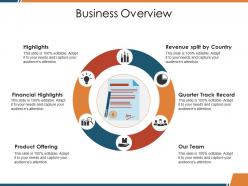
Establish a functional inventory with our Business Overview Ppt Show. Identify essential components to be catered for.
People who downloaded this PowerPoint presentation also viewed the following :
Business overview ppt show with all 5 slides:
Bank balance grows with our Business Overview Ppt Show. Greater assets get added on.
FAQs for Business
So people are totally over boring PowerPoint decks - interactive stuff is taking over instead of those static slides. Data storytelling is way more visual now. Micro-animations and embedded videos are huge, plus everyone wants real-time collaboration since we're still doing hybrid meetings constantly. AI tools can auto-generate layouts and give design suggestions which is honestly pretty neat. Oh, and mobile design matters more because execs are checking presentations on their phones all the time now. You should mess around with Figma or Canva for better layouts - way more dynamic than the usual stuff.
Templates are honestly game-changers for staying consistent. Throw your logo, brand colors, and fonts in there so everything looks professional without thinking about it. Works for sales decks, team meetings, client stuff - whatever. I'd make maybe 2-3 different versions depending on what you need them for. One company I know looked totally amateur before they got their template game together, now they look legit. Just start with one really solid master version first. Then make sure people actually use it - that's the tricky part honestly.
Hit them with your main point right away, then back it up with your strongest stuff first. That whole "tell them what you'll tell them" thing actually isn't just corporate BS - it works. Use words like "first" and "next" so people can follow along without getting lost. Bold headers and bullet points are your friend here. One idea per slide though, or you'll lose everyone. Oh, and don't forget to end with what you want them to do next - be specific about it. Visual hierarchy makes a huge difference too.
Okay so visuals are honestly make-or-break for keeping people hooked on your stuff. Like, your brain processes images 60,000 times faster than text - crazy right? So if someone opens your template and it looks messy or totally off-brand, they're gone before reading a single word. I learned this the hard way when I made some truly ugly presentations last year. Pick 2-3 colors for your brand and just stick with them everywhere. Clean layouts + consistent colors + decent images = people actually stick around and remember what you shared. Cluttered mess = instant bounce.
Colors seriously mess with people's heads in presentations - in a good way though. Blue makes you seem trustworthy and professional, which is why every corporate deck uses it. Red screams urgency and grabs attention fast. Green feels stable and growth-focused. Orange? Pure energy and creativity. Honestly, most people don't even realize they're reacting to the colors you picked. The key is choosing 2-3 colors that actually match what you're trying to say, then don't go crazy switching them up. Your message hits way harder when everything looks intentional.
Honestly, I'd hit the basics first - big fonts and high contrast colors are game changers. Alt text for images too. Captions or transcripts help tons for audio stuff. I bombed a presentation once because my text was way too small and someone in back couldn't read anything. Awkward! Different people learn differently - some need visuals, others prefer you just explain it clearly. Skip the fancy jargon if you can. Oh, and test it with screen reader software beforehand. Saves you from surprises later.
Dude, you should totally customize your pitch decks for different industries. When prospects see you're using their lingo and showing relevant case studies, they instantly trust you more. It's like speaking their language, you know? I've found it cuts my sales cycles in half because people don't have to work as hard to see how your solution fits their world. Yeah, it takes some upfront work to build out templates - maybe start with your top 2-3 industries. But honestly? Once you have them, presentations just flow so much better. Your win rates will thank you later.
Honestly, just bake the story right into your template structure. Set up sections that follow problem → journey → results, like you're telling a friend what happened over coffee instead of rattling off bullet points (so much better!). Keep your visual themes consistent throughout. Add spots for real examples or case studies - those always hit different than generic info. Oh, and throw some prompt questions in your speaker notes! That way people naturally lean into storytelling mode instead of just listing random facts. Makes the whole thing way more engaging.
Honestly, the worst thing you can do is just slap your content into a template without changing anything. You'll get this super generic-looking presentation that screams "I didn't try." Also - and I see this ALL the time - people stuff every single text box just because it exists. Like, calm down! Pick something simple instead of those fancy templates with tons of moving parts. Way easier to customize. Change the colors, fonts, spacing... whatever makes it actually yours. I'd rather see a basic template that's been tweaked to death than some complex thing that boxes you in, you know?
Yeah, culture totally changes how you should build your presentation. Japanese audiences want way more background info and relationship stuff, while Germans just want you to cut to the data. Colors are tricky too - red's lucky in China but screams "danger" everywhere else (made that mistake once, oof). You'll need to adjust everything from slide density to storytelling style. Even Q&A handling differs massively between cultures. Honestly, just do your homework on communication norms first. Then tweak your deck to match what they're expecting.
Honestly, just watch how engaged people actually are during your talk - are they asking questions or staring at their phones? Post-presentation surveys help too, but the real test is action. Did people actually do what you wanted them to do afterward? Track stuff like sign-ups, purchases, or whether your team scheduled those follow-ups you mentioned. I always throw together a quick feedback form (nothing fancy) because the data actually helps you not suck next time. Internal presentations are trickier - look for whether decisions got made or if everyone just nodded and forgot about it.
Templates are honestly a lifesaver for presentations. Create a master one with your brand colors, fonts, logo spots - the whole deal. Then everyone just uses that instead of starting from scratch each time. Sales, marketing, even the CEO will look consistent and professional. The tricky part? Actually getting people to use them lol. I'd start with maybe 3-5 templates for different presentation types and make it company policy. Oh, and don't forget to update them once in a while or they'll get stale. Saves so much time in the long run though.
Honestly, go for templates with clean fonts and lots of white space – cluttered slides are the worst. You'll want something with flexible layouts so you're not cramming bullet points into a chart slide, you know? High-res graphics are key since they won't look pixelated on big screens. Professional color schemes work best, but not so boring that everyone falls asleep. Oh, and make sure it fits your industry's style. I learned this the hard way – always test the template first! Trust me on that one.
Dude, you gotta get people actually *doing* stuff during your presentation. Polls work great - just throw one in there to see what people think. Q&A boxes are clutch too, and those clickable hotspots keep everyone awake (nobody wants to be the person staring blankly at slides for an hour). When people participate, they actually remember what you said later. It's weird how that works. You could try quizzes or even just a simple comment section. Honestly, start with just one interactive thing and see how it goes - don't overwhelm yourself right off the bat.
Build a solid story first - problem, solution, what happened. Your slides should back up the key moments, not dump everything at once. Way less text is better (trust me on this one). Break down complex stuff into smaller pieces. Skip the bullet point overload. Each slide needs one clear point that you actually talk through instead of just reading off the screen. I've found the headline + visual combo works really well - gives people something to focus on while you explain the good stuff. Your voice should add way more value than whatever's written up there.
-
Nice and innovative design.
-
Understandable and informative presentation.