


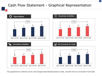
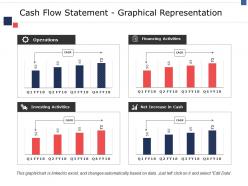
Cash flow statement graphical representation ppt model visual aids




Try Before you Buy Download Free Sample Product
 Impress Your
 Audience
 100%
100% Editable
 Save Hours
 of Time


Get bright ideas about conducting business with our Cash Flow Statement Graphical Representation Ppt Model Visual Aids. Come up with commercial brainwaves.
People who downloaded this PowerPoint presentation also viewed the following :
Cash flow statement graphical representation ppt model visual aids with all 5 slides:
Efforts of your team become more fruitful with our Cash Flow Statement Graphical Representation Ppt Model Visual Aids. They create friendly colleagues.
FAQs for Cash flow statement graphical representation ppt
So there are three main buckets you need to look at: operating, investing, and financing activities. Operating cash flow is honestly the big one - it shows if your actual business makes money, not just on paper. Then investing covers stuff like buying equipment or selling assets. Financing is your debt payments, new loans, that kind of thing. Most people overthink this and get buried in spreadsheet hell, but if you just map out those three sections and their flows, you're pretty much set. A waterfall chart works great for visualizing how cash moves around.
Honestly, graphs are a game changer for cash flow stuff. Way easier than scrolling through endless spreadsheet rows - your brain just processes the visual patterns faster. Line charts work best since they show the actual flow over time. You'll catch seasonal dips, see if certain quarters always suck, or figure out whether that good month was real progress or just a fluke. Bar charts are solid too if you want to compare operating vs investing vs financing cash flows side by side. I swear you'll spot red flags and opportunities that would've stayed buried in those number columns forever.
Honestly, waterfall charts are perfect for this - they show exactly how cash moves from your starting position through all the operating stuff to where you end up. Way better than trying to decipher spreadsheet rows, trust me. You could also do stacked bars if you're comparing across different periods, makes trends super obvious. Line charts work too for showing the flow over time, like quarter by quarter. But if you're presenting to the big bosses? Definitely go waterfall. It tells the story clearly and executives love that.
Yeah, cash flow charts totally depend on your industry. Retail gets those crazy holiday spikes - think Black Friday madness. Manufacturing is way more predictable, just steady flows tied to their working capital cycles. Tech companies? They're weird because negative operating cash flow during growth phases is actually normal (not the disaster it looks like). Service businesses have it easiest honestly - no inventory headaches means cleaner, consistent patterns. Just focus on whatever metrics your people actually watch instead of using some cookie-cutter template everyone else has.
Honestly, color coding your cash flow statements is such a simple trick but it works so well. I always do green for positive operating cash flow, red for negative, blue for investing stuff. Your eye just catches the patterns way faster than staring at endless black numbers - trust me on this one. Plus it looks way more professional in presentations (though maybe that's just me being extra). Just pick 2-3 colors max and stick with them across all your reports. Otherwise your team will get confused switching between different color schemes each time.
Pie charts work great for this - make two of them. One shows where your cash comes from (sales, loans, whatever), the other shows where it goes (expenses, equipment, debt payments). Each slice is proportional to your total cash flow. What's cool is you can instantly see if you're way too reliant on one income source or if something's eating up most of your budget. I'd probably do this quarterly too since cash patterns change with seasons. Like, retail businesses get weird around holidays. The visual makes it obvious what's happening without staring at spreadsheet numbers forever.
Honestly, just use Excel or Google Sheets if you want something fast - their chart tools work fine for basic stuff. Tableau and Power BI are solid choices when you need fancier dashboards though. I've actually seen people make decent waterfall charts in PowerPoint (weird flex but okay). Start with whatever BI tool your company already uses since the data connections will be way easier. But if it's just for a presentation, Excel's waterfall chart is perfect - that's literally what it's made for. Cash flow statements are tricky to visualize well, but these options should cover you.
Think of a cash flow waterfall like watching your bank account change in slow motion - you start with your opening balance, then each bar shows what hit your account next. Operating stuff might bump it up or down, then investing activities, financing moves, whatever. Honestly, it beats the hell out of trying to decode those traditional statements. You can actually see where money's bleeding out versus what's bringing cash in. I built one for last quarter and immediately caught stuff I totally missed before. The visual just makes everything click way faster.
Honestly, interactive dashboards are so much better than those boring static reports. You can filter stuff by time periods or departments instantly, and actually see what's happening with your cash flow in real-time. The visual stuff makes it way easier when you're presenting to people - nobody wants to stare at spreadsheets, trust me. Set up alerts for when your cash hits certain levels too. Oh, and start with the basics first - operating cash flow and runway. Those will give you the most useful insights right off the bat.
Honestly, turning your cash flow data into charts is a game changer. You know how your eyes just glaze over looking at spreadsheet rows? Visual stuff fixes that instantly - suddenly you can spot seasonal dips and where money's actually going. Plus when you're presenting to people who aren't finance nerds, graphs just work better. They'll get it right away instead of pretending to understand your numbers. I always start with basic monthly trend lines first. You'd be surprised what patterns jump out that you totally missed before. Makes timing decisions so much easier when you can actually see the cash crunches coming.
Dude, visual storytelling is a game-changer for cash flow stuff. Waterfall charts show exactly how money moved between operating, investing, and financing activities - way better than boring spreadsheets. Trend lines highlight seasonal patterns too. Honestly, executives zone out looking at raw numbers, but show them a clean visual and boom - they're suddenly asking good questions. Interactive dashboards are clutch because you can drill into specific periods during presentations. Oh, and start simple with one chart that tells your biggest story. You'd be surprised how much better the response is compared to... well, Excel hell.
Okay so free cash flow is your golden metric - that's just operating cash flow minus capex. Show operating cash flow trends over a few quarters too. Cash conversion ratios matter, plus days sales outstanding. Honestly, I'm obsessed with comparing cash flow from operations to net income because huge gaps are sketchy as hell. Working capital changes tell a story, and debt service coverage keeps everyone happy. Make it visual with trend lines so they can see if you're actually generating real cash or just pretty accounting numbers. Benchmarks help too - investors love context.
Honestly, infographics are a game-changer for explaining cash flow to people who aren't finance nerds. Turn those boring numbers into actual visual stories - green arrows for money coming in, red for money going out. Most people's eyes glaze over at spreadsheets (mine definitely do). But show operating activities like a pipeline? Investment activities as building blocks? Suddenly they get it. Focus on the big trends instead of tiny details. Oh, and figure out what's actually keeping your audience up at night first, then design visuals that hit those exact worries. Way more effective than dumping raw data on them.
Don't jam all three cash flow types into one chart - looks like a hot mess and nobody can read it properly. Split operating, investing, and financing activities into separate visuals instead. Time trends matter way more than single snapshots, trust me on this one. I've seen too many people mess up by using different scales across periods, which makes comparisons totally useless. Label everything clearly so people aren't playing guessing games. Oh, and put operating cash flow front and center since that's what most people actually care about anyway.
Netflix nailed this during their streaming pivot - they watched subscriber costs vs cash burn on dashboards to time everything perfectly. Tesla's another good example. Musk was probably obsessed with those cash flow charts during the whole Model 3 chaos, figuring out when to spend vs save. Buffer does it too for timing hires and launches. Look, even if you're not running a massive company, tracking your cash flow visually shows patterns you'd miss otherwise. Seasonal stuff, investment timing - it's all there if you chart it out properly.
-
Unique and attractive product design.
-
Very unique, user-friendly presentation interface.