

Centralization chart ppt examples slides





Try Before you Buy Download Free Sample Product
 Impress Your
 Audience
 100%
100% Editable
 Save Hours
 of Time


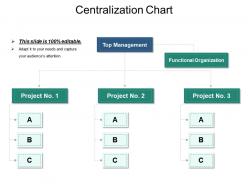
The Centralization Chart PPT Examples Slide describes a process in which activities involves planning as well as decision-making within an organization. Also, the template helps in delegating authority and responsibility to the members of the organization. This way everybody becomes aware of who is to report to whom. The centralized organization flow chart presentation template helps you in concentrating on the activities. This readily available PowerPoint template helps you in decision making, planning, framing strategies and policies. The centralization flowchart PPT slide is an ideal slide for executives and specialists who need to make critical decisions. The centralized government structure PowerPoint template diagram is perfect for the user to explain to his viewers about decision-making authority. Familiarize your viewers with the organizational structure using this professionally designed PPT slide. A presenter can take the assistance of the centralization chart benefits presentation slideshow to highlight the advantages of centralization such as clear chain of command, focused vision, reduced costs, quick implementation of decisions, improved quality of work, and many more.
People who downloaded this PowerPoint presentation also viewed the following :
Centralization chart ppt examples slides with all 5 slides:
Guide them to fulfilment with our Centralization Chart Ppt Examples Slides. Your group will develop the drive.

FAQs for Centralization chart
So basically, a Centralization Chart maps out who actually makes decisions at each level of your company. Pretty useful for figuring out if you're running things top-down or if lower-level people get to make calls. Honestly, most companies are way more centralized than they think they are. You can spot where decisions get stuck waiting for approval - those annoying bottlenecks that slow everything down. It'll also show you places where people need more freedom to act without asking permission first. Next time approvals are taking forever, check your chart. Bet you'll see exactly why things crawl at a snail's pace.
So basically it maps out who can decide what at each level of your company. Super helpful because people actually know where to go instead of running around confused. No more "can I approve this or do I need my boss?" situations - trust me, that stuff gets old fast. Plus you'll catch those bottlenecks where one person becomes the decision roadblock for everything. Everyone knows their boundaries too, which creates real accountability. I'd start by sketching out how decisions currently flow, then figure out what needs to change. Makes the whole process way smoother honestly.
Start with your main functions - HR, finance, IT, operations. Map out where decisions actually happen: headquarters vs regional offices. Color-coding saves you so much time later, trust me. Be specific about dollar amounts and roles, like "budget approvals over $10k" or "senior hiring decisions." Don't forget reporting lines and who people escalate to when shit hits the fan. The whole point is someone can glance at it and instantly know how your company works. Oh, and include real examples - abstract descriptions are useless.
Yeah, so too much centralization kills autonomy - everything has to go through upper management first. Super frustrating when your front-line people know exactly what's broken but can't fix it without waiting for approval. That said, some centralization isn't terrible since it pools resources and keeps everyone aligned strategically. Honestly, the trick is centralizing your big-picture strategy while letting people make their own day-to-day calls. Take a look at who's making decisions in your company right now. Can you push more of that authority down to whoever's actually doing the work?
So basically it's about who gets to make the calls. Centralized means everything goes up the chain - you know, those places where you need three approvals to order new pens. Decentralized is the opposite - teams can actually make their own decisions without waiting around forever. Most companies are somewhere in the middle these days, which honestly makes sense. You get better control with centralized stuff, but decentralized is way faster and people don't feel micromanaged. Just look at how many approvals you need for basic decisions and you'll figure out where your company sits.
Yeah, totally! Those charts are perfect for catching communication jams. You'll spot when one person's drowning in messages while others barely get looped in. Super helpful for finding those managers who somehow need to approve literally everything - honestly, we've all worked with that person. The visual makes it obvious where stuff gets stuck waiting around. Plus you can see if your setup forces things through too many approval steps. I'd use it to spread out who handles what communications. Makes workflows way smoother when you're not bottlenecking everything through the same few people.
For centralization charts, I'd go with Lucidchart - they've got templates made for exactly this stuff. Visio and draw.io work great too. PowerPoint's totally fine if you already have it, though navigating those formatting menus can be a pain sometimes. You'd be shocked how many decent org charts I've seen people whip up in Excel of all places! The main thing is just picking whatever lets you make those box-and-line hierarchies without fighting the software. Keep the design clean and readable. Nobody wants to squint at some overly complicated chart during a meeting.
Yeah, it totally depends on what industry you're in. Healthcare companies go crazy centralized with compliance stuff - they literally can't afford to mess up patient data regulations. Tech is the opposite - they want teams moving fast and innovating, so they decentralize most things except security and their main platforms. Manufacturing centralizes the big operational stuff but lets local plants make day-to-day calls. Finance is interesting though - super tight control over risk and regulatory reporting, but customer service teams usually get more freedom. Honestly, just look at where your biggest risks are. That's where you need the tightest control.
So basically it's a chart that shows who gets to make what decisions during big changes at work. Maps out if everything goes through the top bosses or if teams can actually decide stuff themselves. Super useful when projects get stuck because nobody knows who's supposed to sign off on things - honestly happens way more than it should. You map where decisions currently happen, then figure out where they should go once your changes are done. Really helps spot those annoying bottlenecks where everything just... sits. Start with how things work now, then design what you want it to look like after.
Update it every quarter, or whenever big changes happen - new leadership, restructuring, that kind of stuff. Most people totally forget about theirs until someone's like "wait, who's actually in charge here?" Which honestly happens more than you'd think. The chart becomes pretty worthless if it doesn't match reality anymore. Roles shift around constantly. Set a quarterly reminder to review it with your team - even just 15 minutes works. Trust me, it'll save you from so much confusion later.
Honestly, the biggest pain is gonna be pushback from teams who don't wanna lose control over their stuff. Territorial much? You'll also need to figure out what actually makes sense to centralize - not everything does. Timing's brutal too since you can't just shut things down mid-process. Leadership will probably freak about upfront costs, and nobody likes being told their current system sucks. Oh, and communication gets weird fast. My advice? Start tiny with something low-stakes first. Prove it works before you go after the major functions. Way less drama that way.
Honestly, visual stuff is what makes these charts actually readable instead of just boring boxes everywhere. I'd go with color coding for different levels - like maybe blue for executives, green for managers, whatever works. Arrows show who reports to whom, and you can make the big boss's box larger so it stands out. Oh, and icons are clutch for breaking up all that text. Just don't go crazy with colors - stick to 3 or 4 max or it'll look like a rainbow exploded. The main thing? Stay consistent with your choices so people aren't trying to decode what everything means.
Honestly, just make it simple so people can actually follow the decision flow without getting lost. Use the same shapes and colors for similar authority levels - consistency is your friend here. I've seen so many org charts that look like complete chaos! Start with your main decision points, then build outward. Group related stuff together, but don't try shoving every single role onto one chart if it gets messy. Break it up instead. Oh, and definitely run it by the actual people involved before you call it done. They'll spot things you totally missed.
Honestly, culture is huge here. Asian companies? They're used to top-down decisions, so centralization works. But try that in Scandinavia and you'll crush people's spirits - they need autonomy to thrive. Americans fall somewhere in between, though they hate being micromanaged. Communication style matters too. Germans can handle direct orders, while in places like Japan you need to build relationships first or nothing sticks. I'd actually map out your markets and see where they fall on the hierarchy scale. Don't try to force the same approach everywhere - that's asking for trouble.
Look, even with your chart done, there are times you'll want to loosen up control. Crisis situations? Don't wait for HQ approval - local teams need to move fast. Same goes for customer service issues or when you're breaking into new markets where your corporate playbook is basically useless. Innovation stuff works better when people aren't constantly checking boxes too. I'd say use that chart to figure out what genuinely needs central oversight, then back off on the rest. Oh, and if your teams have specialized knowledge that headquarters doesn't? Trust them to make those calls.
-
Excellent work done on template design and graphics.
-
Editable templates with innovative design and color combination.