


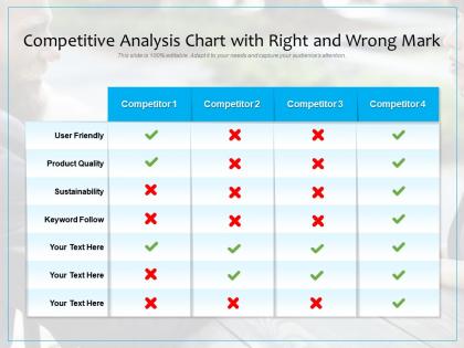
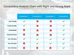
Competitive analysis chart with right and wrong mark




Try Before you Buy Download Free Sample Product
 Impress Your
 Audience
 100%
100% Editable
 Save Hours
 of Time


Our Competitive Analysis Chart With Right And Wrong Mark are explicit and effective. They combine clarity and concise expression.
People who downloaded this PowerPoint presentation also viewed the following :
Competitive analysis chart with right and wrong mark with all 2 slides:
Give your audience a fulfilling experience. They will find our Competitive Analysis Chart With Right And Wrong Mark elevating.
FAQs for Competitive analysis chart with right
Honestly, the collaboration stuff is where we crush everyone else - teams can actually edit together without wanting to throw their laptops out the window. We've got 300+ industry templates vs most competitors' measly 50-100, plus the automation is pretty sweet (auto-resizing text, one-click color changes, brand consistency checks). PowerPoint and Canva still feel like they're stuck in 2015 when it comes to teamwork features. The real-time commenting actually works, and version control means no more "final_FINAL_v3" nightmares. I'd definitely push the collaboration angle hard in your pitch - that's our secret weapon tbh.
We're right in the sweet spot at $19/month - most template sites run $9-29 for unlimited downloads. Canva Pro and Slidebean are our main competition there. Gamma charges $30+ but honestly? Their stuff isn't *that* much better than ours. What sets us apart is the credit system for people who just want one template without committing to monthly payments. Oh, and you'll want to check competitor pricing every few months or so. Don't want to accidentally price yourself out or miss easy revenue.
Clean minimalism is everywhere right now - lots of white space, bold geometric shapes, the whole deal. Also dark mode templates have totally taken over (seems like half of everything is black or dark gray these days). Color-wise, people are ditching those super bright gradients for muted pastels and monochromatic schemes. Way more sophisticated honestly. Data viz is getting more artistic too, less of that sterile corporate look. I'd hit up Behance or Dribbble to see what's hot, then compare your current stuff to spot where you might be missing out. Those sites are goldmines for this kind of research.
Honestly, the feedback stuff is crushing it for us right now. We're way ahead of competitors because they're still doing those slow quarterly surveys while we get real-time input. Makes us iterate so much faster. Those user interviews your team does? Pure gold - probably our biggest edge right now. Most companies are just guessing what users want or working off old data, which seems crazy to me. I'd say keep pushing those feedback channels you built and maybe track how fast we implement changes vs competitors. That could be interesting to see.
Yeah, everyone's going hard on TikTok and Instagram Reels right now - that's where all the engagement is. Influencer collabs are huge too, plus they're pushing user-generated content like crazy. Email's actually making a comeback, but not the boring mass emails from 2015. Now it's all about those personalized sequences that actually feel relevant. SEO and content are still the basics, obviously. Honestly though? I'd spend a month tracking their posting schedules and see how much they're spending on ads. You'll start noticing patterns in their messaging and timing - super helpful for figuring out what's working.
Honestly, we focus on the stuff everyone else ignores - nonprofits, local government, creative agencies. Most competitors just slap together generic business templates and call it a day. But we actually built specialized layouts for grant proposals, impact reports, portfolio showcases. The color schemes and icons feel authentic instead of sterile corporate garbage (nobody needs Comic Sans energy at city council meetings, you know?). What really sets us apart though is researching what these audiences actually want to see - donor metrics, creative workflows, that kind of thing. Check out our nonprofit and creative collections first.
Honestly, our customization is pretty decent - you can change colors, fonts, layouts, plus add your branding stuff. Most competitors like Canva do similar things. We're actually really good at drag-and-drop though, and we've got tons of template options. Figma has fancier design controls but it's way too complicated unless you're a designer or something. Our weak spot is definitely animations - we need more there. Oh, and here's what I'd do: just try 2-3 different tools with whatever you're actually trying to make and see which one clicks for you.
Most companies are going hard on personalized emails and those tiered loyalty programs. They're also doing customer success check-ins, especially in that 30-60 day sweet spot after someone signs up. The smarter ones use behavioral stuff to spot who's about to bail. What actually works though? Map your customer journey and find where people usually drop off. Then hit those spots with targeted help - tutorials, calls, maybe discounts. Honestly, just look at where you're going radio silent on customers first. That's probably where you're bleeding users. I see this mistake constantly.
Most of the big names refresh templates every 2-4 weeks. Canva and Adobe are honestly kinda crazy - they're pushing new stuff almost weekly. It really works though, they stay super current with whatever's trending design-wise. The companies updating more often definitely keep users more engaged. Plus they snag new customers who want that fresh look. I'd keep tabs on your top 3-5 competitors' schedules - you'll start seeing patterns and figure out when they're going hard on certain categories. Gives you a heads up on where things are moving next, which is pretty valuable intel.
Dude, the AI stuff in presentation tools is getting crazy. Most competitors are doing auto-generated slides from text prompts now. Real-time design suggestions pop up as you're typing. Smart templates that actually match your content type - honestly pretty impressive how well some work. There's also AI speaker coaching and audience analytics, which feels a bit much but whatever. The big thing everyone's pushing is automated design help - it handles layouts, colors, even picks images while you just worry about your actual message. You should probably check what your top competitors are rolling out every few months. This space moves ridiculously fast.
Look, you're doing okay but nothing special. Most competitors have the same drag-and-drop stuff and templates - though your platform loads way faster than Canva's mess (seriously, Canva can be so slow). Support response is where things get interesting. You're at 4-6 hours, Slidebean takes forever at 24+ hours, but Adobe's premium support crushes everyone at 2-3 hours. Here's the thing though - users actually care way more about having intuitive design tools than getting quick chat responses. So honestly? Focus on improving the design experience first, worry about support speed later.
Start with their visuals - successful competitors usually have their colors and fonts locked down everywhere, so you recognize them instantly. Then check their positioning. Going premium? Budget-friendly? Trying to shake things up? Their content tone matters too. Some brands get playful on social, others stay corporate, but good ones stick to their vibe consistently. Also look at where they're showing up - maybe they're sponsoring stuff you never thought of or using platforms you've been ignoring. Honestly, the messaging thing is huge. Write down what's clicking for them, then figure out your own spin that'll work better for your people.
So I've been checking out what Canva and Microsoft are doing lately - they're actually putting diverse imagery and multiple skin tones into their icon sets now. Pretty cool stuff. Their color palettes work better for colorblind users too, and some templates have different cultural themes (though honestly, a few feel kinda token-y). Alt-text suggestions are becoming standard, plus everything's meeting those WCAG readability standards. Oh, and this whole space changes super quickly - I'd probably peek at their template libraries every few months to see what's new. We should definitely compare how our diversity stacks up against theirs.
So from what I'm seeing, competitors are crushing it on template overwhelm - instead of bombarding users with endless options, they're curating smaller collections organized by actual use cases. Smart move. They're also fixing that annoying thing where every slide ends up looking totally different with better style inheritance and brand controls. The time crunch issue is getting solved through AI layout suggestions and one-click redesigns. Collaboration and version control? Still a mess everywhere, honestly. I'd definitely dig into how they're making template discovery less painful and automating those design decisions that slow everyone down.
Check out G2 reviews, but skip the 5-star ones - those 2-3 star reviews are where people actually explain what's broken. I literally spent hours on there last week and found so much good stuff. Look at customer complaints on their support forums too. What features keep getting requested but never built? Pricing gaps are huge - maybe they're ignoring smaller companies or specific industries. Customer service issues pop up a lot, or they can't integrate with the tools people actually use. Just pick your top 3 competitors and write down what their customers complain about most.
No Reviews