


Computer Repair And Service Company Brochure Trifold




Try Before you Buy Download Free Sample Product
 Impress Your
 Audience
 100%
100% Editable
 Save Hours
 of Time


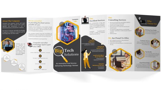
Make the most of our Trifold Brochure Template to elevate your marketing strategy for your computer repair and service company. Utilize this brochure to showcase the comprehensive range of IT solutions offered by the company, including hardware repairs, software installations, network setups, and maintenance. With our contemporary brochure design, you can highlight your companys proficiency in delivering tailor-made solutions to meet unique needs customer needs. Our brochure also includes critical information about our consulting services and expertise, empowering you to make informed decisions about your IT infrastructure. Our Trifold Brochure PPT features essential contact details and provides a brief history of our company, establishing credibility and building trust with potential clients.
People who downloaded this PowerPoint presentation also viewed the following :
Computer Repair And Service Company Brochure Trifold with all 1 slides:
Use our Computer Repair And Service Company Brochure Trifold to effectively help you save your valuable time. They are readymade to fit into any presentation structure.
FAQs for Computer Repair And Service
Okay so first figure out who you're actually talking to - that's gonna drive everything else. Your headline needs to grab people right away, then use good typography and white space to guide them through your main points. Don't make the same mistake everyone does by cramming too much stuff in there. It just looks messy and nobody reads it. Stick with colors that match your brand, get decent photos (blurry ones are the worst), and make your call-to-action pop. Oh and definitely show it to someone who isn't on your team first - they'll catch things you missed.
Honestly, colors can totally make or break your brochure. Blue screams trustworthy (banks love this for obvious reasons), red gets people hyped up and creates urgency. Green feels natural and eco-friendly, orange is super energetic. I've literally watched great brochures bomb because they picked weird colors that didn't match their vibe. Your palette needs to work with your brand AND push people toward whatever action you want. Oh, and definitely test a few options with real people first - their immediate reactions don't lie. Trust me on this one.
Stick with clean fonts for brochures - Helvetica or Montserrat work great for headers. Body text can be sans-serif or simple serif, whatever feels right. Those fancy script fonts look tempting but trust me, they're impossible to read when small. I learned that the hard way! Two or three fonts max, otherwise it gets messy. Good contrast between text and background is crucial. Older readers especially hate that light gray text trend. Print a test page first - screens lie about how stuff actually looks on paper.
So basically make your headline huge and bold - that's what people see first. Then work your way down by importance using different sizes and colors. White space is clutch here, don't be afraid to let things breathe! Your subheadings should fall somewhere between the main title and body text size-wise. I always use contrasting colors for the stuff that really matters. Mix up your font weights too - bold for important bits, regular for everything else. Oh and here's a trick: squint at your design and whatever jumps out first is exactly what your readers will notice. Works every time.
Honestly, just go with 8.5" x 11" tri-fold for most business stuff. They fit in folders and briefcases without getting weird creases. Trade shows are different though - people are juggling coffee and business cards, so 8.5" x 14" bi-fold is way more practical. I swear I've watched so many beautiful oversized brochures get absolutely destroyed in tote bags lol. Real estate agents love the big 11" x 17" ones because they look expensive, but that only works if your clients aren't shoving them in purses. Tri-fold letter size hits that perfect spot where people can actually read it AND carry it around without cursing your name.
Look, visuals do what your words can't - they grab people emotionally and make complicated stuff click instantly. Most people just skim anyway, so your images need to tell the whole story even if they skip the text entirely. Pick photos that actually show your benefits happening, not just random pretty pictures. I learned this the hard way when I used to just throw in generic stock photos that looked nice but said nothing. Every image should back up your main point or make people feel exactly what you want them to feel. It's way more effective than hoping they'll read paragraphs.
Honestly, whitespace is a game changer for brochures. People's eyes need somewhere to rest, you know? I've seen way too many that just dump everything on the page – looks cheap and nobody reads it. When you give things room to breathe, it actually makes your important stuff stand out more. Plus it looks way more professional. Here's what I'd do: cut out like 20% of whatever you're planning to put in there, then spread out what's left with decent spacing. Trust me, less really is more with this stuff. Your readers will thank you for not assaulting their eyeballs.
Okay so first off, don't stuff everything onto one page - nobody reads walls of text anyway. White space is your friend here. Pick maybe 2 fonts max and stick with colors that actually match your brand. Headers and bullet points help people scan through quickly instead of getting lost. Think about what hits them first when they open it - that's where your best stuff goes. I always put the most important info right at the top, then work down from there. Visuals help break things up too. Oh and definitely test it on a couple people before you print like 500 copies. Trust me on that one.
Ugh, don't cram everything onto one page like my cousin did with her yoga flyers - total mess. White space is your friend! Pick fonts people can actually read, not some fancy script that looks like ancient hieroglyphics. Your photos need to be crisp, not pixelated disasters. Colors should match your brand vibe too. Here's the thing though - proofread like crazy because fixing typos after printing costs a fortune. Oh, and definitely get someone else to look it over first. Fresh eyes catch stuff you'll miss every time.
Oh nice question! So with digital brochures you can actually go crazy with interactive stuff - videos, clickable buttons, cool animations. Way more fun than print tbh. Colors are basically unlimited since you're not paying per page to print. But here's the thing - you've gotta think about how it'll look on phones vs laptops, and nobody wants to wait forever for it to load. I always tell people to map out what the user's gonna do first, then worry about making it pretty. It's more like designing a mini website than a traditional brochure, you know?
Honestly, if you're just starting out, go with Canva - super easy to use and you'll have something decent in no time. Yeah, the templates can look kinda generic, but whatever. Once you get the hang of design stuff, InDesign is where it's at for professional work. That's what the pros use for layouts and it handles everything perfectly. Illustrator's awesome too if your brochure is more graphics-heavy. I mean, you could even use PowerPoint if you're really in a bind, though I wouldn't recommend it. Start simple with Canva, then level up later.
Honestly, just start with figuring out who you're actually talking to. What bugs them? What do they care about? That'll drive everything else - your colors, fonts, images, the whole thing. Like, a brochure for tech bros is gonna look totally different than one for retirees, you know? Write in their language and focus on stuff they actually want. Also - and this is kinda obvious but people skip it - test it with a few real people first. You want them picking it up thinking "oh this is definitely for me." Makes all the difference.
Paper weight's huge - go at least 100gsm or it'll feel flimsy. Matte vs gloss coating depends on your vibe, but honestly cheap paper just looks sad. Want it fancy? Think spot UV, embossing, or foil - though that stuff adds up quick. Full-color's pretty standard now. Just make sure your design has proper bleeds if it goes to the edge. Oh, and definitely get samples of different paper stocks first! You need to actually feel them. Always get a proof before they print everything - learned that the hard way once. Your printer should handle color matching fine.
Put your logo top-left or center on the front - somewhere obvious but not screaming for attention. Stick to 2-3 of your brand colors max, otherwise it'll look like a mess. Match your usual fonts too. If you're typically sleek and minimal, don't randomly throw in some ornate script font, you know? Your copy should sound like you normally do when talking to customers. Honestly, the biggest thing is making sure it feels connected to everything else you do brand-wise. Oh, and definitely double-check it against your brand guidelines before you hit print - saves headaches later.
Honestly, there's a bunch of ways to measure this stuff. QR codes and URLs are your best friend for tracking response rates. If it's for a store or something, watch your foot traffic numbers. Phone calls and contact form submissions tell you if people are actually interested - not just looking. Sales are obviously what matters most at the end of the day. Did they buy? Track your cost per lead too, since brochures aren't exactly cheap to print and distribute. Oh, and basic math helps - if you handed out 1000 and got 10 responses, that's your baseline. Just make sure you've got tracking set up beforehand or you'll be guessing later.
-
I looked at their huge selection of themes and designs. They appeared to be ideal for my profession. I'm sure I'll grab a few of them.
-
I didn’t expect such a good service for the money I am paying. But, they exceed my expectations. Great work SlideTeam.