

Control tower powerpoint layout




Try Before you Buy Download Free Sample Product
 Impress Your
 Audience
 100%
100% Editable
 Save Hours
 of Time


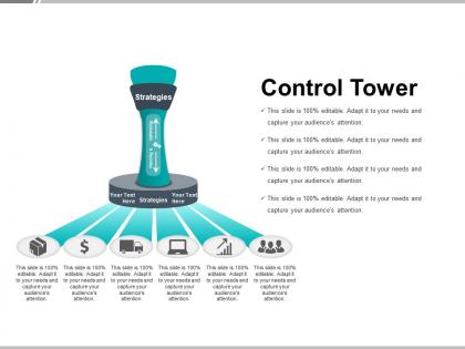
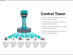
Choose this control tower PowerPoint layout PPT slide for delivering a business presentation while discussing about the increasing complexity in supplier relationships and growing product portfolios to make it more and more relevant for your company and to be able to act flexibly while focussing on positive results. With the help of this supply chain control tower PPT, you can react flexibly to the constantly expanding requirements and offer the prominent clients comprehensive advice in the areas of your corporate performance management and performance optimization. The usage of the operations control tower slideshow is generally used in the fields of industry, commerce and services which have a need for high-performance control concepts and solutions for the overall organization of all business areas. The presenter may start a discussion on the business models and processes in order to be successively digitized, automated and make more flexible with well-functioning processes and systems of this template. Balanced conditions come back due to our Control Tower Powerpoint Layout. Instability will disappear.
People who downloaded this PowerPoint presentation also viewed the following :
Control tower powerpoint layout with all 5 slides:
Our Control Tower Powerpoint Layout ensure arguments don't get hectic. Conduct discussions in a calm environment.
FAQs for Control
For your Control Tower deck, put KPIs and dashboard stuff right up front - that's what they want to see first. Use traffic light colors or similar visual cues so status jumps out immediately. Honestly, executives have zero patience for walls of text, so keep everything scannable. Clean charts showing trends work great. Focus on exception reporting - only flag what actually needs their attention. Oh, and make sure there's clear ownership for each action item. Skip the flashy animations (they're annoying anyway). Anyone should grasp the current situation and next steps in like 30 seconds per slide.
Honestly, visuals will save your life in those Control Tower meetings. All that logistics data is a nightmare to parse otherwise - like, who wants to stare at endless spreadsheets? Charts and heat maps let people actually see what's happening. Dashboards work great for your KPIs, flowcharts break down processes nicely, and maps are perfect when you're dealing with location stuff. I learned this the hard way after boring people to tears with raw numbers. Keep things simple though. You'll lose them if it gets too cluttered, and then you're back to square one.
Go with high-contrast stuff like navy/white or dark gray/light blue. Your audience needs to spot different data streams fast without squinting. Red for critical issues, green for healthy metrics, amber for warnings - pretty standard but it works. I've sat through way too many presentations with those crazy rainbow dashboards that hurt your brain. Test everything on a projector first though! Nothing worse than colors that look great on your laptop but turn to mush on the big screen. Trust me, stakeholders in the back row will actually be able to see what you're talking about.
Visual hierarchy is key here - flowcharts and process diagrams show how info moves between tower functions way better than walls of text. Split-screen layouts work great for before/after scenarios (honestly, audiences love that stuff). Air traffic coordination is super dynamic, so you need visuals that actually move with it. Mix clean process flows with real tower screenshots or photos - makes everything click. Dense slides will kill you when explaining something this complex. Oh, and don't underestimate how much real operational photos help people get it.
Honestly, simple is better - focus on the metrics that'll actually change how you make decisions. I'm a broken record about colors but seriously, pick 2-3 max and stick with them. Nothing screams amateur like a presentation that looks like Skittles exploded everywhere. Make your labels big enough so people in back can read them without squinting. Bar charts beat pie charts almost every time for Control Tower stuff since you're comparing performance across regions or months. Oh, and this is huge - always explain what comes next. Don't just dump data on people and expect them to figure out the action items themselves.
Think of your Control Tower deck like telling a story - open with the messy problems everyone's dealing with, then hit them with data showing how bad it really is. After that, boom - here's how we fixed it. I always throw in real people too, like "Sarah from warehousing used to spend 3 hours daily on spreadsheets..." Everyone eats up those before/after transformations. Oh, and don't overcomplicate your charts - they should just move the plot along. Maybe dedicate a slide to showing what a typical Tuesday looked like before vs after your changes? That stuff really lands.
For Control Tower stuff, you really want clean fonts that won't give people headaches when they're staring at data all day. Arial, Calibri, Segoe UI - the boring reliable ones work best. Nothing fancy or weird (obviously skip Comic Sans, but also those trendy thin fonts that look cool but are impossible to read). Go big on font sizes too - 18pt minimum, way bigger for the important numbers. I learned this the hard way when my manager couldn't read my dashboard from his desk. Test it on whatever screens you'll actually use because what looks fine on your laptop might be tiny on the conference room display.
Honestly, less is way more with animations in ops decks. Simple fade-ins for your key metrics work great, maybe a basic slide between sections. That's it though - nobody wants to watch charts spinning around like a carnival ride. I'd stick to 0.5 seconds max for timing, and definitely avoid bouncing text or swooshing effects. Those just scream "trying too hard." For section transitions, fade or push transitions are solid choices. Here's the thing - if people walk away talking about your cool animations instead of your actual data insights, you've totally missed the mark. Quick test: run through your deck once with zero effects. Still makes sense? You're golden.
Don't cram everything onto one slide - people's eyes just glaze over. Focus on metrics that actually help with decisions, not every single data point you've got. Fonts need to be readable from across the room (trust me, squinting at tiny text kills engagement). Red/yellow/green status indicators work great, just explain what each color means upfront so there's no guessing. Oh, and definitely run your layout by a few stakeholders first - they'll spot confusing stuff you missed. Short sentences work. But mix in some longer ones that flow naturally too.
Honestly, interactive stuff makes all the difference with Control Tower slides. Clickable dashboards work great - let people dig into the data themselves instead of just staring at static charts. Real-time polls keep everyone awake too. I always build in spots where I actually ask for input on the metrics, maybe get different teams talking about their KPIs. Live annotation tools are clutch for highlighting problems as they come up. Oh, and breakout sections help break the monotony. You don't want people zoning out while data just streams past them. Make them part of it, not just sitting there watching.
Focus on stuff that actually moves the needle - on-time delivery, inventory turns, cost per shipment. Exception resolution times are clutch too. Customer satisfaction scores will make your execs happy since they're always obsessed with the customer-facing metrics. Don't forget operational basics like how fast you respond to disruptions and whether you're being proactive or just putting out fires. Mix leading indicators (early alerts) with lagging ones (cost savings). Honestly, dashboards with good visuals work way better than spreadsheets. Just be ready to explain why things went sideways on random Tuesdays - someone always asks.
For Control Tower presentations, I'd go with side-by-side charts or before/after dashboards - they're pretty straightforward. Heat maps are honestly amazing for comparing regions or different time periods because the patterns just jump out at you. Waterfall charts work well too if you need to break down variances. Oh, and stacked bars are solid for multi-dimensional stuff. Just make sure you're using the same baseline across everything so people can actually see what's different. One thing I learned the hard way - stick to one main comparison method per slide or you'll lose everyone in the data.
Honestly, just stick to basic PowerPoint stuff - no crazy animations or weird fonts that'll break on other computers. Save as .pptx but definitely make a PDF backup too. I learned this the hard way lol. Font size matters more than you think - go 18pt minimum because projectors are terrible. High contrast colors are your friend since every screen shows things differently. Oh and test it on another device if you can, especially for your Control Tower layout. Seriously though, that PDF backup will save your life when the tech inevitably crashes right before you present.
Definitely lead with the pain points they're feeling right now, then position Control Tower as the fix. Keep the intro super high-level - what it is, why they should care about it. Hit them with the benefits that actually matter: faster response times, better visibility, cutting costs. Save all the technical architecture diagrams for later once you've hooked them. Honestly, I've seen too many presentations die because someone jumped straight into process flows. Stakeholders just zone out. Your first few slides need to answer "why should I care" way before you get into "how does it work." Think problem-solution structure - show the current chaos, then boom, here's how Control Tower fixes it.
Don't dump all your case studies in one spot - that's boring as hell. Sprinkle them right after you explain each benefit instead. Like when you talk about better visibility, boom - show how Company X cut lead times by 30%. Before/after stories work great for this stuff. Keep each example short though, maybe 2-3 minutes tops with clear metrics and visuals. The trick is connecting each case back to what your audience actually deals with. That way they're thinking "oh shit, that could be us" instead of just nodding politely.
-
Very well designed and informative templates.
-
Presentation Design is very nice, good work with the content as well.