


Current state vs future state info graphics





Try Before you Buy Download Free Sample Product
 Impress Your
 Audience
 100%
100% Editable
 Save Hours
 of Time


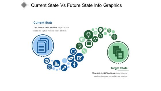
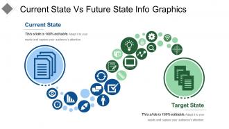
Connect with your audience through our, current state vs future state info graphics. A plathora of business icons are shown here connecting two stages shown, current state and future state. Elaborate your current goal and compare them with your future statistics. Get a better idea of where you can improve. Set your hard work apart and explore through contextualized text-based notes. Include better ideas in your current process, seal the leaks, meet deadlines and keep a track on your progress. Here at Slide Team, we are ceaselessly working on better ideas for producing superior results and walking a step to step with the technology. Current state vs future state info graphics PPT image slide will heighten the quality of your presentations Fashion a connection with your audience. Let our Current State Vs Future State Info Graphics dress up your thoughts.
People who downloaded this PowerPoint presentation also viewed the following :
Current state vs future state info graphics with all 5 slides:
Our Current State Vs Future State Info Graphics are really kosher. They are descendants of a pure lineage.
FAQs for Current state vs future
Focus on clear hierarchy first - that's what makes or breaks it. Your data needs to tell a story instead of just throwing numbers around. I always sketch the flow on paper before touching any design tools, saves so much time later. Use contrasting colors and plenty of white space because squinting at cluttered screens is the worst. Hook people with your headline, then guide their eyes through everything logically. Keep text short but punchy. Oh, and make sure your visuals actually back up the data rather than just looking nice. Readable fonts are non-negotiable too.
Dude, color choice can make or break your infographic. I've watched people completely skip over solid data just because the colors were awful - like neon green text on bright yellow backgrounds, ugh. Use contrasting colors for your most important stuff so it pops. Complementary colors keep things looking clean together. Warm colors feel energetic, cool ones are more calming. Don't go crazy though - stick to 3-4 colors max or it'll look like a rainbow exploded. Also, good color choices naturally guide people's eyes where you want them to look first.
Stats and percentages are perfect for infographics - anything with numbers that pop. Survey results, trends over time, that kind of stuff works great. I'm obsessed with process flows honestly, they just look so clean when done right. Geographic data is solid too, plus rankings and before/after comparisons. Don't try cramming in walls of text or super complicated datasets though. Those need way too much explanation. Pick your strongest stat first and build everything around that. Oh, and demographic breakdowns always perform well - people love seeing where they fit in the data.
Match your infographic style to what you're actually trying to say. Process or timeline stuff? Go with flowcharts. Statistics work better as charts and graphs. Complex ideas need those diagram layouts. I used to pick whatever looked pretty and then got confused when people didn't understand lol. Now I just think "what's the main thing I want them to remember?" Makes choosing way easier. Oh, and write your key message first - then figure out which format supports it best. That order matters more than you'd think.
Typography literally makes or breaks your infographic - it's what guides people through everything. Use different font sizes and weights to show what matters most. Your font choice sets the whole vibe too (seriously, don't use Comic Sans for data about climate change or something). Numbers and complex info need clean, readable fonts or people just bounce. I'd stick with maybe 2-3 fonts tops - any more gets messy fast. Good contrast against your background colors helps a ton. Start with one solid header font, then pair it with something simple for body text. Trust me, keeping it simple works way better than getting fancy.
Honestly, infographics just work better because people process visuals like 60,000 times faster than text. Crazy right? Your audience literally gets the info quicker without having to slog through paragraphs. They're super shareable too - way more than regular posts. I mean, who wants to read a wall of text these days? Visual content gets 94% more views than text-only stuff, which is pretty wild when you think about it. They make complex data actually digestible instead of overwhelming. Next time you write a blog post, turn it into an infographic and check your engagement metrics. You'll probably see a huge difference.
Ugh, don't cram everything into one graphic - it looks like a hot mess. Colors that clash or make text unreadable? Total rookie move. Make your important stuff pop with bigger text or bold colors. I'm guilty of this too, but avoid those decorative fonts that look cool but nobody can actually read. Low-res pixelated images are the worst. Oh, and figure out your main message first before you start designing. Seriously, that saves so much time later when you're not redesigning everything three times.
Okay so first thing - figure out what data actually matters and put that front and center. Don't cram everything together or people's brains just shut off (learned this the hard way lol). White space is your friend here. Group similar stuff with the same colors and fonts so it flows better. Stick to like 3-4 colors tops - more than that gets messy fast. Size and positioning will guide people through your story way better than adding more colors anyway. Oh and definitely show it to someone else first. If they can't get the main point in 10 seconds, you're not done yet.
Honestly, Canva's probably where you should start - super easy to use and has a ton of templates. Only downside is your stuff might end up looking like everyone else's (which, let's be real, happens a lot). Adobe Illustrator is what the pros use but it's kind of a pain to learn. There's also Piktochart and Venngage if you want something in between. I'd just mess around with Canva's free version first. See what you actually need before spending money on anything fancier.
Make it tall and skinny for mobile - that's the biggest thing. High contrast colors because people scroll crazy fast and you need to catch their eye immediately. Break everything into small chunks since no one's reading paragraphs on Instagram, trust me. Don't go overboard with your logo but definitely include it somewhere. Oh, and leave blank space around the edges! When people share it, the platform adds text overlays and you don't want that covering your main points. The visual hierarchy matters too - put your key message where it'll still be readable even when compressed.
Honestly, infographics are perfect for storytelling because you can walk people through your narrative using visual flow. The key is structuring it right - maybe chronologically or showing cause-and-effect. Visual stuff like charts and icons break down complex stories into bite-sized pieces that actually stick, unlike boring text blocks. People love sharing good infographics too, which is huge for reach. I always map out the story arc first (learned this the hard way), then figure out which visuals will support each part. Short sentences mixed with longer explanations work best for keeping attention.
Honestly, the biggest thing is don't cherry-pick data that makes your point look better - I've seen so many infographics go viral that completely twist the original research. Always cite where you got your info from, and make sure it's recent stuff from legit sources. You don't want to oversimplify complex data so much that it becomes wrong. Also watch out for visual tricks that mess with proportions. Before you post it, think: could I defend every single claim to someone who actually knows this topic? That's usually a good test.
Definitely customize based on who's looking at it. Executives want the big picture stuff - key metrics, clean visuals. Technical people need way more detail and actual process flows. Oh, and don't forget cultural differences matter a ton - colors mean different things everywhere, plus some cultures read right-to-left. I've watched so many beautiful infographics flop because nobody actually tested them first with real people. Major mistake. Format changes depending on where it's going too. Social media? One page max. Presentations can handle multiple panels. Also check your contrast and fonts for accessibility - some people legitimately can't read certain color combos. Always run it by a few target users before you call it done.
Interactive stuff is where it's at right now - like actually walking people through the data instead of just throwing charts at them. Motion graphics are everywhere too, especially for social feeds since you need something that stops the scroll. Oh, and everyone's going super minimal with big, bold fonts because cluttered designs are dead honestly. Accessibility is finally getting the attention it deserves with better contrast and screen reader support. Honestly though? Figure out your story first - I see way too many people jumping straight into the pretty visuals without nailing down what they're actually trying to say.
Track social shares and how long people stay on your page - that's your bread and butter. Website traffic spikes are obvious wins. I'd also set up UTM parameters so you actually know where visitors came from. Email distribution? Works way better than most people think, so watch those open rates. Backlinks take time but they're gold when they happen. Don't get discouraged if week one looks meh - I've seen infographics blow up months later when someone big shares them. Google Analytics conversion goals help too if you're trying to drive specific actions.
-
Use of icon with content is very relateable, informative and appealing.
-
Qualitative and comprehensive slides.