

Data Analysis Business Evaluation Process Visualization Presentation




Try Before you Buy Download Free Sample Product
 Impress Your
 Audience
 100%
100% Editable
 Save Hours
 of Time


Our Data Analysis Business Evaluation Process Visualization Presentation are topically designed to provide an attractive backdrop to any subject. Use them to look like a presentation pro.
People who downloaded this PowerPoint presentation also viewed the following :
Data Analysis Business Evaluation Process Visualization Presentation with all 12 slides:
Use our Data Analysis Business Evaluation Process Visualization Presentation to effectively help you save your valuable time. They are readymade to fit into any presentation structure.
FAQs for Data Analysis Business Evaluation
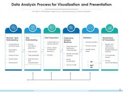
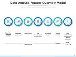
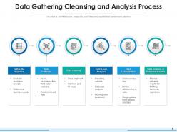
So there's basically 6 steps to this whole thing. You start by figuring out what problem you're even trying to solve - sounds obvious but people skip this all the time. Then collect your data and clean it (ugh, this part is the worst and takes forever). After that you can actually start exploring to see what patterns pop up. Apply whatever methods or models make sense for your situation. Interpret what you found and draw some conclusions. Present it to whoever needs to see it. Honestly, I'd block out way more time for the cleaning step than you think - it's always messier than it looks!
Honestly, just think about what story you're trying to tell first. Line charts are your go-to for anything happening over time. Comparing different categories? Bar charts all the way. I'm obsessed with scatter plots lately - they're amazing for showing how two things relate to each other. Histograms show distributions really well, though I tend to overuse them probably. For showing parts of a whole, you can't go wrong with pie charts or stacked bars. But here's the thing - always picture your audience looking at it. What question do they need answered? Pick whatever makes that answer super obvious right away.
Track both tech stuff and business impact - data quality, model accuracy, analysis speed on one side. Revenue growth, cost savings, customer satisfaction on the other. Business side matters way more though, honestly. Also watch adoption rates because amazing insights that nobody uses are basically pointless. Decision speed is huge too - are teams actually making faster calls because of your work? Oh and don't go crazy with metrics at first. Pick like 3-4 that match your main goals and expand later.
So basically ML finds patterns in your data that you'd never catch on your own. Way faster than doing everything manually too. You can feed it messy stuff like customer reviews or sales trends - honestly beats the hell out of trying to make sense of that in Excel. The cool part? It doesn't just tell you what happened, it predicts what's coming next. I'd start simple though - maybe try clustering your customers to see if there are groups you're missing. You'll probably be surprised what pops up.
Look, data storytelling basically takes your messy spreadsheets and turns them into something people actually want to listen to. You're walking them through the "why" instead of just throwing charts at their faces. Our brains are wired to remember stories way better than random stats anyway - it's wild how that works. Structure it like any good story: problem, what you found, what it means. I always figure out my main point first, then build everything around that. Makes the whole thing way less overwhelming for non-technical people, and honestly? They'll actually care about your findings instead of zoning out.
Honestly, the big three are consent, transparency, and only grabbing what you actually need. People should genuinely understand what data you're taking - not buried in some legal nightmare nobody reads. Collect the bare minimum for your analysis. Anonymize stuff when you can. Be really careful with sensitive demographics that could bite you later with discrimination issues. Also don't hoard personal data forever just because you can store it cheaply. I'd start with a privacy impact assessment on your next project - catches problems before they become headaches.
Dude, totally doable. Actually, small businesses have a huge advantage here - you know your customers way better than some massive corp does. Start with the free stuff: Google Analytics, your social media insights, even just Excel to track patterns. I'd pick one thing first, like email open rates or when people hit your site most. Watch it for a month, then actually do something with what you learn. The best part? You can change course in like a week when you spot something interesting. Big companies take months to pivot on anything. Oh, and don't overthink it - sometimes the simplest data tells you the most.
Look, the two biggest mistakes are confirmation bias and mixing up correlation with causation. We all hunt for data that backs up what we already believe - so force yourself to find stuff that proves you wrong. Just because two things happen together doesn't mean one causes the other. Like, ice cream sales and drowning both go up in summer, but obviously ice cream isn't killing people lol. Don't cherry-pick your timeframes either. Check your sample sizes. Ask "what other random factor could be causing this?" It's honestly saved me from some pretty embarrassing conclusions.
So basically, data analysis takes all that messy raw info and turns it into stuff you can actually use. You stop guessing and start seeing real patterns - like where things are getting stuck or what's actually working. Honestly, it's kinda like getting superpowers for spotting problems before they blow up. The trick though? You gotta ask the right questions from the start. Otherwise you'll waste time making pretty graphs that look impressive but don't help anyone decide anything. Been there, done that - learned the hard way!
Honestly, big data is a total game changer but also kinda intimidating at first. You're dealing with massive amounts of messy info instead of those nice clean spreadsheets we're used to. The cool part? You can actually predict customer behavior and catch market trends as they're happening - stuff that was literally impossible before. Tools have gotten way better too - cloud platforms and ML algorithms that don't crash when you throw terabytes at them. My advice though - don't go crazy right away. Pick one data source that's relevant to what you're already doing and mess around with it first.
First thing - validate your data upfront. Check for duplicates, missing stuff, weird outliers. Document every single change you make because guaranteed someone will question your work months later and you'll have no clue what you did. Version control is huge for both datasets and scripts. Never touch your raw data - keep that backup sacred. I always cross-validate results using different methods when I can. Honestly though, the best trick? Get a colleague to review everything. They catch the dumbest mistakes that you'll stare right past.
Definitely start with Python or R - Python's probably easier if you're new to coding. SQL is a must for pulling data from databases. Excel sounds basic but you'll use it constantly for quick stuff and presenting to executives who don't want fancy charts. For visualizations, Tableau and Power BI are solid choices, though honestly Power BI integrates better if your company uses Microsoft everything. Jupyter notebooks make Python work way cleaner. AWS or Google Cloud might come up depending where your data lives, but don't stress about learning cloud stuff right away. Just focus on what your current team actually uses first.
Predictive analytics works for basically any industry - retail uses it for customer behavior and sales forecasting, healthcare predicts patient outcomes, finance does risk assessment and fraud detection. Manufacturing is probably where I've seen the biggest wins though, especially with equipment maintenance (saves crazy money). The trick is figuring out your actual problem first, then work backwards to see what data you need. My old boss used to go nuts over fancy algorithms when simple trend analysis would've done the job. Don't overthink it - start with what you're trying to solve, not the cool tech.
So basically, descriptive analytics just tells you what already happened - like your sales tanked 15% last quarter. Diagnostic goes deeper and figures out why that mess occurred. Predictive is where it gets interesting though - it'll forecast what's coming next based on your old data. Then prescriptive is like having a really smart advisor who says "here's exactly what you need to do about it." Honestly, most companies just start with the basic descriptive stuff since it's way easier to set up. I'd probably figure out what questions your team is actually trying to answer first - saves you from building the wrong thing.
Dude, you really need other departments involved from the start - not just at the end when you're presenting. Marketing gets customer stuff you'd never see, ops knows where things actually break down, finance spots the money issues. When you're just solo with spreadsheets, you miss so much context. Plus here's the thing - if they help build the questions with you, they'll actually care about your findings instead of nodding politely then doing nothing (been there). Oh and definitely loop people in during problem definition, not after you've already done everything.
-
Colors used are bright and distinctive.
-
Excellent products for quick understanding.
-
Very unique, user-friendly presentation interface.