

Design And Implement Hospital Dashboard For Managing Patient Capacity And Beds





Try Before you Buy Download Free Sample Product
 Impress Your
 Audience
 100%
100% Editable
 Save Hours
 of Time


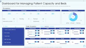
This slide shows the dashboard for managing patient capacity and beds which includes occupancy, alerts, etc, with total number of available beds, discharges, admissions and estimated ones.
People who downloaded this PowerPoint presentation also viewed the following :
Design And Implement Hospital Dashboard For Managing Patient Capacity And Beds with all 7 slides:
Use our Design And Implement Hospital Dashboard For Managing Patient Capacity And Beds to effectively help you save your valuable time. They are readymade to fit into any presentation structure.





FAQs for Design And Implement Hospital Dashboard For Managing Patient
Focus on patient flow first - bed occupancy, ER waits, discharge rates. Then clinical stuff like infection rates and readmissions. Financial metrics matter too (revenue per patient, cost per case). Don't forget staffing ratios and overtime hours. Seriously though, dashboards become a hot mess if you throw everything in there. Charts and color coding are your friends - executives need to spot issues in like 30 seconds or they won't use it. Start simple with these basics, then build out based on what your leadership actually cares about. Trust me, less is more here.
So dashboards are basically like having eyes everywhere in your hospital at once. You'll see bed availability, patient flow, ED bottlenecks - all that stuff in real time. The cool part is catching patients who are getting worse before it becomes a crisis through alerts and monitoring trends. Honestly, it beats the hell out of jumping between five different systems just to figure out what's going on. Oh, and you can actually predict when you're gonna be short-staffed instead of scrambling last minute. My advice? Start with whatever's driving you crazy right now and build from there.
Dude, real-time data is everything for hospital dashboards. Without it you're basically flying blind - like trying to manage patient flow with yesterday's bed counts. Total disaster waiting to happen. You need to see current volumes, staffing, and availability as it's actually happening so you can jump on emergencies right away instead of finding out about chaos hours later. Here's what I'd do: figure out which metrics need live updates versus stuff that can refresh hourly. Patient locations? Live. Monthly budget reports? Eh, hourly's fine. Honestly the refresh rates should match how urgent each piece of info actually is.
Critical alerts go at the very top - life-threatening stuff first. Patient vitals need to be front and center where you can't miss them. Colors help (red = urgent, green = stable) but don't make that the only indicator since colorblind staff won't catch it. Navigation has to be dead simple because nurses are literally sprinting between rooms half the time. Make text big enough to read from across the room too - I've seen people squinting at monitors from like 10 feet away. Honestly, just test it with real medical staff constantly. They'll find problems you'd never even think of.
Heat maps work great for patient flow stuff, and trend lines are your friend for vitals over time. Bar charts handle readmission rates and similar comparisons without looking cluttered. Honestly, I've seen too many dashboards that tried to get fancy and just confused everyone. Scatter plots are solid for finding correlations between clinical indicators. Color coding should be dead simple - red means critical, yellow's a warning, green's all good. Your users are crazy busy doctors and nurses who don't have time to decode weird visualizations. Test it with real clinical staff first or you'll end up redoing everything later.
Honestly, just make different dashboards for different people - it's not rocket science but hospitals mess this up constantly. Admins want the big picture stuff like bed capacity and revenue numbers. Doctors need patient data, lab results, that kind of thing. Interview each group first to see what they actually look at during their day. Then set up permissions so everyone sees their own relevant metrics upfront. Oh and use those customizable widget things - makes it way easier than rebuilding everything from scratch. Most places overthink this but it's really about matching the view to what people need to get their work done.
Focus on real-time sync first - stale patient data will bite you hard. Map out which EHR fields you actually need (probably way fewer than you think). Build those API connections solid, then work incrementally from there. Your clinicians don't care about pretty dashboards, they care about workflow. Surface the critical alerts but cut the data noise. I've seen too many projects dump everything the EHR spits out and wonder why nobody uses it. Clean, contextual interface beats fancy every time. Oh, and nail down your data governance early - sounds boring but you'll thank me later.
You can pull data straight from your systems into dashboards that'll format everything for CMS, Joint Commission, whoever. Set alerts when your metrics go wonky outside required ranges. Those quarterly reports that used to take forever? Now it's literally a few clicks instead of hunting through five different systems. Been there, it sucks. Build in audit trails though - regulators love asking for proof your data's legit. I'd start by figuring out which compliance reports eat up most of your time, then see what you can automate first.
Build predictive models straight into your dashboards to catch problems early. Patient deterioration alerts, bed shortages, staffing gaps - stuff you can actually prevent instead of just reacting to. Layer these predictions over your current views with color coding or alert panels. Algorithms run quietly in the background spotting warning signs before they blow up. Honestly, predicting what might happen beats staring at yesterday's numbers every time. Don't go crazy though - pick one high-impact model first, see how it works, then add more. Way better approach than trying to do everything at once.
Start with role-based access - nurses don't need admin data, docs don't need billing info, you know? Auto-logout is huge since everyone's constantly running around and forgets to sign out. Encrypt everything in transit and at rest, obviously. Audit trails are mandatory for HIPAA compliance (trust me, those violations get expensive fast). Multi-factor auth for anything sensitive. Oh, and make it play nice with whatever SSO system they're already using - hospitals hate switching platforms. Build this stuff in from the start rather than trying to patch security holes later.
Honestly, mobile is everything for hospital dashboards. Your staff are literally running around all day - between rooms, different floors, you name it. Doctors need to pull up patient vitals while they're walking to the next case. Nurses are updating records right at bedside. Plus administrators are checking capacity numbers from wherever they happen to be standing. Make sure your buttons are actually finger-sized though - trust me, nobody's got time to tap tiny links when there's an emergency happening. Load the most critical stuff first, test it on real phones, and yeah... keep text big enough to actually read!
Don't cram everything onto one screen - it's overwhelming. Colors should actually mean something to your clinical staff, not just look pretty. Skip the fancy metrics that sound important but won't help anyone make real patient decisions. Honestly, making nurses click through multiple screens for critical info is just cruel when they're already swamped. Test with people who actually work nights and days - tech comfort varies wildly. Oh, and build around workflows they already use daily instead of whatever looks cool in presentations. Generic dashboards are usually useless.
High contrast colors are everything for hospital dashboards - red for emergencies, green for stable patients, that kind of thing. I've literally watched dashboards with bad color choices slow down response times, which is terrifying when you think about it. Clean typography matters too. Make it big enough to read while you're rushing around. Skip the fancy fonts that look pretty but are impossible to scan quickly. Actually, test this stuff with real medical staff - they'll tell you what works. Oh, and honestly? Forget about winning design awards. You want instant comprehension when lives are on the line.
Honestly, multiple feedback loops are clutch here. Regular surveys with different departments work great - doctors and nurses use dashboards totally differently than admin staff. Throw in some quick feedback widgets right in the interface so people can complain or suggest stuff on the spot. Track your analytics too - see what features get completely ignored vs what people actually click. Quarterly "dashboard walks" where you literally sit with users and watch them work? Game changer. The key is being able to make small tweaks fast instead of doing these massive redesigns that take forever.
So basically these dashboards pull data from everywhere - patient numbers, symptoms, resource usage, location trends. Way faster than waiting for weekly reports or whatever. You'll catch stuff early, like how COVID could've been spotted sooner if we had better systems. The magic happens with automated alerts that ping you when numbers get weird. Honestly, the timing thing is huge - you're not scrambling after the fact. Set up your normal baselines now so when something's off, it'll be obvious. Your teams can actually get ahead of problems instead of chasing them.
-
They had the topic I was looking for in a readymade presentation…helped me meet my deadline.
-
Their professional templates are very impressive, even my manager was curious about the source. I am very grateful.