


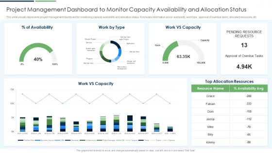
Project Management Dashboard To Monitor Capacity Availability And Allocation Status




Try Before you Buy Download Free Sample Product
 Impress Your
 Audience
 100%
100% Editable
 Save Hours
 of Time


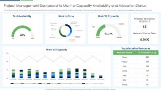
This slide visually represents project management dashboard for monitoring capacity availability and allocation status. It includes information about availability, work type, approval of overdue tasks, allocated resources, etc.
People who downloaded this PowerPoint presentation also viewed the following :
Project Management Dashboard To Monitor Capacity Availability And Allocation Status with all 7 slides:
Use our Project Management Dashboard To Monitor Capacity Availability And Allocation Status to effectively help you save your valuable time. They are readymade to fit into any presentation structure.





FAQs for Project Management Dashboard To Monitor Capacity Availability
You need the basics: timeline/milestones, budget tracking, task status, team workload, and risk flags. I've watched so many people create these monster dashboards that nobody actually uses - total waste of time. Keep it simple. Progress visualization is huge whether you go with percentages, burn-down charts, or just good old red/yellow/green dots. Your stakeholders should glance at it and instantly know what's up without squinting at a million data points. Honestly, start with less than you think you need. You can always add more later when things get messier.
Honestly, it's like giving your team a shared brain for the whole project. Everyone sees the same deadlines, updates, and who's doing what - no more endless email chains asking for status updates. Those weekly "where are we?" meetings basically disappear because people just check the dashboard instead. When someone gets stuck, others can actually see it and jump in to help. The tricky part though? Getting everyone to consistently use the damn thing. That's where most teams struggle, but once you get past that hurdle you're golden.
Stick to the basics that actually matter - are you hitting your milestones and staying on budget? Those two alone will save you so much headache. Also track scope creep (trust me on this one) and how productive your team is being. Resource utilization is huge too - nobody wants burned out people or folks sitting around with nothing to do. I've seen way too many fancy dashboards that look pretty but tell you absolutely nothing useful. Start simple and only add more metrics when people start asking specific questions in your meetings.
Oh man, you've gotta segment this stuff by audience. Execs want the bird's eye view - budgets, risks, high-level progress. They definitely don't need to see sprint details (learned that one the hard way when our CEO got annoyed at burndown charts lol). Team leads need the nitty-gritty: resources, timelines, actual bottlenecks they can fix. Clients? Just show them deliverable status and major milestones. I'd use filters or separate dashboard pages for each group. Pro tip: ask each stakeholder what decisions they're trying to make with your data first. Saves you from building the wrong thing.
Real-time data turns your dashboard into something you'll actually use instead of just pretty charts gathering dust. When bottlenecks pop up, you catch them immediately - same with budget issues before they get ugly. Your team finally stays on the same page without those painful weekly meetings where half the info is already stale. Honestly, the automatic alignment thing is huge. Everyone's looking at current data, not last week's drama. I'd say start with whatever data matters most to your sanity, then build from there once you get the hang of it.
Ugh, the worst thing you can do is jam everything onto one screen - total information overload. Nobody knows where to look first. Skip the vanity metrics too - like who cares about pretty numbers that don't actually help anyone decide anything? Your CEO wants different stuff than your project managers, so don't give them the same dashboard. I've seen so many orgs make people hunt through endless clicks just to find basic project status. So annoying. Put the critical stuff right up front. Honestly, just figure out what decisions each person needs to make first, then build from there.
Look, your dashboard's visual design is what decides if people actually use it or just get overwhelmed and give up. I'd focus on clear hierarchy first - like putting the stuff your team checks daily front and center. Charts work way better than boring tables for spotting trends, trust me on that one. Keep your colors and icons consistent so people don't have to relearn everything each time. But don't go overboard with fancy graphics - that just creates clutter. Map out what data matters most to your team. Then make those pieces pop visually while keeping everything else clean and simple.
Honestly, custom dashboards are a game changer. You can pull up exactly what you need - budget burns, sprint updates, whatever - instead of clicking through a million generic reports. Like, why would I want to scroll past 15 random widgets just to check my team's velocity? Makes no sense. The best part is you stop getting overwhelmed by irrelevant data and catch problems way earlier. I spent maybe 20 minutes setting mine up to match how I actually work, and now I'm not constantly hunting around for basic info. Saves me probably an hour every day, no joke.
Honestly, dashboards saved my butt so many times. You get alerts when budgets go haywire or deadlines start slipping - way better than finding out during those awkward status meetings. The visual stuff makes patterns super obvious too. I track maybe 4-5 key risk indicators daily, nothing crazy. Resource shortages, milestone delays, that kind of thing. Oh and you can actually see if your backup plans are working or just sitting there looking pretty. Wish someone had told me this years ago instead of letting me stress-check spreadsheets every morning!
Tableau, Power BI, or Grafana are solid picks if you need heavy customization and real-time stuff. But honestly? They're probably overkill for most teams. I've seen people waste weeks setting up fancy dashboards when a simple Notion board would've worked fine. Check what you're already using first - Asana, Monday.com, and Jira all have decent built-in dashboards that might do the job. Airtable's another good middle-ground option. Don't fall into the trap of picking something just because it looks impressive. Start basic, see what's actually missing, then upgrade if you need to.
Dude, dashboards are a game-changer for agile teams. You get real-time updates on sprints and can actually see your velocity trends without digging through Jira for an hour. Burn-down charts show you if you're on track, and blockers pop up right away instead of surfacing in standup the next day. Everyone stays on the same page with priorities - super helpful when requirements shift (which they always do). You'll spot overloaded team members fast too. Oh, and definitely connect it to your existing tools so data updates automatically. Trust me, manual updates are the worst.
Track your daily users and how long they're actually staying on the dashboard. More importantly though - are people finishing tasks quicker? Set baselines before you launch, then check monthly if project completion rates and deadline hits are improving. Budget stuff usually takes forever to show real trends, maybe 3-4 months honestly. Don't forget the softer metrics too - is your team communicating better? Do stakeholders feel more in the loop? Those matter just as much as the hard numbers.
Honestly, daily updates are the minimum but real-time is way better if you can swing it. I got burned so hard when my boss kept getting wrong milestone info - super awkward. Automated updates are a lifesaver since I'm terrible at remembering to do it manually. Morning updates work great, or right after standups if that's your thing. Your team has to actually trust what they're seeing on there, otherwise what's the point? Oh, and figure out which numbers change the most in your projects first. Makes way more sense to focus on those instead of updating everything constantly.
Ugh, old dashboards are basically fancy Excel charts that someone has to manually update every week. Super static and outdated by the time you look at them. The newer ones though? Completely different story. They pull data automatically from everywhere, update live, and you can actually click around to dig deeper into stuff. Plus they try to predict trends instead of just showing you old news. Honestly the difference is night and day - like going from a flip phone to an iPhone. If your company's still using those ancient systems, definitely worth pushing for an upgrade.
Honestly, I'd go with something like Tableau or Power BI - they're pretty solid for pulling data from different places. Most of them already connect to the usual suspects (Jira, Asana, your CRM, whatever). The tricky part is making sure your data fields match up across everything so it doesn't look like garbage when you combine it. Pick maybe 3-4 main sources to start with - trust me, don't try to connect everything at once or you'll hate yourself. Set up the connections, mess around with some basic charts first. Once that's working smoothly, then you can get fancy with it.
-
“Love it! I was able to grab an exciting proposal because of SlideTeam.”
-
The best part about SlideTeam is their meticulously prepared presentations (complete-decks and single-slides both), infused with high-quality graphics and easy to edit. All-in-all worthy products.