


Project Management Dashboard With Resource Allocation




Try Before you Buy Download Free Sample Product
 Impress Your
 Audience
 100%
100% Editable
 Save Hours
 of Time


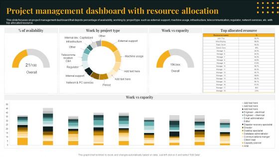
This slide focuses on project management dashboard that depicts percentage of availability, working by project type such as external support, machine usage, infrastructure, telecommunication, regulator, network services, etc. with top allocated resource.
People who downloaded this PowerPoint presentation also viewed the following :
Project Management Dashboard With Resource Allocation with all 8 slides:
Use our Project Management Dashboard With Resource Allocation to effectively help you save your valuable time. They are readymade to fit into any presentation structure.







FAQs for Project Management Dashboard
You'll definitely want project timelines, budget tracking, and team workload - those are must-haves. Risk indicators too, because nobody likes surprises. Task completion rates help a ton, plus resource allocation and maybe a communication log for stakeholders. Here's the thing though - I've watched people stuff every possible metric into these things and they become totally useless. Focus on what actually helps you make decisions. Real-time updates are crucial too, or at least close to it. Stale data just confuses everyone. Start simple with these basics, then only add more if your team's genuinely using what you've got.
Look, visualization tools are game-changers for messy data. Your brain processes charts and graphs way faster than endless spreadsheet rows. Heat maps show you problem spots immediately. Progress bars? They'll tell you if you're behind without any math. I actually used to waste hours digging through numbers for project updates - such a pain. Now I can spot trends and bottlenecks in seconds. Color-coded dashboards make everything obvious at a glance. Whether things are improving or tanking becomes super clear with the right visuals.
Honestly, just track what you actually need to make decisions. Timeline and budget variance are obvious ones - gotta know if you're behind or over. Resource utilization matters a ton when you're spinning multiple plates (which, let's be real, is always). Task completion rates show momentum, plus flag any blockers before they become real headaches. Don't go overboard though. I've seen dashboards that look like someone threw up spreadsheets everywhere and nobody touches them. Stick to maybe 5-7 metrics that actually tell you what's happening and what needs fixing next.
Honestly, real-time data is a game changer. You catch problems while they're still fixable instead of finding out a week later when it's too late. Live dashboards showing budget burns and milestone progress? That's how you actually stay on top of things. I can't tell you how many projects I've watched crash because everyone was looking at outdated spreadsheets from last Tuesday or whatever. Short story: decisions based on current data beat guessing every time. Oh, and set up those metric alerts - you'll thank me when they ping you before disaster strikes.
Oh man, the data thing is brutal. People constantly forget to update their progress, or they'll just mark stuff as "on track" because nobody wants to be the bearer of bad news. Manual entry is the worst - so many errors and delays. Plus you've got different systems that refuse to talk to each other properly. Honestly, I've seen teams waste hours trying to figure out why their dashboards don't match. Set up automated feeds wherever you can and give everyone specific days to update things. Otherwise you'll go crazy chasing people down for info.
Just ask each group what they actually check most often - that'll tell you exactly what to put on their dashboards. Executives want the big picture stuff: budgets, major risks, overall progress. They really don't need every single task update cluttering their view. Your team members need the opposite - detailed task lists, deadlines, who's doing what. Clients mostly care about milestones and when they're getting their deliverables. Most tools have role-based permissions anyway, so you can filter what everyone sees. I'd honestly start there instead of guessing what people want.
Think of KPIs as your dashboard's GPS - they show what's working without drowning you in data. Pick 4-6 that actually connect to your project goals. Nobody has time to decode 20 random charts, honestly. Your dashboard becomes way more useful when it focuses on metrics that matter. Spot issues early, make faster decisions. Figure out what success looks like first, then build your KPIs around that. I learned this the hard way after staring at useless charts for way too long.
Honestly, mobile access is a game changer for keeping people actually engaged with project dashboards. Your team's already glued to their phones anyway, right? So when they can quickly update tasks during their commute or check project status between meetings, you get real-time info instead of waiting around for everyone to get back to their computers. People can jump on urgent issues immediately rather than finding out about problems hours later. Just make sure your dashboard doesn't look like garbage on phone screens - I've seen too many that technically "work" but are impossible to navigate.
Your most important stuff should pop within 3 seconds - that's the golden rule. Use progress bars and colors so people instantly know what's up. Honestly, I'm obsessed with white space because cramped dashboards are the worst. Group similar info together and don't try to shove everything on one page. Different users need different views - what a PM wants isn't what developers care about. Oh, and navigation needs to be dead simple. Test with real people first though, or you'll end up fixing obvious problems later.
Set up regular review sessions where people can actually play around with your mockups. Quick surveys work great for figuring out which metrics they actually care about - not just what sounds important. Honestly, watching someone struggle to find something obvious is way more valuable than formal feedback sessions. Get input at every stage: wireframes, prototypes, the works. Ask specific stuff like "Can you pull up last week's numbers in 10 seconds?" instead of those useless "thoughts?" questions. Oh, and your team already knows what sucks about the current system, so just ask them early on.
Asana and Monday.com are solid if you want something straightforward - their dashboards work pretty well out of the box. ClickUp's another good one. Power BI and Tableau are amazing but honestly kind of a pain to learn at first (worth it if you're dealing with tons of data though). Notion's become weirdly popular lately and you can build some decent custom dashboards there. Same with Airtable. Oh, but here's what I'd actually do - check what your team's already using first. Most project tools have dashboard stuff built in that people totally ignore. Way easier than switching everything up.
Historical data is your best friend for catching problems before they blow up. Pull info from your last 5-10 projects and see where things usually go sideways - late deliveries, budget issues, resource crunches. We actually caught scope creep super early once just by comparing our current pace to a similar project from last year. Pretty neat trick. Your dashboard should flag these patterns so you can tweak estimates and manage stakeholder expectations better. Resource allocation gets way easier too. Start with your biggest pain points and work backwards from there.
Honestly, it's a game-changer for remote teams. Everyone can see what's happening in real-time without constantly bugging each other about updates. No more awkward "wait, when was that due?" situations. You'll catch problems early before they blow up into actual disasters. The whole team stays on the same page with priorities and deadlines - which is harder than it sounds when you're all scattered. I love that you can actually see who's drowning in work and shift things around. Oh, and set up those auto-notifications so people know what's up without scheduling yet another Zoom meeting.
Your dashboard needs to change with your project - don't just set it and forget it. New priorities pop up? Update your metrics right away. I've watched teams track completely irrelevant stuff while missing what actually mattered (so awkward in meetings). Add widgets, remove old ones, switch up your timeline views. Review it weekly during active projects - seriously, it's worth the 10 minutes. The goal is matching reality, not sticking to some setup you made months ago. Your stakeholders will thank you when the data actually reflects what's happening now.
Okay so when you don't update your dashboard, everything goes to hell pretty fast. Your team can't see what's actually happening, deadlines creep up on you, and stakeholders get annoyed because they have no clue what's going on. Honestly, it's worse than using an old GPS that keeps telling you to turn after you've already passed the street. You end up making terrible decisions with outdated info. Resources get thrown around randomly, and small problems turn into disasters before you notice. I know it's boring, but just block out 15 minutes every day to update it - trust me on this one.
-
A fantastic collection of templates. I'll likely use this as my go-to resource for future templates and support.
-
Stunning collection! With a wide variety of options available, I was able to find a perfect slide for my presentation. Thank you, SlideTeam!