Remember the frustration of untangling a knotted wool yarn ball? Now, imagine if your hospital's data looks like that. Sprinting through the hospital halls collecting piles of patient records, lab tests, endless spreadsheets, and reports – enough to leave any healthcare professional feeling overwhelmed and adrift.
But what if there was a way to cut through the chaos, transforming your data into a clear, actionable roadmap for improved patient care and hospital efficiency?
Yes, we are talking about SlideTeam’s empowering Healthcare Dashboard Metrics Templates. These are not just fancy charts but data filters, transforming information overload into consolidated patient metrics, recruitment costs, hiring charts, trends, ER wait times, and lab test turnarounds into one easy-to-access format. No more wading through numbers, codes, and jargon; instead, you have a real-time snapshot of all your patients' health, allowing you to:
- Identify at-risk patients at a glance, allowing for early intervention and improved outcomes.
- Shed insights into treatments and how these affect hospital finances and room/bed availability.
- Monitor patient metrics and treatment progress in real-time, ensuring patients stay on track and receive prompt help.
- Helps hospitals understand how their financial resources are being used.
- Optimize resource allocation by examining the number of patients admitted to the ER (ER wait times) and the average time at the hospital.
- Benchmark department-wide performance, identifying areas for improvement.
- Improve communication with patients and families by providing clear, data-driven health updates.
Healing shouldn't be risky. Protect your patients & reputation with effective risk management with our top 24 Healthcare Risk Management Templates! Click here to learn more!
Designed for hospital departments and specialties, these PPT Templates are 100% customizable, providing a solid foundation and allowing you to add, remove, and adjust metrics to match your needs and priorities perfectly.
Ready for the data detox? Let’s dig into these templates!
Psst… stick along to get some secret tips no one will tell you about editing a healthcare dashboard template for maximum reach and benefit!
Drowning in data? You're not alone. Our Top 10 Healthcare Dashboard Templates are here to rescue you from the tides of data overload. Check them out here!
Template 1: Healthcare Project Manpower Planning Dashboard
Struggling to fill key healthcare roles? Say goodbye to staffing hassles! This planning dashboard showcases metrics such as open, closed, and vacant positions for medical officers, accountants, and clerks, along with insights into state and area-specific staffing needs. Stop guessing and start optimizing your workforce management as the template sees through aspects such as demand forecasting, supply evaluation, and demand balance, ensuring you're prepared for staffing needs. Get access to it now!
Template 2: KPI Metrics Dashboard to Measure Effectiveness Healthcare Administration Overview Trend Statistics Areas
Hiring the right healthcare professionals is crucial, as recruiting these heroes isn't just about filling seats; it's about saving lives, boosting budgets, and building a healthcare cover for all. Hire right, hire smart with this customized template designed to evaluate the effectiveness of healthcare recruitment efforts. It analyzes KPI metrics such as technical and non-technical hiring processes, tracks recruitment costs YTD, and visualizes your hiring pipeline, offering a detailed overview of top hiring sources. This dashboard sparks productive data-based discussions, navigates challenges, and optimizes your recruitment strategy, enabling in-depth analysis of effectiveness in healthcare administration. Get access to it now!
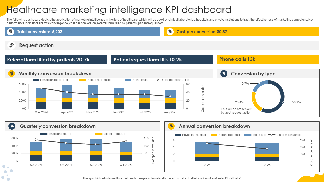
Template 3: Healthcare Marketing Intelligence KPI Dashboard
Navigate your way through the marketing maze with this Healthcare KPI Dashboard! Laboratories, hospitals, or private institutions – ditch the guesswork and embrace data-driven marketing to track the efficacy of marketing campaigns. This comprehensive tool spotlights KPIs such as total conversions, cost per conversion, phone calls, patient referral forms, and patient requests, offering insights into campaign effectiveness. Observe factors like conversions by type, patient behavior, and conversion breakdowns (annually and quarterly) and request actions to identify what's working and what needs to be changed. Download now to transform your marketing game!
Template 4: Healthcare Dashboard with Customer Satisfaction and Patient Metrics
Unfollow those generic templates; show unwavering determination with this healthcare dashboard featuring customer satisfaction and patient metrics. Powered by ambition and actionable insights, this is fueled by a set of slides, such as detailed patient arrival metrics – Bed, nurse, physician, and discharge. It also includes a customer satisfaction pie-chart scale, which enhances patient experience and guides strategic decision-making. There’s more! The template encapsulates data on average salary by department, which aids in optimizing resource allocation and fostering a balanced workforce ecosystem. Additionally, its salary range breakdown chart gives a bird's-eye view of the industry's performance and trends. Get your hands on this template now!
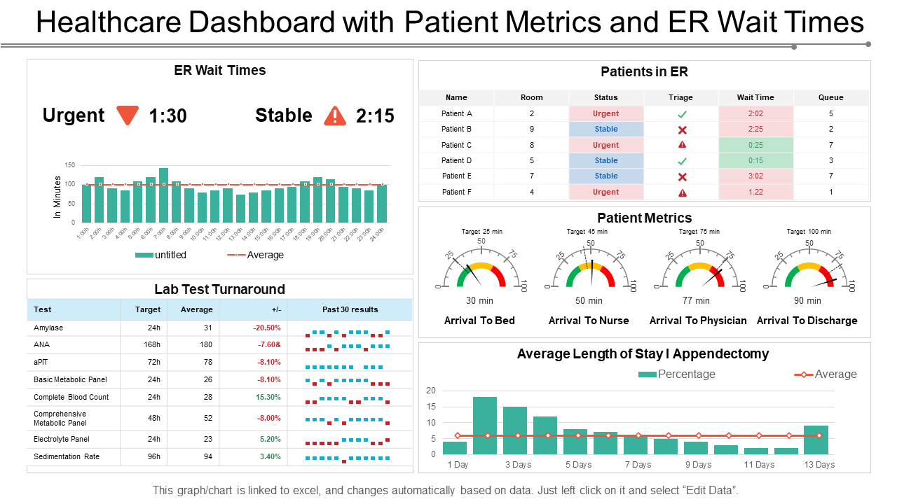
Template 5: Healthcare Dashboard With Patient Metrics and ER Wait Times
This dashboard is more than just some numbers on the screen; it’s a digital window into your healthcare system's health, full of insightful patient metrics and ER wait times. The template acts as a window for displaying KPIs for informed decision-making. It tracks the number of patients in the ER, demographics, patient arrival metrics, vitals, lengths of stay/ appendectomy graphs, and lab test turnarounds, portraying the overall patient experience. But that's not all. It zooms in on the urgent & stable ER wait times, occupancy levels, and even abandoned visits, helping identify bottlenecks and optimize resource allocation. Packed with filters, comparisons, and alerts, this dashboard aids in improving patient care, reducing costs, and ensuring transparency.
Focus on being the change, not being lost in the change!
In modern healthcare and technology, where change is constant, and every decision impacts lives, the significance of healthcare dashboard metrics templates is immense. Therefore, our digital marvels (templates) serve as the compass guiding healthcare professionals through the loops of data, highlighting pathways to enhanced patient care and operational excellence.
Healthcare teams can leverage these templates to bridge the gap between scattered data and actionable intelligence with a swift click and swipe. Through their dynamic capabilities and intuitive interfaces, these templates streamline operations and encourage continuous improvement and excellence. In the ever-evolving healthcare management, embracing the potential of dashboard metrics templates isn't just a strategy — it's a commitment to weaving a tapestry of care & trust where every thread counts.
As promised, here are some recommended tips while editing Healthcare Dashboard Metrics Templates:
- Tailor data to your audience:
- Identify users: Determine who will use the dashboard (e.g., administrators, institutions, clinics, hospitals, patients). Customize metrics and visualizations based on their needs.
- Language is the key: Use clear, jargon-free language.
- Target on relevance and clarity:
- Prioritize key metrics: Don't bombard users with data overload. Choose metrics directly impacting user roles and decision-making. Employ appropriate charts and graphs (e.g., bar charts, percentage charts for comparisons, and line charts for trends).
- The context says it all: Label axes, provide comparisons, patient metrics, lab test turnarounds, and add brief explanations.
- Embrace interactivity:
- Filter to clarify: Allow users to explore specific data points or subsets for deeper analysis.
- Highlight trends and important text: Use visual cues (e.g., color codings, themes, pie charts, alerts, and annotations) to draw attention to critical information.
- Data accuracy, branding, and consistency:
- Verify your internal/ external data sources and maintain consistent formatting to avoid confusion.
- Stay updated: Update data to reflect performance and eliminate any outdated information.
- Branding and aesthetics: Align the dashboard design with your institution’s brand guidelines for a professional feel.
Evolve beyond pain points. Elevate healthcare quality, spark innovation & patient satisfaction with our Top 10 Healthcare Quality Improvement Templates. Check them out here!



 Customer Reviews


